Poll results
Save to favorites
Add this poll to your saved list for easy reference.
Which picture would you more likely click on to see product details?

Option B won this Ranked poll with a final tally of 28 votes after 2 rounds of votes counting.
In a Ranked poll, respondents rank every option in order of preference. For example, when you test 6 options, each respondent orders their choices from first to sixth place.
PickFu requires a majority to win a Ranked poll. A majority winner differs from a plurality winner. A majority winner earns over 50% of the votes, whereas a plurality winner earns the most votes, regardless of winning percentage.
If an option does not earn a majority of votes, PickFu eliminates the option with the lowest number of votes. The votes from the eliminated option are reassigned based on each respondent’s next choice. This process continues in rounds until a majority winner emerges.
Scores reflect the percentage of total votes an option receives during the vote counting and indicate the relative preference of the respondents. If there is no majority winner, look to the scores to see how the options fared relative to one another.
| Option | Round 1 | Round 2 |
|---|---|---|
| B | 50% 25 votes | 56% 28 votes +3 |
| C | 40% 20 votes | 44% 22 votes +2 |
| A | 10% 5 votes | Eliminated 5 votes reassigned |
5 Responses to Option A
A because the design is more detail oriented and laid out more professionally
I like seeing all parts of the product laid out separately, which makes it easier to see the product detail, which is helpful. Looks like a very cool and useful product for sure!
I like seeing the expanded view of option A where everything that comes and is used is visible. This gives me a clear picture of what to expect. Option C was really good at visualizing the product but made me curious what the other pieces showing in option A and B were. Option B would of been second if the product was not on top of the case. I liked option A overall because it made me more confident at wanting to click it to learn more, compared to the other two choices where I questioned how the product was placed.
I think Option A does the best job of showcasing the product and all its components
I like seeing how the different pieces fit in this
25 Responses to Option B
I like showing an example of how the brushes could use used in this instance in B and A
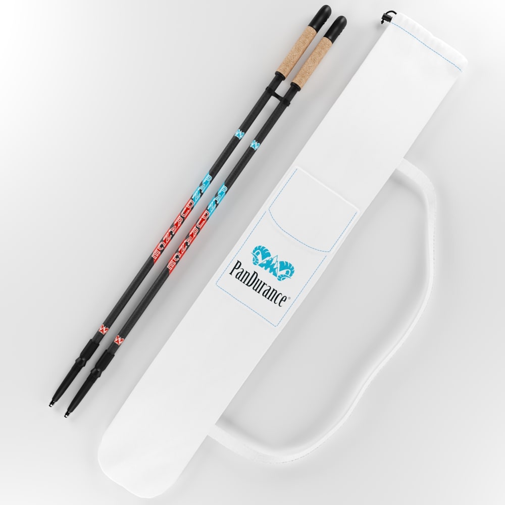
I liked option B the best because it shows the trekking pokes with the box, but also shows the full length as well as with the baskets at the tips. Option C I liked the least because the trekking poles don't have the baskets.
Well I think B shows the product best, but all three require a deeper look to see what the product really is.
I prefer seeing the chop sticks in the travel tote on option B. I don't like that I can't see much of the tote bag on option A.
I like option C because you can see everything that is included plus the packaging. Then I like A and C, they are good pictures of the product.
I chose based on how easy it is to see the different parts in the image.
B had a good design to it and the look was interesting. I love the appearance a lot.
not entirely sure what this product is but i like the fact that the first one shows me all the parts, which the other two really don't much. the second one seems to show some of them while the 3rd only seems to show the product as a whole.
I would click on B, I like how it shows all of the items and materials it has to offer. I also like how it shows the items will fit great in the container.
I choose B just more in the image and can see the product better
they are painted beautifully with bright colors and really nice graphics on them
I like the composition of this one the best. I like the centered composition with it in the packaging.
I think B gives the best overall view of the product. It's sort of hard to tell what the product is in A.
Option B shows everything you would get in your purchase. Option C shows less, but still shows the nice carrying case. Option A does not give enough in the picture to tell what you are getting.
i like option B the most I think that the image overall makes the product more appealing
I like seeing it placed neatly in the see through packaging and then seeing the accessories it comes with scattered around it.
I can see all the parts in B and A - C is just the package basically.
I chose B because the items are in a neat bag and I like how the picture looks tidy.
B is the only one that makes me think I see all of everything.
I like the transparent cover on this one as it gives a better impression of what the product looks like.
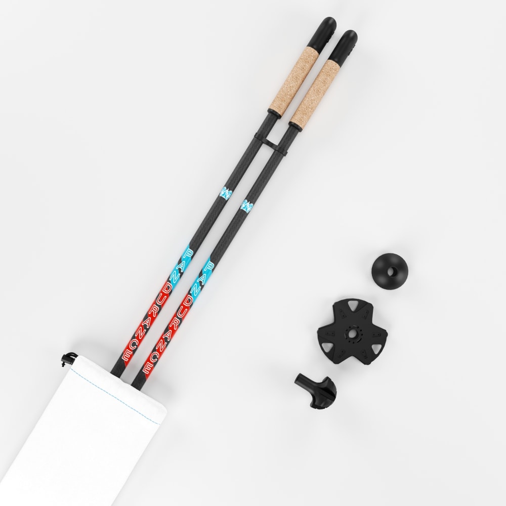
Option A is the one that would most likely make me want to see the product details because you can see more of the components.
I like option B the most because I feel the product has the most accessories. I then think that product A has more accessories than choice C.
It shows me how it goes in the carrying case. It shows me more than the others, so it is more attractive
I chose this order because it was the most visually appealing to me.
I like seeing everything that is included completely visible.
20 Responses to Option C
I most prefer option C. I like being able to see the case and a plain view of the product itself as well.
I voted based on how appealing the images were to me compared to the others and which ones I would click on in the real world.
C looks most simple and elegant. All the little black pieces take away from the simplicity of chopsticks.
I actually think having the logo/name intrigued me to look more closely at C and B, and would thus also make me look at other photos because of those two. More than A, at least.
I think this one makes it the easiest to see the details of everything. I like how it is laid out side by side and nothing is covered. I like B as my second choice because it looks the most organized. Nothing is cluttered and just laying around
I went by how structured the pictures were because my last choice looks messy.
I really don't care for any of the pictures but showing the case with the name actually clued me in to what this is, the clear case might look better in person but its hard to make out in the photo and option a is just far too plain
I would most likely click on option C. Overall this listing image is the most attractive to me. I really like the way the product is laid out.
Both the images and description are vague to me and I do not really know what type of product it is. That being said, I went C, B and A in that order based on the presentation/layout.
I chose C because it is the neatest looking of the three. I like its presentation.
I chose C because it doesn't really tell me to much about the case so I think I would want to click into the product to see more.
I am going to be honest and say I don't know what the product in the images is. With that being said I would click on choice C first because the text is more visible and I would try to read it and see the the product in greater detail.
C is the best image because it lets me see the product clearer by itself and I can see the detail and quality better.
C does the best job of clearly showing everything that is included in the product. Nothing is hidden away and you can clearly see the size of everything
C is false advertising, but it has a prettier ad.
C gave me a better idea of what the product was. I felt like I was looking at spare parts with the other ones. B inside the bag is the neatest with the extras in the picture. A is confusing and you can't see the bag.
I like that "C" shows the chopsticks and the case, but not layered on top of each other. It is not too cluttered. I don't like that "A" doesn't show the entire length of the chopsticks.
I like seeing all components of a product
i like option c the best. becuase you can see the entire product .
I would pick C because it shows the product and the packaging.
Explore who answered your poll
Analyze your results with demographic reports.
Demographics
Sorry, AI highlights are currently only available for polls created after February 28th.
We're working hard to bring AI to more polls, please check back soon.

