Poll results
Save to favorites
Add this poll to your saved list for easy reference.
If you were shopping on Amazon, which product would you rather buy?
Option B won this Ranked poll with a final tally of 56 votes after 2 rounds of votes counting.
In a Ranked poll, respondents rank every option in order of preference. For example, when you test 6 options, each respondent orders their choices from first to sixth place.
PickFu requires a majority to win a Ranked poll. A majority winner differs from a plurality winner. A majority winner earns over 50% of the votes, whereas a plurality winner earns the most votes, regardless of winning percentage.
If an option does not earn a majority of votes, PickFu eliminates the option with the lowest number of votes. The votes from the eliminated option are reassigned based on each respondent’s next choice. This process continues in rounds until a majority winner emerges.
Scores reflect the percentage of total votes an option receives during the vote counting and indicate the relative preference of the respondents. If there is no majority winner, look to the scores to see how the options fared relative to one another.
| Option | Round 1 | Round 2 |
|---|---|---|
| B | 47% 47 votes | 56% 56 votes +9 |
| C | 33% 33 votes | 44% 44 votes +11 |
| A | 20% 20 votes | Eliminated 20 votes reassigned |
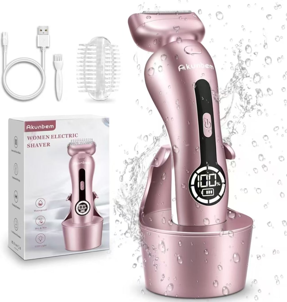
20 Responses to Option A
the base of A seems to be the sturdiest
I like A best because it looks most sleek and easy to manuever.
I voted A because I felt like the large numbers 100 were too top heavy on the other two. C feels a little more balanced with the button above the number at least but B is way too top heavy/imbalanced as a design I feel like
All the options show very similar products and accessories. The packaging is very similar. Here the differences are subtle. Hence, the ranking is based on the default alphabetical order.
I prefer option A. I like this one because it has a smaller screen and more pink handle.
Option A, because it looks less likely to have mechanical issues, and only if it were a different color. Thank you.
Option A looks like it wouldn't interfere with your hands and the button placement while in use. The other choices look like they could potentially be hit during use.
I like that the power alert is smaller on this shaver. I also like that the stand looks more sturdy like it would tip over as easily. I think the look of photo is so much more attractive just in the way the water coming off of it isn't so over done.
Option A has an on/off button that is placed in such a way as to keep from accidentally hitting it during use. It also has an easy to read gauge. Options C and B look nice, too, but the on/off button placement might be problematic.
I prefer this option. The color looks brighter and it seems like it is easier to use, than the other options.
A first because I can see it the best, it’s the closest to the screen and the charging station is wider. C next because I can see the buttons that you need to use for this product better. there are in a more isolated spot making it easier to find and then use. B last because the image seems the furthest away so I can’t see the features as well as I can with both A and C.
I like the extra supports on A and the bigger button on B over the small button on C.
This product looks easier to hold and has a base that seems much more stable and less likely to tip over.
In my opinion the electric shaver shown in option A has more elegant and clean look. I like the fact that the percentage of the charged battery is not as large as in option B, the black portion is smaller, but provides nice contrast to the power on/off button.
I chose option A first because I like the curve of the structure of the shaver and I prefer the electrical part of the shaver to be the furthest from the head of the shaver. I chose option C secondly because the screen is further from the shaver head and doesn't seem like it would run the risk of slipping through my hands if they're wet. I chose option B last because the design seems faulty in the ways that the shaver may disrupt the functionality.
I like the battery read out at the bottom. I don't think the digits of the battery needs to be the focal point. I like the colors and would like to see more of them.
I choose A first. I prefer the power button in the middle. B is second, with it located below the power "lert," and C is last.
The fact that the "numbers" are placed at the bottom and smaller in choice A makes it seem more streamlined.
I think I would most likely go with Option A between the 3 of these choices, as I prefer the positioning of the digital screen. Other than that, I would be content with any of these.
I like the base on this one better, it seems like it would be more sturdy.
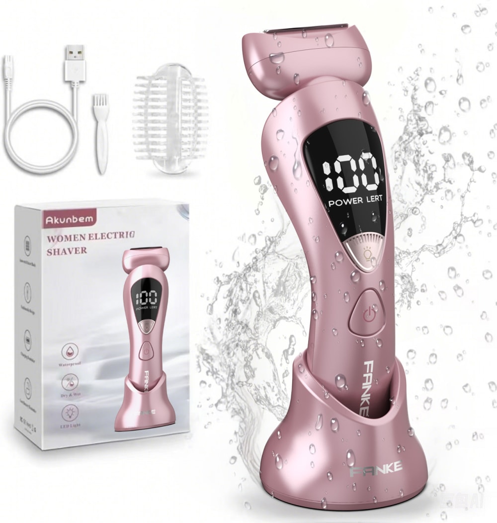
47 Responses to Option B
I would rather Option B because of the position of where it says power left it really stands out to me.
Option B is the product design that I would be more likely to respond to . The way that the handle curves means that this product is going to be easy to hold in my hand. The brightness of the color captures my attention but the high quality product appearance holds my attention and it would get me to buy this item
I wouldn't buy any of these because I don't like pink products. That said, I like the B display.
B and C look easier to clean than A. It's subjective how handle makes me think one is easier to clean but it has to do with the shape of the screen part
I like option B the best because of the large settings display which looks easy to use and understand.
I love this new woman's electric saving device. This device has a main body and a charging station. The sleek pink color of this electric saving machine is just mind-blowing. It looks premium and is full of modern features. The digital display on the saving machine's top area and the controls look informative and easy to use. The packaging and the accessories in the background seem helpful and attractive. This woman's pink electric saving device looks extremely powerful and will provide smooth savings. I am now very interested in buying this exclusive woman's pink electric saving device.
I like the digital display on b and c they are very modern looking
I chose B as my number one because I like that the display for battery level is at the top. When it's in the center or bottom of the handle, I feel like it would be covered up while you're holding it so in B you'd be able to see it while you're using the product. Between C and A, I think the display design is more aesthetically pleasing in A with its more bold battery level feature. It just seems to fit into the design of the product more effectively.
B, C first because the designs are similar and the most sleek, clear and the most appealing A second because the design is a bit too much and overwhelming to see which makes it the least appealing
I prefer the numbers on top. This one is large and easy to read.
I chose B as my first choice because I like the design, style, and look.
B- the digital display placement is best and that was my main ranking criteria.
Option B is my 1st choice because the overall look is attractive. I appreciate the layout of the button below the display. That would feel natural to use it and still get to easily read the display. Option C is my 2nd choice because while I don't care for the button being above the display it was more functional than option A. Option A the display is hard to read and too low on the product.
You can see the digital display better on this one. The numbers are larger.
B: it's more user-friendly if the button is on a lower position, so we can turn it off with just 1 hand and no need to adjust the finger too muchA and C's button position is not as friendly as B, but A's design looks more premium than C with the big bottom, and the screen is more aesthetic
B was my first choice because the power lert is clearest. C was second because it is the next most clear. A was third because it's the least clear.
B, I like the display above the power button as it makes the most visible and will not be obscured by your hand
Option B seems to have a better charging stand with a good shape for a better grip. The power alert message is well visible
I would purchase Option B. It has a sleek design and looks easy to use. It also looks like it takes up less space than some of the other options which is nice. For similar reasons I rated Option C second though I feel Option B look nicer in appearance. Option A I votes last since it seems more bulky and the position of the battery information seems less convenient.
B is first choice - I like the curve and where the display is (the display is in the right place to see it as you use it). I like the button style as well. This is also the one that looks like it will be easiest to maintain in terms of cleanliness. Option C - This is okay but I think the display in the center is exactly where I would be holding it so that would be blocked. I also worry that the ridge inset would be hard to keep clean. Last is A - this is awkward...it's not curved in a way that would be helpful as you use it and the display panel is unattractive and makes the product look cheaper.
I like the position of the power button in option B.
I prefer the look and design of my first choice the most. I like the look of the larger display/readout at the top. I think it just looks nicer and more professional looking.
I'm looking at where the buttons are located and where my fingers would rest on the top part as I would use the razor. Option B seems to have more of a button-free area that would not interfere with where my fingers would rest.
A is my least favorite. That interface is strange and awkward and looks more difficult to read than the other options.
I like option B, because I like where the screen display is and how large it is
I prefer option "B" with the large LED display that is right at the top. Its clear , large and is the focus of attention
I like where the button showing how much power is left is in the perfect position on the item. I think it's easier to see in this location. I don't like how Option C has this button towards the bottom. It makes it difficult to read.
I would like to go for the option B at first as the product is very premium by looks and the design is very luxurious . Then i chose the other options as per my choice .
Option b looks the most user friendly, option c is a good 2nd choice, i like optoin a but not as much as the other 2
I like the way the charging numbers show up on this one and where the power button is I would buy this
I like the way the display screen looks in option B
I prefer having a digital screen with larger numbers because it is easier for me to read.
I like the top numbered layout that is easy to see when in use
I prefer sleek design so B and C are top choices, as the display and press button in B is more attractive, I'll buy B.
I would choose B first because it has a timer on it.
I would rather buy B because the product display most meets my needs and is the most alluring.
B because it has the charge percent in the biggest font. If it is small, sometimes it is hard to see. Having a big font will make it very easy to see the percentage of the battery.
I like option b as it looks like it will be easier to hold and to understand the screen that is on it.
my first choice is the one that looks the easiest to use. n
I would have to go with option B. The design itself appears like it would fit better when in use and the base looks like it takes up less room. Option A looks super bulky and uncomfortable.
I prefer option B because I like the position of the "power left" display the most. It is easiest to see and process and looks the most attractive to me. It also seems to have the best placement of the power button and what I assume is the light button for the display. The overall look of the product is sleek and stylish. Option C is my 2nd choice but I do not like the lower placement of the power display and I do not like the design as option B. I dislike the power display of option A, so that is my last choice.
B's interface and interaction looks the most modern and innovative. C's interface and interaction is bold and large. A's interface and interaction is of a dated design.
I would rather purchase Option B because I like the way the numbers are shown on the top of the razor. It makes it really easy to read and see. I also like where the power button is shown on the bottom. This makes it easier to turn on and off with where your hands would be if you were using this product.
This one looks like the easiest to read and the base isn't too big
I like the digital readout higher on the handle like in B, so my palm won't be covering it while I'm holding it.
I like the sleek look of option B. Looks high quality!
B is first as I like the large display and I’m not worried about accidentally touching the power button while shaving. Option A is second as the power button is smaller so I’m hoping that even with the placement I won’t hit it while shaving. C is last as it looks like the power button would be too easy to bump while using.
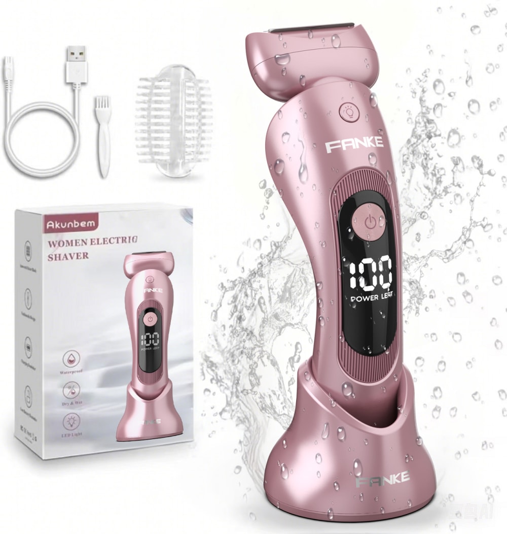
33 Responses to Option C
I like the shape of it with the large display. It looks easy to hold and use.
The shape of the handle on razor C looks the easiest to hold onto. Its number display right in the middle of the back is the best location for that.
The placement of the display is a bit more elegant in Option C than in Option B. The display in Option A doesn't seem very realistic at all. It almost looks like a sticker.
I like the positioning of the numbers on option C the best- it is easy to read but not too big.
If I were shopping on Amazon I would want to buy Option C due to the fact that I like the design the best of the screen and such.
I chose A because the interface looks very straightforward and easy to use. A looks very complicated.
I like the power button up higher like it is in C. I prefer the shape of A to B.
The button on the top is much more appealing, the bigger screen with the numbers is nice, to be able to see, but its the perfect ratio of upper button and big display screen (option C) is my favorite. The button at the top is more convenient, easier to feel/find and use. And the bigger display screen of numbers is better to see!!!!
I prefer the display on option C the most. I like the round power button at the top of the main display area. I think it makes a more cohesive design.
I really like options C and A, they are very appealing to the eye. I would be likely to consider buying this product because it is something I would be interested in using. these designs are more appealing to me, I think they have very good quality.
Importance for the placement of the buttons. C is nice with a wider base to grip and button in the middle to not accidentally turn on or off. B is also great since it has everything at the top rather than the bottom as in A.
Honestly, because the images give me no hints as to what the product could possibly be used for, I wouldn't buy any of them. I strictly chose in order of what is most aesthetically pleasing, with C being first, B is second, and A is last. A product image should always be clear as to what the product is used for. These images lack that.
I chose options that have the most easy to read display of the number.
C looks less bulky and easier to store, use and grip
The power button seems to be more convenient that it would be closest to the thumb when turning it on and off.
Seems most clear and understandable display style.
The base of C and B is very stylish. I prefer the power button at top so I would buy C.
I like the readout more in the middle. Seems about right and easy to see.
The display on C is better than the display on the other options. I like the size and overall look of the display. C's display is too low and looks awkward to me.
I liked options C because the button placement looks the most comfortable.
I ranked based on the power button placement that I think would be the most ergonomic.
The base of the shaver looks best in option c as it’s more streamlined
I like the reading to be near the power button in this fashion as the display is easier to process.
I am liking the shaver design of choice C as my first pick and then choice B as my second pick as I like the design of the shaver.
I like the larger numbers on the digital displays in both Options C & B because they are more easily visible, with a preference for the location of the power button on the center of the device in Option C.
I lean toward the more sleek and organic forms in C and B, and prefer the interface with C which looks sleeker and more elegantly integrated into the form.
The design if the one I chose is clear and attractive.
I would pick option C because design of this is better distributed and arranged, seems better in quality.
I like the larger display that shows the power and I think it fits better in the middle of the handle.
Option C is the product that I would be most likely to buy. It is easiest to read and I like the design, particularly where the power button is. Option B is my second choice because I also like how easy it is to read, but the power button seems to be in a spot where a hand holding it could accidentally turn it off. Option A is my third choice because it is the least aesthetically pleasing of the three. Option C and Option B have more natural, intuitive designs than Option A.
They all look good but C is the most sleek and smooth looking one
i like the position of the button in option c. i wouldn't want to accidentally slip and turn the machine off while in use.
The design of the product in Option C looks more stylish and appealing than other options.
Explore who answered your poll
Analyze your results with demographic reports.


