Poll results
Save to favorites
Add this poll to your saved list for easy reference.
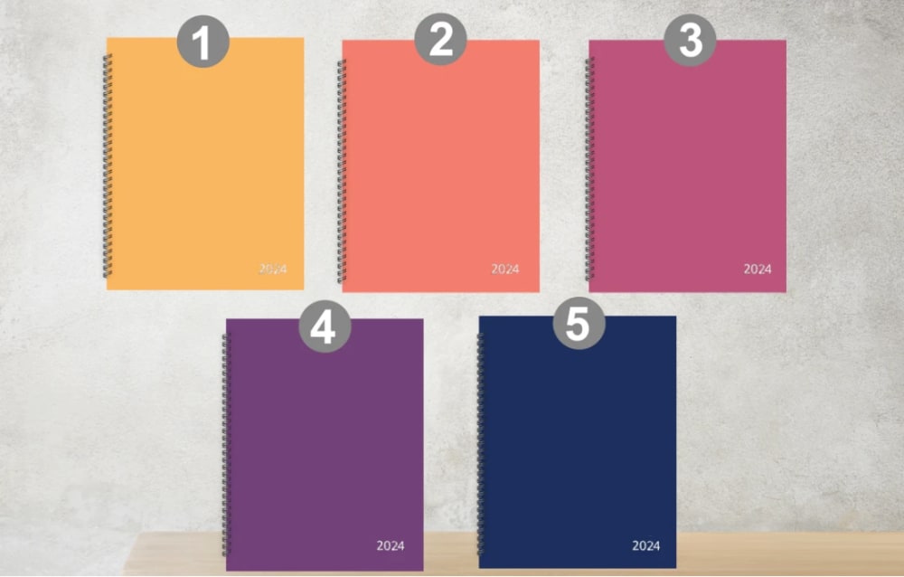
Which cover of the hourly planner would you purchase? (Write number 1-5 in the comment)
Age range
Education level
Educator, coach or teacher
Gender identity
Household income range
Personal income range
Racial or ethnic identity
30 Responses
4: Purple is my favorite color.
I chose number 2 as my first choice because I like the color of the product as it looks beautiful and also the quality of the product is premium.
I like 5 the best. The dark blue has the best image to me.
I prefer number 5 because it is the most neutral color in the bunch.
I prefer #4 because of the color pallet. I feel that is is a neutral color for anyone.
I like the peach colored cover. It is very cherry. I love the look of the bright color. It is nice for this type of product.
I would pick number 4, as the purple color is regal and classy for sure!
I like number 4 which is the purple one. This is my favorite color.
I chose option 4 because I like purple. I would have chosen 3, but it's too dark of a pink. 2 doesn't have enough pink, too peach.
I would choose #5. I prefer blue; it reminds me of nighttime and of the ocean.
I like number 5 the best
I would buy #4 because purple is my favorite color, so I choose purple options when I can.
The 2nd color looks really bright and stylish. So, I would purchase the 2nd hourly planner.
I'm a fan of darker colors so personally I like number five the most here navy blue is one of my favorite colors and number four is also really nice I like that shade of purple either one of those would make a really nice cover
I prefer number 3. It is a happy and cheerful color. I would enjoy it.
4, 5, 3, 2, 1I would purchase number 4 and 5 definitely. Purple is my favorite color and I really like this shade of blue.I might purchase 3 since I kind of like this shade... However, I would not purchase number 2 or 1 because I don't like either color. Pastel and yellows are not my taste at all.
I would choose number 2 because it is gender neutral and it is a spring color.
I would choose option 5 because it's suitable for all demographics and is nondescript. If I had to rank all the options, I'd buy 5, 4, 1, 2, and 3. I think planners should mostly be unobtrusive and the colors should be unisex or not typically associated with either gender. Options 2 and 3 tend to skew towards the female demographic.
I like that 3 features the most feminine and flirty pink color.
I like the darker color the best. Number 5 looks like the best quality.
I actually like all the colors but 3 would be my top choice
2. Orange looks better than other colors.
3. My favorite color is pink I love the bright color. It looks nice with the white type on it as well.
5 - I do not like any of these colors, but navy/blue seems the best alternative as it is inoffensive and professional looking at least.
I would definitely choose #5. Blue is my favorite color. This is a great shade of it. I would probably rank them in the order of darkest to lightest.
4 is the planner I would choose since purple is one of my favorite colors.
3 - My favorite color, feels personal2 - Attractive, bright, fun1 - Energetic but too gender neutral for me4 - Too dark5 - Basic, boring
Among the five different colors of cover of the hourly planner show, I'd choose number 3 first with the red color. First, the color red evokes a sense of passion and vitality, igniting a spark of energy within me. And then, the boldness of red resonates with my desire for enthusiasm and determination, making it the perfect choice to kickstart my day. Second, the orange color number 2 represents warmth and creativity, symbolizing a burst of inspiration and optimism. Next, number 5, blue color, seems to me as calming and serene, like a tranquil oasis amidst the chaos of everyday life. Finally, numbers 4 and 1 with the colors violet and yellow respectively complete my choices, offering a balance between introspection and joy, allowing me to reflect on my thoughts while embracing the brightness of new beginnings.
5. It's a nice color and is great and professional looking for any setting.
Number 5 has a nice deep blue color which also has a nice design to it as well, I love the color blue and this shade certainly looks the best
Explore who answered your poll
Analyze your results with demographic reports.


