Poll results
Save to favorites
Add this poll to your saved list for easy reference.
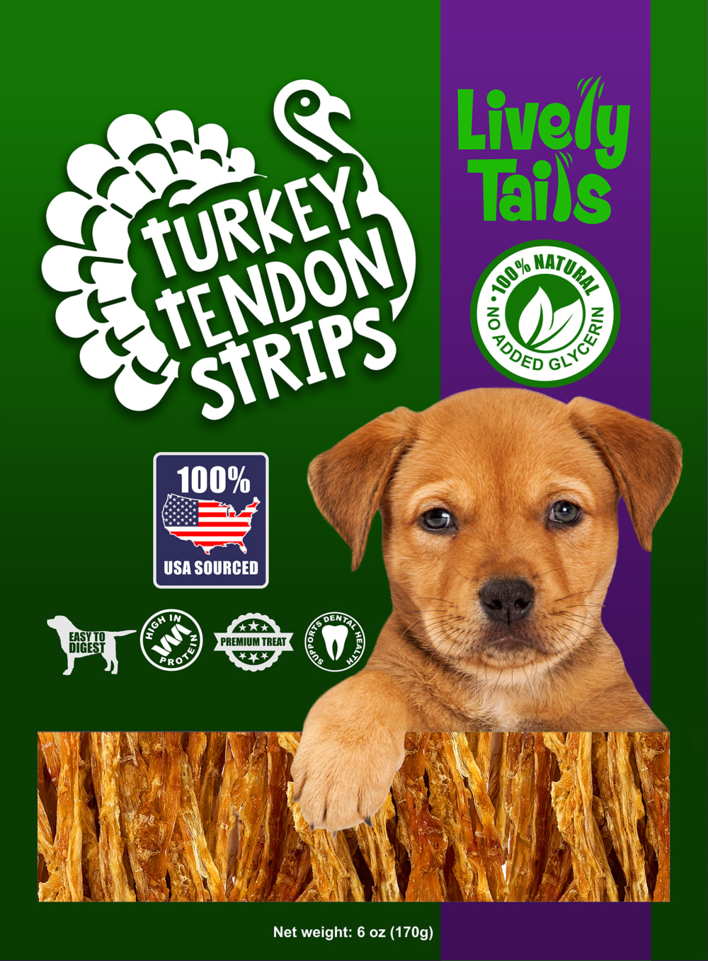
Which turkey tendon for dogs bag design do you prefer and why? (Note: The rectangle with turkey strips represents a clear window on the bag).

56 Responses to Option A
The way the colors are laid out on this one are a little more ee catching.
to me the purple background gives the item some authority and high end aesthetic fits the product
i chose option a because the purple background makes the package more visually appealing
The colors are brighter in this version. Lives up to the "Lively" part of the name.
For me I like purple more than green, so I like the mostly purple bag.
I like the purple background better with the green rectangle. I think it makes it a lot brighter. I think the little accent of green looks better than having too much of the darker green which I do not like much
The more purple bag is more fun and gets my attention more quickly!
The purple color really stood out for me.
The purple background in Option A stands out more.
I like the purple color on A better than the green.
I prefer the presentation of the product shown in option A the most, mainly because the combination of colors and their placement is more appealing and makes the product look more enticing in the clear window as it allows the public to see what the product actually looks like which enhances its presence towards the people.
I like the more vibrant colors, grabs my attention more.
The purple color being the predominant color makes the package stand out more and look more vibrant. I also like the more vivid green color that's used as well.
I like the colors of A more, it looks brighter.
I prefer this one as it is eye catching and the white font on the purple background stands out alot more than the white font on green background
I prefer option A. I like the purple back ground on the package.
I like this color scheme better. Even though green is my favorite color, this looks better being predominantly purple.
The purple color makes this one stand out more.
A. Color makes the product stand out more, and easy to see they are healthy turkey tendon strips and 100% USA.
I prefer the purple back ground taking up the majority of the space, it makes the bag look brighter and more eye catching.
I like option A the best because I like the purple dominated color on the package with the green strip on the right hand side.
I just think the purple makes for a better background for the turkey stencil and for the brand text.
I prefer option A because I like the design. It has a lot of purple color. I think that looks better.
I think these colors are bright and make the white pop better on the purple background than the green. It is eye-catching too.
I like the purple bag because the information pops better off the background than on the other option.
I prefer A because the turkey tendons look healthier for my dog.
I think the purple color on the background looks good and convenient to display this new brand.
I feel that the purple background is more eyecatching.
I like Option A as my first choice. The purple seems a little more eye catching and unique. It's more vibrant looking in general. Option B is perfectly fine with good graphics that pop and are appealing but I don't like the green background as much.
I like this option because the amount of purple and bright green band draws my eye more around the packaging than the other.
I prefer the look of a darker base color.
I like the purple bag design with the green accents
I prefer Option A simply because the packaging is purple and that is my favorite color so it would catch my attention.
I like this one with the bright purple and the green it brings out the packaging really well and draws my attention to the product it self
I like the lighter shades of green on purple background. I think it stands out more.
A's colors choice is able to look more appealing and is able to stand out more to me.
The purple colors is easier to read the info on - just seems easier on the eyes.
The dominant purple scheme stands out more.
The purple bag is more appealing and has a better overall appearance.
The bright purple helps the wording standing out much better for better advertising of the product.
I really like the purple of this option. It immediately draws your attention
I like both packages for sure, but Option A is icing on the cake due to the coloration of the bag. the Purple pops out with the white font, and then the green stripe pops as well as a contrasting color. It also helps the dog seem 3D and more prominent. The 100% USA symbol seems easier to read as well.
A is more cheerful bright, eye catching and colorful.
I think the purple stands out. There are a lot of green bags on the shelf (purina, Iams).
Option A is lighter, it looks more modern even if the only thing that was done was a color flip. The more predominant purple of Option A makes it feel like it's more pleasing to the eye, as well as more thought-out.
I like the purple on the box so i'd pick that one.
Prefer the purple packaging as I think it showcases the clear window/product better. The green has less contrast -- almost like they are the trunks of trees and the packaging is leaves.
I think the purple with the green stripe a lot better
Purple with the green stripe on the right is better. It stands out more with the color contrast. Nice clear window to see the product too. I'll go with option A as the better choice here.
I prefer the purple as the dominate color. The green ribbon stands out better.
I like Option A. These color choices look well balanced and eye catching.
I choose A. I really like A. I love the colors of the bag. I love the way it's designed. So I would definitely buy A.
I like bag A, everything really stands out more to me on the purple. The color would catch my eye on a shelf of other bags as well.
I think the font is easier to read on the color scheme for A.
I find that the purple box makes the treats through the window stand out a little more.
purple looks more glamorous
44 Responses to Option B
Bright neon green makes it look unnatural
Option B is better because I prefer the primary color to be green, with the strip section to be purple.
The purple looks great as a highlight and break from the green, but to much as a main color.
i like the color green so I was more drwan to b
I like the green being more of the focal point more than the purple
1. Option B - The green background feels more natural and appealing, which aligns with the idea of a healthy, natural product for dogs.2. Option A - The purple background is bold but might be less visually associated with natural and healthy products for dogs.
I like more green on the package as green seems associated with products that are more gentle and natural.
I choose B because the color pattern of B is visually appealing and attractive to me, compared to A
The purple color of Option A looks too girly. I like greens and other earth tones, so Option B fits my style better.
Using the purple color as a highlight is more eye-catching to me.
I like option B. The green gives me a feeling of the product being more tasty and also more natural. It's also soothing to my eyes.
The purple on green of option B is less jarring than option A.
I liked choice B and the green background looks more appealing and eye catching while looking natural.
I like the forest green packaging. It's easier to see the symbols and I also think it seems more environmentally friendly or "green".
The green color is far superior in my opinion.
I like the green color on the box in option B, so that is the one I would choose.
B feels more natural and healthy- A is more eye catching because of the color choice.
I chose option B. I like the predominately green packaging as it looks great and makes the treats look more tasty.
I would choose B first because I like the reverse colors of this bag over the other bag.
The green color makes the turkey strips look more natural.
I chose option B because i love the green color scheme it looks professional.
I like the green packaging because I think that goes best with the "100% natural" claim on the package.
I think the darker green looks more attractive with the brown and makes me think of a natural product.
The green just looks more "premium" to me.
The green color being more dominant here tells me it at least signifies to me that this is a green and sustainable product
I like the color use much more.
The brighter background of B pops a lot more
Green is my favorite color so I like green being prominent on the package in B.
I think the green background with the purple stripe just looks better than the alternative.
I think the green with purple stripe accentuate the puppy more and make the packaging more appealing.
The green box appealed to me more for dogs.
the green seems more natural to me
Green on the packaging looks good and makes the bag stand out.
i like the predominately green bag. it looks more natural and healthy for my dog.
I really like the color play of B the best. The dark green withe deep purple strip highlights the info well and is the more marketable of the two options!
I prefer B because the package is bolder and stands out more. The words and graphics are more vivid and show up better. The font on the name is also easier to see and read than on the other option. Overall the package is much more memorable and stands out better than option A.
I find the package that consists of more purple to be too gaudy.
I like b. The green isn’t as overbearing so much as the purple. Lends to better visua
I prefer green as the main background color as it looks healthier and is easier to read text against. I think that mixing in the purple is not needed and looks terrible.
The green background makes it seem more natural.
For some reason the green makes the dog stand out more so i like b better. The green stripe on A is almost too bright looking
Option B's color scheme looks more fluid.
I think the green fits a lot better than in this option more than the other one. The purple doesn't make as much sense to me.
B because the greener background made it easier to read.
Explore who answered your poll
Analyze your results with demographic reports.

