Poll results
Save to favorites
Add this poll to your saved list for easy reference.
Which set of framed motivational wall art would you buy and why?
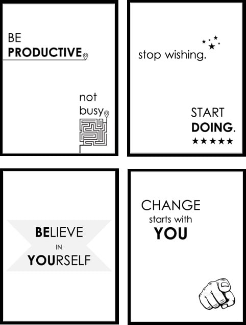
27 Responses to Option A
The expletive is not necessary.
the designs are more unique
I really felt the messages in Option A made me feel like doing something I needed to do.
I really like the maze icon in this set. But honestly, both sets are pretty neat. Hard to go wrong!
I can't hang curse words on the wall, so I chose A
I prefer these quotes and I don't like strikethrough text
It was hard to choose because both are good, but A has a cool layout.
I like these saying and graphics better
I feel these are very positive and would give me affirmation each day to be positive, productive and believe in myself.
option A seem more better the quotes stands out to me more
I prefer the art to include both pictures and text
Seems more positive to me - it is talking to the person. B's messages are more like commands, seems to be pressuring a bit which may turn off some people.
I would want the ones without vulgar words on them!
I think they are better presented
I would choose this option because the alternative used profanity and would be inappropriate to hang in a professional environment.
Both sets are straightforward and have nice messages, but I like the visuals much more in Option A.
I would pick these because they are motivating and inspirational. They are not vulgar or offensive and the text format is great.
I think the little maze in the "be productive" sign sold me on A. It's really cute, and it really spoke to me. I don't like the "change" poster in that group though, since I'm old enough that it reminds me of army recruitment ads. Maybe sub in the "get it done" poster from the other set.
The only that I don't like from Option A is the hand pointing to myself. I found it offensive. If you could get rid of that then this option would be the best.
The graphics that accompany the text will help emphasize the messages.
it's easier to read, more direct, just in general easier on the eyes to figure out, the others are too busy and annoing
I like the maze a lot
This choice has no profanity. This choice contains statements I am familiar with but seem to forget, so having them on wall art is very helpful. The font and graphics are professionally done and respectful in nature.
Inclusion of design and doodles helps make it more interesting.
I like the graphics as opposed to just text.
I would choose A. I like most of them. I would not even consider B due to the language on one of the prints.
Option A looks more modern.
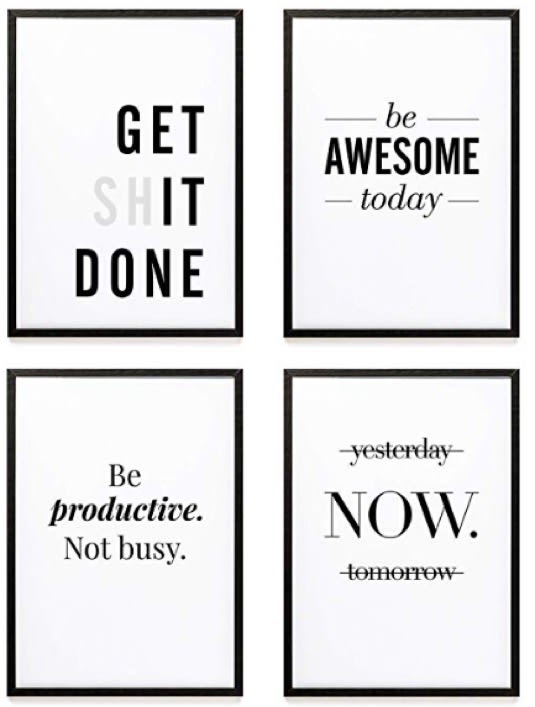
23 Responses to Option B
These look much more trendy
A is too generic, I like how creative B is
I like the style
I chose option B because there are more fine lines and the overall look is more modern. I also like the fonts on this option best.
I thought overall the choices in B were less cheesy and more motivating. I particularly liked the GET **IT DONE one. Also I really didn't like the finger pointing at me in the one poster in Choice A lol.
It is more geared toward work and getting things done, not as personal as the other.
A is way too boring and vanilla
I like the "get shit done" wall art. Is humorous, what everyone needs once in while in their life.
I will choose profanity every time...it's just my humor
B is slightly more aggressive and vulgar but is more direct and likely to be motivational.
I like edgy sayings. I think this would be more motivating to me.
I think the simpler design, more focused on the words, is better overall
B is creative and unique.
more motivating and not as negative as some others
I like the context, the font, and how only letters and lines are used.
I PREFER THE WRITING AND ARRANGEMENT IN B
I chose option B. I like the messages and it would get my attention.
font is easier to read
I like this one and woudl chose it.
The little bit of humor along with the firmness make it more appealing to me.
Choice B had more impactful font, and I feel the additional graphics in choice A just make the images more busy and tough to read at a glance
I think it is more interesting and up my alley.
Option B looks more modern and higher quality than Option A. I don't really like the pictures on Option A of the hand and the not busy picture.
Explore who answered your poll
Analyze your results with demographic reports.
Demographics
Sorry, AI highlights are currently only available for polls created after February 28th.
We're working hard to bring AI to more polls, please check back soon.

