Poll results
Save to favorites
Add this poll to your saved list for easy reference.
Which App would you download when searching for a "Fitness App" ?
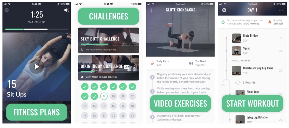
35 Responses to Option A
The titles are easier to see in Option A.
it looks simple. B looks unorganized and messy,.
Looks neater and more functional
The color scheme and layout of Option A seems more user friendly for me.
Option A seemed more organized and even though there appears to be more information in each panel, it seems less cluttered to me than B. It doesn't make sense as there's more space in B, but I think it's because some of the boxes are not aligned with the containers. Spatially it seems disjointed.
i think these colors look more modern and high-end
I am a fan of Green
B looks generic while A seems to have real design skill behind it
lets you know its more a workout app
I like the color scheme more. It is more subtle and simple
Darker themed colors are easier on the eyes
I chose option A because I like the challenges section and how it checks everything off once completed.
I like the check off calendar option.
I would choose Option A because I prefer the color choice. The photos chosen look more professional. I like the calendar graphic. I like the way the workout is outlined, it looks like it is set up to have a status bar showing what has been done and what is left to do.As for Option B, I do not like the shades of red and blue used together, I do not like the way the workout goals section is set up, it seems over the top. I do like the way the progressive challenge is set up.
option A follows a cohesive structure. the eyes easy follow the screen from top to bottom. I also like that it has check marks allowing the consumer to visually see what was completed and what was not. the start workout screen seems easy to follow, and I like that its following a "timeline" fluidity. the colors are also a bit more classic and professional. option B seems like there are too many options to choose from, screens look to busy and the light background does not compliment when the video is playing. I prefer a dark background for videos.
Love the color on this and the organization seems more attractive.
I’m more attracted to the teal color
The graphics on this one remind me of an instagram add, and look better than the alternative.
I like the look and the images in this one the most.
The layout and color choices look very good
this one is more fun with the colors easier to look at.
I would choose option a because the app layout looks more professional. Apps that look more professional tend to be more user friendly, and have better features.
I like choice A because it shows me challenges based on a calendar and has some nice pictures. The main points are also easier to read and shorter than option B.
Choice A has a more streamlined look. I like how everything is uniform and organized. Choice B does not seem to mesh as well.
Option A's color palette is more pleasant to look at than the contrasting blues and pinks of option B.
I choose A, because it shows everything that I am looking for in a fitness app. Different fitness plans, the challenges, the video excersises and immediately start workout. I just looks more appealing to me than choice B. Exactly what I would be looking for.
A is a little more colorful and grabs my attention.
I like the colors in this one better.
At first the pink of B pulled me in but when I looked closer I was attracted to the video of the woman exercising. Then I liked the challenges that you could click off what you had done. People love to do that. And then the videos looks good. The whole thing in A is good.
I just like this set up better.
Option A's design looks better
I would choose option A if I were personally looking for a fitness app. The screenshot in option A seems to show more detail and more information than option B. I like how it shows that you have challenges and gives a mark when completed. Seeing that would motivate me personally to complete the challenges.
I like choice A better because the pictures are better, more cohesive and attractive. I like the green color and font on the labeling better than the red. I also like the little circles with the checkmarks to track challenges, that's something that appeals to me personally.
I like the color scheme better, and I respond better to challenges than to goals
i like the countdown option with A. The colors are better. The layout is better.
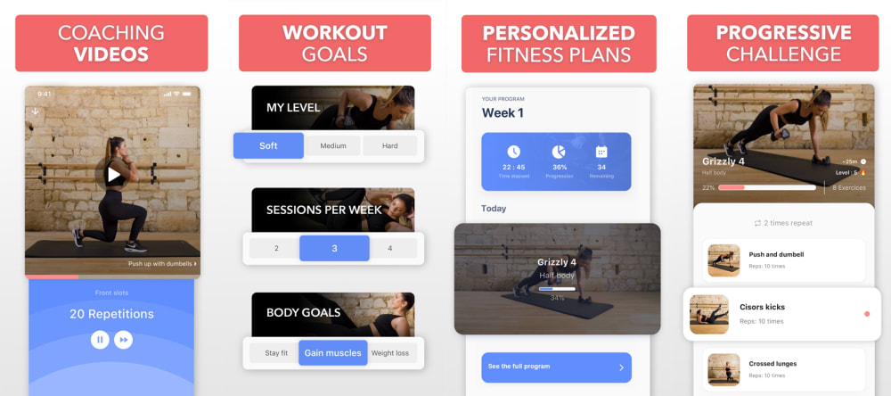
15 Responses to Option B
i like the pink happy coloring best
B - I immediately like the color pink and was more interested in what workouts the girl was doing. I liked that it showed "workout goals"
In B the photos are lighter and easier to see all elements
B with the personalized plan and challange looks interesting!
I think both are great but I like the colors in B and the layout in B as well, looks a bit more profressional
more details and a better layout
I like that all of the features are at the top, my eyes naturally go there- the other one is hard to find the info you want quickly.
The very first screen looks more about fitness than the first screen on option A at first glance. I tend to look for images and B has the most images with fitness.
The headings fro Option B are more uniform and aligned to the top of the picture. Option A looks good, but the randomness of the headings is not useful or helpful.
This one looks more appealing to me.
I like the color and design more in A, but the pop out tags in B appeal to me more.
The UI in choice B looks easier to follow. Less text, bigger widgets, clearer defined paths. These things are important when you have a smaller viewport / device screen size and are trying to work out.
The layout looks simple, and functional. It's not always about the bells and whistles, but more so about the app working to help get you to your fitness goals.
I chose option B because the overall design of the app seems more organized.
Honestly chose Choice B because of the red color. It stood out more. Plus, I liked the "coaching videos".
Explore who answered your poll
Analyze your results with demographic reports.
Demographics
Sorry, AI highlights are currently only available for polls created after February 28th.
We're working hard to bring AI to more polls, please check back soon.

