Poll results
Save to favorites
Add this poll to your saved list for easy reference.
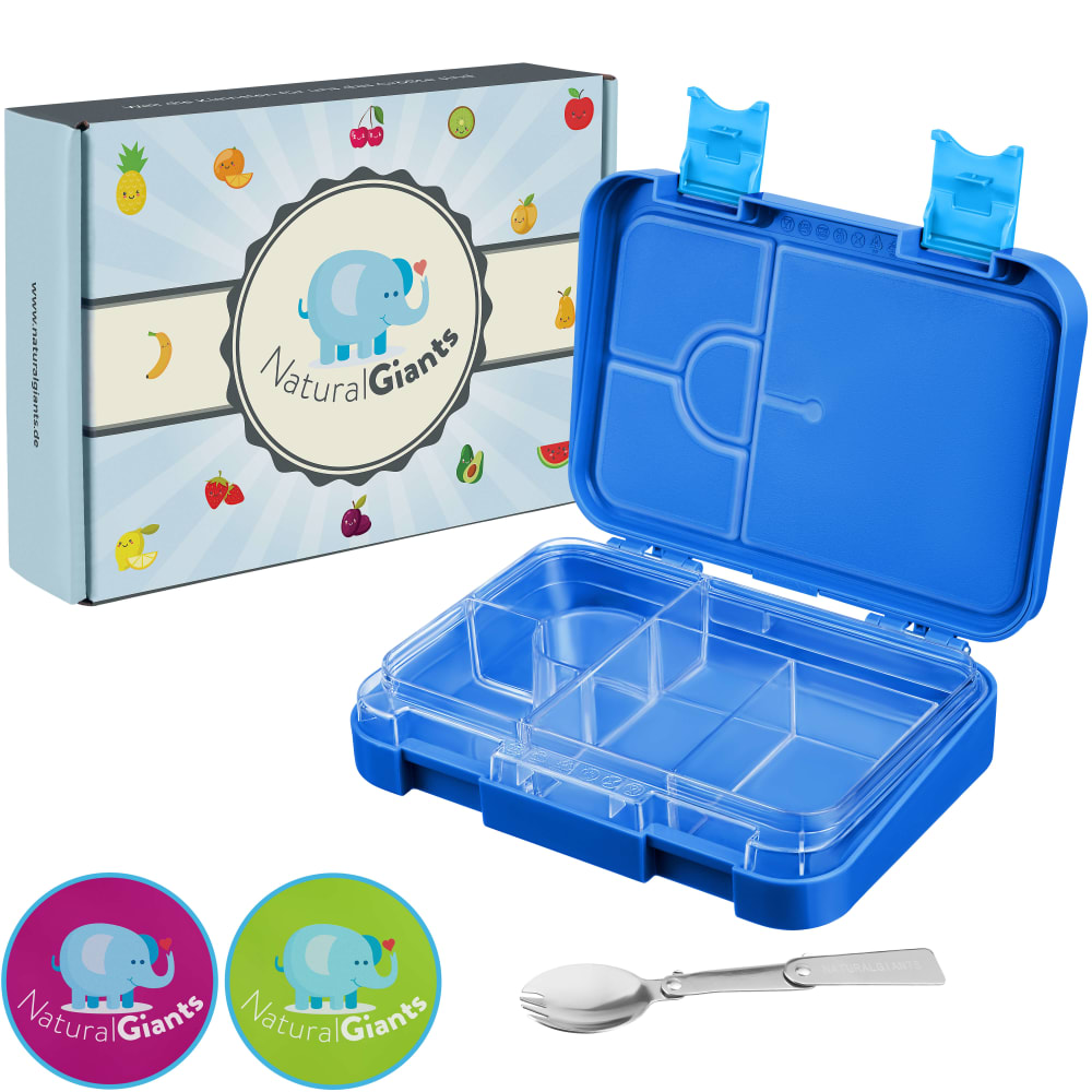
Imagine searching for a lunchbox for your kids on Amazon. On which picture would you click?
Option B won this Ranked poll with a final tally of 27 votes after 1 round of vote counting.
In a Ranked poll, respondents rank every option in order of preference. For example, when you test 6 options, each respondent orders their choices from first to sixth place.
PickFu requires a majority to win a Ranked poll. A majority winner differs from a plurality winner. A majority winner earns over 50% of the votes, whereas a plurality winner earns the most votes, regardless of winning percentage.
If an option does not earn a majority of votes, PickFu eliminates the option with the lowest number of votes. The votes from the eliminated option are reassigned based on each respondent’s next choice. This process continues in rounds until a majority winner emerges.
Scores reflect the percentage of total votes an option receives during the vote counting and indicate the relative preference of the respondents. If there is no majority winner, look to the scores to see how the options fared relative to one another.
| Option | Round 1 |
|---|---|
| B | 54% 27 votes |
| C | 30% 15 votes |
| A | 16% 8 votes |
8 Responses to Option A
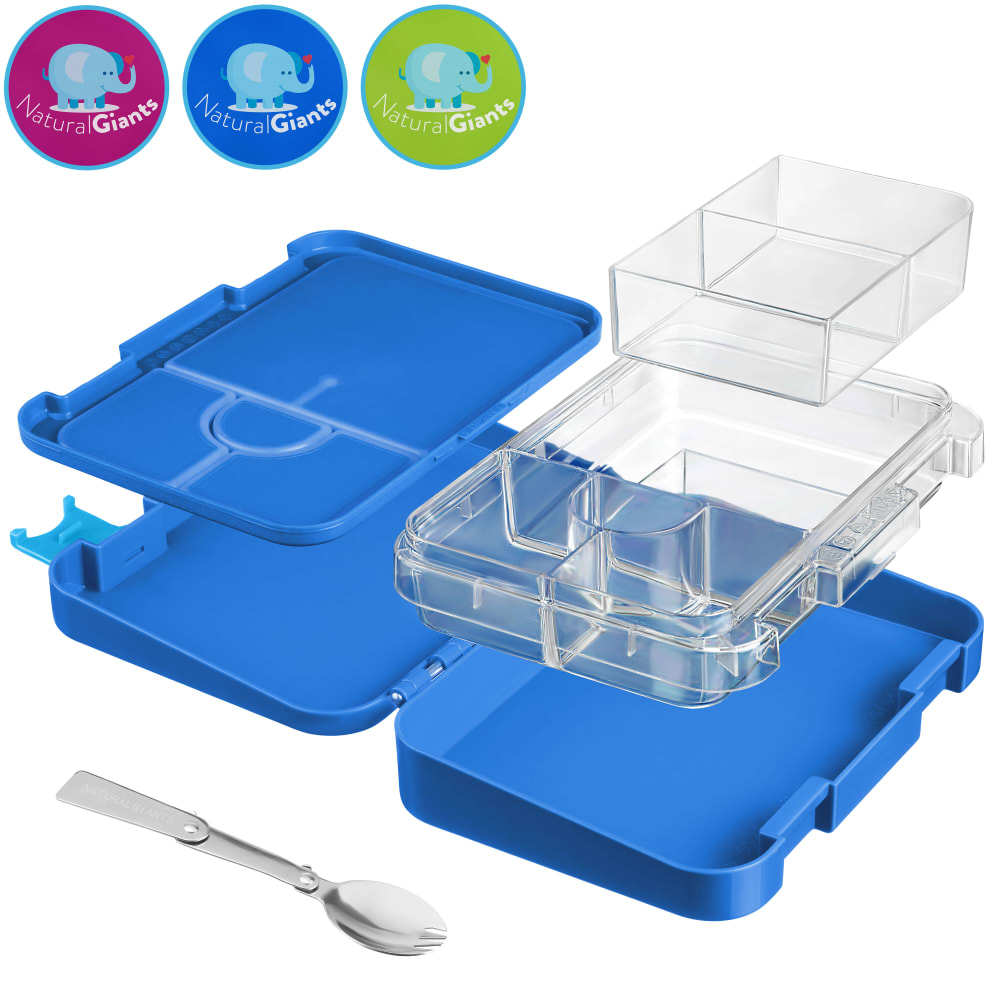
I like to see the packaging in the photo. It makes the product seem 'new' as compared to 'used'. I chose option B second because it shows how the product comes apart.
They are all good images. I like being able to see the different parts.
Option A shows the box, the packaging and the spoon. I feel like it looks nicer and gives a better idea of what the product is.
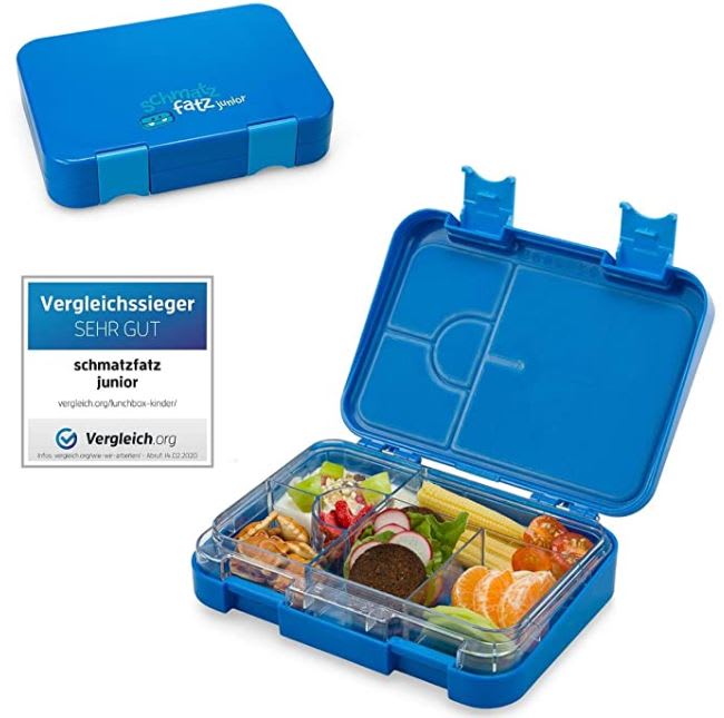
I like A because I think it gives you the clearest idea of what you get. I also like that it shows the package and that it comes with a spoon also. I like that C shows what the product looks like closed and what it looks like being used and it's a close 2nd. B is okay but not one I would probably click on.
A is the most detailed and informative.
Option A is first because it shows everything that comes with the product, including the box, the available colors and the spoon. It makes it seem like you are getting a good value. I picked Option B second because it shows how it all stacks together, includes the spoon and the available colors, but does not seem as good a value as Option A. Option C was last because it leaves too many questions to be answered on how it works/stacks, does not include the spoon, nor the color options.
I chose A because the packaging box helped this product be more appealing. It looks interesting and scientific, if you will. B was cool too but it was missing the box (plus, I can't make out the elephant logos). C would not get clicked on because with it being already packed hard to tell what you are getting.
I like option A the best because I can get a good look at the lunchbox as well as a good look at the packaging. I like option B second because I can get a good idea of how the lunchbox comes apart. I then chose option C third because I like that I can see the lunchbox being used.
27 Responses to Option B
Choice B is the clear winner because it promptly displays the entirety of the set broken down into separate parts.
i like that it shows all the compartments and where they go
I think B best shows how the product can function, and C is helpful to see it in action with food in it.
Would like to pick option B is the best collection that each item of the boxes can easily viewable , great collation, adorable picture.
I like how Option B shows the lunch box's full functionality.
I liked choice B the best since the picture best illustrates what the different features of this lunchbox are. I liked the angle the lunchbox is placed in and how the little icons on top are pleasing to look at and get my interest.
I loce exploded view images so I can see all of what I will get and how it will all go together. The second choice over the third was just because I like seeing the different compartments in use.
option B is good because it shows the most pieces and the color options, option c shows how the foods looks which is good so i can imagine what it looks like but it needs to show more pieces
B showed all the different compartments clearly. A’s cute packaging was eye-catching.
lifting the pieces up to show what you get when purchasing gives a better idea at what you get
I picked choice B as the first one I would click on, as the exploded view of the lunchbox is really helpful to visualize how the lunchbox is set up and how the trays can be used. It is also helpful that the exploded view shows how they all fit together.
Option B highlights the variability of the product by showing how the inserts are removable and that the storage is maximized. It really depicts the functionality of the lunch box.
I prefer the graphic that has the multiple compartments set aside as one can see the dimensions and potential use.
The exploded view in Choice B gave me the best picture of what the lunch box contained, it's sizes and dimensions, and how it is assembled. Choice A gives a similar view, but because the components are stacked, it is more difficult to get an understanding of what is available with this product. I would most likely click on A, but B is still my favorite image. Choice C is my least favorite for several reasons. I don't feel I need to see a closed version of this lunch box to make an educated choice, so that portion of the picture is not useful to me. The image of the food in the lunch box is appealing, but it makes it difficult to determine the actual size and available space within the box itself. My ideal image, the one I would certainly click on, would incorporate the exploded view of choice b with actual food items, such as in choice C.
B is my first choice because I like how I can see all of the components and how they stack into the box. It gives me a clear idea how it will work. C is my 2nd choice because I like that it shows the food in the box because it gives me a good idea how much food it can hold and how it would be organized. A was my last choice because even though it was a good image I preferred the other two choices.
All the lunch boxes look very similar, but B better showed how it comes apart which makes it more appealing.
Option "B": The layout on this graphic is dynamic, almost moving, with each piece of the lunchbox suspended as if about to combine. This display shows all available interior pieces in combination and was the most clickable at first glance.
Option B is the best choice as it gives the detailed information such that we know each component.
I like seeing all of the compartments in B. It gives me a sense of how it works and the possibilities. I liked seeing it full in A. I didn't like C as much, because it didn't look like it came with a spoon, so I thought I was getting less for my money
Option B because it shows how the inserts come out so that they are easily washed.
Option B is first choice, i like to see the plastic trays are removable for washing, all of the features are clearly defined in one image. Option A is next , the spoon and box are nice points of reference. Option C last because you dont clearly know there is a spoon or if the trays are removable, you see a reference of food for scale of the product.
B is the best because it shows all the components. C is next because it shows it capacity. A is fine, but not to much detail as to the components or it's capacity.
I feel that the pictures that show how the product comes apart is a more accurate depiction of the product. This would be important for cleaning and customizing the box.
Although I like seeing the product in use, I chose B because I think it's important to see all the components included.
I like the one that shows you all the different pieces. I like to see how things work .
I definitely would click on Option B first because it displays the various sections of the lunch box and how they fit together. It's both helpful and intriguing. The other two show the sections already inside the box and are less helpful.
I like B because it shows all the compartments and gives a better view of whats included. I chose A second because it shows what packaging it comes in. I chose C third because it just shows the product with food in it. It doesn't show the product clearly like in the other two.
15 Responses to Option C
Using food gives a better idea of actual size, you can use scale to determine that.
Choice C would be my first pick because it shows some who is buying it just how much you can fit in it. There is such a large variety of food in the lunchbox that it would be easy for someone to imagine using it daily. The other 2 choices were good, but choice A rally didn't show anything that would help determine if the lunchbox was big enough.
I picked the first picture because it showed how it could be used and what it will look like with food in it. Then the second picture shows the components broken out so I can visualize how it would look like in a real world setting.
I really liked seeing the food actually in the lunchbox. I thought it was good seeing the designs too.
I like to see the food being put inside the lunchbox. It makes it more visual for me and I enjoy looking at it. I like option A with the box that it comes with and followed by option B.
I will chose option C because of the function and the design. Option C will keep food chill until its time to eat
Seeing the pictures in action is why C is my favorite as you can see what is going on in the lunch box. A is okay as well as you can see the actual box and labels.
I like where it shows a sample of the food in the box. Gives a better visual for how much it fits and what it looks like in there. I think this one is best.
i like the first one it shows the demonstration with food in it
Prefered C as my number one choice because the picture gives me an idea on how to package the food should I get the container.
I have an 8-year-old so this one doesn't look as baby-ish as the other pictures. This one would draw my attention in first.
C - 1st choice - I like that it shows how much it will hold - which is pretty impressive! GIves one an idea that by buying it - what I can send for lunch to the kidos. It gives the best description (visually).B - 2nd choice - It shows how the pieces go together. Again - description is the key. If I can't visualize it - I won't buy it. A - Last choice - boring. This picture is not worth a thousand words. I wouldn't even consider it because it is just a lump - no visualization...
i ike seeing it in use, then eeing what all is there.
I like seeing food in the lunchbox to get a sense of how much it can hold. That's the most helpful thing for sure! The bright blue color is nice!
it is important to show food in the box so that i can understand sizing, so thats why i picked option C, i really liked to see the pieces come out and the packaging, but option C gave me the most important details size of food that will fit.
Explore who answered your poll
Analyze your results with demographic reports.

