Poll results
Save to favorites
Add this poll to your saved list for easy reference.
Which design do you think suits our yoga mat best? Our mats are a brand new design called a 'Yoga Pill' mat, so let us know what design suits best, if you want to tell us a colour that would work better we'd love to hear that too!
There was no majority winner of this Ranked poll after 6 rounds of vote counting. However, Option C and Option B had the most votes (22).
In a Ranked poll, respondents rank every option in order of preference. For example, when you test 6 options, each respondent orders their choices from first to sixth place.
PickFu requires a majority to win a Ranked poll. A majority winner differs from a plurality winner. A majority winner earns over 50% of the votes, whereas a plurality winner earns the most votes, regardless of winning percentage.
If an option does not earn a majority of votes, PickFu eliminates the option with the lowest number of votes. The votes from the eliminated option are reassigned based on each respondent’s next choice. This process continues in rounds until a majority winner emerges.
Scores reflect the percentage of total votes an option receives during the vote counting and indicate the relative preference of the respondents. If there is no majority winner, look to the scores to see how the options fared relative to one another.
| Option | Round 1 | Round 2 | Round 3 | Round 4 | Round 5 | Round 6 |
|---|---|---|---|---|---|---|
| B | 18% 9 votes | 18% 9 votes | 22% 11 votes +2 | 26% 13 votes +2 | 36.73% 18 votes +5 | 50% 22 votes +4 |
| C | 16% 8 votes | 22% 11 votes +3 | 24% 12 votes +1 | 26% 13 votes +1 | 34.69% 17 votes +4 | 50% 22 votes +5 |
| E | 16% 8 votes | 16% 8 votes | 18% 9 votes +1 | 26% 13 votes +4 | 28.57% 14 votes +1 | Eliminated 14 votes reassigned |
| A | 18% 9 votes | 18% 9 votes | 20% 10 votes +1 | 22% 11 votes +1 | Eliminated 11 votes reassigned | |
| D | 14% 7 votes | 14% 7 votes | 16% 8 votes +1 | Eliminated 8 votes reassigned | ||
| G | 12% 6 votes | 12% 6 votes | Eliminated 6 votes reassigned | |||
| F | 6% 3 votes | Eliminated 3 votes reassigned |
Answer Attributes
Age range
Amazon Prime member
Education level
Exercise frequency
Gender identity
Options
Personal income range
Racial or ethnic identity
U.S. geographic region
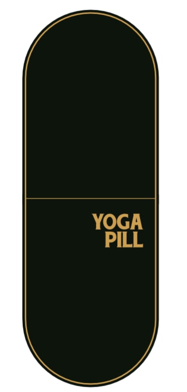
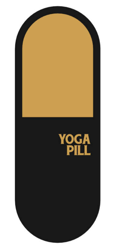
9 Responses to Option A
Selected larger ones that I liked the look of.
The colors flows better throughout the mat. It is balance better and is not focused on one side.
A is best because it simply shows the product, but I like the idea of the border around the outside. The ones that highlight only half the mat are the worst, because I don't understand the point of highlighting a half when both seem the same.
I like the simplicity of the yoga mats I picked.
i like the flat black look of A the best
Choice A strikes a good balance between black and gold and would be my top choice because of the nice blend of each however, I do think the design would benefit with other colors that reflect a "pill", you could go with blue/red alternating sides and capture more of a gaming market with "Dr. Mario"
Option A is simple yet bold in its border and color scheme. The color schemes that show simplicity yet are bold in what it presents are most appealing to me as the consumer.
It looks the best with the gold border/trim.
I like to more simple sign of option A, the lines are balanced and more appealing to me.
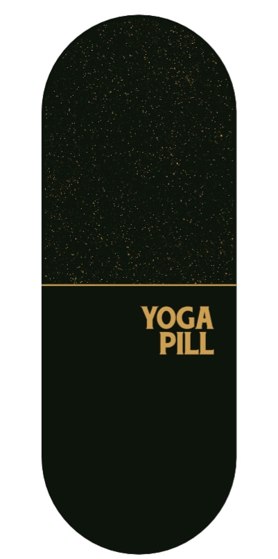
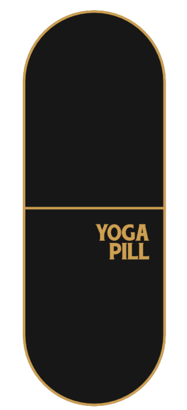
9 Responses to Option B
Some different colors would be better
I like the grainy texture a lot, and think it should be on at least half of the board. The rest are kind of miss, but C and D are acceptable. The thick yellow border in D is not great, but it's better than the solid yellow half of the board in the other one.
I like it to be more minimalist. The black background is nice, and the yellow lines should be smaller. But I do like some symmetry too.
I really like the starry look, it is unique. Otherwise, even, simple, geometric/asymmetric looking is appealing. Probably in a larger size.
I like the black color all over. I also like ow the top of the mat is a little sparkly, it ads a nice touch to the mat. I realize the options I didn't pick would look more like a pill, but I just don't like those color combinations at all. I'd like the other color be something I like, like light pink or light green.
I love B the best because it reminds me of Star Wars, but even for people who aren't familiar with the movies, it looks cosmic. I love the peacefulness of the stars and the idea of being one with the universe. My second choice is A because the thin inner yellow border looks quite racey to me. It's almost like racing stripes. My third choice is F and I chose it for the same reason as #2. I like the outline border and I love how yellow looks on black. My final choice is E because it resembles most like a pill. Though one thing I would change about it is how the black outline on the upper half is too thick.
I love the glitter on the first two and I'm pretty indifferent to the rest but liked C & F a good bit
I like the sprinkle yellow design in the top portion of the mat in options B and G. The tan lining is nice as well in G
I dig any of the spacey galactic ones.
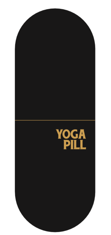
8 Responses to Option C
Simple and clean with no border makes it really stand out.
My voting comes from the fact that I think simple is best, especially for something like a yoga mat. It shouldn't be overly distracting or too vibrant in my opinion, so I think the colors are just fine as is. I chose Option C as my #1 because it's the most simple; I love the two-tone look of Option E, so that's my second. Option F is close to Option C, but I don't like the trim as much. Finally, I like the colors with F more than A, so that's why A is last.
I prefer the more subdued less flashy or sparkly designs that aren't as visually distracting and allow the user to focus more on what matters, the yoga posing and breathing. I would also suggest a deep blue color for a popular color choice with soothing connotations.
Explaining my choices is difficult because it's asking me to justify personal preference. I prefer minimalist designs over complex designs, usually, which is why I made my first choice. The "speckled" patterns of my second and third choices are because I think it looks like an exercise (Yoga) mat more than most of the other choices. My fourth choice was because it's the more minimalist design of the remaining options.
I prefer the solid color design the most
They look the most appealing to the eye in that specific order
C is my first choice as it is the most understated option. Yoga mats are generally bright, eye catching colors. In looking for a black mat, it would be because I want something plain and C comes the closest. F is next because the line is a little thicker, logo a little bigger, and there is a border around the edges. So still somewhat understated, although I feel like the logo is a bit big on all options. I get that it is supposed to look like a pill, but B is my third option because I like flecks on one side that make it look like sky. I'd prefer it to be all that pattern, but that does add a bit of interest if I want something more than plain. And 4 is A because it looks like F which is number 2, but I think the border of F is more appealing than having the stripe on A where the gold border doesn't reach the end so it is black then gold then black. And to the question of color, black and gold makes me think of the Pittsburgh Steelers because those are their colors. Maybe that is a good thing, but I personally don't love the combination so would probably want a black/white option, or black and gray if going dark.
All the yoga mats are similar, but I chose that top 4 because i liked the simplicity of those mats in order. More is sometimes less.
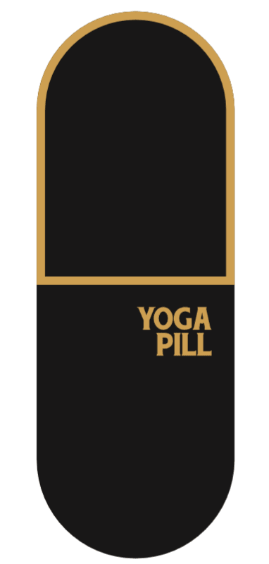
7 Responses to Option D
I love the gold type color on the out edges. It makes the product really stand out and looks flashy as well. I strongly prefer that option
I like the golden half portion to help indicate to which part of the mat is the front/tail part. Granted most mats can be either direction, with color indicators. It can help with positioning for where some poses to avoid bumping into other people if used in a tight class room.
bolder, larger size, visual reference points
D is bold and assertive in that it quite clearly resembles a capsule or pill, those familiar two colored ones most especially. I believe red and blue is common with OTC pain relievers and should look most familiar to a user and really be a Yoga "pill".F is quite similar but the outline is thin and not as bold as D, also I do not like it being fully outlined I think it looses some of that direct resemblance to a capsule.B is good in many of the ways D is, but rather than a bold outline it uses a subtle textured design that in it's way reminds me of those pills or capsules that are semitransparent and you can see the powder or small materials that make up the drug inside.G is very similar to B in my opinion but I don't find the outline being on the bottom to be very attractive, it looks almost upside down but this is certainly a very personal preference and I could see others finding the reverse top heavy. I do think the outline found on many of the designs was the most aesthetically pleasing choice and represented the name of the product very well.
Would like to buy option D is the best design and excellent fits , blue, green and grey color are best
I definitely would not opt for the design with the speckles, it makes the mat seem dirty. C is last because it is just so bland. The others are arbitrary but those 3 are the most solid combination of cool design with minimalism.
because of best combination of colors
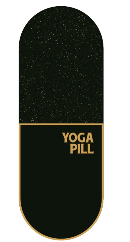
8 Responses to Option E
I like option E for the mat. Equal between the black and the gold.
They all are kind of boring. The black is just not a soothing color for yoga.
By far my favorite mat was option E because it actually looks like a pill and the concept and idea is unique and very good. Options D F and C were the next 3 in line and looked somewhat like a pill and had a good color scheme. However option E is by far the best for me and I really did not enjoy option B or option G as I thought they were the worst looking ones.
Option E was the most efffective of the Yoga pills at grabbing my attention, the most concise and elegant.
The one with the solid color of gold looks best because it looks the most like a pill. I like how it looks. The others are okay, but don't really convey it being a pill as well as the solid color (half black/half gold) one.
I like the concept and therefore, I thought the design in Option E would fit that concept the best. When you think of a pill or capsule, they are usually two different colors and I thought the gold and black fit represented that the best. The other choices were somewhat based on this concept as well, plus, the options I found the most appealing or attractive. I think the idea is good. I think other colors resembling an actual capsule might be good, but I understand may not translate well to a yoga mat. Maybe white and gold or turquoise and white? I liked the idea of the sparkles sort of representing the little spheres inside a capsule. Maybe you could use different designs like stars or hearts to represent that? Also, many pills are stamped with a code - maybe you could use a variation of your brand name to "stamp" the yoga mat such as YP 2020 or another date/year/number which represents you.
I started with the one that looked most like an actual pill and worked down accordingly.
E is the best one for me because I like the yellow and black together, it is soothing for me and energizing at the same time for me. the shape is great and I would like to try this one. I feel like this one will fit my body perfectly. I can't think of anything negative because it is great.
3 Responses to Option F
Basic black is good and easy to work on. I also voted for the largest mat. More room to move and work out on. Plain and simple is best. Black is good, does not show dirt. Wipe down to clean
I picked these for the dark colors. Dark colors are my favorite.
I think the solid colors, and outlined mats look the most aesthetic.
6 Responses to Option G
I think that seeing the grip take is helpful, gives me a good idea of the product.
I picked based upon the ones I thought were most interesting looking. I would remember them if I needed to.
I wouldn't buy any of these to be honest. I hate them all. Black feels like such a negative color. I want a bright happy color if I am working out and trying to make myself feel better. What about a nice teal or bright blue.
i liked most of them equally. The only ones i did not like is the one with the extreme thick border (D). Other than that i chose G because the border was thin and then E because i wanted an alternate color on the top section.
I personally like Option G the most. I think the design is chic, modern, and fashionable. I especially like the glitter detail. I think having another light color choice would better accommodate users' needs.
I love the idea of a yoga pill for a mat. It looks great and I would totally buy it! I would keep the black and offer more color options for the letters and outline: lilac, cream, light blue.
Explore who answered your poll
Analyze your results with demographic reports.

