Poll results
Save to favorites
Add this poll to your saved list for easy reference.
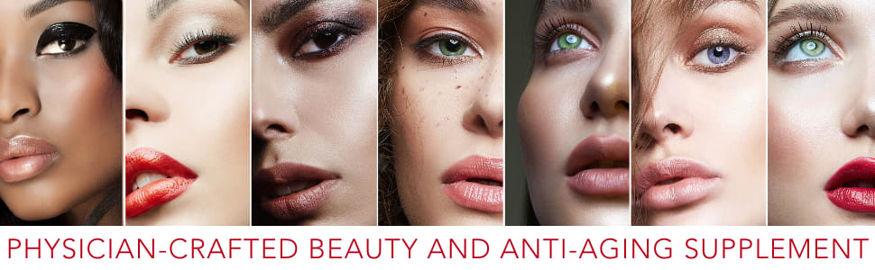
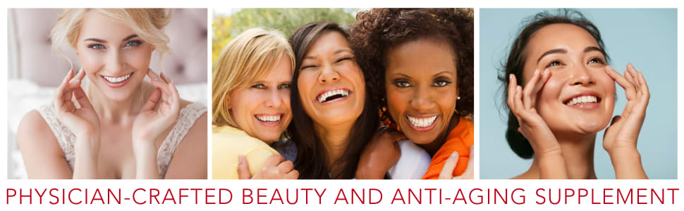
This product is a premium anti-aging & skin beauty supplement. Which image do you most connect with and would convince you to purchase? Why?


Option C won this Ranked poll with a final tally of 29 votes after 3 rounds of votes counting.
In a Ranked poll, respondents rank every option in order of preference. For example, when you test 6 options, each respondent orders their choices from first to sixth place.
PickFu requires a majority to win a Ranked poll. A majority winner differs from a plurality winner. A majority winner earns over 50% of the votes, whereas a plurality winner earns the most votes, regardless of winning percentage.
If an option does not earn a majority of votes, PickFu eliminates the option with the lowest number of votes. The votes from the eliminated option are reassigned based on each respondent’s next choice. This process continues in rounds until a majority winner emerges.
Scores reflect the percentage of total votes an option receives during the vote counting and indicate the relative preference of the respondents. If there is no majority winner, look to the scores to see how the options fared relative to one another.
| Option | Round 1 | Round 2 | Round 3 |
|---|---|---|---|
| C | 40% 20 votes | 42% 21 votes +1 | 58% 29 votes +8 |
| A | 28% 14 votes | 32% 16 votes +2 | 42% 21 votes +5 |
| D | 20% 10 votes | 26% 13 votes +3 | Eliminated 13 votes reassigned |
| B | 12% 6 votes | Eliminated 6 votes reassigned |
14 Responses to Option A
I don't really care for the "natural" pictures like in D. I really like the glamour shots of A and B
I like the variety in skin tones in the first and third choice, but the second showcases older women aging gracefully.
I chose Option A first because I like the up close pictures of the faces including a variety of different skin tones. I chose Option B next as I like that there are fewer women in the picture so you can look at each women individually. I chose Option D last because of the the group of women in the middle is distracting, and makes you forget it is about skin care and not friendship.
A. looks way more professional than the other pictures. B. I like how its showing the womens hair and shoulders. D. was okay but its was very bland and nothing really too it that caught my eye.
The images i think are the best depiction showing women of all races and skin tones. This gives the feeling of inclusion for all
A had a lot of elegant, youthful faces. B had a lot of diversity. D had everyone looking happy.
A is my absolute favorite because I like how it has the most amount of women displayed. I think it does a decent job of showing color diversity, and the overall "panel" design looks very modern. It reminds me of makeup gurus' social media posts, so I think it will be the most effective logo to sell beauty supplements right now. Option B is my second favorite. It resembles Option A in a way, and I like that the background is all white. It makes the image look clean. Still, it is not quite as striking and intriguing as Option A. My third choice was D. If I had to pick between D or C, D wins because it looks like a more realistic advertisement. For some reason, Option C looks like something out of a PowerPoint presentation rather than something I would see in a magazine or website. I do not like Option C's collage of the four photos together, so I ultimately decided to choose D as my third favorite.
The quality of the photos are excellent in A & C. The photos show a wide variety of women of all color and ages.
I like choice a because it has a lot of different skin tones.
I liked the images that showed multiple women of different ages and ethnicities. It made them feel more relatable.
I think Choice A is the most attention grabbing. I like that it features various complexes, and the whole layout seems the most modern.
Option A is an attractive array of faces. Option C is nice and includes an older attractive looking woman. Option D is another picture that includes the trio of women that looks fun and happy.
I was most drawn to option A as it seemed the most polished and professional to me.
I think the first option shows a variety of women and it's eye catching.
6 Responses to Option B
The image that I connect with the most is Option B, It shows women from various races. As an Asian women, it's nice to see that my race is represented in that image. Image B also has clear photos that focus on the skin of the women. That would convince me to purchase the product.
The look is realistic and their beauty obtainable. I want such results. I will gladly order.
i identify with this age group
I connect with the images in B the most strongly as they are individuals. That is really important to me as a woman and a consumer.
These pictures look more attractive and young
The more natural the look the better.
20 Responses to Option C
I find the images of the women that look more natural and in a natural setting to be more appealing.
C seems like it someone I could know. I could know these girls and it makes it more personable and makes me want to know more, rather than the stock pictures that B and A give off.
I most connect with Option C and would be likely to purchase that one because I relate closely in age to some of the ladies in the picture - they all look to be healthy and aging well so I would be inspired to purchase the product. I chose Option D as second for the same reason - photos that I connect with because we are the same general age/appearance so I would think the product may help me as well in my quest to look my best as time goes on. I chose Option A as last because the ladies in that ad seem to be more perfection than reality - they look more like models or actresses than a normal person - very perfect which I cannot connect with as easily as the others.
I like that choice C has a lot of unique smiles and variety and diversity of women.
I like option C and D and really connect more with C are the women are more my age range and don't look too much as if they are posing, natural smiles and natural pose. They look great but they do have a few wrinkles. I do like option D also but B and A really look fake to me and would not make me want to buy the product. The models look too perfect.
The photo with the three women looks like a happy group and smiling and older, yet youthful.
Option C shows more realistic ladies which makes me feel more comfortable. The same for option D. Ladies who look more like everyday people are more appealing to me than models posing.
When you are looking for a product to help YOU, you want to see someone who you can relate to and looks like you. I picked option C for my first choice. I like that there are several women of different ages and different colors. Option C is the most relatable of the choices. I picked option D next, because of the assortment of women with different ages and colors. I wasn't a fan of any of the other options, but of the rest, I picked Option B. It as assortment of skin colors.
I like all the Options except Option A, as Option A looks a little too airbrushed and only for models. Option B wasn't that good because it was all young people. I liked Option C and D as it was very diverse and showed people of all colors. Option C is the best as it was inclusive of age, size, and color. I think it was the only option that was realistic and relatable to the public.
The first option portrays real women better. The second option also portrays real woman but I don't like the layout as well. The third option is ok, but seems a little artificial.
The more faces shown means more diversity. It is better to see all different ages in an advertisement then just young people which is why I picked C and D. I picked A as my last option simply because it shows more faces than option B.
OPTION C SHOWS WOMEN OF ALL AGES. SOME OF THE OTHER OPTIONS SHOW WOMEN THAT JUST LOOK LIKE MODELS. I LIKE THE OPTIONS THAT SHOW REALISTIC WOMEN
C and D have the most appealing image. The center image looks the most natural and not staged. D and B looks phony and completely staged. I also dislike that all the modelsa are very young with flawless skin. At least C and D looks more realistic.
I like C the best because the models look realistic and natural. Option D is almost as good exempt the first pic in D looks very altered. Option B is just okay and A looks way to fru-fru.
your audience is not young people with this product so i would want to see pictures of people my age.
Options C and A show the most variety in women and makes it easier to connect with. It shows that it would work for all women.
I like the images that show normal older women having fun. It's also who should be using anti-aging products. For the third image I like the close ups.
I chose the first 2 because they showed older women which we be more representative of older women. The second one shows women that are slightly younger but still shows some women that look to be slightly older. The last one I chose because it shows more of their faces vs just a little sliver of them. The one I didn't choose just didn't show enough of their face for my preference.
I chose C first because it looks like it includes multiple ages which I can easily connect with.
Options C shows a diverse group of women that look to be different ages. This appeals to me the most because it's very inclusive.
10 Responses to Option D
These women in D look the most natural of them
I like D because I like how it has the 2 different individuals on each end and the group in the middle. It looks the mos balanced and attractive. I also like how all the ladies are smiling. I like B and A somewhat. I like the clear images in B and the close up images in A, but neither look as good as D.
i like that d and c have older women. b because i had to choose another. i would not use a or b at all.
The images were very interesting and appealing
The graphic that shows people happy and being uplifted is the one that grabs my attention first. I like the fact that the women look like they have been greatly benefited by using the product and that they are thrilled with the results. This inspires me to trust the product and want to use it myself
I liked that D showed multiple age groups. I think that is important for a skin care product.
I prefer option D because it shows varying ages and ethnicities and would appeal to a wider audience.
I liked Option D the most. I liked the larger images, so I can see it easier. Then I liked that it seemed to show older women, closer to my age.
i like D and C as they show imiages that are not glamor shots and look less touched up.
they had more diversity
Explore who answered your poll
Analyze your results with demographic reports.

