Poll results
Save to favorites
Add this poll to your saved list for easy reference.
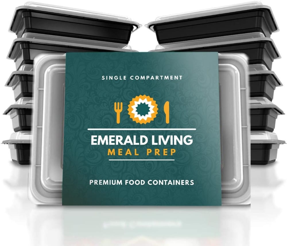
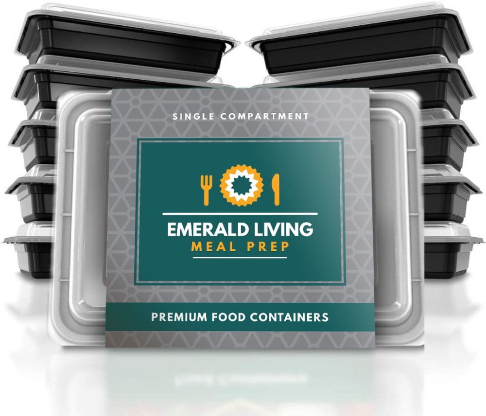
Which online store product image would you most like to click on to buy & why?
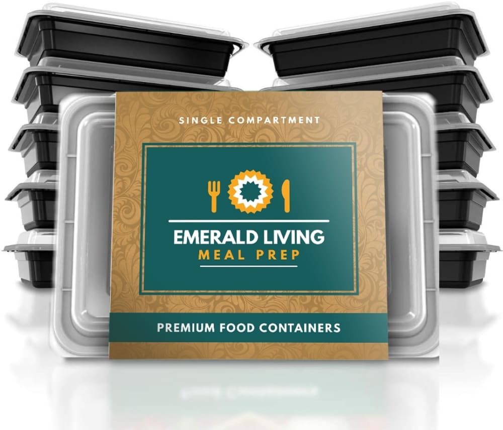
Option C won this Ranked poll with a final tally of 28 votes after 2 rounds of votes counting.
In a Ranked poll, respondents rank every option in order of preference. For example, when you test 6 options, each respondent orders their choices from first to sixth place.
PickFu requires a majority to win a Ranked poll. A majority winner differs from a plurality winner. A majority winner earns over 50% of the votes, whereas a plurality winner earns the most votes, regardless of winning percentage.
If an option does not earn a majority of votes, PickFu eliminates the option with the lowest number of votes. The votes from the eliminated option are reassigned based on each respondent’s next choice. This process continues in rounds until a majority winner emerges.
Scores reflect the percentage of total votes an option receives during the vote counting and indicate the relative preference of the respondents. If there is no majority winner, look to the scores to see how the options fared relative to one another.
| Option | Round 1 | Round 2 |
|---|---|---|
| C | 48% 24 votes | 56% 28 votes +4 |
| A | 38% 19 votes | 44% 22 votes +3 |
| B | 14% 7 votes | Eliminated 7 votes reassigned |
Age range
Amazon Prime member
Education level
Gender identity
Interest in cooking
Options
Personal income range
Racial or ethnic identity
19 Responses to Option A
The simpler background makes the name and logo more prominent and easy to understand.
I really don't have any strong preference here, but personally I like the all-green one. It just looks simpler and more inviting. Next I like the gray because it's discrete and sets off the main green box in the center. But I don't think that the gray matches the green and gold very well, so that's why I'd put it second. For C, I think that the gold is a bit ugly, but it's not a deterrent and this is just a wrapper that is going to go immediately into the trash, so it doesn't matter.
The preferred choices, A, B and C, in that order, have more legible product labeling and the color combinations are more engaging and compelling.
I really enjoyed the coloration design of choice A
The colors pop with the name. It stands out as if the name enhances the color.
The packaging on A goes better with the name and the color. The set up for the package on B has a nice standard look to it that fits, the color and the product on C do not match well
I like the Royal green the best.
The teal colored package looks the best. I don’t like the gold package and the grey is kind of bland
The coloration of A is much more appealing and has the tone of food. The other two colors give a sense of vending machine snacks and the last appears to contain gardening mulch.
I would most like to click on Option A. It has an incredibly sleek look to it. The design is very professional, and it makes me have a sense of trust for the company. It is really cool to look at, and I think the services would be great because of it. The coloring really goes together well!
I like the solid green label the best because it looks the cleanest.
I like the look of the solid one color scheme. I find it more attractive and appealing to me.
The color if this one is most appealing
I like the solid color of A the most because it looks and feels more expensive.
I would select image A because the ad card is bolder than the other options. It's all one color and doesn't distract my eye from the message. I also like the teal color with the yellow and white contrast.
I think the solid full green design on A is more eye-catching than the other two. If I had to choose, I'd take B over C, because I think the gold color used on C is really just kind of hards and gross looking.
I like the almost all green label of B. That says wholesome food to me. C with the gold accents is not appetizing.
I liked choice A the best since the green background behind the logo was more appealing and looked more natural and healthy. Choice B didn't catch my interest since the grey background blended in with the color of the lids.
I chose Option A fist because I like the simplicity of the green background as it makes it easier to read and less distracting, along with the lettering being larger and easier to read. I chose Option B next because I find the gray background less distracting than the orange one. I chose Option C last because the orange background makes it look too busy and makes it distractive when trying to read the messages given about product.
7 Responses to Option B
I picked B as my number one choice as Gray color makes the product look more prestigious and expensive versus the other two colors. I feel it makes me like the product actually works better than the two.
Option B caught my attention first. I am partial to the color gray, and this one is nicely accented by the teal color. Option C has nice contrast. Option A is also good, but not my favorite of the three. I think the three options are all nice, and I would click on any of them.
The design and color options are very trendy and modern looking. it has a type of quality attached to it and looks great.
I like the grey border around the product logo and name, it makes the name and logo stand out and it contrasts the dark green nicely. I also like the geometric pattern on the border, it is different looking and makes the product look nicer. I like the brown border of choice C but not as much as the grey border of choice B. The brown border clashes a bit with the orange portions of the logo and the orange text. Choice A is very plain compared to the other choices. The borders on choices B and C really make them stand out a lot more than choice A.
I think choice B, and the more plain grey label was the best. I think it looks clean and professional. Choice A was okay with the green label, still felt rather clean. Choice C was the worst, I did not care for the brown colored label, did not seem as clean and new as the other choices.
How natural the product feels. The first two gives me a lot more view of the product
I like the green accents better than the entire thing being green. And I like the green better than the yellow to
24 Responses to Option C
I like the contrast of the gold color with the black bins. The all green is also a nice look
The color background in choice C contrast well with the prep containers and looks more attractive as I decide which containers to purchase.
I think C with the two contrasting colors stands out the most and looks the nicest, so after being drawn to that first, I would choose that. Then same reason on B, but not as much of a contrast. A just seems to all blend together with it being one color with no border.
Gold is the top of the line color. It's what makes me feel like I've purchased the best of the best. The gold color stands out! I think choice c would be the first one I would pick up and the one I would buy from the three choices above. The second choice for me is the solid dark green color. That is simply because it's easier to read the white font on the green colored background far more than it is to see the white font on the sliver colored background.
I like the emerald and gold combination of C. It's a great color combination and looks really classy and premium.
I like the contrast between the brown and green colors on C, it seems more warm and welcoming. I chose the green and grey B next because although it is not as warm as the first one I chose the contrast in the colors on the package are modern and nice. I chose A last because its packaging was plain and unexciting.
I think the gold background looks best (it looks premium). I can also read the print easier.
I like the contrast with the multiple colors on the label
The gold coloring makes me feel like I'm getting a top of the line product.
I picked C and B first because of the gold and silver completmentary colors.
The color contrasts make the image/text stand out
Option C has the most eyecatching package, with the greatest contrast between the background and the green label. Option B is better than Option A because there is more contrast. However, it's difficult at first glance to determine what the product is--at first I thought these packages were some type of food product or frozen dinner.
I picked the ones with the nicest packaging.
Option C offers some color contrast with the gold background and thus the verbiage pops better and draws my attention and interest to read more. Option A is next most attention getting with its use of a solid backgrounds allowing attention to quickly gravitate to the verbiage. Option B is least attention getting due to the dull gray patterned background which detracts from my attention to the verbiage.
The gold outline is the best. Very district and bright. I would definitely see that in a grocery store. It's the best option for this food container as it draws the consumer in the most.
Colors and texture are so beautiful. That is the only reason for this selection.
the all green looks like a cheap countertop
the brown background makes the containers stand out
option C is the most eye-catching. The light brown packaging stands out a little better than the green and gray. Option A, with its green shade, blends in with the black container. I guess it would depend on how the product is displayed on whether it would stand out or not. Option B does not stand out at all.
the color of C stands out the most. It is classy, elegent, and attractive.
Option C - this has a nicer design on the background. It catches your eye a bit better the others. I think they are all nice though.
Choice c stands out more and is easier to read and catches the eye better
C is the best option because the gold background highlights the green, or Emerald color and makes the product look bigger, A is the worst option, strangely enough, because with no background to the logo..it does an Optical trick shrinking the package size and enlarging the label size. This is a twofold problem, it draws attention to wasted packing and it makes it appear you are getting less actual product. Avoid option A, anything else is better.
The gold on the packaging stands out more
Explore who answered your poll
Analyze your results with demographic reports.
Demographics
Sorry, AI highlights are currently only available for polls created after February 28th.
We're working hard to bring AI to more polls, please check back soon.

