Poll results
Save to favorites
Add this poll to your saved list for easy reference.
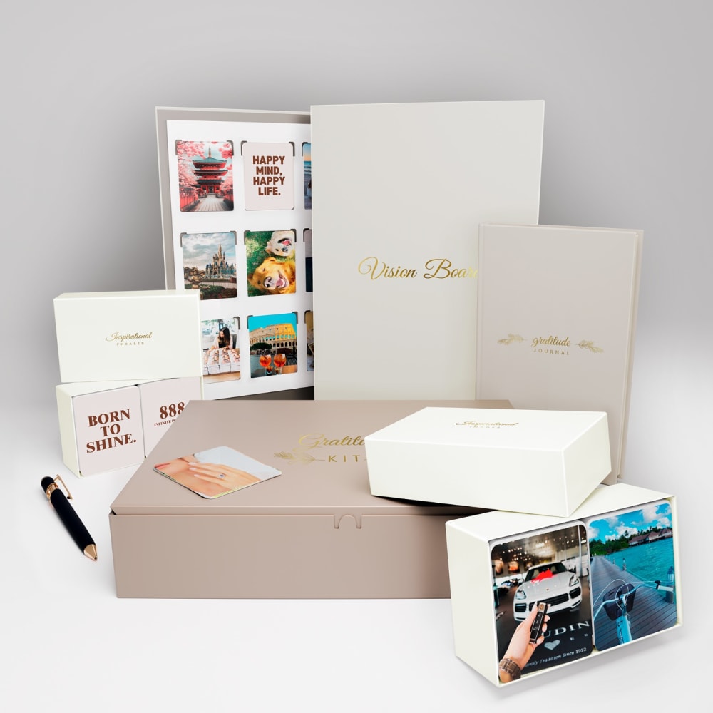
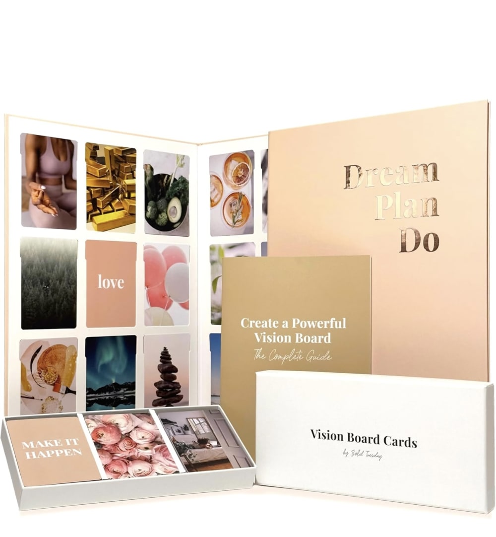
You are shopping on Amazon. Which one of these images would you click on, and why?
Age range
Education level
Gender identity
Household income range
Options
Racial or ethnic identity
Religious affiliation
8 Responses to Option A
I chose option A over option B because I like the presentation of the product with the backdrop that gives it more depth and realism. Option B lacks the other pieces of the product's whole collection that option A has.
I would click on A. This one seems to offer more and I like the way things are organized so I can still see a lot at once but then the card looking items are broken up into two boxes, one for text and one for images, so it will be easier to sort through them all and find the ones I want more easily. I also like the little tab things more on this one because it looks more like the corner holders for photos instead of something you slide the things into like B. It makes it look more elegant the way they are in A.
While I prefer the box colors of option B, I choose option A as my preferred due to it appearing to have more cards and having both picture cards and cards with words/phrases.
Option A appears to come with more items and the image is overall more appealing and neatly organized.
It looks like more comes in the set with option a so it would be a better buy. This would make me click on it.
This one is set up nicely and displays everything in a way i can easily see it
I would click on this one to find out more information about the product
I chose A because I like the design and I like the white color with gold writing. I love the card that says happy mind, happy life. Very beautiful.
22 Responses to Option B
The colors are so much more vibrant and pretty than the boring gray version
I like the cleanliness of this image . I like the way that the photos and the things that you get with the product or displayed . Not really a fan of the other one because it looks like it , the picture got taken in a photo box and not very visually pleasing with the layout of everything either .
I think option B gives a better presentation of the display board.
B looks more professional and realistic. It looks more premium
I would click on Option B because the items are closer to me, better able to see it all.
Something about the way options is set up and arranged in the photo is so visually appealing
I think that option A makes it more obvious what the product is and how it works, because it shows the box labeled "vision board cards" and the cards in the box. Without that, it just kind of looks like a photo album or that you would need to supply your own cards.
A focuses too much on the packaging, B does a much better job showing the product.
The more colorful card designs and closer-up display in Option B definitely grab my attention better than those in Option A. Additionally, I like how the packaging box is in the foreground with the product name clearly stated in the center.
This one stands out more and makes me want to buy it.
The colors and the way things are laid out with B seem warmer and more inviting.
I selected option B because it let's me know what the product is. I also like that I can see the cards clearly. I selected option B because I can see the packaging clearly. Option B gives me more information about the product and I like the way the product is presented.
B because the images are more detailed, sleek and easier to see and understand the wording, which makes it much more appealing than option A
Option b is top because the text is more clear and readable and the components of the set look more appealing.
The colors in option B feel more warm and inviting. The photo caught my eye moreso than the colors in option A.
I like the design of the vision board itself better in option B, and the overall design of the set is more appealing. I like the color scheme.
I like how everything is displayed orderly in B.
b looks more interesting and intrigues me more
this looks less complicated and easy to use
I would choose B first because I like the sentiment better on this lot.
These look much more high quality and I like the colors better as well.
The presentation of the set is more clear in B so I would click on it.
Explore who answered your poll
Analyze your results with demographic reports.

