Poll results
Save to favorites
Add this poll to your saved list for easy reference.
Which screen do you prefer?
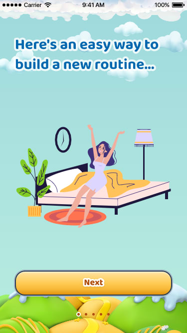
Option B won this Ranked poll with a final tally of 26 votes after 2 rounds of votes counting.
In a Ranked poll, respondents rank every option in order of preference. For example, when you test 6 options, each respondent orders their choices from first to sixth place.
PickFu requires a majority to win a Ranked poll. A majority winner differs from a plurality winner. A majority winner earns over 50% of the votes, whereas a plurality winner earns the most votes, regardless of winning percentage.
If an option does not earn a majority of votes, PickFu eliminates the option with the lowest number of votes. The votes from the eliminated option are reassigned based on each respondent’s next choice. This process continues in rounds until a majority winner emerges.
Scores reflect the percentage of total votes an option receives during the vote counting and indicate the relative preference of the respondents. If there is no majority winner, look to the scores to see how the options fared relative to one another.
| Option | Round 1 | Round 2 |
|---|---|---|
| B | 48% 24 votes | 52% 26 votes +2 |
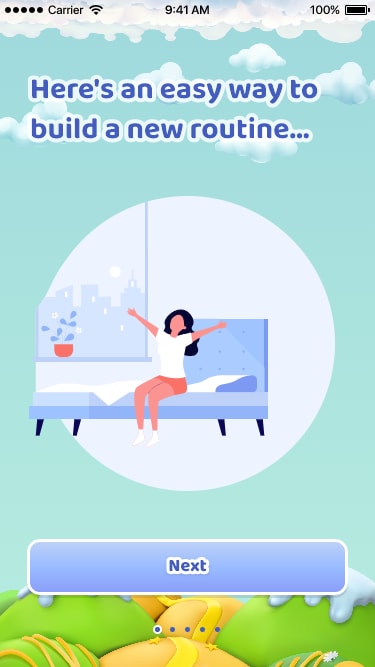
| D | 30% 15 votes | 34% 17 votes +2 |
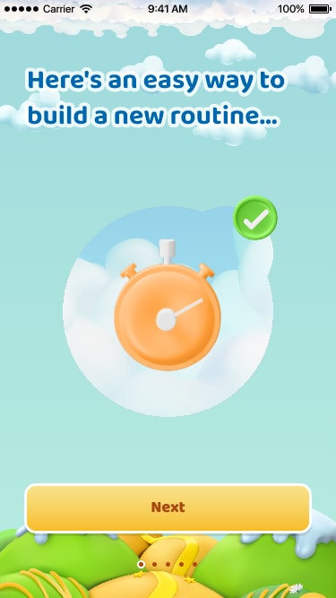
| A | 14% 7 votes | 14% 7 votes |
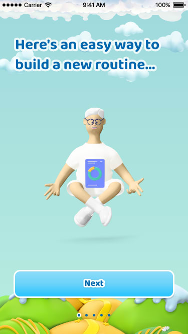
| C | 8% 4 votes | Eliminated 4 votes reassigned |
7 Responses to Option A
Ranked by what I think would actually motivate me more.
The images with the clocks and progress meters makes me turn it into a game for myself and that makes it easier to know I am progressing
I prefer A because it's free from bias.
I'm not particularly attracted to the people designs of Options D,B,C here. So this makes Option A the most appealing to me. I don't feel as if I need to see human characters in the app graphics to be able to associate it without myself and my objectives for the day.
I like that choice A is gender neutral
I chose A first because the alarm clock is what I would be most focused on the ensure the change happens after that I chose B because it felt the most uplifting and motiviating
I would suggest avoiding images of people in connection with this concept. A is the best, I like the stopwatch imagery. For C , I guess floating grandpa works but I don't care for it. I really dislike both B and D, I only took D first because of the lady in her Pajamas.
24 Responses to Option B
These screens are the most attractive in terms of content and presentation
I like the woman in the bed. I can relate to her the most. I like the way she looks.
Prefer this stylized cartoon of the character getting out of bed as an attractive option to showcase. I enjoy it though.
I like the more realistic looking ones and the ones with people invoke a bigger connection
I like options B and D the most as it shows the woman kind of stretching and getting out of bed signifying starting your day off right with a new routine which seems to be the point of the app and the picture as a whole.
I slightly prefer the people in the snapshot over the stopwatch (with the exception of the dorky-looking dude I placed last in my choices). My first choice has nice splashes of color compared to the 2nd choice--otherwise they were very similar. I think the plant in the first is more "modern" looking.
My top choice was option B, I liked the artwork the best and it looks like you're about to start your day. Option D, I ranked second due to the art, it didn't look as nice as option B. Option A, I ranked third because it was more simple. Option c, I thought just looked weird which is why I ranked it last.
The game would want to play the most would be B.
For the ones i did not like. I thought the guy looks weird in C and the cut out of A looks cheap and i dont like the middle icon. B and D i like the woman but i like the Bs design.
I like both B and D because it shows the lady waking, rising to meet the day. It's a positive image. C seems sort of zen too, cool. A is too inhuman- no person, just a clock.
Based on how excited the people look
I think Option B is best because it's the most colorful and vibrant compared to the others, as well as highly detailed.
B is the most attractive and colorful. D is the next best one, but a little bit boring. C looks unfinished, like he is just floating in the air. With A, it's kind of hard to tell what it is, I assume it's a stopwatch, but I'm not sure.
Gettong out of bed is a key focus and time to,think about routines
The one I chose looks full of energy. It looks nice. I like the color scheme also it is attractive. Thank you.
B and D are easy to relate to. C and A seem more random.
I like B and D the best because they seem the most personal. C is a little too cartoony for me.
B and D have nicely drawn images. A just loos boring and looks pretty standard. C is bad though. It is a cheap 3d render of a cartoon man which would make the app itself comes off as cheap.
i think options are the best looking designs in the background
I like the softer colors in B and I really dislike the creepy guy in C
Option B and D are great with the person waking up. That is when the routine starts. So it's a great looking option there. I would go with that as the choice. Option C is not bad either but less active looking. Option A isn't as personal without a human in it. The graphic in option B resonates the best.
The girl reminds me of me kinda so yea. That one :)
I voted this way because I felt that B was the one that I could relate to the most with the person just waking up and being full of energy. I felt the other options were either too caroonish or I could not relate to.
The girl in options B and D look well rested and excited to seize the day. The guy in option C looks sort of silly to me, and I don't like option A. Option A makes me feel slightly anxious instead of excited to learn a new routine.
4 Responses to Option C
They are all really cute. And work while with the app.
The one where the person is meditating makes me think of the different healthy routines I would need or like to build and gets me yearning for them. For the two with the woman stretching in bed, I think I'd gravitate to the one with more facial features because I connect more to people than to designs or objects. And the alarm clock to me just gives a feeling of like... discouragement and unhappiness, as though changing my routines is moreso a responsibility and a nuisance than something I would enjoy.
I picked C as my top choice as the screen looks very clean for me to look at.
I want to see the people relaxing and being happy, i think it helps me realte to the product, I am a guy so I chose him first
15 Responses to Option D
I like the human touch, especially the woman stretching first thing.
I like the ones of the woman on the bed stretching, I think those are the two best
I liked Option D because it was brighter and had an attractive city scene out the window.
i prefer the images with figures that shows activities
I like the getting up from bed idea best when it comes to a routine. I like D better than B. C and A I’m not a fan of at all
I like d&B because of the bed
The woman with the circle background looks calming and pleasing. The stopwatch is a little too simple but still nice. The art style and colors for the other woman don't look as good. And the weird 3-D model guy is, well, weird.
I like D the best. I like the minimalist look of the picture.
I like the minimalist design of the women rising from bed and like the circle around her in option D. B is second best because it is fairly similar to option D, but is less minimalist and doesn't have a good color scheme. Option A is boring but inoffensive. Option C looks terrible, the CGI looking design of the guy is jarring.
I love the screen for D because it's a great way to start the day.
I'm going to go a little existential here. With D, there's that added symbolism of starting your day, which is strong. You could also argue it represents ending it, which works to a degree too. So I think D is probably the most impactful. It's the one that says the most.
I prefer option D because I think it's a really nice screenshot. I like how the colors go well together and it makes me want to build a new routine. Option B is nice too, but I like option D better. I'm not feeling Option A & C because they are just to plain and boring.
I ranked the designs of the mobile app for better sleep that I liked the most. I really like the design of option D the most because I like the image of the woman waking up the most followed by the woman in option B. I then liked the image of the alarm clock in option A more than the image of the man in option C.
I find D appealing because it is colorful and attractive, it has a very nice content of design with good display, while B is cool and attractive and i like the display content with good design and nice content of screen color, also A looks nice and I belief it has a good idea of screen design and the pleasant color of the image, C looks plesant and simple with good design on the screen but the content is not really attractive to me
I like choice D the best because I feel like the lighter colors that are in the background of the actual photo make it stand out more, it stands out more without being bold. My least favorite is the guy meditating in choice C because I feel like that's not really a good interpretation that's not really a good interpretation of building a new routine cuz not everybody meditates but everyone wakes up in the morning so I feel like choice D and B are the two best choices.
Explore who answered your poll
Analyze your results with demographic reports.
Demographics
Sorry, AI highlights are currently only available for polls created after February 28th.
We're working hard to bring AI to more polls, please check back soon.

