Poll results
Save to favorites
Add this poll to your saved list for easy reference.
Which podcast cover would interest you an lead to listen to the podcast?
Option D won this Ranked poll with a final tally of 29 votes after 3 rounds of votes counting.
In a Ranked poll, respondents rank every option in order of preference. For example, when you test 6 options, each respondent orders their choices from first to sixth place.
PickFu requires a majority to win a Ranked poll. A majority winner differs from a plurality winner. A majority winner earns over 50% of the votes, whereas a plurality winner earns the most votes, regardless of winning percentage.
If an option does not earn a majority of votes, PickFu eliminates the option with the lowest number of votes. The votes from the eliminated option are reassigned based on each respondent’s next choice. This process continues in rounds until a majority winner emerges.
Scores reflect the percentage of total votes an option receives during the vote counting and indicate the relative preference of the respondents. If there is no majority winner, look to the scores to see how the options fared relative to one another.
| Option | Round 1 | Round 2 | Round 3 |
|---|---|---|---|
| D | 28% 14 votes | 40% 20 votes +6 | 58% 29 votes +9 |
| B | 26% 13 votes | 32% 16 votes +3 | 42% 21 votes +5 |
| A | 26% 13 votes | 28% 14 votes +1 | Eliminated 14 votes reassigned |
| C | 20% 10 votes | Eliminated 10 votes reassigned |
Age range
Coffee drinker
Education level
Exercise frequency
Gender identity
Homeownership
Liquor consumer
Options
Personal income range
Podcast listener
Primary mode of transportation
Racial or ethnic identity
Social media platforms
Travel frequency
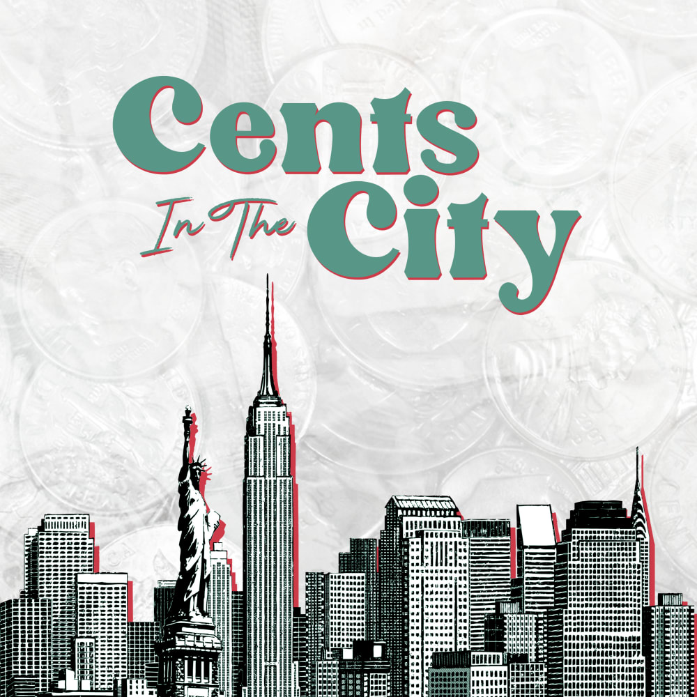
13 Responses to Option A
I llike the city one more, it looks way better, the gray and white background on the city with some hints of pink look amazing.
I like the color scheme used in options A and B better than the colors used in c and d. I think option A was the most inviting of the four that was provided. It looks like it would fit the title of the podcast better than the rest.
I really like A and D because I could see the whole New York Skyline, and not just the statue of liberty. I think A has a super cool color scheme, and really looked hip, I would go with this one. D was not bad, and I liked it but it was just as not hip. Between C and B I would go with with B i like the white background.
I liked the cityscape as the main image and thought the modern black and white look of A went well with it.
I picked option A first because I love the font style and color, and the contrast of the green against the white background. I also love the look of the city, with the red outline against the background. I then picked option D because it's the same style picture, but I like the yellow background a little less...it kind of takes away from the picture in my opinion. I then picked option B because the picture looks really nice and eye-catching, and the color scheme looks great (but I like the city picture better). I picked option C last because I don't love the yellow background paired with the picture, it doesn't look great in my opinion.
I decided to select Option A as my primary choice simply because of the design of the podcast artwork. I think it has a more natural and "Home-made" style that I appreciate!
I like option A the best because I think that it is the most interesting and visually appealing podcast cover out of the four options.
The white and the city skyline looks good together. Its fancy and fun to look at
the red circle in B and C make me think its gonna be a podcast about Japan
Design A looks unique and put together professionally. Design D is a good alternate design, but the color scheme is clunky. Design B looks like the Japanese flag. If the red section was a different color or even removed altogether, this design would probably be my preferred design. Design C is too busy and has no real identity for a podcast.
I prefer the city skyline. I do not like the yellow color
I like the cover image in option A for the podcast. The color scheme looks appealing and would catch my interest. I would want to learn more about what this podcast is discussing.
I prefer the white background to the yellow because it looks more like a naturally textured piece of paper or t-shirt design. Plus the color of yellow doesn’t exactly fit my perception of New York City. Of the two picture options, I am much more interested in hearing about a show that uses the entire skyline than one just focused on the statue of liberty and all that that implies.
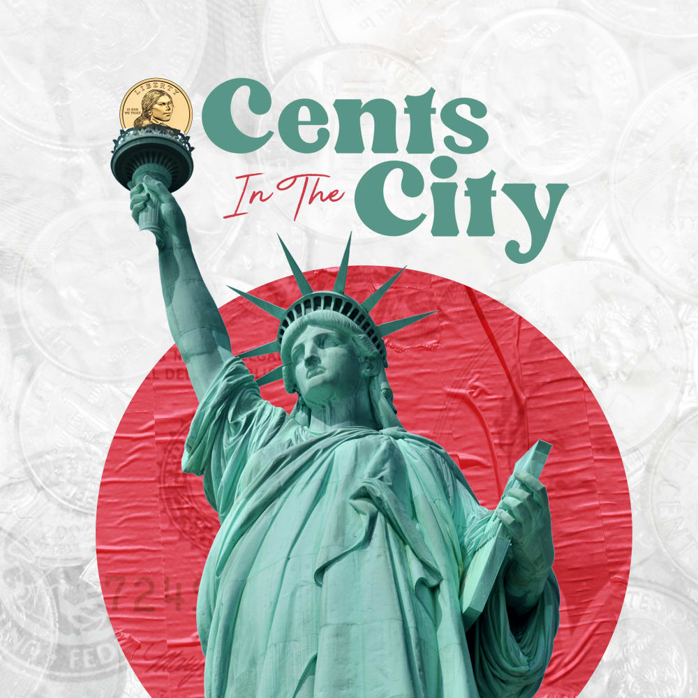
13 Responses to Option B
Statue of Liberty is most obvious New York specific, yellow background is hard to read
I chose option B because it was very eye-catching and appealing.
I like the white background as it makes the illustration pop out more. I like the design of the statue of liberty more than NYC skyline.
I think the statue of liberty is a pretty cool symbol of america
I like the design with the statue of liberty the best, I think this symbolizes both New York and America in general. I like the white background more because it makes the title pop more and the yellow looks kind of dirty and gross. So for these reasons, I like the white background and statue of liberty in B, the white background in A, the statue of liberty in C, and I don't really like anything in D.
I'm not a big fan of the yellow backgrounds, so D and C are ruled out for me. Of the other two, I really like B - the red background behind the Statue of Liberty helps everything pop, and the green font really stands out nicely. (It doesn't need the border)
I chose in this order based on which ones were more appealing to the eye to the dullest. Top choice goes to the statue of liberty with the white background which has a better visual feel to it, leading to the city back drop in white which has an art about it, then the orange back ground statue of liberty which has nice color but makes it hard to focus on nad finally the orange city backdrop which to me is least appealing because of its overtaking of the statue as if the orange totally doesnt match the image
i love the contrast of the white and the red in B and A! and the upclose lady liberty icon is eye-catching
B and C are the best because when someone thinks of NYC they think of the statue of liberity so it's best to showcase this.
I selected the podcast that would most interest me and that would entice me the most to listen to the podcast .
The coin instead of a flame is very important, and it is most visible on the white background of B
This was extremely difficult for me, as I loved all 4 of them! Having said that, being required to select #1 I'd have to go with option B as it captures a certain essence that I think their striving for. Wish them luck and I'll be keep my eyes peeled for this in my podcast discoveries.
The yellow is a bit overwhelming/too much. I prefer option B the best. This coloring makes my eye go to the title a lot better.
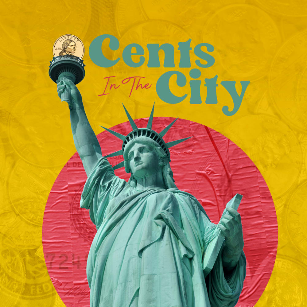
10 Responses to Option C
I love the color contrast of yellow and red.
I like the background of c and b but prefer the color in C
The yellow background really makes everything else in the image "pop" more, where the white one makes everything blend into it, making it uncomfortable to look at. On the same note, having just the Statue of Liberty still communicates the "city" theme as it still brings forth the image of New York City, and simplifies the image so it doesn't look too busy.
I liked the yellow cover for C and D as it gives it more color and that's why they are my first two picks. I liked C's statue of Liberty picture a little more, especially with the coin, which is why I have it first. The same thing applies to B and A.
I like the use of the golden dollar as seen in choices C and B as it looks neat to me
Looks most appealing offering me the best look and value with what I would be looking for
They all look nice I like them all
I chose "Option C" because it stands out more to me. It's more in my face with the bold color, and the closeness of the graphic. My second chose is "Option D" because the boldness of the color still grabs my attention.
I like the colored ones the most, and I prefer the closeup of the statue of liberty to the skyline design because it piques my interest more.
I prefer the yellow color scheme of both C and D the most and find it more eye-catching. However C and B have my preferred designs, with the statue of liberty and the extra splash of red color behind it. C is the one that combines all the elements that I like most, whereas A lacks them so it's my least favorite.
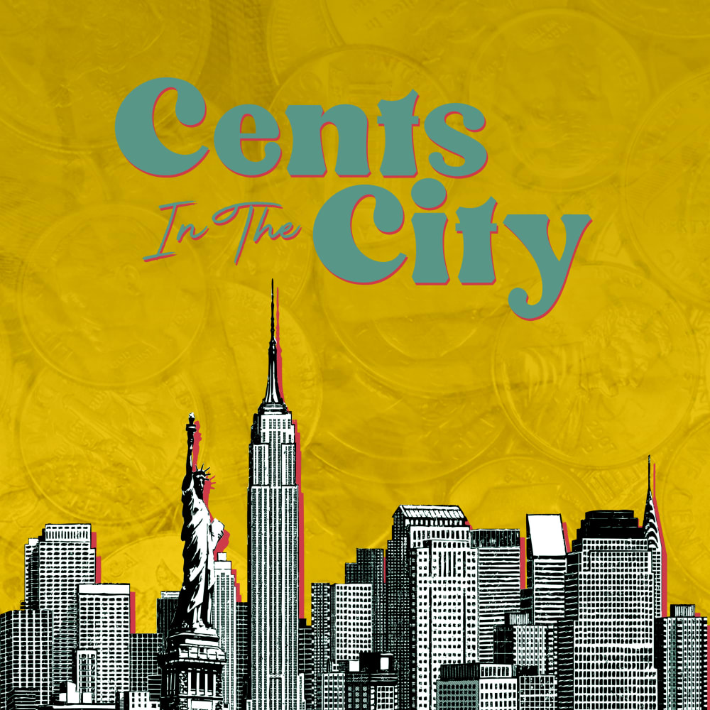
14 Responses to Option D
I prefer the art of D and A. The yellow on D pops very well. Not a big fan of the art on C and B
I think that choice D is the best looking of the 4 looking images.
I chose D first because the city wide view makes it seem less like a political podcast and more of a city-type podcast. In addition, the yellow scheme caught my eye faster than the white.
I think the city skyline with the yellow background looks the best.
I prefer the designs that show the NYC skyline.
The yellow background to me is more eye catching than the white and I like the city over the statue of liberty as the title is about the city
I chose option D first because I love the color and design used. Option A was second because I love the design. I just don't care for the color that much. I like the color of option C but not the design. Finally, I don't care for the color or design of option B.
I prefer the cityscape over just an image of the statue of liberty. I like how the yellow background helps to make the landscape stand out.
I prefer the two options with some color in the background other than the next 2 options which have only a white background.
I think the yellow background is very contemporary and attention grabbing. It stands out and fits a young, vibrant city vibe. The cityscape makes more sense than just the statue of liberty.
I like how option D is really colorful – it makes the podcast seem more upbeat and interesting. I also prefer the New York skyline because it fits the 'Cents in the City' title more than the Statue of Liberty. I think of buildings when I think of the City, not the statue of liberty which is a symbol for freedom, welcoming immigrants into the new city.
I dont like the giant lady liberty/the yellow and red is a lot (why C and B are last). I think the yellow by itself is nice, why D is voted first
I chose the images that stood out the most to me first
Choice D has a good background and the image of tall buildings which signify a city. It makes the listener want to know more about the cents in the city with the city properly visualized in the mind.
Explore who answered your poll
Analyze your results with demographic reports.
Demographics
Sorry, AI highlights are currently only available for polls created after February 28th.
We're working hard to bring AI to more polls, please check back soon.

