Poll results
Save to favorites
Add this poll to your saved list for easy reference.
Which of these three images of an air fryer would most likely make you consider purchasing the product when browsing an e-commerce website?
There was no majority winner of this Ranked poll after 3 rounds of vote counting. However, Option B and Option D had the most votes (15).
In a Ranked poll, respondents rank every option in order of preference. For example, when you test 6 options, each respondent orders their choices from first to sixth place.
PickFu requires a majority to win a Ranked poll. A majority winner differs from a plurality winner. A majority winner earns over 50% of the votes, whereas a plurality winner earns the most votes, regardless of winning percentage.
If an option does not earn a majority of votes, PickFu eliminates the option with the lowest number of votes. The votes from the eliminated option are reassigned based on each respondent’s next choice. This process continues in rounds until a majority winner emerges.
Scores reflect the percentage of total votes an option receives during the vote counting and indicate the relative preference of the respondents. If there is no majority winner, look to the scores to see how the options fared relative to one another.
| Option | Round 1 | Round 2 | Round 3 |
|---|---|---|---|
| B | 23.33% 7 votes | 33.33% 10 votes +3 | 50% 15 votes +5 |
| D | 33.33% 10 votes | 40% 12 votes +2 | 50% 15 votes +3 |
| A | 26.67% 8 votes | 26.67% 8 votes | Eliminated 8 votes reassigned |
| C | 16.67% 5 votes | Eliminated 5 votes reassigned |
8 Responses to Option A
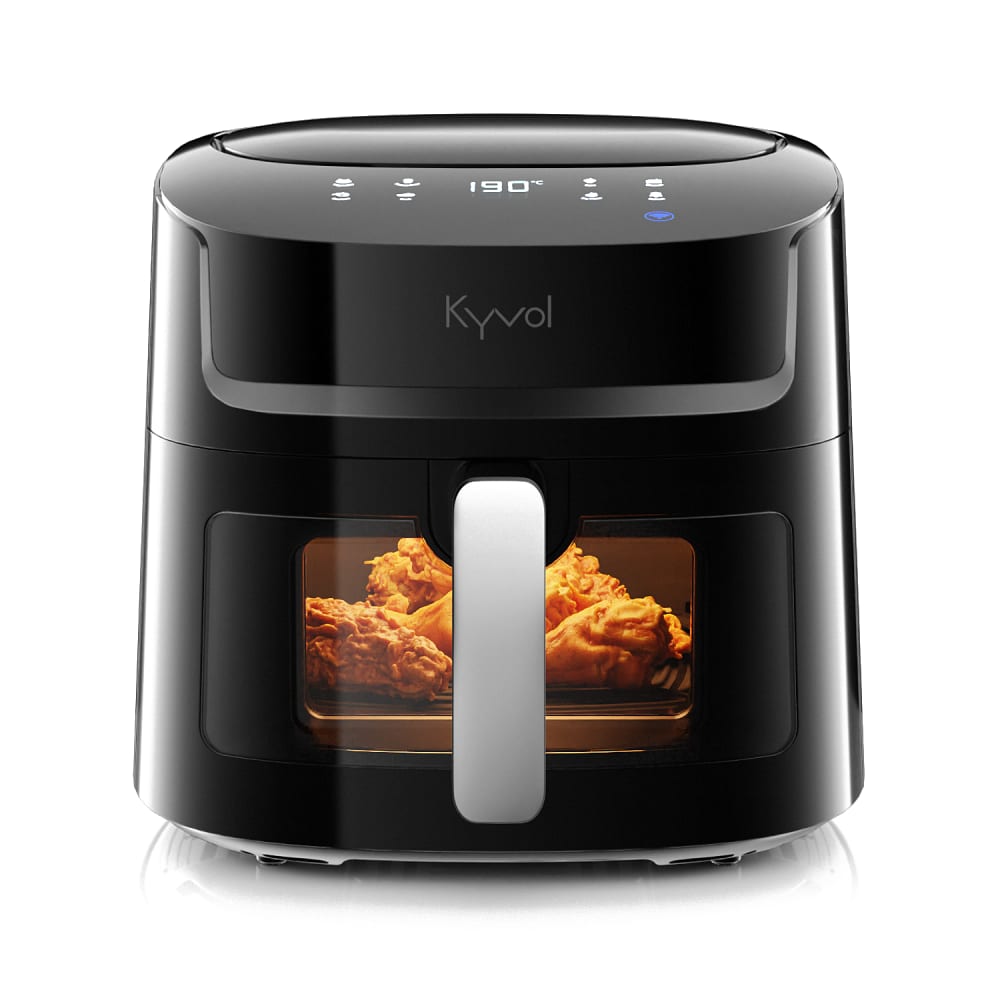
I like the darker logo on the air fryer in option A but I like the darker handle on the air fryer in option B. I also kind of prefer the gradient reflective appearance i options D and C because they don't look superficial or photoshopped on.
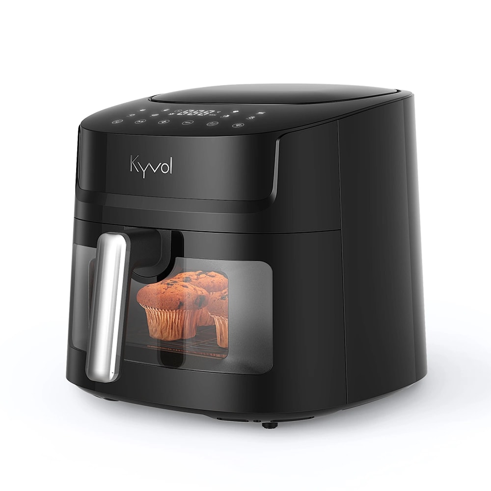
I like Option A because of the brightness of the food inside the air fryer. I picked the muffin picture (Option D) last because I don't think I would utilize an air fryer for muffins, so it doesn't really catch my eye as a product I would consider purchasing.
Option A's image of the air fryer would make me the most likely to consider purchasing the product because of how much light is displayed in the image giving me the impression that this is a feature for the product.
It is very hard to tell what is inside of B. I like that A is very clear and you can see some features. I would not like D as a main image, but if it was like the second or third picture you saw it would be helpful. It let's you see the size more than the others, but the angle is a little odd. I like that you can see more of the buttons on that one as well. I would probably not click on C or B because it is hard to tell what is in the appliance.
The items in the air fryer for A were more clearly lit up and thus looked more crispy.
Options A and C are very nice looking with a well lit window that makes the food inside very appetizing.I would buy the product if I saw one of these two options because I like the light and how the food would look inside. I think the other two options are two dark.
A because it shows the front clearing and the inside
The brighter images of fried chicken look better to me
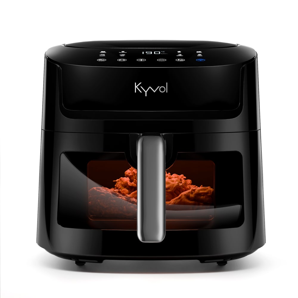
7 Responses to Option B
I have ranked these options based on how their designs resonates with me.
The button layouts at the top of both B and C seem to be fairly intuitive, yet still offer a lot of features, so those are my two favorites. Subjectively, I think that the slightly darker design of B also looks a bit better. I do not really like the angle of D, because the emphasis on the glass front makes the appliance look rather fragile, but I prefer the button layout to that of A. With D, despite the large number of buttons, it appears that everything is fairly self-explanatory, whereas A tries to combine everything into too small a space. I feel like I would need to memorize a lot of commands in order to use A for even mundane meals.
Air Fryer B has a very nice design, looks strong and quality. The design is also very aesthetic, especially the size, shape and color.
I will choose choices B and C because I can be able to see the name of the product more clearly and I love the color of the handles which have brighter colors as compared to choices A and D.
I like the look of Option B the most the image doesnt look faded out like the others and the front facing portion gives a better idea of all the buttons and how much space there is inside the fryer
B is attractive, functional, and looks like it's high quality
I chose in the order they look high quality
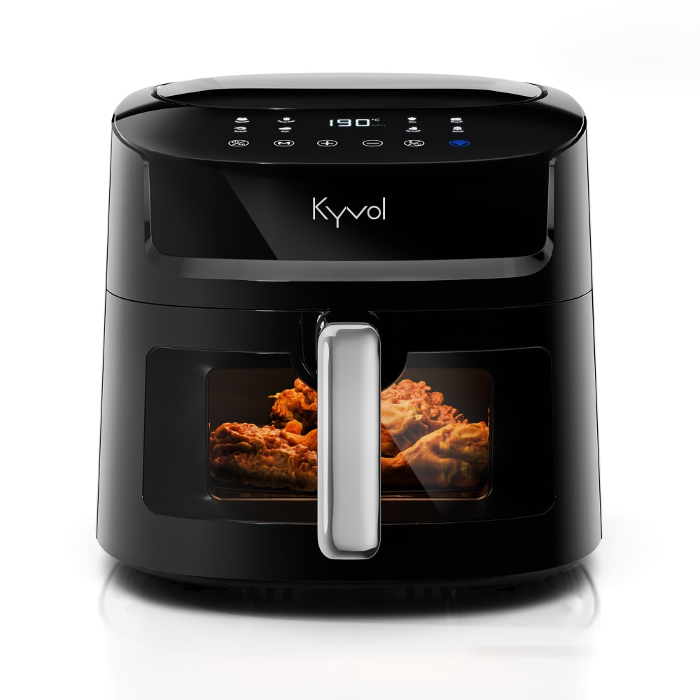
5 Responses to Option C
My main thing with these images is which one looks the least photoshopped. C and B do. A and D looks really photoshopped.
I like the actual Dimension number one and number two in particular remember what is a little bit too head-on for me with a good picture however I really like number two almost more so because of the ankle I think it lets you see more of it it lets you see the size a little bit better. Something there for context would be even better so that you know the size compared to say a person's hand or something like that or an overhead view so that one can see the square size because my problem is always been storing my air fry
Option c provides the best look for the product. The image is clear and sharp. You see exactly where the food is inside the item. I would buy this one based on the picture.
The design, color and presentation in C and B is attractive
The forward facing images of Options C, B, and A give a clearer view of the fryer. Option C also looks easy to use. Option D was the hardest to see very well, since the image was mostly a side view.
10 Responses to Option D
I would click on option D because I like that I can see a side angled view of the air fryer, which gives me a better all around look at it.
I picked D because it gives me a better idea of the product dimensions than B, A or C.
This angled view here gives me a better idea of the dimensions of the product
D and B let me get a better look and feel for the air fryer so it would make me more likely to buy it
I most prefer the option D air fryer product design because I like the rotated side view more because it more clearly shows the interior spaces the best. I chose options B, A and C second, third and last because I like the gray handle design more than the lighter silver style while the light gray ridged style is less visually pleasing for this product image here.
I chose option D as my first choice as I like the unique shape and also the functions are good.
I ranked D first because I like that it shows the air fryer at an angle, and has food inside. I'm able to better see all of the buttons on top as well thanks to the angle of the air fryer.
I picked D because turning it at an angle allows me to see more of it.
This side view provides you the most unobstructed view of the inside of the product.
I strongly prefer option D. I believe it looks better seeing at an angle.
Explore who answered your poll
Analyze your results with demographic reports.

