Poll results
Save to favorites
Add this poll to your saved list for easy reference.
Which infographic best convinces you to add this product to your cart?
Age range
Amazon Prime member
Education level
Gender identity
Household income range
Options
Racial or ethnic identity
Relationship status
8 Responses to Option A
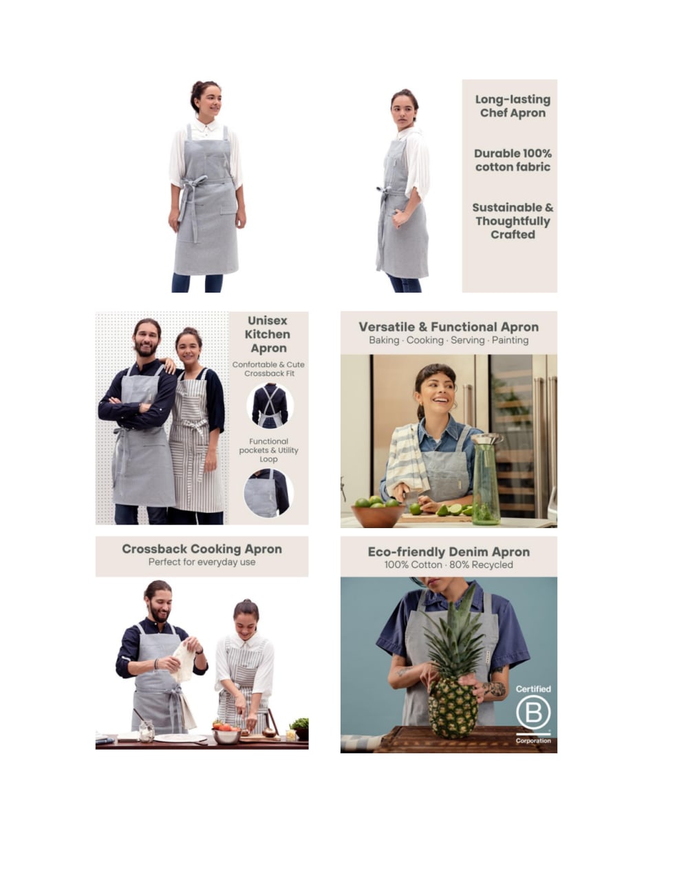
The lighter backgrounds makes the information on the graphics easier to read.
I choose A because its illustration looks visually appealing and attractive to me
Option A uses more appealing images that stand out and also has descriptions and features of the product.
Option A's Chef Apron infographic looks professional and visually pleasing. It looks more chief-friendly and featureful. The images and the information were placed creatively. I like the overall light design theme. This infographic highly convinces me to buy the Chef Apron.
I choose A for these images of the apron. I'm more drawn to A. I really like A. I find A to be more useful and helpful. Whereas B is a dark blue and I'm finding it hard to look at and read.
all of the images are easy to understand and focus on details of the product
Half of B's images are dark and hard to see. A is light, easy to see and easy to understand.
Option A explains the advantages well. I prefer this layout. Overall, it has more visual appeal. Had this been available in dark colors, I would have tried to bookmark it for a future order.
7 Responses to Option B
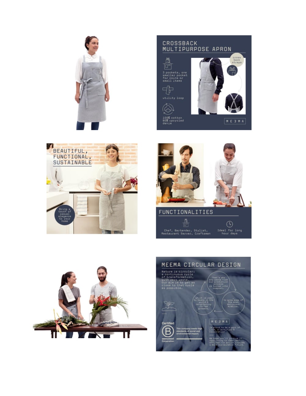
I think it works better with the blue, its more appealing and i find it a bit easier to read.
I like the contrast with the colors as the darker background looks great and the information is Alsop great on helping you see what you are getting.
I like B the most. The photos look more genuine and less staged than in A.
I feel like option B provides more details about the product and how it’s produced. I like how the infographic in option B breaks down the apron functionalities and how it can be used in various jobs from cooking to painting to hairstyling. A big difference with option B is that it showcases its recycling process and I find that very interesting. The sustainability and care for the environment makes me want to use the apron more.
The colors make me more interested in b
The images for B are the most appealing and look the most flattering for the models wearing the apron. Also, I feel B includes the most information in terms of product details.
Both Options are honestly quite good, but I chose Option B because I like the font better. More specifically, I find the font style to be unique and different, so it made me WANT to read the text more as a result.
Explore who answered your poll
Analyze your results with demographic reports.

