Poll results
Save to favorites
Add this poll to your saved list for easy reference.
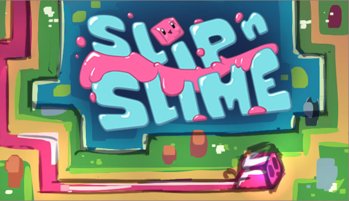
Which game art logo is more likely to make you click through to learn more about the game?
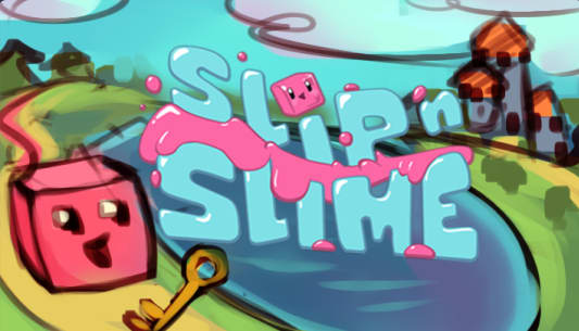
19 Responses to Option A
The fact that I can see the characters a lot easier makes this one more fun to me as as the characters are what make this.
I think the character looks cute in A, and having buildings in the background creates a nice contrast. A seems like a more dynamic picture.
the cube on the outside is appealing design to me, I love the bright colors that are used here, it looks special and fun to play.
I chose A, as I felt that it was higher quality and seemed like a game I would be more likely to want to learn about
I chose option A because i like the pink cube character on the package.
Option A seems more fun, and the curves seem compatible with "slip." The right angles in Option B don't really fit the name.
Option A logo looks more fun, active, pleasing, and visually appealing than the other one. I am more likely prefer option A logo for this game/app.
This one looks like it has a story behind it. The other one is just a background design.
I love this one more because it shows off more landscape in the logo, making it more attractive to look at.
I think this concept looks more fun and more familiar at the same time I would go with this option.
Looks like a lot of fun on an adventure.
I like image "A"..the facial expression on the little slime block is kind of adorable. They both look good (both pictures) but that little detail gives "B" an edge
I like that this has a better angle and seems to have depth.
A seems to have more of a story line behind it than B does so I went with A.
I can tell what is happening in A's logo, unlike B.
I liked that A featured brighter, more refreshing turquoise hues.
The background with the castle/moat immediately caught my eye. I just think it's more fun and reminds me of being a kid.
I thought image A better drew my interest into the game.
The little mouth on the cube is very cute and draws my attention in
11 Responses to Option B
I feel I have a better idea what the game is using the image in option B over the image in option A.
I like B more because it appears to actually show some of the gameplay, which makes it more enticing to me than something that doesn't as directly describe the actual game, as in A.
Option B is the game logo I would click on to hind out more about the game
I like option B better because it feels like a larger more complete picture of the title
There is a big drawback with Option A in that the top line of text is partially obscured by the very similar sky-blue background. This meant that when I first glanced over these two options, I missed the first two words and just saw "Slime" which did not seem very appealing. It was only when I looked back and focused on the images one at a time that I could see the full title, and if that is what I initially saw on a larger laptop screen, it will almost surely happen to others with the tiny thumbnails in a phone's app store. Option B, on the other hand, has a title that immediately jumps out due to its darker background, and the image even shows that there is a path or journey that the character follows in the game, so it seems a lot more engaging. With A, I might get the wrong impression that this is just a kind of simulation for very young children to play with, manipulating a 3D rendering of slime or something like that, whereas B makes it clear that this is at least a game with something of a plot or purpose.
I like choice B because it involves elements of the game as well.
I'm betting that B gives you a better idea of what the gameplay is like so I picked that one.
The artwork of the building and the cube look really amateurish to me. Don't appeal to me at all. I like abstract things more anyways and B looks more abstract. The colors are also more uniform and interesting.
option b gives more context clues on what the game is
I chose option B because I like this game art logo the best. It would make me interested to learn more.
I prefer B because there is a wealth of more color in terms of contrast.
Explore who answered your poll
Analyze your results with demographic reports.

