Poll results
Save to favorites
Add this poll to your saved list for easy reference.
Which cover do you prefer for a book about Personal Finances for Teens and Young adults?
Option A won this Ranked poll with a final tally of 20 votes after 3 rounds of votes counting.
In a Ranked poll, respondents rank every option in order of preference. For example, when you test 6 options, each respondent orders their choices from first to sixth place.
PickFu requires a majority to win a Ranked poll. A majority winner differs from a plurality winner. A majority winner earns over 50% of the votes, whereas a plurality winner earns the most votes, regardless of winning percentage.
If an option does not earn a majority of votes, PickFu eliminates the option with the lowest number of votes. The votes from the eliminated option are reassigned based on each respondent’s next choice. This process continues in rounds until a majority winner emerges.
Scores reflect the percentage of total votes an option receives during the vote counting and indicate the relative preference of the respondents. If there is no majority winner, look to the scores to see how the options fared relative to one another.
| Option | Round 1 | Round 2 | Round 3 |
|---|---|---|---|
| A | 33.33% 10 votes | 46.67% 14 votes +4 | 66.67% 20 votes +6 |
| B | 23.33% 7 votes | 30% 9 votes +2 | 33.33% 10 votes +1 |
| C | 23.33% 7 votes | 23.33% 7 votes | Eliminated 7 votes reassigned |
| D | 20% 6 votes | Eliminated 6 votes reassigned |
Age range
Amazon Prime member
Gender identity
Literary preference
Options
Reading frequency
10 Responses to Option A
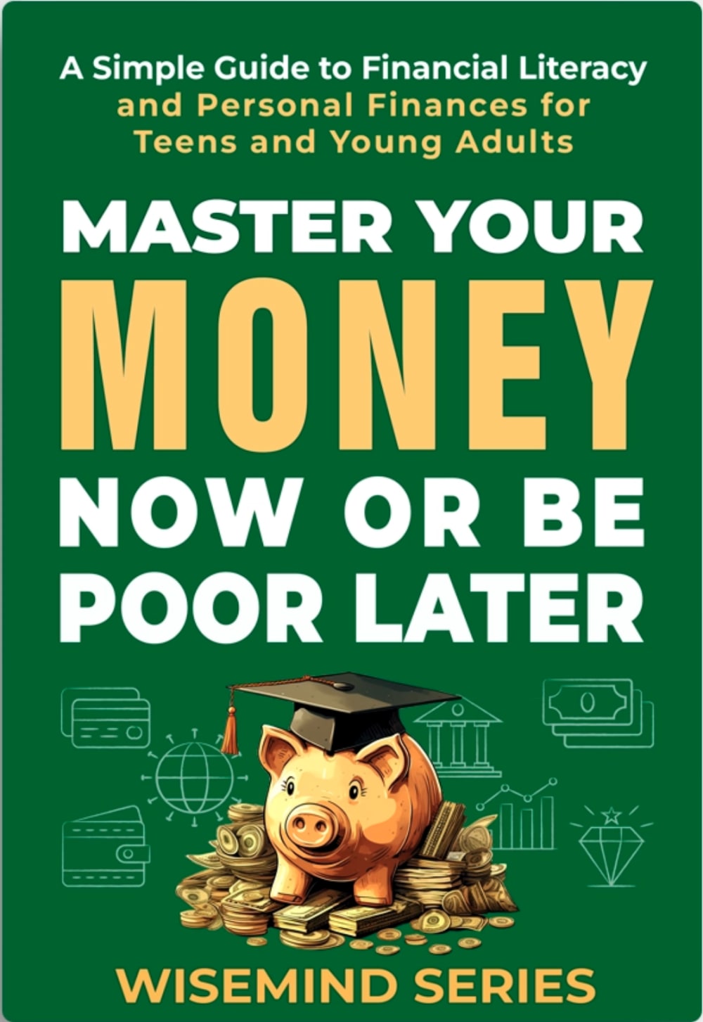
The green and the orange that is used with A and B are a cool fit for the aesthetic of the cover.
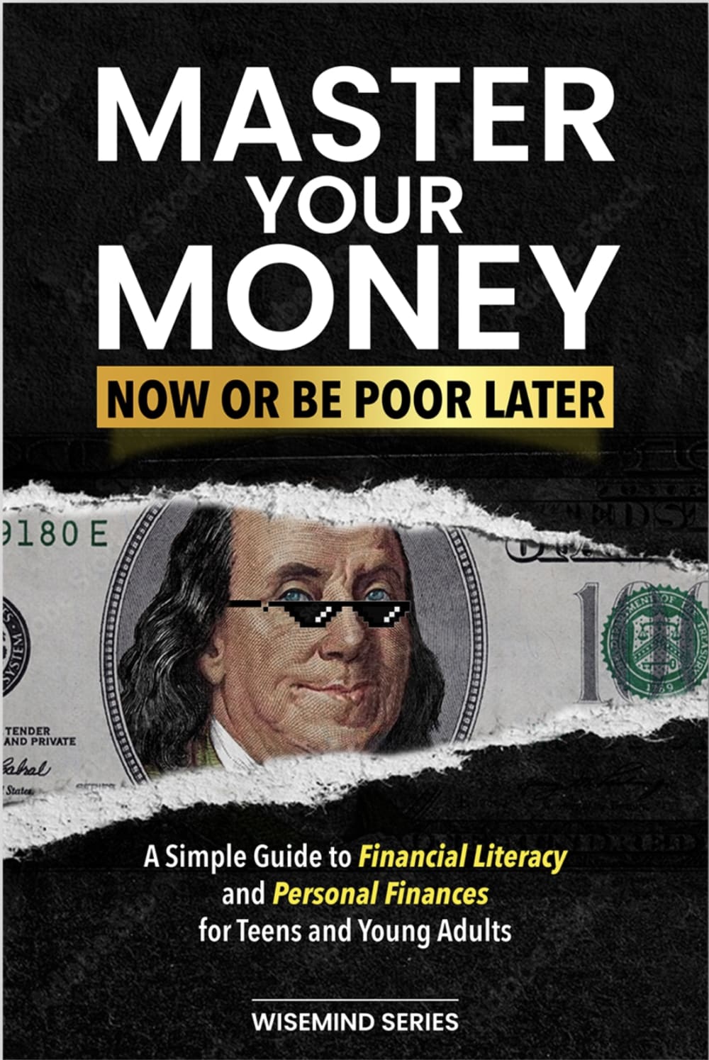
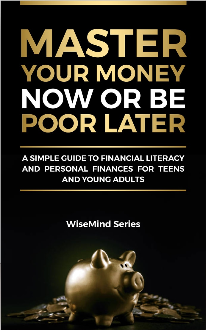
A and D best cause the pig icon and what represents. Though I like the green over the black color on cover more.B not bad the image should be bigger to much space on sidesC bad people might not know Franklin on the cover of it.
A has the best cover because it is green like money. C has a cool looking picture of ben franklin. B just looks like I would learn something. D just looks alright.
I love having a bit more color for younger adults as I feel like the black is too stark and looks too bold for someone younger. It feels too strict so I love A because the green is pleasing and feels fun to me but still relevant. From there, I like B because the color is also pleasing for me to see
I think since the theme is money, having a green cover makes the most sense. I like option A best for this reason.
I like the image of the golden pig on the front cover. I also like the spacing of the letters and the color of the cover.
The piggy bank featured in A and D is the most appropriate symbol for such a book. It's all about saving.
I feel like option A would catch a teen's or young adult's attention the most. I feel like option C would have the second strongest chance at drawing buyers in. I feel like option D and option B look quite generic.
I like the piggy and the green cover; other than that I rated based on how attractive the colors were
I think the black and gold color scheme hits harder for the older crowd when it comes to financial books. A lot of these people in the target market are trying to get through school or get ahead in life so the piggy with the cap might resonate with some viewers while climbing the money stairs may hit for some too. I just think they're more likely to be in school so (A) is the winner. Now they're still young so there's a good chance Ben Frank with those glasses on might still catch them and attract them as well because it was initially the first cover that drew me in. I know it from older memes. (D) is generic so the target market would have to already either be interested in the topic or the book itself.
7 Responses to Option B
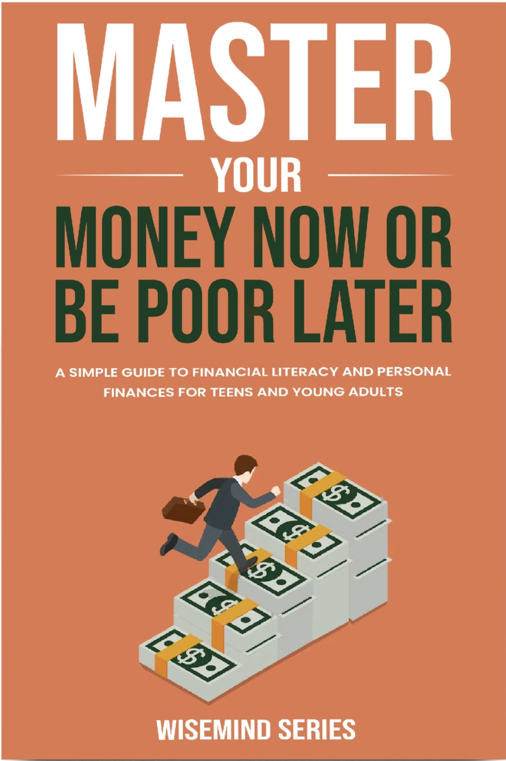
The first one I chose seems most representative of the content as well as actually looking like it's own concept. The others are kind of samey to other financial literature.
I like the colorful covers. The black covers seem outdated to me.
The title in all of these options is really poorly spaced, but Choice B looks most professional, followed by Choice A. Choice D is acceptable but looks a little wordy, and Choice D looks like a parody, not a serious book.
I like the cohesive and modern feel of the first two picks, but dislike the gold on black, flashy and cheap feeling themes of the latter two. The first two seem more scholarly and trustworthy as resources.
B has the most professional and serious cover. The other 3 could potentially look like joke books or not to be taken seriously. If I was looking for a book about personal finance I would take the one that looks the least over the top.
I loved B, it was colorful and hip which the target age will like, it looks fun. I did not like D or A and all, they look like a million covers I have seen that touch on this topic. They do not stand out at all C was decent an, it was fun, but if it was between B and C I would pick B every time, it is a book I would read and the cover made me want to learn more.
I chose option B first because it jumped out at me those most, seems the most professionally designed, and seems the most authentic. I ranked option A second because it is an attractive enough, simple and cute design. Options C and D didn't appeal to me at all, and seem almost a little scammy looking, so I ranked them last.
7 Responses to Option C
I chose my options based on the designs that would attract young adults and teens to the book's content.
C seems to have the most visually appealing cover.
I really like the edgy photos - the Ben Franklin one is super cool. It grabs my attention immediately.
I am a big Ben Franklin fan. I love seeing him. I like how the whole thing is set up. This is definitely my favorite
I think C would appeal most to teens
Teens and young adults will relate to C since it resembles a meme. B looks too academic.
I like this choice due to the funniness and humor of the cover. I like the sleek-ness of choice 2, followed by the other 2 which are somewhat neck in neck in preference.
6 Responses to Option D
d has a classy look and option c is very cringy, the other two are colorful and fun
Option D is a very eye catching option.
To me I have always felt that a piggy bank is the universal sign for money. And also it is just cute. So with that being said, i would look at a book about money with a piggy bank on it. Just a little more attention grabbing for me.
like the one with the piggy bank, cute
I like the color combinations and simplicity of option D. The black background and gold text is very alluring to me.
I like how it almost looks like it could be a thriller or horror or something, jumped right out at me as not a self help book and I got curious
Explore who answered your poll
Analyze your results with demographic reports.

