Poll results
Save to favorites
Add this poll to your saved list for easy reference.
Which cover do you prefer for a book about a success journal for building self-confidence?

Option B won this Ranked poll with a final tally of 56 votes after 1 round of vote counting.
In a Ranked poll, respondents rank every option in order of preference. For example, when you test 6 options, each respondent orders their choices from first to sixth place.
PickFu requires a majority to win a Ranked poll. A majority winner differs from a plurality winner. A majority winner earns over 50% of the votes, whereas a plurality winner earns the most votes, regardless of winning percentage.
If an option does not earn a majority of votes, PickFu eliminates the option with the lowest number of votes. The votes from the eliminated option are reassigned based on each respondent’s next choice. This process continues in rounds until a majority winner emerges.
Scores reflect the percentage of total votes an option receives during the vote counting and indicate the relative preference of the respondents. If there is no majority winner, look to the scores to see how the options fared relative to one another.
| Option | Round 1 |
|---|---|
| B | 56% 56 votes |
| D | 23% 23 votes |
| C | 14% 14 votes |
| A | 7% 7 votes |
Show answers in:
7 Responses to Option A
I think the first one looks promising because it's concise and very easy to understand The others, which don't really bring the influx we need
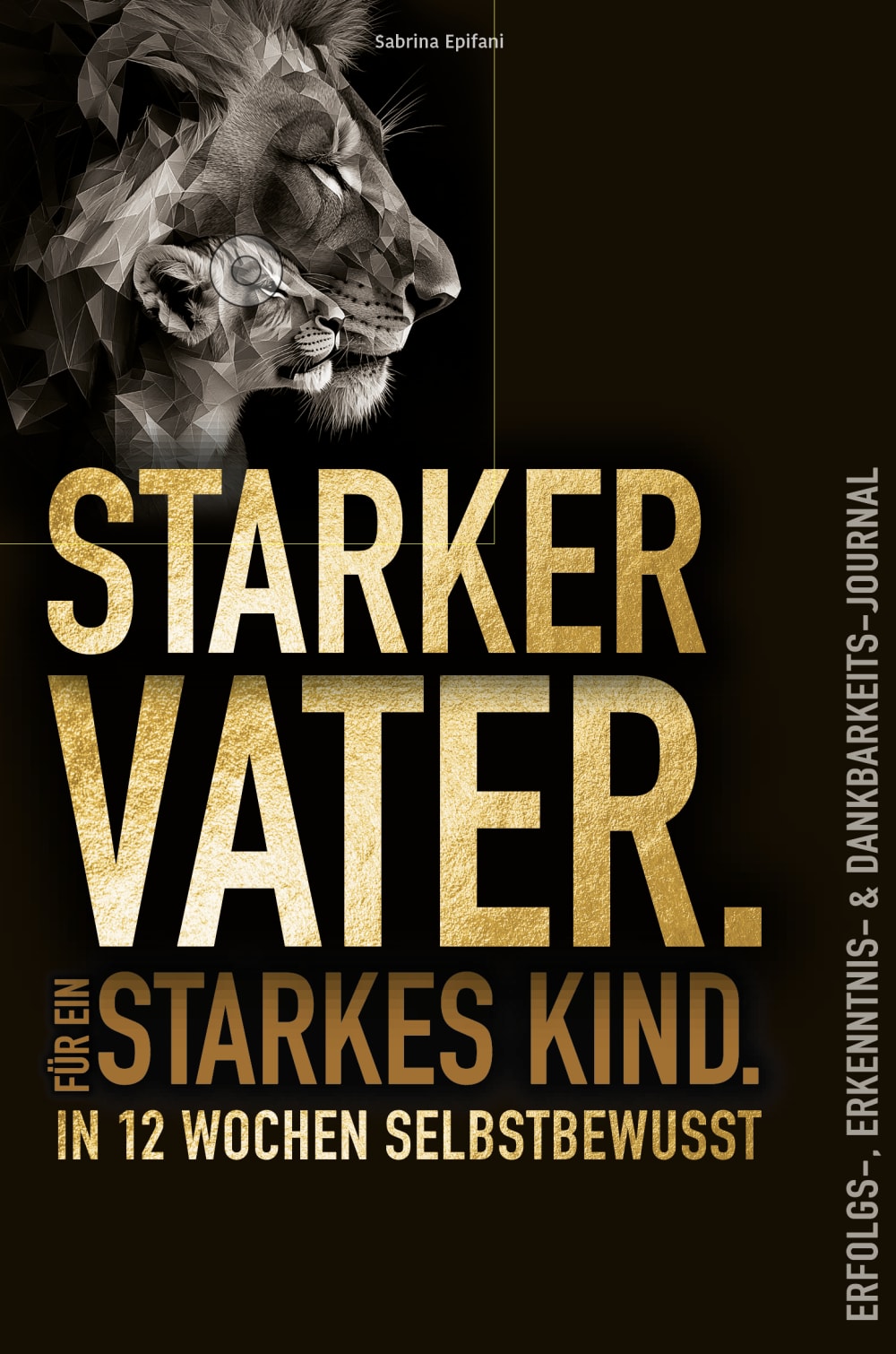
I like the design of the first book title a best because it looks modern and high-quality. I don't like book title c so much because it is not expressive enough.
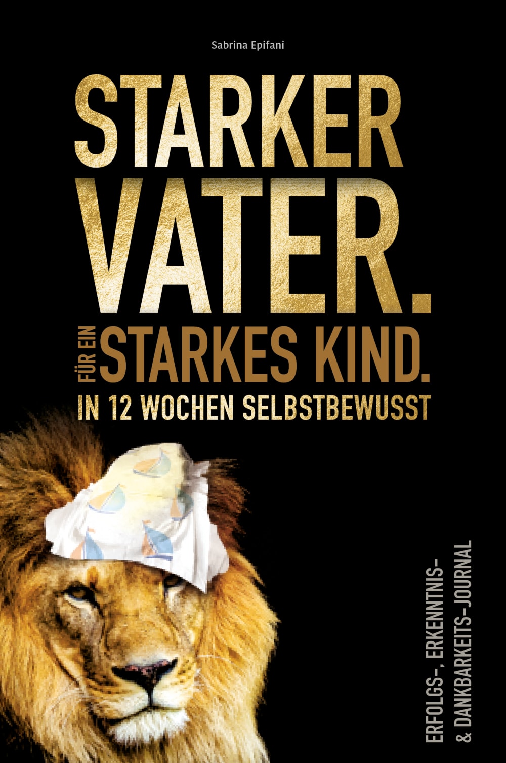
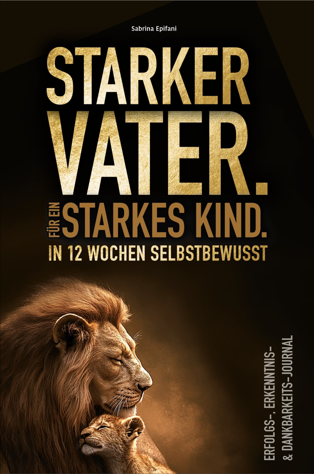
For me, this order makes the most sense in conjunction with the corresponding cover pictures and I would buy it that way. The picture with the diaper gives a good impression of what it's about, but also the picture with the lion and the boy, the pure black cover is also ok Picture D is well
Looks much better than others. In terms of color and fonts. I find it much more pleasant
I find the ranking the most innovative because the presentation of the individual images and image texts is also the most eccentric in terms of size.
It is very authentic to read. Suitable for young and old. The lion is a good example
The thickness is best visible on the first one. In the second, the font is the most interesting for me. The 3rd one looks coherent. I don't see enough strength in the 4th.
56 Responses to Option B
I based my decision on when I would take a book off the shelf in a bookshop and read the blurb. So I used the criterion of which book would catch my eye first.
The lion in B radiates the most strength. In C, the lion is barely recognizable. The cloth on A looks as if the lion is sweating. Why? Hence the order BDAC.
I chose this book cover because I find it by far the most expressive. I really like the picture and the type of lettering and I like everything about it.
i have looked at all the covers in peace and must really say 1b looks the friendliest you recognize everything very well and simply i would love to buy the book and give it away very well done
The picture shows the father as the child's protector while the child shows trust. For me, this picture fits the title best.
I would prefer answer b. The father lion gives the young person a sense of security
I think the lion is very beautiful. With b. At c it is too dark and at d the diaper is funny
B is compact and has everything you need to know at first glance. Then comes D, the cover is quite OK but doesn't come close to B. With C, everything is a bit too small for me. And 4 makes no sense with the diaper on the lion's head
The lion with the mane radiates strength and energy from greatness that you can protect your child
The cover b caught me immediately. For me, the big lion stands for self-confidence and success. The intimacy with the lion cub reminds me of myself and my son.
The first picture shows a very strongly emphasized lion, which I really appreciate because it demonstrates self-confidence. In the second picture, the height is still clearly recognizable, but I don't like the design as much. In the third picture, everything is a bit too small. In the fourth picture, it looks like the lion has a handkerchief on his head
This cover has a good division of the elements. The color scheme is also better. The font is very well arranged.
I chose B because the text is easy to read, it is clearly presented and the picture looks good.
The cover looks the most appealing. Cover A is the worst. Cover D & C look classy but I found the picture with the lions very appealing.
The picture on the first cover is the most beautiful. I like the color and the lions
The intimate relationship between the lion and the boy on the first cover fits the book title best. The second choice here is also good but not as good as the first. The rest is more 08/15
The cover looks better with the title, the others are also good but B is a good deal better.
Because I like it best with the lion, because it symbolizes strength and I feel like a lion
My choice relates to the meaningfulness. The lion stands for strength and is the king among the animals. The first choice best describes this statement and is best represented.
Cover B has the best overall impression. No space is wasted and yet the cover does not look mercilessly overcrowded. Furthermore, the picture of the lion in the bottom left corner is well chosen
The lion signals strength and power. The title is clearly written above it
The book cover B that I chose for 1st place is very attractive, the lion with his cub is very well depicted. 2nd place is also visually very appealing. 3rd place is somewhat simple but elegant. The last place, I think the lion is a bit embellished.
I think the colors match best because they reflect the color of the lion.
I made my decision based on the cover design, the lion in particular influenced it.
I like the lion in the first picture best. The second picture is also okay. I didn't like the third and fourth. Especially the fourth one because the font is so small.
I like the cover and the description best because you know exactly what the content of this book is about
i took my time looking at all four book covers and have to say woww 1b looks the best and friendliest to me, it all comes across very simply, so you want to buy it straight away and give it as a gift looks great
I like it best. The lion looks particularly majestic here.
I think it is the strongest image of the lion in my first choice. It shows strength and experience from my point of view.
b clearly shows in the cover how important the shared relationship is d is the closest to the first c is still okay and a is ridiculous
The lion pictures go well with the theme and I have chosen them in the order I find most suitable for women
I think this one is the best, the title and thus also showing the lion with the lion cub underlines the statement
In principle, I went for what was clearest and most expressive. The cover has to be recognizable at first glance.
Cool pictures in a reasonable order that make sense e.g. the first picture says something good interesting picture two shows the lion well picture three shows the lion a bit blurry but it's a good cover and picture four is boring
The 1st book I chose is bursting with power and self-awareness. It immediately caught my eye. With the second book, the title in the foreground is the expressive force that led me to this decision. The 3rd book unfortunately has no wow effect on me. I wouldn't notice it on the shelf. I find the fourth book a little ridiculous. Sorry
I really like the motif with the lion. The other motifs are a bit boring. I'm a father myself. I would do anything for my daughter. I would become a wild lion.
I chose the most compassionate and interesting cover. The others look boring and wouldn't appeal to me at all
Cover one and two of my choice reflect the bond between father and child and are the most appealing
I rated the covers in the order I would think of buying the book as I think the cover plays a very important role.
I like cover B best because I think the image on the cover of the book conveys something strong and combative.
b shows the lion, this is my first choice. c shows the content compressed, therefore 2nd choice. d is the third choice. a is rather sad, therefore in last place.
I think cover number B is the best, as it best represents the bond between father and child.
i have looked at all four book covers in peace and long and can only say 1b looks best to me you recognize everything quite simply it says here i am buy me and give me away, simply super made
I think the font should be large and central and you should also be able to recognize the cover well
I decided on cover B, as this appeals to me the most in terms of theme. In the picture, the father lion is shown protecting the little lion cub. This arrangement suggests that the big lion is self-confident
Because the cover can accurately reflect the content with one image. A father can be stsrk woeon eon lion when he slips into the role of a father
Because there are two lions on it, the title is also effective, pictures speak many volumes, that's why I decided so
The visual representation of the individual book covers is similar in the first three: you can see the self-confident lion sitting and looking after his lion cub: he radiates the so-called care or nurturing and gives his offspring protection and security. In the last picture, on the other hand, the lion looks insecure and overwhelmed: A rather unsettling state.
I went by the look and which one appealed to me. Whichever picture caught my eye first was my first choice. Overall, it was important to me that I immediately understood what it was about and how I would be helped.
Because the lion is clearly visible in picture B, I think it is the best with the details. Immediately after that comes picture D, where the lion can be seen in black and white, which also makes a good impression. Picture C is not so impressive, as the lion is almost invisible and the cover consists only of writing. The last and in my opinion the worst one with the lion and what's on his head. It makes the lion look weak in my opinion.
The first cover is much more appealing to me personally than the others. It would also have a high recognition value on the bookshelf
I find the design the most appealing. The lion with the child presents the theme appropriately
I have made the setting according to the attraction and the color of the posters, the lion stands for inner strength and courage that attracts more people.
B is authentic and convinces me the most. A is silly, a lion and a diaper don't go together. C and D are similar and I like them, but they don't come close to B's motif.
The cover, which I put at number 1, best reflects the appeal of this book for me. 1 and 2 as well and I wouldn't choose number 4 under any circumstances ... too childish.
Because the picture with the lion stands for strength and respect, it fits best
14 Responses to Option C
When making my selection, it was important to me that the image of the lion was as discreet as possible in the profile. I therefore chose b as my first option. And I find the lion with the diaper on its head the least attractive.
it's a good choice of cover except for the 4th one! It shows the union between father and son and the lion stands for self-confidence! also the dark design makes it look more profound!
I'm more attracted to simple designs. I don't really understand the message of the last cover. It comes across well on all the others.
It has the most attractive cover. The colors of the cover and the font matched the title of the book
The first option is more attractive because it is mysterious. The lion motif is small, artistic and beautiful to look at. The second option is very close to the first. I don't like the third and fourth options as much, the lion motif is too big and can be distracting. The first version is definitely very nice!
The order corresponds to my preference. The pictures look great. It was quite difficult to choose, only A doesn't appeal to me.
I like variant C best, as it looks the most serious. Black cover and the title of the book centered - that just looks good. I don't like the pictures with the big lion heads. I also think variant D is okay. But C is my clear favorite!
I think the title is good, I would be interested in the book. I find this cover the most appealing because the lion is only discreetly visible. The other pictures distract too much from the title
Because the design looks good you can read it well and the word is very well written
Not too colorful, self-confidence, lions are strength, don't know what else
I like the cover best. The other three covers are somehow too boring for me. I don't like the other three covers because they are too ornate for me.
1. Clear and uniform colors. Clearly understatement. 2. slightly more colorful but also clear and dominant to match the title. 3. fits the title, but nothing more. 4. not quite clear what this image above the lion shows. Looks modest.
The first cover is the most challenging due to the perspective of the lion. In addition, the shot is in B/W.
Places 1 and 2 look nice and mysterious, whereas places 3 and 4 are too much of a mystery
23 Responses to Option D
Looks best to me visually, I like the text and the layout
I basically like all the book covers. However, I find the last one with the one on the lion's head rather inappropriate. It's silly. The lion as an animal embodies strength. I like that and it suits the father role.
The first cover has a simple image and not too much black, which is why I like it best.
I only like D. Looks professional. The font at C is too small. I don't like A and B with lions.
The cover of D looks the best, A looks rather ridiculous. C is okay, just a bit empty and B looks like The Lion King.
the one with the diaper looks ridiculous, so i put it in last place. i like all the others. the lion conveys strength. the cub needs protection. version d is my favorite because mor likes the black and white coloring best.
Not too colorful, radiates self-confidence, lions look best
The D logo is the best, followed by B and C. I find logo A inappropriate.
The 4th is the most suitable, with the large and small lion! It fits best in terms of design and arrangement.
The gray lion looks the most appealing to me, as it radiates seriousness.
The first choice cover promises strength, the 2nd also but not as much
It reminds me of the movie The Lion King and says a lot about the book. Above all, you can already imagine very well what this book is about
D, because the picture refers equally to father and child. Both are shown at eye level and there is a relaxed, loving atmosphere in the picture. B is also depicted lovingly. C is a bit boring and gloomy. A is too silly for me.
The diaper on the lion's head makes him look a bit ridiculous. For this reason I see this cover at the back of the list. The cover with the small pictures seems to be pushed into the background. This makes the cover look very empty. The small picture makes it look very lost. Option B shows a lot of closeness to the father and son connection. The colors give the cover a lot of warmth and security. This creates a good connection to the book. However, I like and like best option D. The black and white makes the picture look a little older. With the view into the distance, the picture creates a future orientation. Family cohesion and thus a build-up of strength and self-confidence. The size is ideal, not too overloaded and not too hidden.
I like the book covers best in this order. The lion as an animal with a strong leadership style fits the theme.
I liked the first one best because the cover was very expressive.
Cover D is my favorite because of the design, cover B is also appealing. I don't like covers C & D
I find the 3the book, which I chose at No. 1, the most visually appealing. It makes the book interesting and looks strong. For this reason I would buy this book.
I like it best because it is expressive. I don't like the others so much. I don't like the lion's head so much.
The lion is gray and somewhat in the background. The font shows a good contrast to this
Organized by picture and how I would like it, in the first picture I like that the son is next to the father, in the second that the son is cuddling with the father, the third I don't quite understand and the fourth is boring.
The motif seems to fit the theme. The simple color scheme goes well with this.
The first picture shows the strength quite clearly, as does the second! The third image drifts a little and is not so great! The fourth one can be completely bent
Explore who answered your poll
Analyze your results with demographic reports.

