Poll results
Save to favorites
Add this poll to your saved list for easy reference.
When shopping on Amazon, for a set of 6 cloth dinner napkins, which one of these images would you be more likely to click on, and why?
Option C won this Ranked poll with a final tally of 29 votes after 4 rounds of votes counting.
In a Ranked poll, respondents rank every option in order of preference. For example, when you test 6 options, each respondent orders their choices from first to sixth place.
PickFu requires a majority to win a Ranked poll. A majority winner differs from a plurality winner. A majority winner earns over 50% of the votes, whereas a plurality winner earns the most votes, regardless of winning percentage.
If an option does not earn a majority of votes, PickFu eliminates the option with the lowest number of votes. The votes from the eliminated option are reassigned based on each respondent’s next choice. This process continues in rounds until a majority winner emerges.
Scores reflect the percentage of total votes an option receives during the vote counting and indicate the relative preference of the respondents. If there is no majority winner, look to the scores to see how the options fared relative to one another.
| Option | Round 1 | Round 2 | Round 3 | Round 4 |
|---|---|---|---|---|
| C | 38% 19 votes | 40% 20 votes +1 | 46% 23 votes +3 | 58% 29 votes +6 |
| A | 30% 15 votes | 30% 15 votes | 30% 15 votes | 42% 21 votes +6 |
| E | 20% 10 votes | 20% 10 votes | 24% 12 votes +2 | Eliminated 12 votes reassigned |
| D | 8% 4 votes | 10% 5 votes +1 | Eliminated 5 votes reassigned | |
| B | 4% 2 votes | Eliminated 2 votes reassigned |
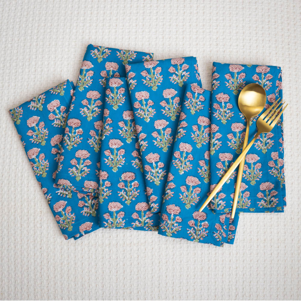
15 Responses to Option A
I think option A is the best presentation being paired with silverware.
I like how this one isn't super organized but still looks nice and the silverware on top gives it a needed pop
This image makes the product look neat and presentable. The napkins look clean and crisp.
I chose A because it looks really nice with the gold utensils.
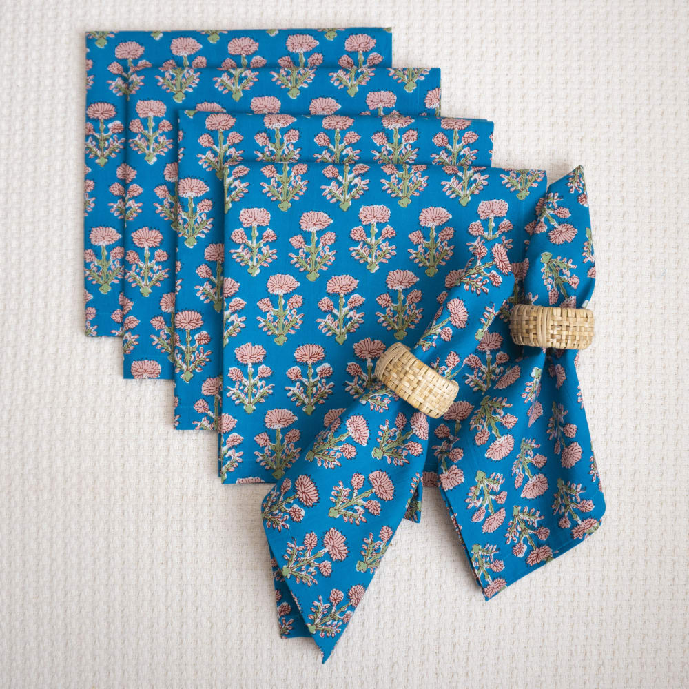
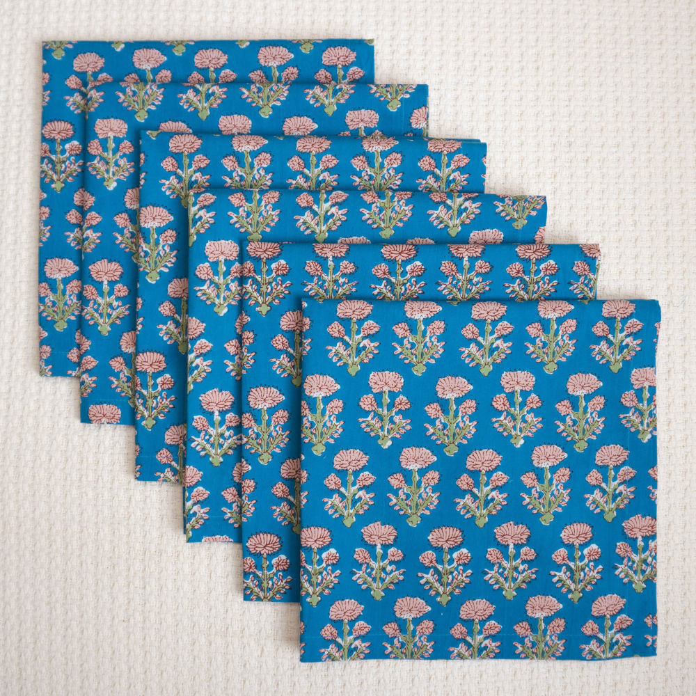
Option A lays out the napkins in a way that really shows how beautiful and thick they are due to how they are folded. I like seeing the silverware on top of the napkins, and with them being gold, it is a nice touch. Option D is very neat and orderly, and I like seeing how many napkins will come in the product selection. Option C gives you a more detailed way of how to decorate the napkins with the added ring around them, and I like that as it helps to give you more ideas for using the napkins. Option E is too simple and gives neither context nor inspiration like the others. Option B is too scattered and disorganized.
A or D are the most appealing to me. I like being able to see them laid out. B is the only one I really don't like - it looks unorganized.
I like the layout of the product in my first choice. I think it looks the most appealing and is also the most "relatable" to me. This is the choice that I would be drawn to.
E is overly simple. B is cluttered. A and C best showcase the use case. A best showcases the respective size. D is most clear about quantity.
I like option A because I can see how big they are and how they would look with the silverware.
I feel like the presentation in options A and B really makes the design on the napkins stand out well! It helps me imagine really using them myself, too.
I like how the napkins are laid asymmetrically but also look nice and neat. I like the fork and spoon on them.
I am drawn to the ones that are showing how the products will look when being used. I want to be able to see what I am purchasing and not just what it looks like in the packaging.
I like the simple display with packaging so I chose A first. As the display in E and C is bit creative, I ranked them next.
I like seeing the set with the utensils on the side because then I know exactly what these products are used for
I like that Choice A gives you an idea of what the print looks like and the proportions of the napkins with silverware.
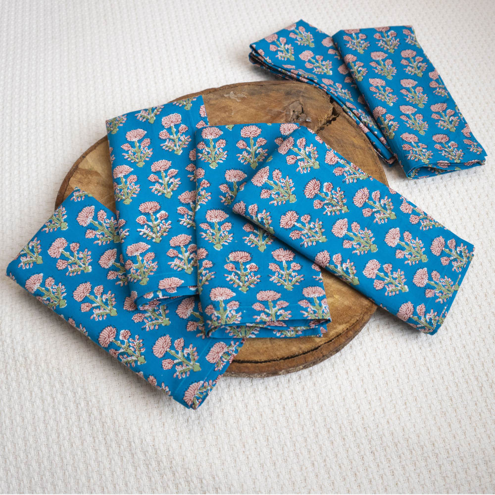
2 Responses to Option B
I like the layout of the napkins on B and that it doesn't show any extra accessories that the listing doesn't include
I like seeing the detail of the napkinds in use in B C and A
19 Responses to Option C
I like how option C shows the napkins styled - this helps me picture myself using the product.
these look the most neat to me and I like that I can see a preview of how they'd look when they are styled up
This is how I would set the napkins up on a formal table setting.
I lean towards the ones that show them in a less folded form so I can get a better idea of how big they are. The presentation in C is great because it shows them folded in a square and then smaller, and it also makes it look more appealing with the napkin rings as they might look in situ. Feels the most immersive and informative. Very appealing and stylish.
The diagonals in Options C, B, and A make them more interesting images than Options E and D.
C is presented the most attractively. A and B just look messy.
I am only compelled to reached for my first two choices, the 3rd and 4th are too messy and the 5th one is completely unappealing.
I actually am shopping in real life for these now so this poll is great! C - this best helps me see the size of the napkin, in relation to the rings. I also get a nice clear view of the print. A - photo strikes my interest, get some idea too of size in relation to flatware. E - seeing the brand is nice D - photo is okay, nothing special B - looks messy
I would click on these I like the way they look and how they stand out with the rings on them
I like how the image in Option C showed you the full napkin and it in a more formal setting. Napkins like these aren't everyday-use; they're for gatherings so I liked seeing it with a ring.
I am most drawn to option C because in this image napkins look relatable and more personal, I like that it shows how they can be arranged/folded.
I like to see the napkins folded and I chose images that best help me to imagine using the napkins.
I prefer option C. I like the view of the napkins in the ring with the ones flat in back of it. I like knowing their size and how they would look in a table placement.
I like to see them in the napkin rings because that is likely how I would use them, it gives me an idea of how they would look once bunched up.
I like seeing some of them with the prop that contrasts with the napkin.
I'd click on C. It shows how many come with the set and how it looks with a ring on. D is plain but okay. E is next. I don't care for A or B, the way the napkins are just thrown about in no kind of order.
My first choice would be option C where it is showing the gold napkin rings against the cloth. I think the gold is so pretty and makes me want the napkins.
i like seeing the napkins laid out and so i can visualize what they look like
i would click on the image in option c because the napkin rings make it look more appealing
4 Responses to Option D
D looks neatly laid out and very nice. I like that. It shows you the shape of the napkins and the amount you’re getting some of the other options are just too messy looking like C & B.
I like D because it is symetric. the other options except one look messy
I like Dee the most because of the simple stacked look of them all together like that.
I would click on D, I like that it shows all of the napkins without other objects to distract me. I already know the size of a napkin so I don't need the other objects in the image. C, B, A, are okay but having an extra object in the image could make people wonder if it comes with those extras. E doesn't look good, it reminds me of tissue paper the way it is displayed.
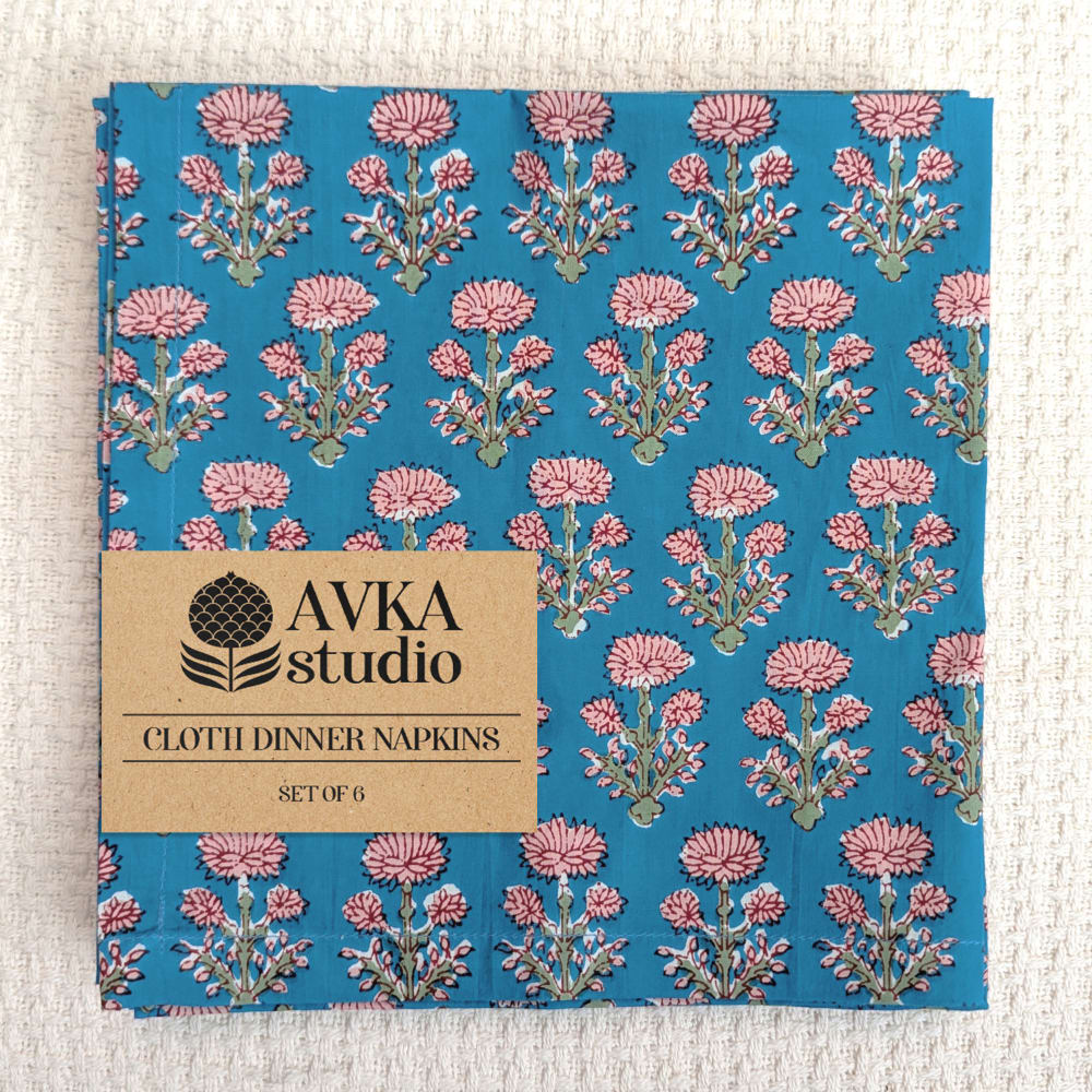
10 Responses to Option E
I selected option E because I love the design and the way the napkin is presented. I like the color combination and the pattern. Option E is also display neatly and professionally. I also like option D. I did not select options B,A or C because I don't like the way they are displayed.
e since I can see right away how many I actually will get
E looks the most organized and high end
I always like to see the packaging of the product. It hrlps me recognize it on the shelf in the store
I like the presentation of the product in Option E more than other options.
You can see the pattern better on this one. The image is more professional.
I like the ones that are better organized. I'd like to see what the product is in a simple stream lined way. I would rather see the product in its true form rather than manipulated.
the display is very nice in many of these. although, i find the label, telling me exactly what i am getting, far more compelling.
I would be most likely to click on Option E because the label is included in this image, which tells me useful information such as the brand name and quantity. Next, I would click on Option A because this image has the most appealing arrangement of the napkins with the gold fork/spoon adding aesthetic appeal.
I would click on Option E because I can be absolutely sure of have many napkins I am getting and because I can see what material they are made of.
Explore who answered your poll
Analyze your results with demographic reports.

