Poll results
Save to favorites
Add this poll to your saved list for easy reference.
If you were shopping on Amazon for Bible verse cards, which design would you be more likely to purchase for yourself or as a gift?
Option B won this Ranked poll with a final tally of 17 votes after 3 rounds of votes counting.
In a Ranked poll, respondents rank every option in order of preference. For example, when you test 6 options, each respondent orders their choices from first to sixth place.
PickFu requires a majority to win a Ranked poll. A majority winner differs from a plurality winner. A majority winner earns over 50% of the votes, whereas a plurality winner earns the most votes, regardless of winning percentage.
If an option does not earn a majority of votes, PickFu eliminates the option with the lowest number of votes. The votes from the eliminated option are reassigned based on each respondent’s next choice. This process continues in rounds until a majority winner emerges.
Scores reflect the percentage of total votes an option receives during the vote counting and indicate the relative preference of the respondents. If there is no majority winner, look to the scores to see how the options fared relative to one another.
| Option | Round 1 | Round 2 | Round 3 |
|---|---|---|---|
| B | 40% 12 votes | 43.33% 13 votes +1 | 56.67% 17 votes +4 |
| C | 26.67% 8 votes | 30% 9 votes +1 | 43.33% 13 votes +4 |
| D | 16.67% 5 votes | 26.67% 8 votes +3 | Eliminated 8 votes reassigned |
| A | 16.67% 5 votes | Eliminated 5 votes reassigned |
Age range
Education level
Gender identity
Household income range
Options
Racial or ethnic identity
Religious affiliation
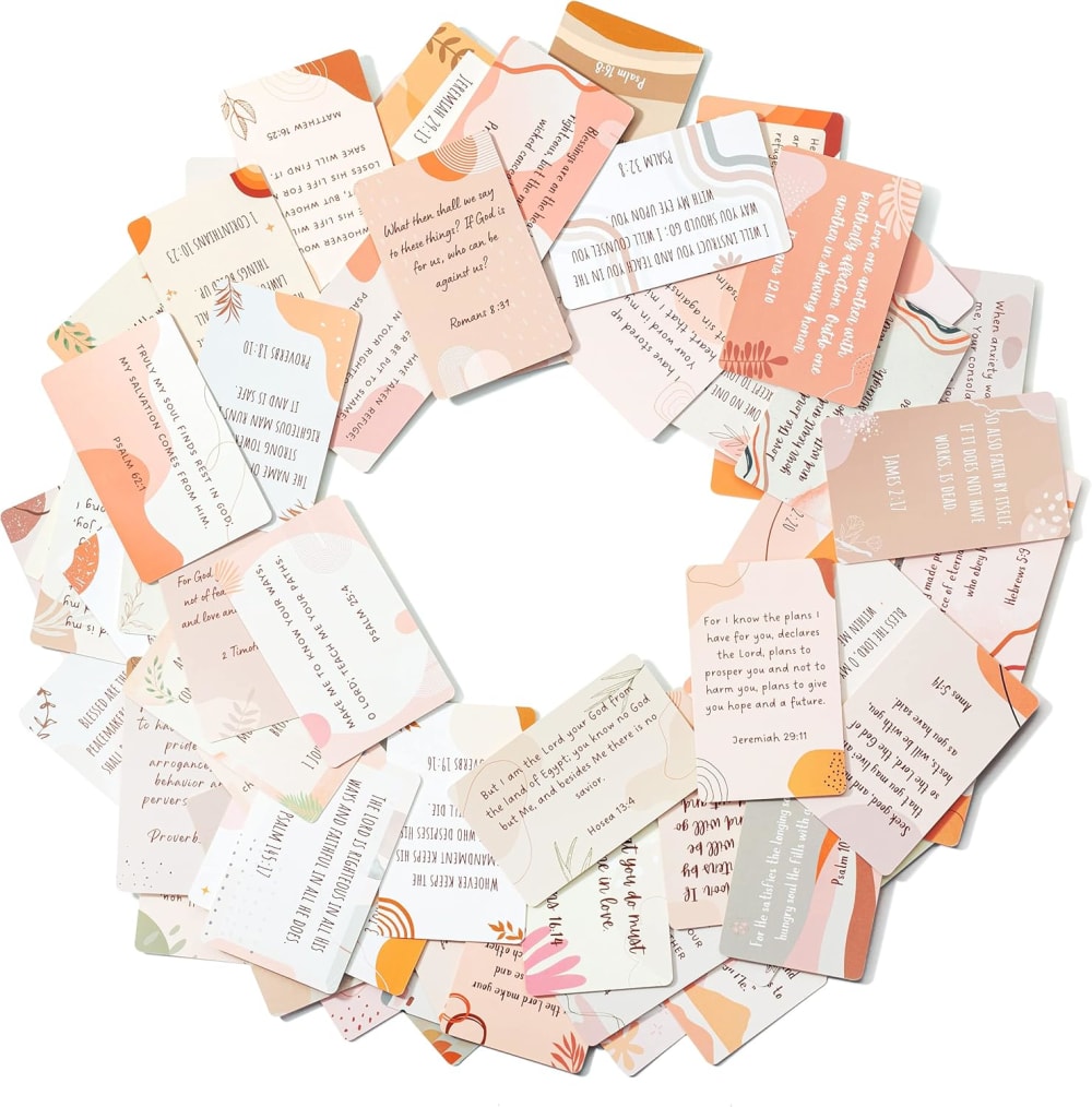
5 Responses to Option A
I like how my first choice is layer out but looks inviting. I also like the color of the cards. It’s soft inviting colors
I like the neutral and toned down colors especially from Option A with the light pinks and browns, same with Option D. I dont like the darker, harsher colors of B and C
For Bible verses, I prefer a more agnostic design in terms of color palette, such as A or D.
I like the pastel colors and varied designs of A best.
I'm not a big religious person , I do attend church . That being said , I like that each card is different design shapes , colors of choice A that I would look into these Bible verses first to give to a friend a gift to a friend . And then I would look into choice C second . I do like the outlying coloring of each card .
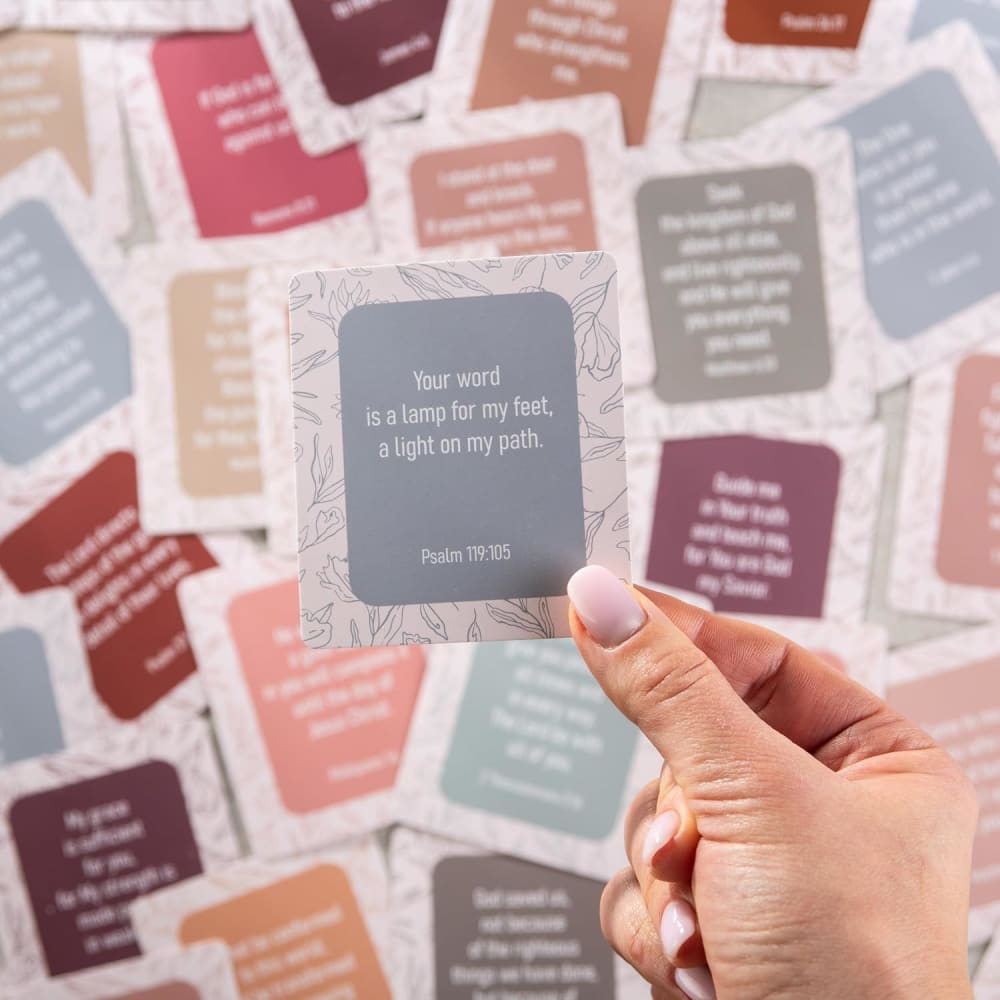
12 Responses to Option B
I prefer the ones that have a more simple overall design
I would be most likely to purchase option B for myself or as a gift for someone else because I think that it has the most interesting and most visually appealing Bible verse card designs out of the four options above.
I like the bold, vibrant and positive colors of these cards.
I like how the design is the same on every card but the color is different.
I like the design of them with the lighter edges and white font with with the pastel backgrounds.
I like how easy these are to read. The backgrounds of A are nice, but it's a bit busy and the fonts are difficult to read.
I like how colorful these cards are. They look kind of modern.
I think options B and D look the nicest. I like the designs of the cards and the chosen quotations in the photos.
The image on option B might look messy and uncategorized, but the aesthetics it represents is very nice. The other options presented are also very nice and calming. But the soothing aesthetics in the uncategorized mess in option B is just different. I like the way it is presented and it will be my favorite among these.
I went for the ones that I thought would be the easiest to quickly. choice D has a lot of text and the text is close in color to the background.
I prefer B because the cards look the simplest and easiest to read. I would buy them.
I like the way these ones are made because I like the soft, colorful backgroundsI like the way these ones are made because I like the soft, colorful backgrounds and that they’re easy to read in this picture as well.
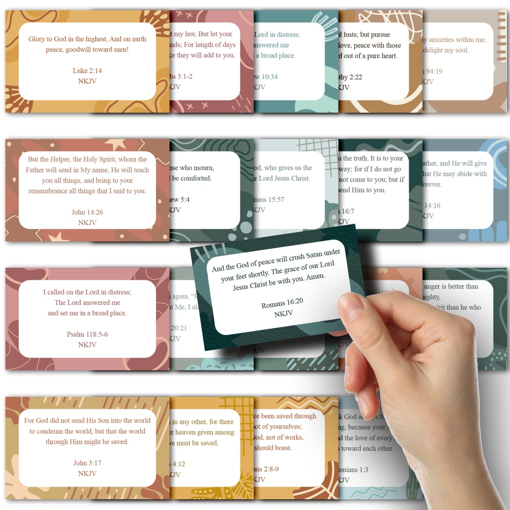
8 Responses to Option C
The portrait style is easier to read and having the cards all stacked neatly in the background looks more professional
I like the design the best. I like the somewhat darker colors that go around the border. They really stick out and make the white box easy to read
The first option is more organized and shows what is coming in the package. The same is true for the 2nd option. the 3rd option only shows 1 verse which i wouldn't like because what do the other ones say? The last one just looks too random and unappealing
I like the colors in choice C. The unique patterns on the borders make the cards look interesting.
I like the colors and overall styling of C and B the most, but C ranks higher because it's easier to read.
I picked option C because I like the bible card's different colored variety and how they are presented in a more organized fashion.
C looks the best and most organized for this and I think organization is a key tool here
These designs have a bit more color and still are easy to read since the text is on a white background in the center of each card
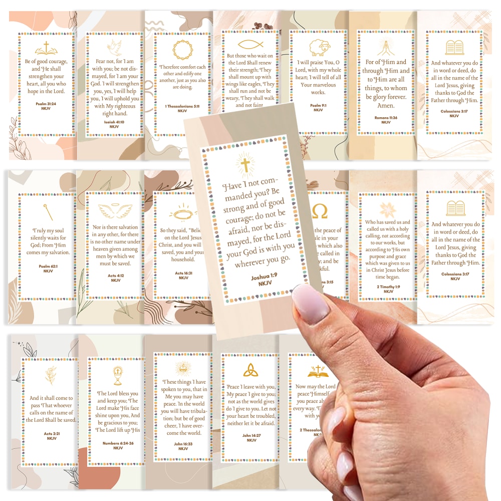
5 Responses to Option D
I would buy option D because of the symbols on the cards. I think they make you think of God as you read the verses.
The first one I chose appear to be classic and just what I need.
OPTION D HAS BEAUTIFULLY DESIGNED CARDS THAT MAKE ME WANT TO READ THEM. I APPRECIATE THE VERSES WRITTEN OUT ON CARDS THIS WAY. THE DESIGN OF THE CARDS IS MOST APPROPRIATE AND THE CROSS ON THE TOP OF THE CARDS IS SIGNIFICANT AND BEAUTIFULLY PLACED.
I like the orientation and color scheme for option D. This is the kind of product I would most expect to see for bible verse cards. I didn't like the cards with the horizontal orientation as much.
My pick would be the option D as the detailing and the design of the product is very classy and it is giving a spiritual and premium vibes . Then i chose the other options as per my choices .
Explore who answered your poll
Analyze your results with demographic reports.

