Poll results
Save to favorites
Add this poll to your saved list for easy reference.
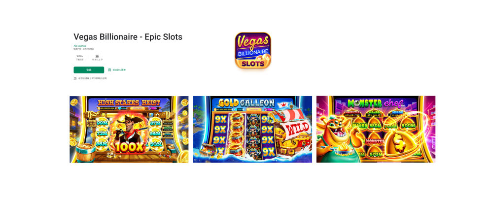
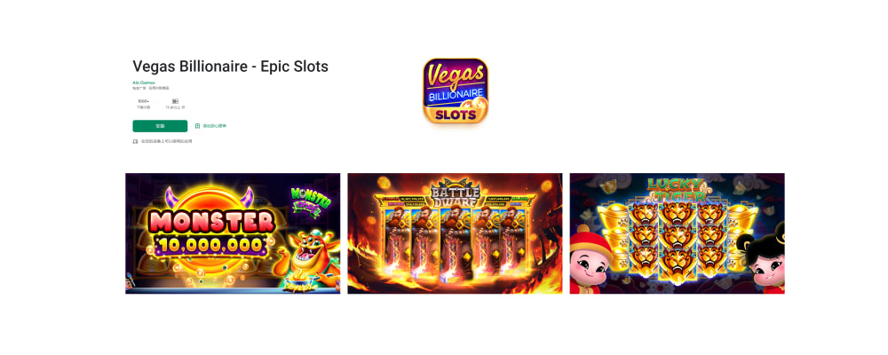
Which screenshot most entices you to download this app? This is a mobile social casino game , players can enjoy awesome slots and free casino games with all the bonuses they can think of.
Age range
Casino game player
Education level
Gender identity
Household income range
Options
Personal income range
Racial or ethnic identity
60 Responses to Option A
its a little more colorful the fire is not that enticing
Little things removed would be better if playing silly slots.
I would pick option A, mainly because I prefer the theme of the games, especially the western one, High Stakes Heist
The colors and images seem more exciting and involved pulling you in.
This is a better screenshot for an exciting mobile casino game because the graphics are more interesting and engaging and the colors are much more vibrant when compared to the other choice. The characters in the other choice look rather silly.
This one shows more of the actual slot games then other screenshots, making it more appealing.
The images on A make it seem that each game has numerous opportunities to win.
A is more clear and attractive. B is to flashy and tacky. It distracts from the information
The bright colors catches my attention more
the cowboy looks more intriguing and the 100 x bonus is good
A gives an impression of being able to win a lot if coin. B seems very typical and common.
I feel showing more examples of slots gets me more interested in playing the game. I like the look of the slots in A better and I like the fact that it looks like I can win bigger wins in A as well.
I would download Option A. These designs are more energetic and I feel as though I would have more fun at these games.
The other option is too dark and depressing for me.
It's brighter and looks more fun.
Both screenshots are good here. I like the Vegas Billionaire version more. This is more fun and looks more colorful. But both are very nice here.
I like the colors over the black.
A is colorful, engaging, detailed and eye catching.
Between the two different options, I decided to go with option A. I thought that the amazingly colorful backgrounds were very attractive. I loved the bright pink colors as well as the blue colors too and I thought that they really stood out. When comparing them with option B, I found the latter to be kind of dull and not really special. Option A had a lot going on and with a video game or application, I actually do not crave simplicity at all. I really enjoy how busy everything looked with option A and just all of the words on the screen as well.
This one reminds me of a slot machine that I saw in Vegas. It brings back fond memories
I liked the big bold design better than the other one, which seemed much more small. I think its important to have things look bold.
I like the graphics on this one... it seems more adult like for a casino based app.
I like the mix of games on A. I don't care for the kid characters on B
Definitely A. The screen shots look more fun and with more possibilities to win
Both have the same appeal but "A" does look slightly better.
A just looks to be more fun. It is brighter and more cartoonish looking. Seems more enjoyable.
That looks really cool! I love the monsters, graphics, and effects.
I'd play both games, but chose A over B since I don't condone children (even their pictures) in a game. I do however like the Battle Dwarf in B over the gold Galleon in A. I guess I would be happy with either with the exception of the children's images in B.
I chose (A), because the slots looked like they would be fun to try, and maybe even win big.
Option A seems more appealing mainly due to the characters depicted within the games. The character details in Option A look more "adult" unlike Option B. Option B's characters look more juvenile in their caricature depiction of people or monsters. The variation in colors in Option A is also more appealing since there are more vivid and different colors to catch the eye. The backgrounds in Option B are all essentially dark.
Option A strikes me as more diverse and "adult"-themed than option B. The Western themes of A ("Gold Galleon," e.g.) are more appealing to me as well.
I feel like A shows more movement and action, more excitement and involvement. I would be excited to see what happens during gameplay.
I prefer the three games on A. High stakes heist looks fun. B’s Battle Dwarf is kind of offensive.
I chose A because I like the brighter colors in the screenshot. B looks evil.
The one I like appears to offer more variety, I like the pirate, it feels like there is more action too and creativity. Overall, visually more appealing, as well.
I like A better because it does a better job at showing the jackpots that can be won, which in my view is more enticing and interesting to the casual player.
I like that I can see the game and how it works. It showcases more to me than what isn't on there.
Seeing the numbers makes me more enticed to hopefully win. Much more realistic of what I’m hoping to gain while playing this app
A is brighter and catches the eye faster. Nice look and design. Modern and fun
I like the look of option A. The pictures are more enticing to me then the other set
With Option A the graphics are better and more enticing.
A appears to show all the actual game play, where as B shows an image that appears to be one of the endless "bonus" popups that plague all casino games. I have a poker game that is constantly throwing promotions up in my face, often asking for money, rather than just letting me play the game. Its bad enough in a game I'm already playing, but I'm already committed so I plow through. If I saw it coming in advance I would never download the program to begin with.
Option A. This option is more dynamic and visually appealing and would make slot players down load it and play
Choice A seems more inviting and fun to play. When I choose games to play, I tend to go for the ones that are cartoonish.
it looks more real and enticing , captivating to users and has a well designed diagrams.
The coloring, especially the background, is more exciting
The colors mesh very well in this image.
A attracts me more because its colorful and very bright
Better visual as it shows that the slots are more complicated than the typical three line slot machine. It would hold my interest more then choice b.
between the two choices which while there are some differences I decided to choose A because of the two I find that it just looks better and more fun
i like this choice the best. it looks like a fun lottery game that i would love to play
A is more colorful than B and catches my eye sooner. The more colors the more fun it looks.
The games in Option A jumped out at me right away. They look like the types of games that I would be most likely to play when I’m in a casino.
Because it shows a lot of excitement and very inviting
This option looks action pack and it is something I would prefer to try. I enjoy the bright lights and color design. It makes it more interactive and addictive.
Just based off visuals I like A's look a little better, mainly based on the different slot games (heist/gold/monster). I like that A shows the different multipliers as well(100x etc). B just shows a full screen of which I know I'd never actually hit or win.
I like the graphics more in Option A as it is brighter and happier. Option B is darker and drab
I chose A because I got more screenshots of the actual game play. B doesn't really tell me much about the slots.
Because it has alot of variety of casino games balls so it not hard for the costomers to chose.
This choice looks more appealing to me than the other option. I prefer the imagery in this choice.
40 Responses to Option B
I prefer the darker color schemes because it puts me more deeply into a casino type type of environment, I love dark casinos
I think option B is way better because I love the graphics on this one better. I really like that it has fire or flames engulfing the slot machine. I think this is really a cool look.
Option b enticed me to download the game because the screenshots were more bold and they grabbed my attention before I looked at option a
This one has sharper/better graphics. I feel like it is less like other slot games/ more upscale looking.
I like seeing the Number 1 award or winnings in slots and choice B shows that.
I picked B because it looks more like real slot machines
The black background makes me think most of Las Vegas and the strip while the other one seems a bit immature and cartoonish.
I like option B better because the word Monster stands out the most and grabs my attention.
I chose option B because of the fire in the middle panel. It made me think of Vegas more than option A.
The excitement of the casino's. Slot machines are so exciting.This app would make you feel like your in VegasThe whole family can enjoy this app
The darker background on B makes me think this is high quality. Since the visuals are deep and intricate, I would expect the games to be high quality and a lot of fun. It seems A would have glitches and not work as well. A has too much going on in the thumbprints which would probably end up crashing my computers.
What I like most about B is that it's a dark theme, and it really captures the Vegas night life aesthetic, plus the gold really pops off of the black backgrounds.
THIS OPTION LOOKS LIKE A LOT OF FUN AND LOOKS LIKE SOMETHING I WOULD ENJOY PLAYING. I ALSO LIKE THAT IT SHOWS HOW MUCH YOU CAN WIN
I like the interactive photos of some of the games you can play in this app.
Seems less noisy, cleaner
Both options appear to have over the top graphics which really doesn't appeal to me.Option B is slightly less over the top vs. A
Better quality and look
I like dark colors so my eye is drawn there first it is easy to see right away
The addition of the two people in the third screen shot makes the experience feel social. I want to have company when playing slots.
Less busy - more clear to see the game. Just overall looks well planned.
I find that B is a little easier on the eye. The "Monster" print is larger and having a colored square in the middle of two black squares makes it more cohesive. Option A is a little all over the place visually. MY eye doesn't really know where to look since all the colors are different and there is a lot of images, words and numbers.
This was a tough choice for me as both sets of pictures are really great. I did chose option B however due to the slightly more friendly appearance of the games and characters. I also feel like the darker background makes the pictures easier to see and makes them appear les "busy" than the other option. They just stand out more as being a strong, well made, app.
I'm really not sure, choice B just appealed to me more.
Choice B is more compelling to me - I prefer the fantasy or Asian slot themes to the cartoony Wild West and Pirate themes. I also prefer the darker backgrounds behind the games in Choice B to the bright pastels of Choice A. Overall, I find Choice B easier to understand and grasp at a glance.
I like the dark backgrounds in Option B, it really makes the graphics pop a lot more. Additionally, Option A is very busy looking and it’s difficult to pick out individual elements at the smaller size, it all blends together into visual noise.
The fire or glow animation makes B look more exciting.
I did not like the monster chef picture in A, it was overwhelming and I don't like the pan with the attached fire. The cowboy was also very unappealing to me. The monster chef was tolerable in B, the dwarves are powerful. The kids are too cute.
I prefer the games that have vertical slots. Whether it is my imagination or not they just seem to pay with more frequency. Also it is more suspenseful because the last winner symbol seems to drop in slower and when it hits it is more rewarding to the brain than just the horizontal slots that fly around so fast and always seem to be duds and it fly right away into the next spin.
The wording of the various games caught my attention immediately. The word Monster told me this would be a gigantic playing game.
i feel like option b is the best looking option.
Thé promotional shots are less tacky and more classy than the other offering.
I like the black background of option B. Both of these are fine, but option B just stands out more. I would be playing on my phone and it sort of centers the game a bit more with the black. I would like that one.
The colors are vivid and the graphics are detailed well. Looks very active and engaging.
I prefer option B because the fire on the image reminds me of slots and makes me think I will win big. I do like the pirate game in option A and would be interested in playing.
I chose option B as my choice for the screenshot because I liked the color scheme and the flow of the images.
I like both but B has more variety. On A all three of the images are of the reels. B the slots look more different and I like the monster screen with the total win.
The image looks more lively and active
I picked option B because I like the way it kind of looks like fire in a couple of the slot games, like the games would be hot and you would win a lot of money.
I like the darker colors. Reminds me of a real casino. I like the darkness that kind of sucks you into the game.
I think the darker background makes the images more vibrant and easier to evaluate as a choice.
Explore who answered your poll
Analyze your results with demographic reports.
Demographics
Sorry, AI highlights are currently only available for polls created after February 28th.
We're working hard to bring AI to more polls, please check back soon.

