Poll results
Save to favorites
Add this poll to your saved list for easy reference.
Which screen for this routine building app do you prefer?
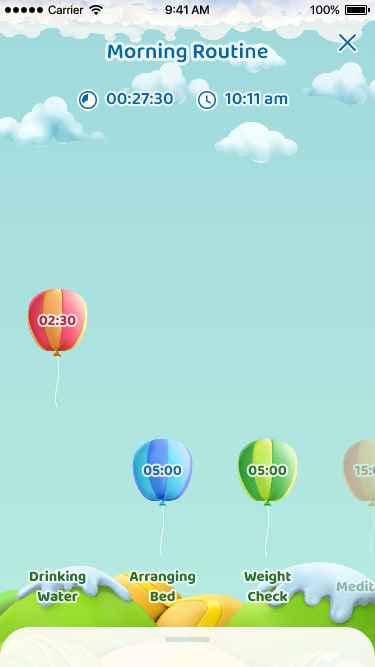
35 Responses to Option A
I like that on this one you can see what the next step coming up is, which you can't on the other one.
I think it's better to have a further view that shows more of the categories at the same time.
I like seeing the bigger picture. To me it is helpful to see my goal in the context of more goals. Makes me feel motivated and like I have a game plan.
i like being able to see all the timers it feels more complete and it allows me to plan better
A nice open layout that is easily understandable and has a cute design.
Prefer option A since you can see the other tasks in one screen.
This option features more information about the app then the other making it more desirable. It also has a better layout, graphics, and broader color scheme that make it more likeable
It looks the most colorful and user friendly. I also like that it shows different goals at different times of the day all on one screen.
I prefer option A because it allows me to see a full snapshot of my morning so I can plan for upcoming events in my routine.
I liked choice A since it is descriptive and easy to understand. Choice B is too simplified and doesn't make it easy to understand.
much prefer this one and seeing what comes next and have an idea what remains for the day
I pick A in this because I love that it shows what you are on now but also what the future has in store and can somewhat plan your time knowing what’s to come.
I prefer being able to see multiple balloons that indicate more than feature of my routine. I'd rather see a holistic overview than obligations in isolation.
I like option A the best because I like how each balloon is associated with a different task.
I like seeing the full day picture of A over the single event of B.
I always prefer seeing more information on the screen at once, rather than making me swipe around in order to get the complete picture;
I don't like the size of the balloon in option B at all. I like looking at the different colors of balloons in option A
I think I would prefer Option A to see the other tasks spread out. It's not as "in your face" as the other option.
A is much more engaging and interactive.
I feel like the one big balloon is too much.
I prefer A because you get a wider perspective, greater view of your options.
I prefer the short view of upcoming events at one glance. I don't need the main task to take up the entire screen. Option A provides a clear distinction as to which is the active task, and knowing what will be coming up soon gives me more opportunities to stay on target.
I like that there is more than one activity shown and that there is more than one balloon to indicate how far along I am. It lets me know what I need to do without having to scroll or swipe.
It seems like in option A it would give you a better overall picture of your day. It's possible for people who get overwhelmed easily, it would be better to focus on just one task at a time, and therefore option B would be better for those people. Maybe you should let people choose based on what motivates them most.
I like how you can see the count timers for the things that I have planned for the day. Great way to display and screen layout.
I like that it allows me to look ahead a bit at what is coming up next.
The screen design in A shows much more information comparing to the one in B. I have a way to check multiple events in a single screen. It is more preferred.
I prefer the smaller icons that show more of the schedule.
The options and day planning are laid out in a more organized manner.
i think it shows the goals better and how much you have to attain and how much you have done.
I like A more because you can see what is coming up later in the day, instead of just one thing
it looks neat and tidy and very organized in this fashion - I like how its laid out as well.
I prefer option A because it shows multiple routines that someone might be working on
In Option A, you can see down the timeline of what it is to come. Option B is more claustrophobic in that regard, and the single big balloon is not very easy on the eyes.
Since this is a routine to follow, I would rather be able to see the tasks that lie ahead like in A.
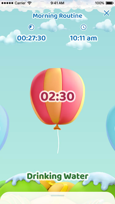
15 Responses to Option B
I prefer Option B because I like to focus on one thing at a time. With this home screen, you can focus on just the one task and it shows you how much time you have left, etc. I like that more than seeing all the other tasks and the times at the bottom in Option A.
I like the enlarged view. It's easier to see and the graphics look more dynamic. I would prefer this image because it's easier to read as well.
I would pick option "B". The screen looks unique and appealing. The screen looks simple and easy to understand.
Larger text, easier to read.
I like a bigger presentation object that I am working on. A menu is fine being small but I want the object I am working on front and center.
B puts the routine in question right in your face so your less likely to forget or overlook it
The bigger air balloon looks a lot better than the design in A.
I feel like the other option looks a little overwhelming. This seems more friendly to the user.
prefer the picture
The balloon is much larger and more prominent, and thus catches my eye more immediately. I like that the text is larger too.
I prefer this one so that I can concentrate on one thing at a time and that way it is easy for me to focus.
I think this artwork is a lot more pleasing
With the task and time being so enlarged that only one appears at a time, I don't feel overwhelmed by what is coming next. I feel like I can takes things one step at a time, and not worry about what I have to do afterwards making it feel achievable.
I prefer option B because I liked the larger size of the icon and the text indicating the time and the task. I can easily swipe to see the next balloon icon so there is no need to make the icons and text smaller to fit all of them onto the screen at once like in option A, which makes that screen more busy and harder to parse.
I liked the color in B more. I thought it was more interesting and useful to look at.
Explore who answered your poll
Analyze your results with demographic reports.
Demographics
Sorry, AI highlights are currently only available for polls created after February 28th.
We're working hard to bring AI to more polls, please check back soon.

