Poll results
Save to favorites
Add this poll to your saved list for easy reference.
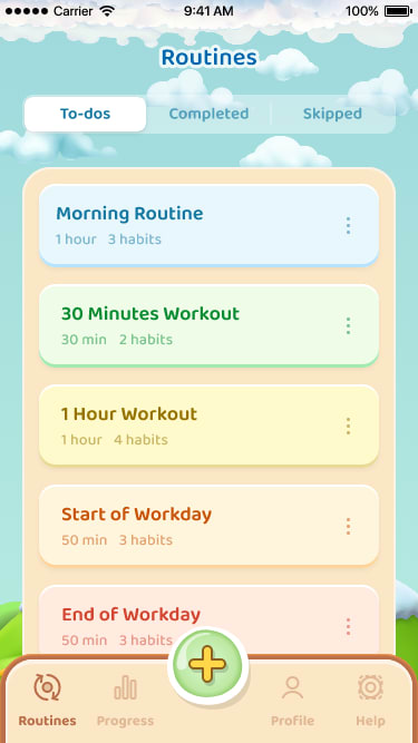
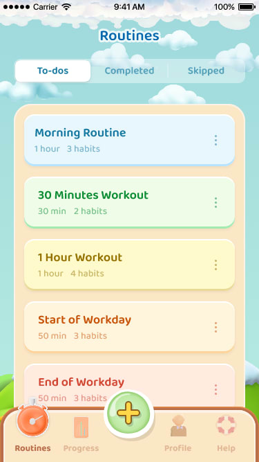
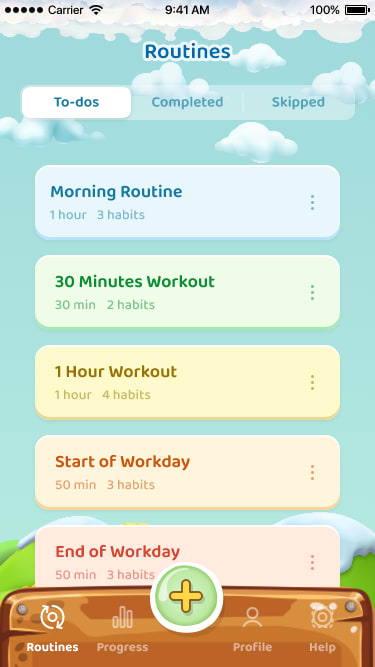
Which screen do you prefer?


Option C won this Ranked poll with a final tally of 28 votes after 1 round of vote counting.
In a Ranked poll, respondents rank every option in order of preference. For example, when you test 6 options, each respondent orders their choices from first to sixth place.
PickFu requires a majority to win a Ranked poll. A majority winner differs from a plurality winner. A majority winner earns over 50% of the votes, whereas a plurality winner earns the most votes, regardless of winning percentage.
If an option does not earn a majority of votes, PickFu eliminates the option with the lowest number of votes. The votes from the eliminated option are reassigned based on each respondent’s next choice. This process continues in rounds until a majority winner emerges.
Scores reflect the percentage of total votes an option receives during the vote counting and indicate the relative preference of the respondents. If there is no majority winner, look to the scores to see how the options fared relative to one another.
| Option | Round 1 |
|---|---|
| C | 56% 28 votes |
| A | 24% 12 votes |
| B | 20% 10 votes |
Age range
App store spending habits
Education level
Gender identity
Options
Personal income range
Racial or ethnic identity
12 Responses to Option A
Ranked by what I think to be more seamless color schemes.
I ranked the interface design of the mobile app that I liked the most. I liked the design of option A the most because of the simplicity of it. I then liked that option B is less complicated looking than the interface design of option C.
The top of the app is key so the bottom portion is least important. I want something that doesn’t take away from that like B does which is why it’s last. We’re left with A and C and A is better because I like that color better
I can't help but think that when I first wake up for the day and review this, I'd favor something with more pastel, subtle colors and graphics. Option A achieves this without being too bland either. Option B is a close second. Option C is somewhat too detailed for my liking. My thinking is that thinking about lists and/or routines can get stressful, so a calming color scheme is the best way to keep on track without making it overstimulating.
In order of how easy it is to read based on the color scheme
I really enjoyed A because it was the most clean looking and the least distracting of the group. Option B was also good, no real issues. Option C was cute but it maybe wasn't as clean as there was a slightly distracting background rather than a solid color.
I prefer A because it's the most basic and easy to understand. B is ok but a little more complicated. I think C is too rustic looking.
Option A is the best because I like the color of the menu on the bottom and the minimalist style of the icons. Option B has my preferred color for the bottom menu, but I don't like the style of the icons. Option C has a wood style/color menu which I think doesn't fit with the overall aesthetic of the app.
I dont like the brown bottom menu at all but I think the lighter one without the clock symbol for routines was good
The majority of the interface is fairly simple and clean, and so I prefer the icons that are simple and clean. I selected Option A because it seems to match the rest of the interface better than Option C. The dark background color in Option C seems to be too much of a contrast. The icons used in Option B are bolder but I think they detract from what is essentially a minimalist presentation.
A is the cleanest and best looking design. B is basically the same as A but with a little extra. C is just weird in the context of the rest of the app design.
A and C have a prettier color palette. I like the icons in the navigation bar better in A and C because they are more indicative.
10 Responses to Option B
I prefer these screens for the most part in terms of design and appearance
I like A's overall with the bright orange Routines. A is a close second but C is last as the theme of a plank is hard to read and poorly designed/
I think it needs that backdrop and i like the icons of B better than A. I do like Cs bottom bar though. I would combine it with B but keep Bs icons instead
I like option B the best as I like the bottom button area to have the lighter background but I also like that in option B it makes it more obvious and clear that I am on the routines page of the tabs.
B is the most appealing to me, I like the submenu on the bottom, I like the tan color
My top choice was option B, I liked the little routine icon and the light color palette matches well with the rest of the design. Option B, I ranked second due to the routine icon being not as large and the other icons being not as cute. Option C, I ranked last because I'm not a fan of the darker color of the bottom part, it doesn't really match the overall look of the screen.
the fonts and image icons look more animated and fun on B and A
I chose option B because the layout is very appealing and the color scheme and buttons of the bottom layout is appealing.
Make it more obvious which screen you're on
Option B is the easiest to read and see the items you want to focus on
28 Responses to Option C
The brown color helps delineate from the rest of the screen.
The no background label and this bottom wood pattern look cool. I like the icons in choice B
i think option c is the most natural looking and interesting options
I like the easier to read ones with all the options available on the bottom
They all look really nice. I like C the best due to the fact you can see the back ground between the task.
I like the clean look of Option C the best! It looks pretty and it doesn't distract at all. It's perfect.
I really like the design of C. Beyond that, I don't think that the additional card behind the tabs doesn't really add anything. With C, each individual entry really stands out on it's own. "Start of Workday" looks like it is separate from "End of Workday." or the workout entry. With the extra card behind it, it all just blends together, so I do prefer it without the card.
I think the darker brown creates a bette contrast and highlights the actual screen.
I would rather pick C because I can see everything the game offers.
I like the darker orange. It looks the best. It stands out the most to me. I like the layout.
I like see better because of the bottom of the screen
I like the unframed choices in Option C. I rather like the background and want to see more of it.
Not having the background on the sections and the wood looking panel both look more soothing and pleasing, I can't say the icon for routine on the other two makes much difference either way.
I like the contrast of green background with each section in front better on C, I also like the darker bottom. B is better because I like the icons on the bottom are more readable.
I like the screen that has each block separated completely
The think the lack of the orange background in Option C looks best compared to the other options.
I like choice C. I like that it doesn't have the beige element in the background. It's just clouds. More seem less and streamlined.
I picked C as my top choice as it looks very attractive and looks clean for me.
I like C the best. I like the dark wood look best.
I prefer C because it has a nice background and more unique features.
I generally prefer darker colors in my apps, and option C fits that category best. My preference isn't terribly strong, though--these were all pretty similar. I like the way the "Routine" tab in option B sticks out a bit more than it does in option A, implying that THAT is the tab that I'm currently viewing.
I like Choice C, then A, and finally B. Obviously, they are all very similar and the color schemes are heavy on the pastels. I do not prefer pastel-like colors, so I went with the one design that had more solid colors. More solid and distinct colors help me organize my thoughts and busy days. Distinct colors help clarify different tasks throughout the work day, and Choice C does this the best. I thought Choice A was next followed by Choice B.
I love the wood grained option menu of choice C. The buttons of choice C look better against the blue background. I dislike the tan background of the buttons in A and B. A has better option button icons that fit the theme better than B. B I dislike the orange icon for routines. C is my clear favorite with A being a peg down.
C is the screen of choice because the darker hues are easier to decipher.
I believe the difference in color scheme between the menu bar and the rest of the app within choice C makes it the best option, The lack of the highlighted icon gives a better understanding within Choice A over choice B.
The boxes separate and open is just more pleasing to my eye.
I prefer option C because I think it's more creative. I like the colors of it. I like how at the bottom, the bar stands out. The others are a little plain for me.
More color and contrast looks better to me. I also prefer the icons at the bottom in my top two choices.
Explore who answered your poll
Analyze your results with demographic reports.
Demographics
Sorry, AI highlights are currently only available for polls created after February 28th.
We're working hard to bring AI to more polls, please check back soon.

