Poll results
Save to favorites
Add this poll to your saved list for easy reference.
Which of these PC Game Cover banner would make you click and take a look at the game?
Option C won this Ranked poll with a final tally of 30 votes after 3 rounds of votes counting.
In a Ranked poll, respondents rank every option in order of preference. For example, when you test 6 options, each respondent orders their choices from first to sixth place.
PickFu requires a majority to win a Ranked poll. A majority winner differs from a plurality winner. A majority winner earns over 50% of the votes, whereas a plurality winner earns the most votes, regardless of winning percentage.
If an option does not earn a majority of votes, PickFu eliminates the option with the lowest number of votes. The votes from the eliminated option are reassigned based on each respondent’s next choice. This process continues in rounds until a majority winner emerges.
Scores reflect the percentage of total votes an option receives during the vote counting and indicate the relative preference of the respondents. If there is no majority winner, look to the scores to see how the options fared relative to one another.
| Option | Round 1 | Round 2 | Round 3 |
|---|---|---|---|
| C | 26% 13 votes | 34% 17 votes +4 | 60% 30 votes +13 |
| A | 26% 13 votes | 36% 18 votes +5 | 40% 20 votes +2 |
| B | 24% 12 votes | 30% 15 votes +3 | Eliminated 15 votes reassigned |
| D | 24% 12 votes | Eliminated 12 votes reassigned |
Age range
Education level
Gender identity
Mobile gaming habits
Options
Personal income range
Racial or ethnic identity
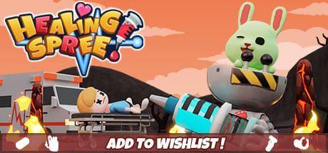
13 Responses to Option A
I strongly prefer the darker colors in the first choice it looks more rich and catches my eye immediately, the more pastel washed out colors of the last three choices I do not like at all.
Option A is the most eye catching and appealing to me due to the background color.
the darker color of the background helps make it seem a little bit easier to look at in my opinion
I picked A because of the bunny in the spaceship. Although, all four options looks fun.
A and D are eye catching. The animalin the machine looks fun and crazy.
I think the background in Option A would definitely catch my attention first because there's a lot going on and is also very stimulating. The entire image is interesting yet confusing which would prompt me to click on it and find out more about what kind of game it is.
I liked the ones with the cute animals the best, especially the one with the apocalyptic background. It makes me think this is a fun and demented game. My least favorite ones had a girl in a bra. What does that have to do with anything? Is this "that" kind of game?
I like the red background in A and that is my first choice. I chose B over C because I preferred the bed in the cover banner for B. D was last because it had the most boring look in my opinion.
The colors in my first choice stick out the most and catchy my eye, which makes me more likely to click on it.
O don't think a hospital setting would be all that fun
My first two options look really cute. I think that the last two look a little bit dark, and although they are a little bit goofy, it just seems not well designed on the last 2
A was first especially because of the fire, it caught my attention. D was second because I like the extra detail like the building and the pill on the building. C was third because it was kind of like D but less attention grabbing. B was last because the girl looks better closer on the stretcher.
I chose A first because I like the background color in this option the most. I also chose it because I like the green bunny looking character. I chose D next because I like the green bunny character in the front of the image more than the girl with the blue hair. I think the girl with the blue hair looks creepy the way she is winking and that's why I chose the images with her in them last. I picked B over C because I like the colors that are used better.
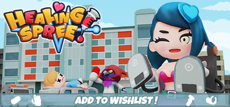
12 Responses to Option B
i like the cover on option B the most of these
Option B is the most compelling to me because the main character is larger and sexier so it is more compelling.
I liked the images with the colorful hospital in the background the most because I like the colors and the creativity of the building (especially the pill sign). But, I really like seeing the human character the most because I feel I would enjoy playing the game more.
I picked B and C as my top choices as the girl on the front makes the game look very attractive and I want to know more about it.
The woman looks more intriguing than the creature on the cover
i like how choice b is the biggest and most eye catching
I like the girl with the paddles as in option B and C. She looks fun.
The images with the doctor/nurse in the foreground do a better job of suggesting what the game might be about, so I put those two first. I ranked A last because it has a less attractive color scheme.
I like the city setting the best with the blue haired girl, kind of a bizarre looking game.
The person is more relatable to me than the rabbit figure. Also, having a closeup of the character, with the chaos in the background, has me focus more on the main character, and due to being able to check them out better, I can more easily make a decision if I'd like this game or not
as a woman, i immediately identified with the female cartoon character, felt like the woman that is more up front is really pulling my eyes and would definitely make the most sense for me to click to play
I prefer the images with the actual human like character vs the bunny
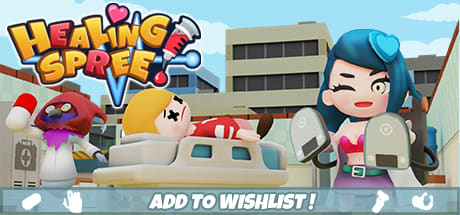
13 Responses to Option C
I like the colors used and design on this one. It stands out among the options
Option C seems more exciting and features a female character in the cover page. The dead person on the stretcher is more noticeable which also emphasizes arousal and excitement on the game's overall purpose.
I found the evil pill holding guy in the choice c to be the one that really got my attention. He is also in choice b but hard to see him. In choice c the paitient is also far easier to see giving me a more clear idea as to the game. I find the colors to be better in blue. The sky lookg more real than in choice a. The bunny in choice d is for sure my second favorite character
I like actual people as characters therefore I choose C and B first with C being more of representation of the game. Then D and B
I prefer the options where the color scheme of the banner ad make it easier to see all of the features. My least favorite choice is a little hard to see everything.
C is the most intriguing image because I like how it shows the main character and the person in the bed fairly equal in size so I can get a better idea of what the game is about.
It is hard to know what is going on here without context. It appears to be a medical theme video game. I think C and B convey this most clearly. The girl with the shock paddles made me think medial. I prefer C because the patient is more prominent. The bunny in the hovercraft in D and A seemed completely unrelated and did not suggest a medical themed game to me
Seeing the girl with the paddles is the most interesting.
For A I really dislike that shade of red in a medical setting, it suggests the healing is not genuine. For B I dislike the image because it feels out of balance. D is a nice image, I like the colors and it is well balanced, I don't love the fish doctor dude. I like option C the best, it is balanced well and the colors fit nicely.
This looks incredibly weird, like some sort of deranged doctor game. It does not look like something I would choose to click on. But, if I had to choose I"d choose the female human doctor rather than the animal.
I would be most attracted to clicking on the banner in option C. The female nurse character fits a game named "Healing Spree" well. I like how it shows a patient in critical condition in the forefront next to the nurse.
I definitely prefer the banners with the woman as opposed to the rabbit/animal. I find it to be a more appealing character. I think C is the best out of all the options as it's not as visually "busy" as the others.
The female character and the lighter color makes it more appealing followed by the female character and darker color. They make the game seem dynamic.
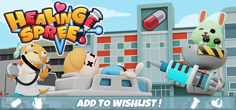
12 Responses to Option D
I like that choice D is well perceived with great level of animations.
The red background is honestly scary versus the lighter backgrounds
Well I definitely wouldn't choose Options B or C because I don't really see the need to have a "nurse" in a bikini top in the banner. Option D would be my first choice because you can see the most medical detail in the picture.
I would pick D first because the bunny character is cute and the background looks interesting. A is second because it also has the bunny character, although the background is more barren and thus less interesting. C is third because I like that the background characters are closers in the image than B.
Option D sense to fit best with the Healing Spree hanger idea. Looks cool that way. Seems to be a great game with a twist on the idea there.
The bunny in the upper right corner is very cute
It appears as if the nurse is scantily clad in Options B and C, which puts me off to be honest. I prefer Options D and A because the characters are very unique and make me want to know more about what's going on.
my #1 i think that you can actually see what's going on in the scene best as the others are harder to tell. although i do like the coloring of my number 3 most. the reason i put it #3 is because it's got so much going on it's rather confusing.
Looks like a nurse so seeing the hospital in the background makes sense. The one with no hospital still has an ambulance in the picture so the hills in the background don't make sense.
I LIKE THE BUNNY IN OPTION D AND A BETTER THAN THE GIRL IN OPTION C AND B
These all look more like mobile games, but I ranked them from how much I would want to play them from 1 to 4.
Choice D is my top pick because I like how the hospital in the background has the giant pill logo to add to the silliness. It fits in well with the rabbit controlling the giant injector machine and the fish doctor. I also like how the cart and patient are bigger and in the front center. Choice C was second for me because I liked how it's layout was done better compared to Choice B. I liked how the masked bird holding the pill and man on the cart were front and center with the woman as opposed to being more in the background. It makes them all seem to be of equal importance. Choice A was last and is the only one I would not click on because the fire and lava rocks seem totally out of place.
Explore who answered your poll
Analyze your results with demographic reports.
Demographics
Sorry, AI highlights are currently only available for polls created after February 28th.
We're working hard to bring AI to more polls, please check back soon.

