Poll results
Save to favorites
Add this poll to your saved list for easy reference.
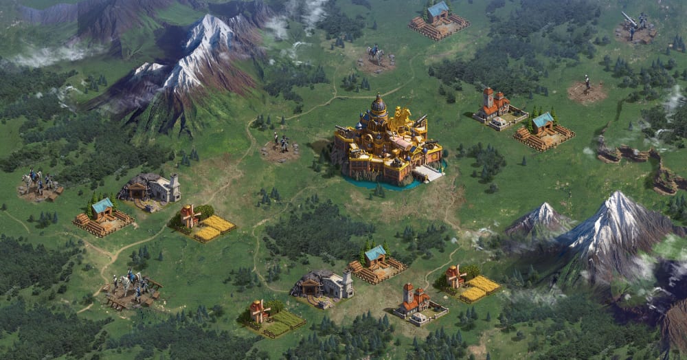
Which game map do you prefer?
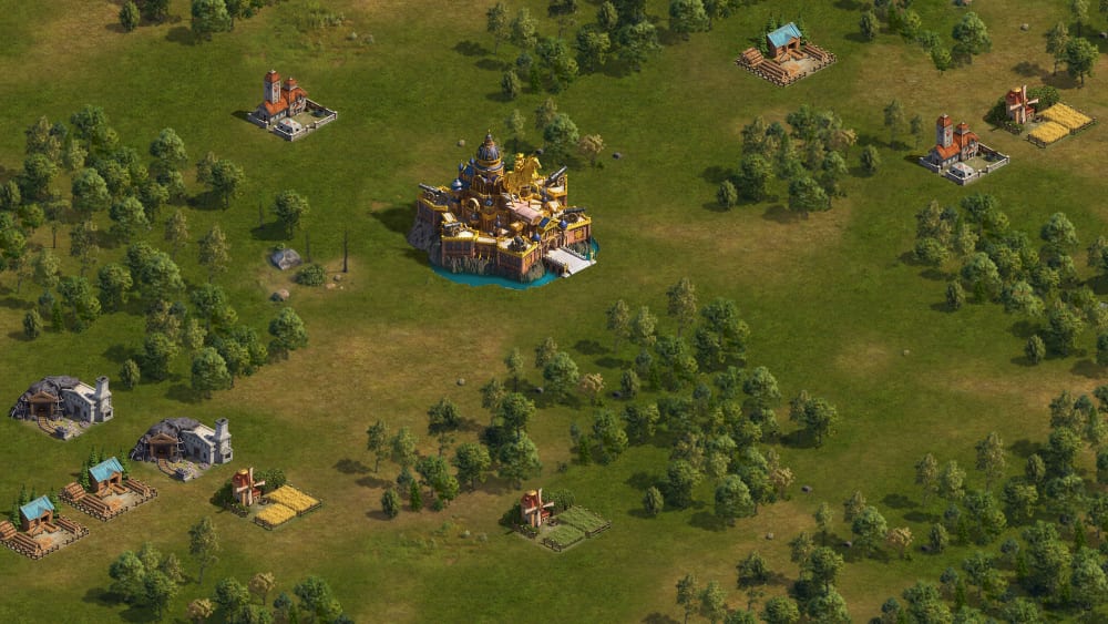
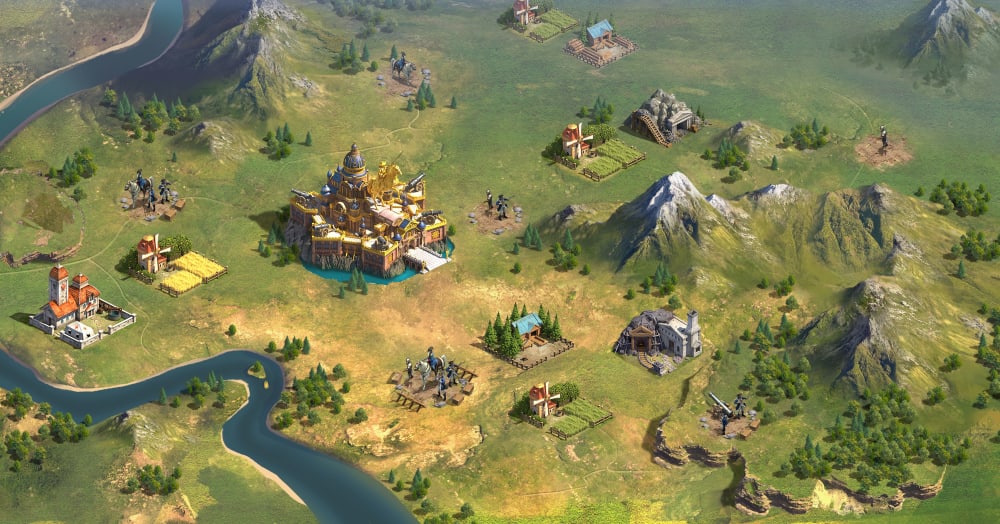
Option C won this Ranked poll with a final tally of 27 votes after 2 rounds of votes counting.
In a Ranked poll, respondents rank every option in order of preference. For example, when you test 6 options, each respondent orders their choices from first to sixth place.
PickFu requires a majority to win a Ranked poll. A majority winner differs from a plurality winner. A majority winner earns over 50% of the votes, whereas a plurality winner earns the most votes, regardless of winning percentage.
If an option does not earn a majority of votes, PickFu eliminates the option with the lowest number of votes. The votes from the eliminated option are reassigned based on each respondent’s next choice. This process continues in rounds until a majority winner emerges.
Scores reflect the percentage of total votes an option receives during the vote counting and indicate the relative preference of the respondents. If there is no majority winner, look to the scores to see how the options fared relative to one another.
| Option | Round 1 | Round 2 |
|---|---|---|
| C | 48% 24 votes | 54% 27 votes +3 |
| B | 38% 19 votes | 46% 23 votes +4 |
| A | 14% 7 votes | Eliminated 7 votes reassigned |
Age range
Education level
Gender identity
Mobile gaming habits
Options
Personal income range
Racial or ethnic identity
7 Responses to Option A
I find them all equally appealing visually to play.
A is the clearest looking picture, so I prefer it the most. C doesn't look like that great a graphic.
This one is the clearest and would make me want to play it.
A is the clearest and least cluttered. C is bright but a little cluttered. B is too dark and cluttered.
because of better map configuration
I think A seems a bit more realistic. Then I like C, it is a close 2nd. and B is too dark.
the colors look better
19 Responses to Option B
the graphics looks more advanced and appealing
My top choice was option B, I liked that there were mountains and I prefer the darker greens used in the game map, it gives it a more realistic look. I choose option A as my second choice because I preferred the more green and brown tones used in A more than option C, which look more dead like with the pops of yellow on the ground.
I like the detail of B, snow on the mountains etc.
I really like to be able to see some of the mountains. This gives the terrain a very dynamic and northern feel, and I love the north
Option B looks more realistic and provides better detail, and when you are playing a game that needs a map, the more detail you have is better. Option C is ok, but just not enough detail as B. A looks very early or low budget
Love the sharper colors but also the more diverse map with mountains and rivers
B just look the best, it looks the most natural and the least dry. There is a lot more variety to the land as well.
Option B has more details and a more diverse color palette
Choice A seemed to have alot more details put into it than the other choices. I especially liked the snow capped mountains.
my first pick is the picture is much more clear and colorful, seems like a game play in real time, the second one is not back but not as vivid, the third is somewhat dull and not exciting
The more unique terrain that includes the mountains is much more interesting for me to play on.
I chose B as my first choice because I really like realism in my games. I like the scenery to have a realistic look to it, for the most part. This option looks the most realistic and interesting to me. I like the snowcapped mountains the best. I like how green the rest of the area is, in varying degrees. I chose C as my second choice because it also has a realistic look to it. But it is less interesting. The ground has large areas that aren't green. The mountains pop out less than they do in B. It is kind of a more muted version of B. I chose A as my last choice because it looks simple and boring. There isn't a lot to look at. There is no mountains and the entire area just looks the same. It doesn't look like a lot of care and time went into the design of it.
B has the most variation in light, or at least appears to. It looks somewhat magical and takes you visually to a different place.I chose C over A between the remaining two because A is just too dark. It makes me feel sleepy when I see it. I feel like I have to squint.
The overall coloring of my first choice is brighter and greener. The grassy area on the game map looks healthier and more natural. The area is flatter so it seems easier to navigate and I would not have to go around a ton of bushes and hilly areas
I like the depth of the mountains and colors, more so than the lack of them
I like the tone/colors of B as well as the spaced out encampments. Not a fan of the tone/colors of C and A. A looks like land that you would start off with in a tycoon game but that does not look appealing to me.
The clouds and darker colors evoke a more mysterious tone, which is what I like. I just like the art style to be rich
The landscape looks more interesting and diverse in B. The trees, fields, mountains, and snow caps make the world look interesting. C had less of this and A less still.
I really like option B, it looks realistic, and it also shows the snow on the mountains and gives a bit of a "relief look" to the map as well. It looks like it also shows a bit of the weather patterns(clouds)and atmosphere also.
24 Responses to Option C
I like the mix of the thing with a sort of desert and grass that they bring here. The full green look is clean as well
I like the bright colors and the details on the map.
I like the relative brightness of Choice C over the otherwise similar Choice B, and I like the complexity and realism of it compared to Choice A. Of the two factors, I guess the realism is more relevant to me than the brightness, since I would slightly prefer Choice B over Choice A.
I answered in order of which I thought was the more detailed. I feel that choice C is more detailed and the shading is really nice. It is clear there is an attention to detail here. The second map, choice A is less detailed but more so than choice B. Choice B is last because of the darker shading makes it appear less detailed.
I liked this one because the colors are warmer as it feels inviting. For B I put that 2nd because I liked all the details and the mountains on this one. Finally A is last because the colors are dull and there are no details.
I like the bright colors of my first choice. It makes the game look more lively. My second choice also looks bright but not as inviting. The third choice looks a little drab.
Option C has more light and looks more cheerful so I like it better.
I think the terrain is really fun and interesting in choice C and I also love the coloring as well. It is a very vibrant environment.
Option C has pretty bright colors and the mountains and stream are interesting. Option A is the least interesting because it doesn’t seem to have as many features.
I feel like Choice C has a nice range of terrain. Choice B is colorful and more vibrant. Choice A lacks terrain and looks bland compared to the rest.
option c has the most information centrally and is the best lit, while option b still maintains interesting colors. though option a is well lit, the repeated trees without much variety seem boring.
this is easier to see
I like the brightness of the land and how the river flows through it. The mountains are cool but the coloring is a bit dark. The last is just the plainest and most boring.
I liked the detail and artwork of the first option and that is kind of what I based my opinion on throughout, ending with the last option with the least detail my least favorite. I do like the bright colors in the last option though, just very base and uninteresting as far as the rest of the design goes.
I perfer games that look really realistic that's why I picked (C)(B)
I prefer it if the map is lighter in color, and C was the brightest, followed by A and then finally B.
I picked them in the order that looked most interesting, or had the most going on.
I chose option C because I like the layout with the river and mountains. I chose option B second because I like the mountains. I chose option A third because the landscape is kind of plain.
I love how bright C is, and the details with the river. I like the mountains a lot in B
C has the best scenery. B is also lush but darker. A is more bland.
the map is bright and easy to see, to many games are dark to look "gritty" but just come across as ugly. Option a looks bad because it looks like a 90s pc game
I like mountains and rivers. C and B just seem richer, and more like a place I'd want to see in real life. I like the colors in B best, but the layout and geographical features in C best. A looks flat, muted, and sad.
This game map has the best design and makes me feel attracted to this game because it has vivid colors.
My favorite one has the most realistic look and more geographical features than the other two. After that it was a tough call and I'm still not sure of my preference for second and third in that order.
Explore who answered your poll
Analyze your results with demographic reports.
Demographics
Sorry, AI highlights are currently only available for polls created after February 28th.
We're working hard to bring AI to more polls, please check back soon.

