Poll results
Save to favorites
Add this poll to your saved list for easy reference.
What is Your Preferred Art Style for a Cat-themed Restaurant Simulation Game?
Option B won this Ranked poll with a final tally of 33 votes after 1 round of vote counting.
In a Ranked poll, respondents rank every option in order of preference. For example, when you test 6 options, each respondent orders their choices from first to sixth place.
PickFu requires a majority to win a Ranked poll. A majority winner differs from a plurality winner. A majority winner earns over 50% of the votes, whereas a plurality winner earns the most votes, regardless of winning percentage.
If an option does not earn a majority of votes, PickFu eliminates the option with the lowest number of votes. The votes from the eliminated option are reassigned based on each respondent’s next choice. This process continues in rounds until a majority winner emerges.
Scores reflect the percentage of total votes an option receives during the vote counting and indicate the relative preference of the respondents. If there is no majority winner, look to the scores to see how the options fared relative to one another.
| Option | Round 1 |
|---|---|
| B | 66% 33 votes |
| C | 18% 9 votes |
| A | 16% 8 votes |
8 Responses to Option A
I like that in A they seem to have different faces and different personalities.
I like the titled perspective in A a lot better.
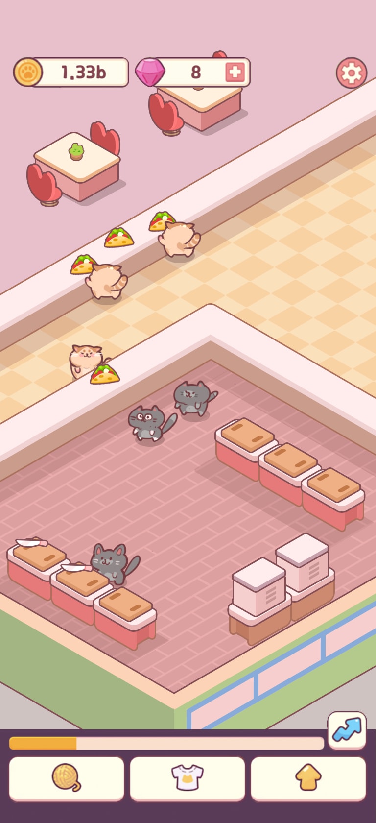
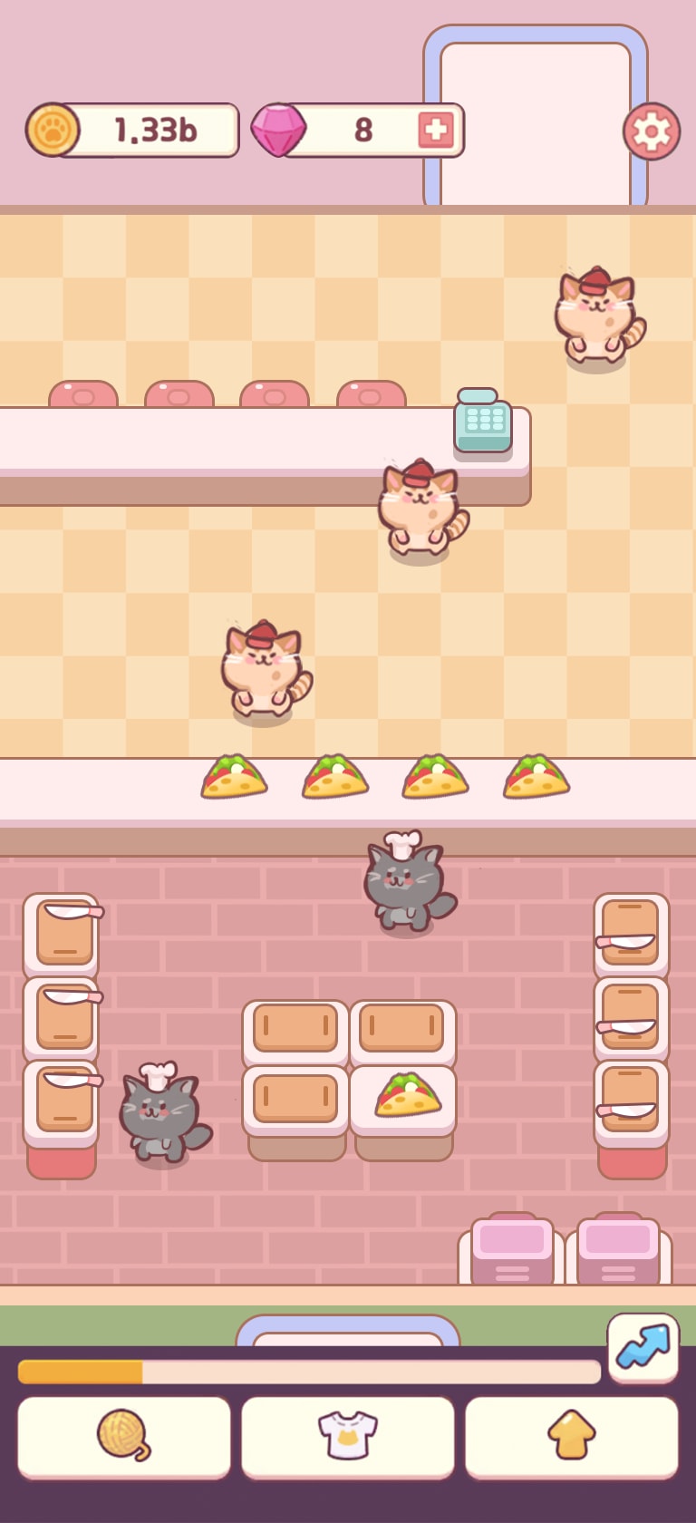
(A) has different faces on the cats, some with eyes open and some shut. (B) and (C) have the cats wearing the same expressions. (B) is slightly better since in (C) the cats look like their eyes are shut, which would make it difficult for them to run a restaurant.
i prefer the art style in option A because it looks easy to understand and has a cute feel to it
In my opinion the art style for option A fits the best for this type of game. It also looks the most aesthetically pleasing, I like how the structures and items have a clean look to them. Unlike option B which look a bit jagged.
look more like cats and fluffy.
I like A. It has a realistic feel but also a few steps in the imaginative realm. Plus, the layout is more enticing.
The restaurant style is obviously somewhat Japanese inspired but A and B are most familiar to me as an American.
33 Responses to Option B
I chose B because the design is more unique and "cute" as you would expect a cat cafe to be.
The cats on B are so cute and I love there full round bodys. C Is slightly cute cause the face is larger. A I do not like just normal looking cats basically.
B has the cutest cats and the cutest cartoony items in the gameC and A look like they have the same cats, I don’t think they are as cute as Ba.
Option B is my first choice. The purple images on the right side really bring it out I also like the cats being white, they pop they're very visually appealing.
I like the more hand drawn looking style with the real lack of straight lines being used. It makes it look more animated and alive. Between A & C, I think A is a little more fun looking and the angled style of the play area gives it more depth. Option C looks very cookie cutter and doesn't feel like it has a personality all it's own.
Option B is my first choice because I felt parts of the design such as the shape of the element containing the price and the details of the table looks more modern. Option C is my second choice because it is similar to Option B but just a design I like less. Option A is last because I feel the angle would make it awkward to play in.
The straight view and the colorful design and scenery make Option V the vest one for me.
The cats look great in option B
I liked choice B and the art style is more straight ahead which is more appealing and eye catching compared to choice A which is on an angle.
Really liked the art style of options B and C. Did not care for the art style of option A
Although I like All of these I think the color in number one is better and I like the angle a little bit more too
the cats look best in B and C. In option A they look like mice.
These are all very lovely designs. I feel that Option B has a good day out. The spaces are inviting and yet feel spacious and accessible. A and C are a little less so.
I like the closeup the best followed by overview of whole place
I like option B the best because I like that the style is more defined and colorful. I also like that the coin area graphics.
I like how the cat is surrounding the kitchen table in B and the color of the cats. The grey cats look like they don't match the color scheme in C. I don't like the angular display of A.
I like the art style in Options B & C, with a slight preference for Option B due to the cuter faces on the cats, which look happier in this option. I also slightly prefer the tile floors in Option B.
I like B and C the most. I think they have a cute style but I also like the layouts of the kitchen better than A.
This arrangement looks very neat and colorful
These cats look more fat and therefore more cuddly. Due to this, this is my top pick
I like the little curve of the UI seen in B. It is cute and fits the theming of the game
B gets my first vote because there's a lot going on there--very busy. I like it. The style and design are superior.
I prefer option B, this looks like a traditional theme for this sort of game.
I thought c was a very good style for a cat game
I like Option B's darker coolers, classier interior. It's cool, even if we're just talking a cat game!
I like B the most- I think the colors pop out more and it looks more interesting.
I like option B more than the other two options because the cat's cute faces are larger and easier to see.
Choices B and C are the top two art style for me because I like how both of them have the chef cats wearing the chef hats and I like the front forward angle that both of them have. Choice B is ahead because I like how the look of all the cats are the same and the design of the restaurant better compared to Choice C. Choice A is last because I do not like the angle it is at, how the cats do not have hats, and the design of the cats in it.
I love the bold colors on B, A is very cute and c is very cozy.
I like the round cats in option B, they are very cute and add a fun visual design element to the game that would make me want to keep playing.
I think the lighter colored cats look cuter, so I would choose option B.
I think the colors are a little more noticeable in B. C and A look really close to the same to me so it's a toss up.
I ranked them in cuteness of cats. I like B
9 Responses to Option C
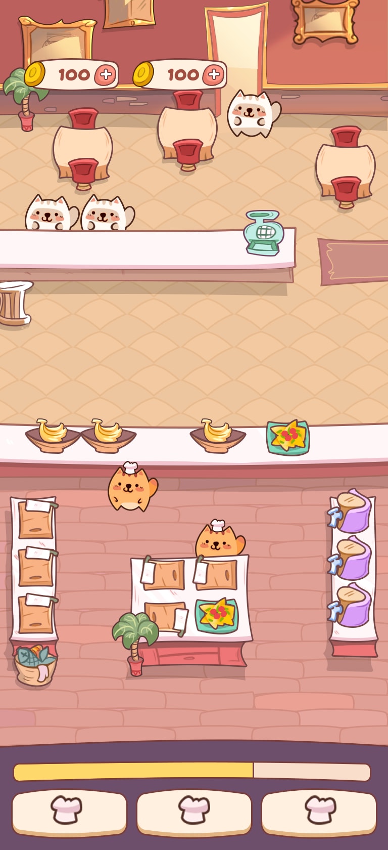
C, I like the square appearance, it is more appealing and pleasant.B, the style looks a little less smooth or well designed, it has less sharp edges.A, I dislike the angled appearance, it makes me feel much less interest. I would need many more details such as shadows that are stronger, and more details to the materials to make it look more appealing.
I REALLY LIKE THE GREY CATS IN OPTION C. I THINK OPTION C IS THE MOST DETAILED OF THE THREE OPTIONS SO THIS WOULD BE MY CHOICE
Option C looks best in getting the restaurant theme across. Nice to see the cat chefs there. I like option B as a good second choice. Those two seem to work the best for this. Great theme and idea here!
The cats with the chef hats are cute and endearing. The variety of elements is engaging. The tiny tacos look appetizing.
First, I think the animals in C look the most like cats. Secondly, I prefer the higher level of detail in C so it is easier to understand what all the visual elements are.
Option C is my preferred choice for a cat-themed game because the design is most fun and engaging and creative.
These two remind me a lot of Pokémon which makes me nostalgic
I ranked option C first because of its graphics, I like the design also, and the blend of colors also is cool. I'll stick with option C.
I chose C first because the cats look most real in that one I think A is also ok but I do not care for B.
Explore who answered your poll
Analyze your results with demographic reports.

