Poll results
Save to favorites
Add this poll to your saved list for easy reference.
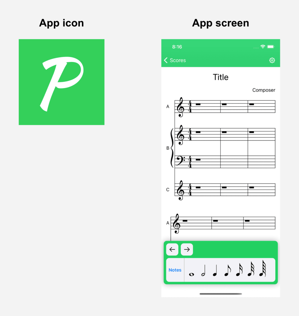
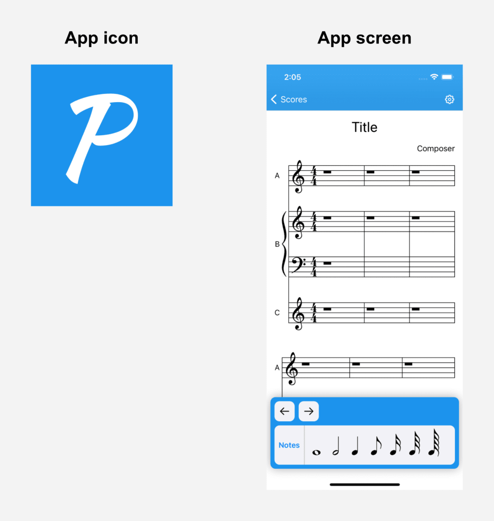
What color do you prefer for a sheet music app?


15 Responses to Option A
The contrast with the bright green against the white text is easier for me to read.
I find the green more soothing and less distracting.
This one stands out more and I like the color green. Plus the color scheme is too similar to other apps
i like green better generally
i just like the color better as a personal preference
A is brighter and pops out more on the screen.
It’s bold and eye catching.
The green color looks bright and energetic, which is appealing. The blue color is also nice, but I prefer green. Very nice for sure!
I'm more attracted to the green version that I am with the blue. The blue seems to be somewhat common and I feel that green is a bit more unusual, which is ideal for marketing and display.
The green is more attractive and relaxing.
I think for me I am just more drawn to the green color. It feels more vibrant and fun than the blue one. If I were looking for a music app, I would be more into one like this.,
Choice A seems to be the best sheet music app. I like it because the color pops and it stands out more then choice B.
I feel like the bright green would keep me focused better
I'd usually go with blue but it seems distracting here, doesn't feel "right" so I'm going with the calmer green.
B is boring and plain. A is unique.
35 Responses to Option B
it is easy on the eyes.easy to read
I think the blue looks a lot better
I prefer the color on option "B". The green matches the design perfectly.
The blue is easier on the eyes than the green color is overall
I like the blue color. It looks better and isn’t as distracting
This is easy on the eyes more of a neutral (per say) color.
The color is easier on the eyes.
Blue is a good go to color. It is very familiar because many websites and apps use this color.
The darker colors are easier to see on screens, especially cell phones.
I like option B the best because the blue logo design stands out more to me.
I really like option B as the blue color looks very soothing and it stands out nicely. It is much more catchy to the eyes.
I just like blue better in general, but it's close
I prefer B because blue is far less abrasive to view. Typically if I am reading sheet music, it will be for prolonged periods so I would select anything that was the least taxing on my eyes as well as the least distracting.
I picked B as my top choice as the blue color helps me understand.
The blue seems softer and serene, but the green theme (despite being pretty) looks gaudy and too flashy
I love the color blue, i think it is calming and beautiful to look at.
Blue is easier on the eyes which is important when reading sheet music. B all the way.
Blue is a more pleasant color to me, it has a nice soothing look.
The green is nice and bright and something that pops, but it is also really annoying to stare at while trying to play the music. I went with blue because it is soothing and calming, and it still sticks out. To the user, they will be able to easily discern the notes without the annoying neon green sticking in their mind too much.
This option felt a bit more accessible to me; the neon green color just looked a bit too aggressive and harsh. Blue was more calming and relaxing.
I liked choice B and the blue tone is more appealing and soft. Choice A looks okay but isn't as appealing with the green look of the page.
Blue just looks more vibrant so I prefer that.
I prefer B as blue is my favorite color.
The blue color is better because it is easier on the eyes.
I like the blue color better
I think the blue just makes more visual sense and better highlights the black musical notes. The green is a nice color, but probably too bright for this purpose.
I think the green is too loud and distracting and draws attention away from the notes.
I LIKE THIS COLOR BETTER THAN THE GREEN.
Choice B is my pick because I feel like the blue color goes and works better with the black colored notes then the green color does. I also just feel like it is a nice color to see and look at in general.
Blue is more peaceful. Green makes me think more of a financial company.
I like the blue, it is slightly easier on the eyes.
the blue seems easier to see for me. the green is too bright and takes away from the music notes
A is an eye sore. It is too bright. B is smooth.
I think that it looks better with the blue, it makes the music notes pop out more.
Although both colors are very pleasing, I would choose B because blue is my favorite color and I tend to buy things more in that color than any other color.
Explore who answered your poll
Analyze your results with demographic reports.
Demographics
Sorry, AI highlights are currently only available for polls created after February 28th.
We're working hard to bring AI to more polls, please check back soon.

