Poll results
Save to favorites
Add this poll to your saved list for easy reference.
Which app logo design do you prefer?


Option C won this Ranked poll with a final tally of 30 votes after 3 rounds of votes counting.
In a Ranked poll, respondents rank every option in order of preference. For example, when you test 6 options, each respondent orders their choices from first to sixth place.
PickFu requires a majority to win a Ranked poll. A majority winner differs from a plurality winner. A majority winner earns over 50% of the votes, whereas a plurality winner earns the most votes, regardless of winning percentage.
If an option does not earn a majority of votes, PickFu eliminates the option with the lowest number of votes. The votes from the eliminated option are reassigned based on each respondent’s next choice. This process continues in rounds until a majority winner emerges.
Scores reflect the percentage of total votes an option receives during the vote counting and indicate the relative preference of the respondents. If there is no majority winner, look to the scores to see how the options fared relative to one another.
| Option | Round 1 | Round 2 | Round 3 |
|---|---|---|---|
| C | 36% 18 votes | 38% 19 votes +1 | 60% 30 votes +11 |
| A | 32% 16 votes | 32% 16 votes | 40% 20 votes +4 |
| D | 28% 14 votes | 30% 15 votes +1 | Eliminated 15 votes reassigned |
| B | 4% 2 votes | Eliminated 2 votes reassigned |
16 Responses to Option A
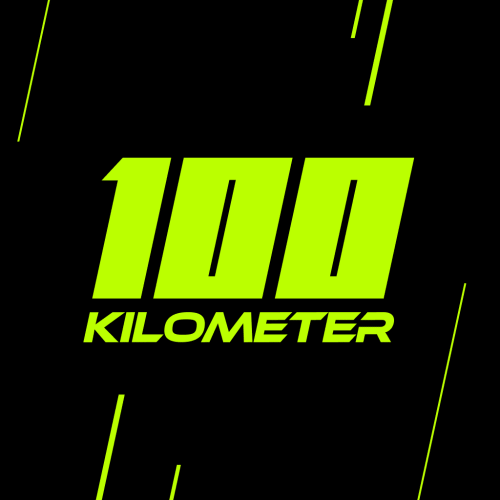
A is bold and easy to read. D is creative, but the 100 could be emphasized more. C is okay. B is difficult to comprehend.
I want to see 100 on the logo to signify excellence like scoring a 100% on a test. Option A is simple and to the point as far as showing 100 Kilometer. It catches my eye with its organized appearance, and attractive color.
It looks more stylish and catchy.
A is clear and identifable. D looks nice but would be hard to make out at a small size. C is too generic and B doesn't look like anything.
the logo needs text so A is the best one
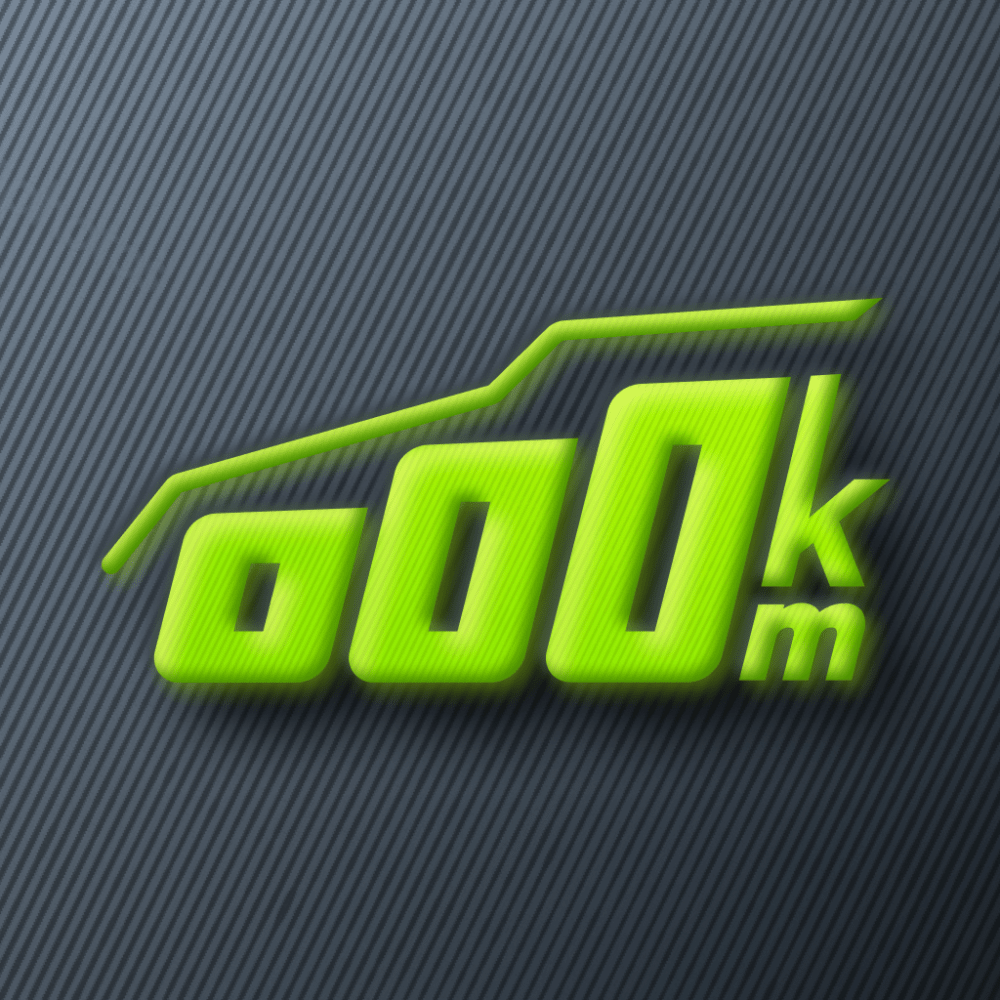
Option A is the clearest way of showing this is the name of the company. Option C is dominated by the car, but is still nice. Option D just looks like a speedometer. Option B reads like 000 Kilometers.
The firs toption is the only one that looks like an actual logo, the rest look like screenshots from a bad mobile app
I think A is the easiest to read. The rest are extremely over-designed.
A looks the most professional and fitting. C the car imagery is a nice design touch. B and D are a bit too ambiguous.
Okay so as a logo - Options D and C are horrible. And not because they're ugly - because that's not a logo - its a graphic. A logo needs to be easily digested. That's why I chose option A as the best!
I like the focus on the logo itself rather than a speedometer or car.
I would say definitely A because the font is fitting for car related products. It looks higher quality. The other options seem very low quality and cheap.
If the name of the company is "100 KM or Kilometer" then I think A is the best. I didn't really get that from the other ones.
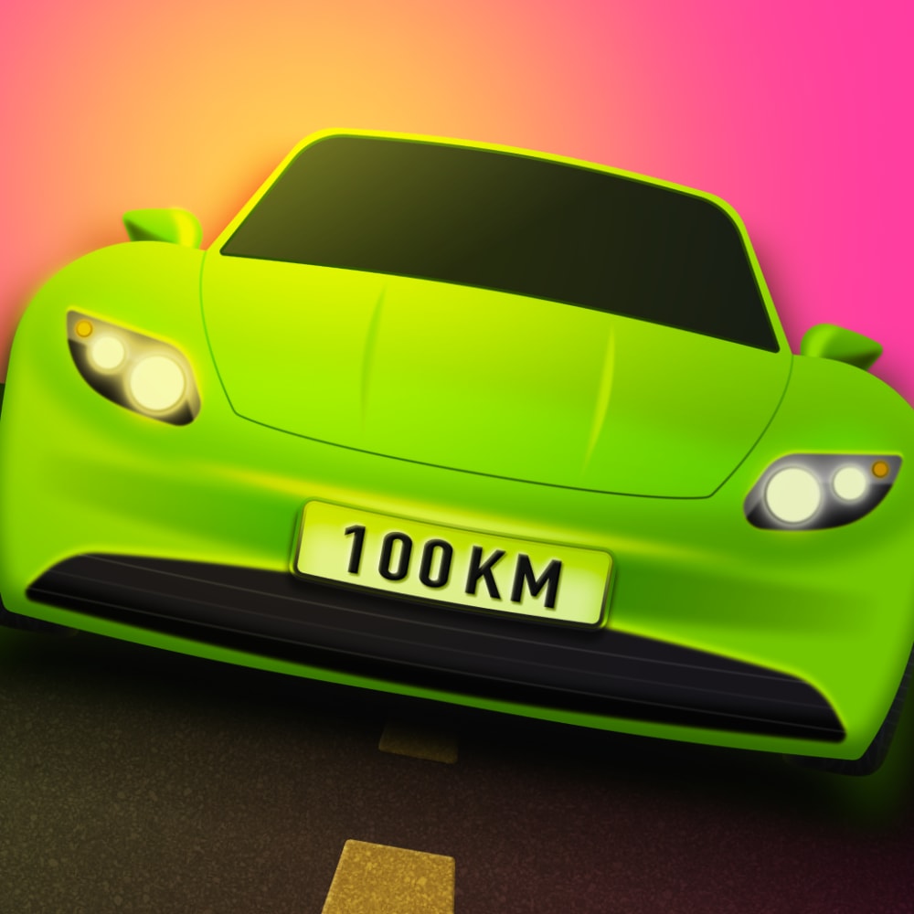
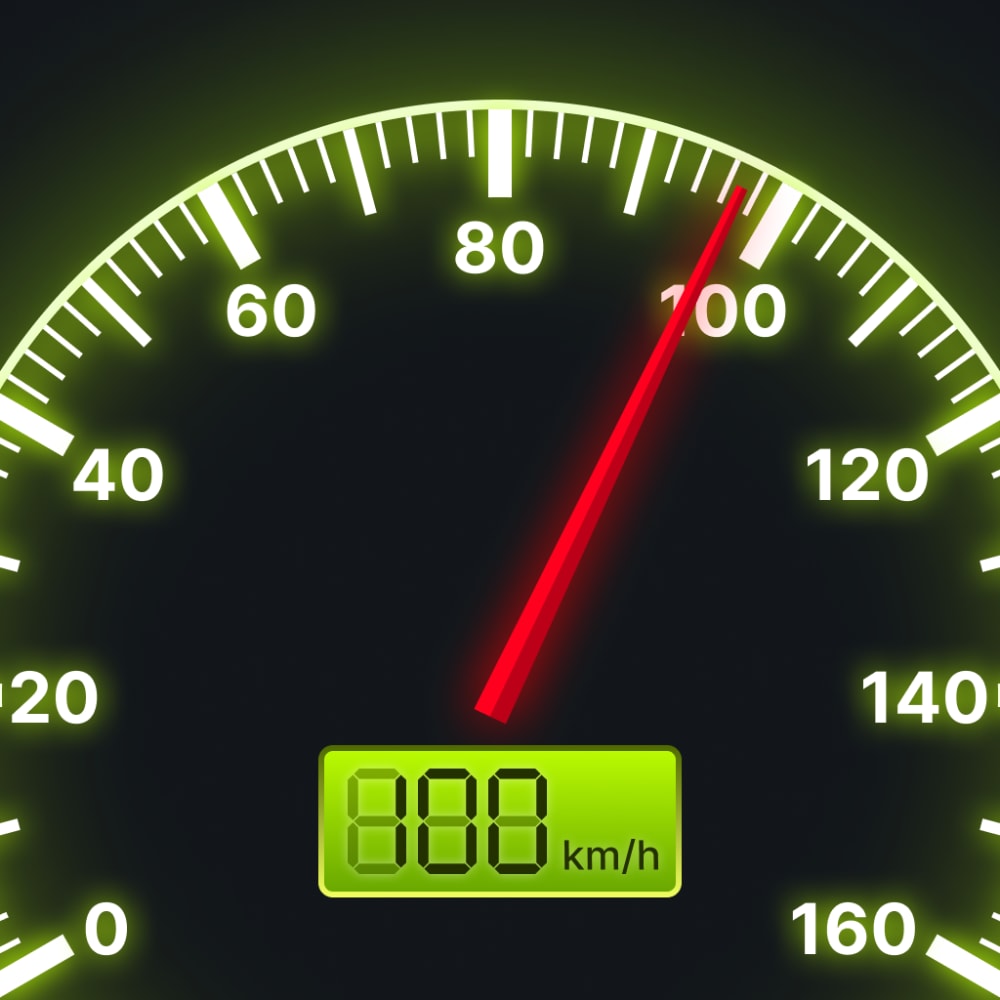
I like A the most because I like that it has a simple background and that background reminds me of a road how it has a dark base like asphalt and then it has lines painted on top. The lines aren't even like they would be on a road but it still reminds me of a road. I like how big the "100" is for the logo. C is second because I like how sporty the car is and the name of the company is on the license plate. I wish the car was even instead of being askew though. D is third because this one sort of implies the "100" of "100 kilometer" but it's a little confusing how it says "100" on the digital readout but then the speedometer is not right at 100. It also seems like this logo has a lot of empty space in it. It has a good theme but I think could be done a little different. B is last because this one doesn't even say "100". If it said "100" instead of "000" I might like it better. But as it is now I don't like it because it causes confusion over what the brand name actually is. This one I think would be better if it was "100" and then instead of the green line that is going up in increments it's a green line like on the speedometer going up over the "100".
I would rank them in this order. Choice A would be my 1st pick because I think just have the number focuses the logo on the company name.
Option A spells out kilometre and I think it looks cooler than the others.
2 Responses to Option B
I like option B the best. I like how the loga looks like you are acclerating up a hill
I like the mountain artistically suggested by the line in choice B. It is simple yet memorable. It can be any size and always look good. As a second choice, the "Miami Vice" 1980s vibe of the car and fluorescent colours of C is fun.
18 Responses to Option C
Chose in order of which icon most displays racing game info.
C seems the most interesting and dynamic. The "kilometer" instead of "km" in A is kind of awkward and wordy, and D and B are too vague.
The car design and colors in option C are the most visually eye-catching and option B is hard to read and understand.
The car is cute for an app logo so I like the design for the face of the logo here, it makes sense to me.
For me it is easily the car as to me I think that it is stylish and very smooth looking. It will easily get your attention.
I like the logo C because the car is cool
Color is eye catching as is the car with 100 km sign
The car, ad the speedometer, in that order. With the other two, which are mostly bright or lime green numbers, it's hard to tell what the app is even about.
When I think of looking at a logo on a tablet or phone, I definitely think C is the one that stands out. The color, the shape, the car....it would really pop and my eye is drawn to it. Very cool. Next, I like D because it's something more than just numbers. It's got a lot of energy. The black/white with the flashes of green/red give it some excitement. A & B remind me a lot of radio station logos but I think A would stand out well (better than B), though neither of these are my favorites.
C looks the coolestD is second most appealingthen A and lastly B
I liked the options with brighter and more vibrant neon hues.
I picked what i liked the most
The car makes it more fun and stands out more! I think an odometer would be good too!
Options C and D logos give you idea about what the app could be about.
Lime green is my favorite color and I think that the more you use it the more it will catch people's eye. I wanted to like D more but it isn't pegged on a high enough speed.
The lime green is a unique color for a car so it makes the app seem unique.
After carefully studying and comparing all four image of app logo designs displayed above, I selected Option C as my first preference and the one that I would definitely click on to learn more about this app. I feel that this image just jumped right out at me as having the most eye catching appeal based on is unique design and bright and vibrant colors. Option D was my second choice followed by Option A and finally Option B with all four rankings based on my own personal opinion of the relative attractiveness of each app logo design image.
I really like seeing the Car in C. It gives a more accurate explanation as to what the app is about just looking at it.
14 Responses to Option D
I like this one it is different stands out really nice , I like the design and how it grabs your attention
more eye catching and something that is memorable
Option D has an app logo that is the most fitting and the most creative overall.
D's logo is able to stand out the most to me and is very fitting with the name.
D best suggest that the speed is being pressed to the limit on this app so I think it's the best.
option B looks like 0 kilometer so its last choice. option d and c are not much stylish but it gives off a faster speed vibe so they are top two choices. option a looks bland so its third choice.
Option D would look perfect sitting on the Home Screen of a phone.Option C is close second. The plate on the car is a neat touch.Option A is good. Easy to identify and not mistakeable with anything else.Option B is either missing the '1' at the beginning of the number series or a little to obtuse. I wouldn't use it.
option D is my first choice because it's more than just numbers like the others say 100 km and the car is kind of like a generic (for the lack of a better word) logo.
Option D of the speedometer indicates the game is about racing.
DGoing fast I like it! / C animated car looks okay / B it's an okay design I guess / A that's awful
I like the designs that imply activity or movement. The color schemes with red and green or white elements are mostly appealing. Unusual or interesting details that involve automotive devices tend to be the most suitable.
B and C are so insanely boring. D and A are both equal to each other; D is the most unique
i don't care for the color green; that explains my rankings. "D" is my favorite by a huge margin. "A" screams out "green" and therefore is ranked last.
Prefer the speedometer. Gives a better feel.
Explore who answered your poll
Analyze your results with demographic reports.

