Poll results
Save to favorites
Add this poll to your saved list for easy reference.
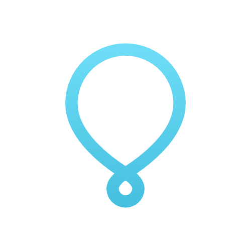
Which app icon do you prefer for this routine building app called Uplifting?
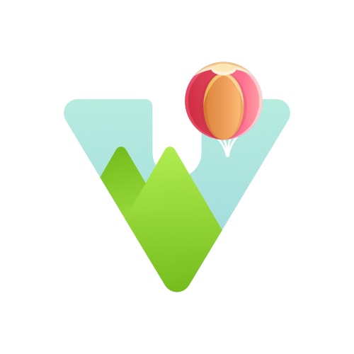
Option B won this Ranked poll with a final tally of 29 votes after 1 round of vote counting.
In a Ranked poll, respondents rank every option in order of preference. For example, when you test 6 options, each respondent orders their choices from first to sixth place.
PickFu requires a majority to win a Ranked poll. A majority winner differs from a plurality winner. A majority winner earns over 50% of the votes, whereas a plurality winner earns the most votes, regardless of winning percentage.
If an option does not earn a majority of votes, PickFu eliminates the option with the lowest number of votes. The votes from the eliminated option are reassigned based on each respondent’s next choice. This process continues in rounds until a majority winner emerges.
Scores reflect the percentage of total votes an option receives during the vote counting and indicate the relative preference of the respondents. If there is no majority winner, look to the scores to see how the options fared relative to one another.
| Option | Round 1 |
|---|---|
| B | 58% 29 votes |
| C | 28% 14 votes |
| A | 14% 7 votes |
7 Responses to Option A
My first choice is Option A because while I feel like the other two options are okay, I feel like they are too on the nose with the literal "uplifting" theme with the air ballon. Option A is unique enough to not make me think of a hot air balloon and it makes it look more mature. Option B is my second choice for that reason. While I'm not a fan of the hot air balloon designs, I think Option B is more adult looking than Option C.
I picked these options in this order according to which icon looked the most professional, intriguing, and made me want to click it to find out more about the building app. I choose then based on which one had the best graphics, color, and overall appeal. In addition I choose them based on which icon best suited the app description.
I like simple, easy to identify logos, like A. B is better than C, but both have more details than I like in a logo.
I like the first one but I have no clue what it is for but it is still cool. I like the bigger balloon over the smaller one.
I picked A because I think with an app icon, less is better.
The size of the balloon in B is not in proportion, so it looks awkward. I appreciate how A is more abstract in representation than C.
None of these make me think of the apps purpose. But despite being brightly colored, C and B seem to relate even less to the apps function. So A is my favorite. Then I have little preference between C and B.
29 Responses to Option B
I like B because it's stylized in an appealing way. I like the colors used and the triangular shape. It's not overly simplistic or too abstract.
I like the colorful icons, especially as they are unique shapes. Really not a fan of that one that looks like a twisted diaphragm my gf used to use for birth control.
I love the incorporations of the balloon into it especially for an app called uplifting.
B makes the most symbolic sense, C is similar to B but it creates a sort of anxious feeling, and C is too abstract to relate to the app title, though it does make sense for the notion of routine.
I like B. Firstly, the graphics being inside a triangle is unique and something you don't see everyday so it caught my eye first. I also like that there's a clear view of the mountains. It makes it easier to realize this is a hot air balloon floating up into the sky.
I am a big fan of triangles, especially when it comes to uplifting slogans!
I prefer option B because showing the balloon floating in the air makes the most sense for the product. It’s eye catching and nice to look at.
Option C is too crowded and busy. I'm not a big fan of the other two but Option A is the best.
B looks unique and interesting so I would use that.
You can easily tell with the balloon that it's symbolizes uplifting because the balloon goes up
I like B with the small balloon apart of the V which also goes as scenery. It makes it look like you are flying over everything is a better visual to me. I like C for almost the same thing as B but what I find different is that this looks like a stock photo of the balloon and doesn’t look different or special. A is an interesting look and is out of the box but I feel the others have more of a look people will understand.
prefer the logo
I don't like Option A at all! But I do like the balloons in Options B and C. Option B gets pride of place because everything is ascending in an upwards arrow and inside the arrow, the balloon is ascending too. It feels like positivity.
I like option B the best because the hot air balloon makes me think of being uplifted in a good emotional way like in the movie Up.
For the name uplifting, it is easier to see the baloon rising over the mountains in option B. Option C took a little more decifering. I do not understand how option A is related to the name uplifting.
I do not like option 'A' because I feel like many apps have recently switched to a minimalist icon style, and as that trend has progessed I have no longer been able to remember any of them. There' sliterally dozens of varying colored shapes on my phone and I have to click on half of them to know what they wre.
I'm not even sure what option A represents. Option B - the baloon is pretty and is something else to look at. I think the balloon in C is too small.
I prefer Option B the most because it's the most colorful and I can tell that it is a balloon lifting up into the sky. Option C looks mainly like a beach ball. Option A, I don't know what that looks like, but not a balloon for sure.
This one gives me the feeling of something being uplifted the most and makes sense for this app.
Option B feels very light and airy to me. Plus the mountains make an M, which makes me feel like motivation. Option C is the worst because it looks like a phone game icon. I see a ball being kicked and not a balloon being lifted. Option A is OK. It's pretty generic, but better than Option C.
I think B is the cutest option. A is ok, it's nice and minimalist and I don't dislike it. Option C is kinda creepy, almost looks like some alien thing grabbing a mountain.
I like the clean look of the app. A bit more professional.
This app icon looks simple, the balloon is smaller and you could add words to this if you needed to.
I like B the best, the balloon uplifting over the mountains is the most motivating.
The balloon graphic in B and C is a really good graphic to help with word association. A is a little too simple in comparison. A is my top choice as it is pretty unique and also incorporates the "u" into the design, further helping you figure out what it is without reading anything further.
Answer B is the most creative and simple design.
B and C are very good with an edge to B - I like them both but B just has that extra something that makes it stand out more. A is pretty bland.
I really like B - its eye catching and attractive as well as easy to remember. C is good but I don;t care for A
Option B having the balloon in full sight is nicer to look at than the close up Option C. Option A is plain and doesn't really communicate any feelings.
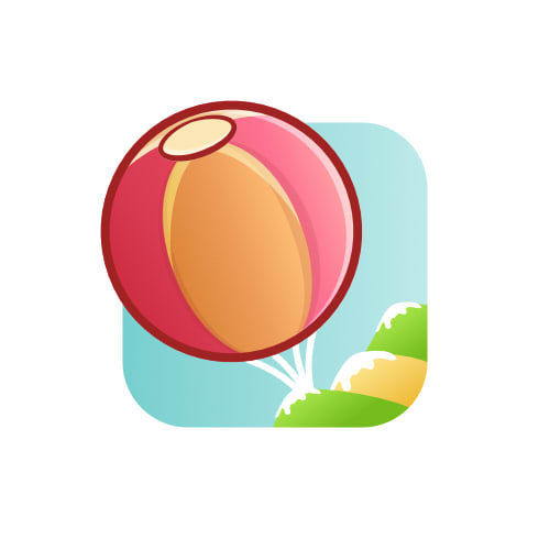
14 Responses to Option C
I like option C because it represents its goal, which is lifting something.
My personal preference in the icons just based on my intuition of what I like the most.
I prefer Option C. The balloon fits with the name uplifting and the colorful image also feels happy and uplifting. Option A is very barebones and doesn't make me think Uplifting at all.
I would prefer option "C". The icon looks unique and appealing. The icon looks colorful and eye catching. I would definitely go with option "C" for an app icon.
The first image of a balloon looks nice and is easy to see from a distance and in small scale. The second one, while it is a nice logo, it's extremely vague to tie a brand on to it. The last one looks like a V and makes no sense for the name.
I liked options C and B but chose Option C as my top choice as I thought it was the cutest and most memorable. I liked how the hot air balloons stood out and I thought the mountains were playful too, especially with the snow which I think makes them more scenic. I liked Option B because it looked more professional, it looked it could be a company logo and builds trust that it's a high quality company. Option A is fine, it's simple but effective in delivering the Company's message.
The balloon is most in focus in C as I feel it should be.
I feel this icon captures the title of the app/service very well visually.
I prefer choice C because it is the most colorful and biggest.
C makes me think of lifting up and rising, also it is large so it is "in sight , in mind" and i like that. B is good but I feel too minimal and small. A is a little too abstract for something like this
I can't really tell that A is supposed to be a hot air balloon. I like that C's hot air balloon is much larger in size since that catches my eye more immediately.
C is bright, bold, and memorable. B is cute, but not as memorable and easy to identify as B. A is way too simple and plain.
The app's name is uplifting. I would imagine that the icon has some sort of relations with the name. Among all of three options, the design in C shows a large balloon. It reminds me of the movie "Up" which is relevant to the app's name. The design in B has a smaller balloon comparing to the one in C. It is also related to the app's name. The design in A is one kind of abstraction. The shape could represent different things. The meaning is unclear in my opinion.
I chose Option C first because i think the image fits very well with the name, and i like the color choices
Explore who answered your poll
Analyze your results with demographic reports.
Demographics
Sorry, AI highlights are currently only available for polls created after February 28th.
We're working hard to bring AI to more polls, please check back soon.

