Poll results
Save to favorites
Add this poll to your saved list for easy reference.
If you were shopping for a romantic gift for your significant other on Amazon and came across this item titled, 'I Love You! Wallet Love Note – Best Anniversary Gift for Women and Men' which image would make you more likely to click to learn more?
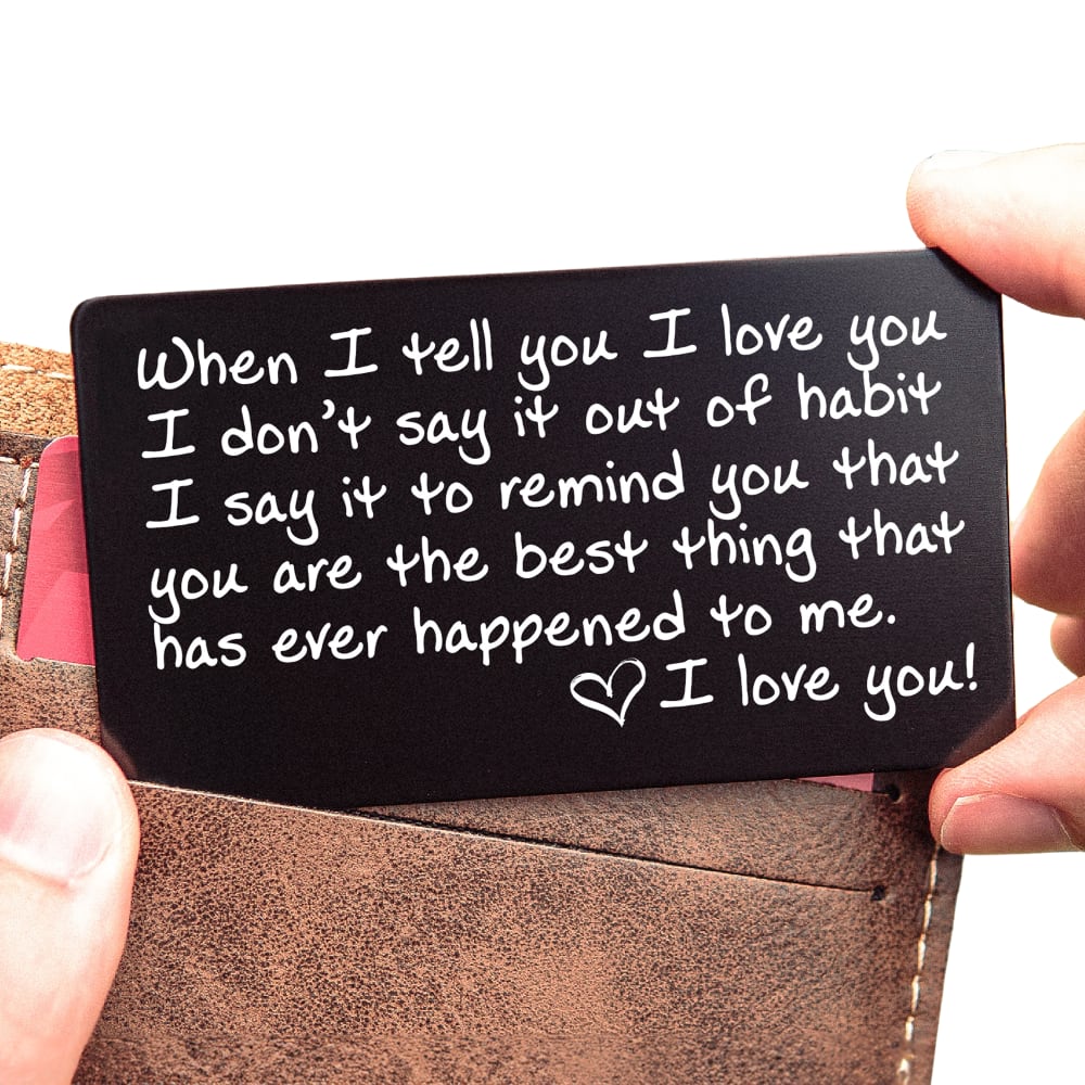
66 Responses to Option A
I think A is much more fitting and the leather just looks higher in quality
I like the witty idea of leaving it in their wallet or purse. It feels more creative and personal.
I like Option A's pocket wallet love note very much. It looks more eye-catching and stylish with the wallet. It also looks more practical and fashionable. I prefer to click on Option A's pocket wallet love note while shopping on Amazon.
I like this because it shows me that it is of a size that could fit into a man's wallet.
A does a better job showing that this is wallet-sized.
I like that this photo shows the card and a wallet.you can carry it around with you always.
I like A the most because you actually can see that it fits inside a wallet.
I would click on Option A because it would fit in a wallet well.
This one shows the note with a wallet and it also tells me this is credit card-sized so that it fits in the wallet as well.
A because the wallet makes the card pop and it reminds me of my husband checking his wallet
It looks like it is being pulled from a brown wallet. I like the hands pulling out the note from a wallet.
a wallet card is more useful and for long term keeping, B in an envelop just gets thrown away
Because it shows it being taken out of a waller. The image helps me envison how it would be used.
I prefer A because the contrast between the two colors is a little softer so feels more natural and romantic too me. Option B has very strong contrast so seems pretty stark.
I like how Option A shows the note actually partially inside a wallet which provides me with a better sense of how it will fit in the wallet.
If it's meant to be a note that you put in someone's wallet to surprise them, that comes across really well in A, and not at all in B, which looks like you'd give it to someone in an envelope, just like any other love letter.
The A Option looks more demonstrative of what the card is used for as in showing the actual wallet. Also, seeing the hands makes it more human oriented.
I guess A because it actually has a picture of a wallet, the fact that the other one is in an envelope when it's not meant for that is super confusing.
A would make me more likely to click to learn more since it shows the card in a wallet.
I like the look of A - this truly makes this a wallet card and not a card in an envelope.
I like this one because I more easily understand what I'm supposed to do with this.
The color contrast makes the note more eye catching and easy to read.
I would choose A first because it looks a little bit smaller.
Since option A is pictured with an actual wallet to show the size, I would be more interested by option A.
I prefer option A because this note is shown near an actual wallet and looks more relatable.
I prefer option A. I love seeing this in a wallet. It would mean a lot to have it there.
I like A because I can get an idea of the size because of the hand holding the card. I also like that it's shown with a wallet. Option B makes the item look like it's the size of a greeting card (4 x 5)
I'd choose this one because it gives me the idea up front to slip it in the wallet for a surprise.
I'd click on "A" more, this image looks more realistic with the wallet in the background.
A looks much more personal and heartfelt.
Actually seeing this love note in the wallet makes the most sense to me to look at the image of choice A to gage an idea of what the note looks like in the wallet
I can see the product is a wallet and the color makes a great contrast with the color of the letter.
A looks more like a wallet and something they can use. B is just an envelope
After carefully studying and comparing both images of "I LOVE YOU" wallets displayed above, I selected Option A over Option B as my preference and the one that I would definitely click on first. I felt that this image jumped right out at me as having more eye catching appeal because of the richness and coloring in the image. However, I felt that both images were quite acceptable.
I like A because it appears to be somewhat like a credit or debit card that would fit in your wallet. It looks like it belongs there. And you could secretly put it there and then surprise your loved one.
I would be more likely to click on Option A. The contrast of the black card with the brown wallet caught my eye first.
A shows the actual size when you look at the image. The man holding the card also makes look more natural.
I like option A because it looks like it is going into a wallet.
It definitely looks for esthetically pleasing. I love the design and the brown leather with the black note.
Don’t like to black one like the brown instead The design is better on the brown one. More my style I would choose if I’m paying for it
I personally like the brown wallet appearing envelope more than the black envelope. The brown envelope looks more personalized
Would rather gift in a wallet then an envelope. The envelope seems like a card, the wallet is more like a gift.
Picture A , Shows the note being placed in a wallet , whereasic B . is an envelope . Showing that is Living up to what the words say it's for .
I chose option a because it's more of a modern look. I like that the color of the wallet is a neutral color and most people love a natural modern looking wallet with a slightly neutral color. It's a great choice for men and woman and I believe most people would appreciate the fact that it's such a modern and natural look.
It looks more personal with the persons wallet then just put in an envelope
It's more personal having hands there versus no hands. Also, I like the color of the wallet, but the hands do make it more romantic/personal.
I chose A because it’s showing it being put in an actual wallet which is what it’s marketed to be instead of putting it in a card
I like the message - that although you tell your person you love them all the time, its not JUST out of habit but because they really mean it.
It shows a better wallet in the picture which makes me want to click on it. The other picture isn’t relevant.
I like the message - which is the same on both "choices." But I like the color of the holder in Choice A.
A because it shows someone actually reading it and it just helps us imagine what they might feel while reading the note.
Because it was the only one that was actually inside of a wallet. The other one is basically a card, it came in an envelope.
I would choose this one because it actually shows a brown wallet in the picture and how it would look together .
I think that the black card will stick out and be quite noticeable with the writing on it to be a cute surprise and unexpected.
I chose my option due to the brown wallet is what caught my attention so I chose to go with that one instead of the one with the black envelope
Choice B is too monotone and uninteresting. Choice A has multiple colors and human hands which makes it more interesting. It also has a wallet in it, which seems like it would be necessary if you are selling wallets.
I chose option A as my choice because I liked the The contrast of the black card against the brown wallet , and I liked being able to , I like seeing the fingers , hold it , and just the contrast of those different colors and different elements , uh , made the picture and the statement popped to me . It was a lot more , uh , to me , a lot more mentally stimulating and made me , it seemed a lot more relevant to me than the other option .
I like this one better because of the envelope color. It makes it look like it is important.
I think option a would be best to give your partner because it is designed better than option B. It would be a great Valentine's Day gift because it contains the color red. I think my husband will love it.
It's beautiful to find a note in my wallet very romantic. It’s romantic if my husband would surprise me with a note written to me in my wallet
The image depicts what it actually says in the title, "Wallet Love-Note" so showing with a wallet gives one a preview of how it may be used.
For one thing, the envelope is black. Looks like a funeral announcement. The option that i chose is much more personal, showing HIM (or her) putting the card in the slot!!
I would pick option A because it sounds very sweet and explains my love well for my boyfriend
I chose A because it looks more personal and lovely. It's very unique and I think my husband would love to find that in his wallet whilst paying for lunch.
I like how A highlights that the card fits in a wallet giving it some scale.
Bevaise its meaningful towards someone i love and care about. It also let thems know that i love them and depend on them for life. It alsom means that i support them and have there back know matter what.
34 Responses to Option B
I like the one with the envelope. I think that it looks like it could be given to a woman or man, by being packaged like this. The other picture looks like it is getting ready to go into a man's wallet. That almost seals the deal on that one, since it seems to be just for him.
B looks more precious and gender neutral to me
I picked b because the item was presented better
I like the addition of the black envelope as shown on option B
I like the display with the little envelope. These are cute I bought something similar for my husband last year from our son.
This one is easier to read. The colors make it stand out. I would spot and purchase this one over the other.
It looks like option a is a wallet. I don't think it is?
I like the envelope that it comes in
I chose Option B because it looks gender neutral and you can't argue with a black/charcoal envelope; its neat and clean looking. Option A looks like a man's wallet and also like a male hand holding onto the card.
The presentation of the gift card in Option B looks more appealing. I would click on it.
i would choose option b because the envelope will keep it safe in my hubbys wallet
I like seeing it with the black envelope option.
I like the cute little envelope but it would be nice if a later picture showed it being used in the wallet as an example
It’s bolder and you can read it better I think it is more brighter than the other
They are both nice but the one with the black envelope looks classier and romantic
It seems to stand out more with a dark background in the envelope with the black of the card and the brighter white look to the lettering.
Like the envelope idea better. It seems more personal and more loving
i would choose choice B because i know what my husband likes and that gift would be a great way for me to show my husband that i love and care for him.
I prefer the choice B one because it just looks more elegant to me honestly. I feel like this type of gift should look sleek and clean and kind of elegant and fancy in a way.
I like the style of the message that is put in the envelope also the contrast of the utensil used to write the note this is very unique
I like the color of the wallet of Option B it is quite unique and different from the normal color that you see like that. I also like how it is setup more like an envelope than compared to option A.
I persobally prefer the contrast of the dark envelope with the white on black letter. It is more aesthetically pleasing and fitting to my style.
The black is more classic and stood out to me more. I personally don't like brown. The black being on a card grabbed me more than the wallet. But going on a wallet is a cool idea.
I go with choice b cuz I like the black card in the black envelope it seems more elegant and for the meaning of a love note or love wallet for my significant other
I like black and i could add red to it to make it sexy the other box didn't express much to me
I choose option B because I like the black wallet. The black wallet makes the card more appealing.
The dark colors match what I’ve come to recognize as my husband’s preference
it looks more direct message feel with it. black and white colors match.
The black on black looks more appealing to the eyes and looks more neat
I like it in the envelope, better than I do the wallet. I like the black.
Liked it better than the other one it sounded better it was more personalized i would love to get it for my husband or anniversary
That the picture with the envelope , looks more classy , elegant like a gift you would give to your significant other . Whereas the other one just kind of looks like someone's pulling it out of their pocket and it just doesn't , it's not as appealing to me at all .
Love the quote it's absolutely beautiful and is surely use it that's why I chose the opposite on the second one I'm big on anniversary gift cards for my husband
Cause it's a beautiful message to remind her that you love her and always will
Explore who answered your poll
Analyze your results with demographic reports.

