Poll results
Save to favorites
Add this poll to your saved list for easy reference.
Which title and description will lead you to buy more when you're shopping on amazon?
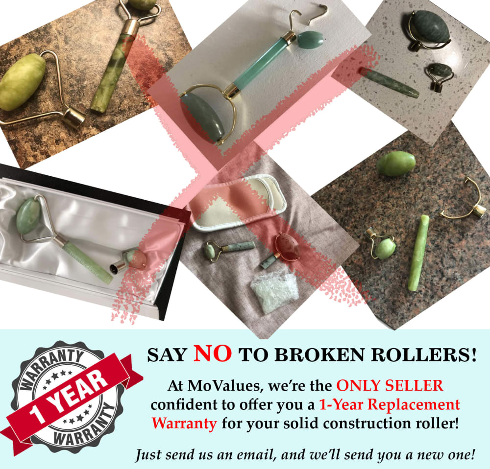
28 Responses to Option A
B is too negative. I would rather choose one that promotes their product in a positive way and not bash another product to do it.
I like option A because it gives clear instructions on how easy their guarantee is, plus the wording is engaging
I chose Option a because option B was confusing. Anything that starts with imagine better not have to do with broken facial products. It sou n d's weird in option B and I would not buy for that store or any other store. Personally unthinkable of these ads are awful. Who has a broken facial rollwr? My girls have them and theirs are perfect. Go but another if it breaks. After 12 months, I would assume you would lose interest or lose the roller. Option A is my choice because it is a little clearer in wording but that is the only reason.
The solid white background makes this looks uncluttered and organized. I like unjumbled product pictures.
The text is shorter than B, there is too much to read on B, I like A better because it is more to the point and when I shop on Amazon I want my information to be short and easy to read.
The bold letters in the description made it stand out and let me know about the product.
Option A broken Rollers very quality i choice option A
The other description is confusing
The only thing that caught my eye is the fact that they will send you a new roller. But I can't tell if they're selling the ones that will break, or a different one. It's confusing.
I chose option A because I like how it leads with no more broken rollers and then goes on to provide the 1 year replacement warranty.
I don't really like either but I guess A looks somewhat more appealing based on the headlines.
A would with the thought of a broken roller. That would get my attention because I wouldn't want to buy something that would break right away, especially a luxury item such as this that I can't afford to begin with.
I like this message a little more.
I like the image betters in this one. I love that it states just send an email we'll send you a new one. Not many companies do that. So I like that they tell you that they are the only seller shows how confident they are. Love that it starts right off with say no to broken rollers before talking about their warranty.
It's never good PR to promote your product via trashing others.
A sounds more grammatically correct. B used "them ones" and that doesn't sound like correct English grammar.
The wording caught my eye and made more sense to me.One year sounds than 12 months. The Say NO portion got the point across.
I think the text in Option A is much more effective. The title clearly explains what the ad is about. In addition, the text says the same thing as the other option but in fewer words (which is better). Lastly, Option A tells you what you need to do for replacement and the other option does not.
B is a little hard to understand because it looks like it is saying don't shop here. Both risk quick glancers thinking not to buy anything because of the red X.
The photos seem closer together and are easier to take in all at once.
I chose A because I think it has the most straightforward tone and content. B has the feeling of an old infomercial the way it asks "Imagine ...choosing one of THESE brands instead?" "Why risk using those ones?" The tone of these questions brings me back to watching TV in the 90s and stumbling across an infomercial. It feels a bit stale and outdated.
You could see the pictures better
I prefer this one, it is direct and makes me feel like I know what the product is and about quickly.
I picked A because of the replacement policy. Sounds like it is easy to get a replacement if needed. B just mentions a warranty, but doesn't state what it covers.
I like the text a LOT more on Choice A but the hodge podge of pictures is difficult for me to look at. I would do the text from A with the graphic from B or maybe just a better graphic overall
The one big picture works better than the six different ones, they make it too busy - however both images are not very appealing looking, too much going on
I chose option A because I like the word replacement in the warranty information. I also chose option A because B is grammatically incorrect.It would make me question the quality of the company.
I chose A because I have done a lot of house painting and the warranty is very appealing to me. I've broken rollers and it's annoying. I like the replacement guarantee. It's clearly communicated in this one what is offered and how to contact the company if something went wrong with the roller.
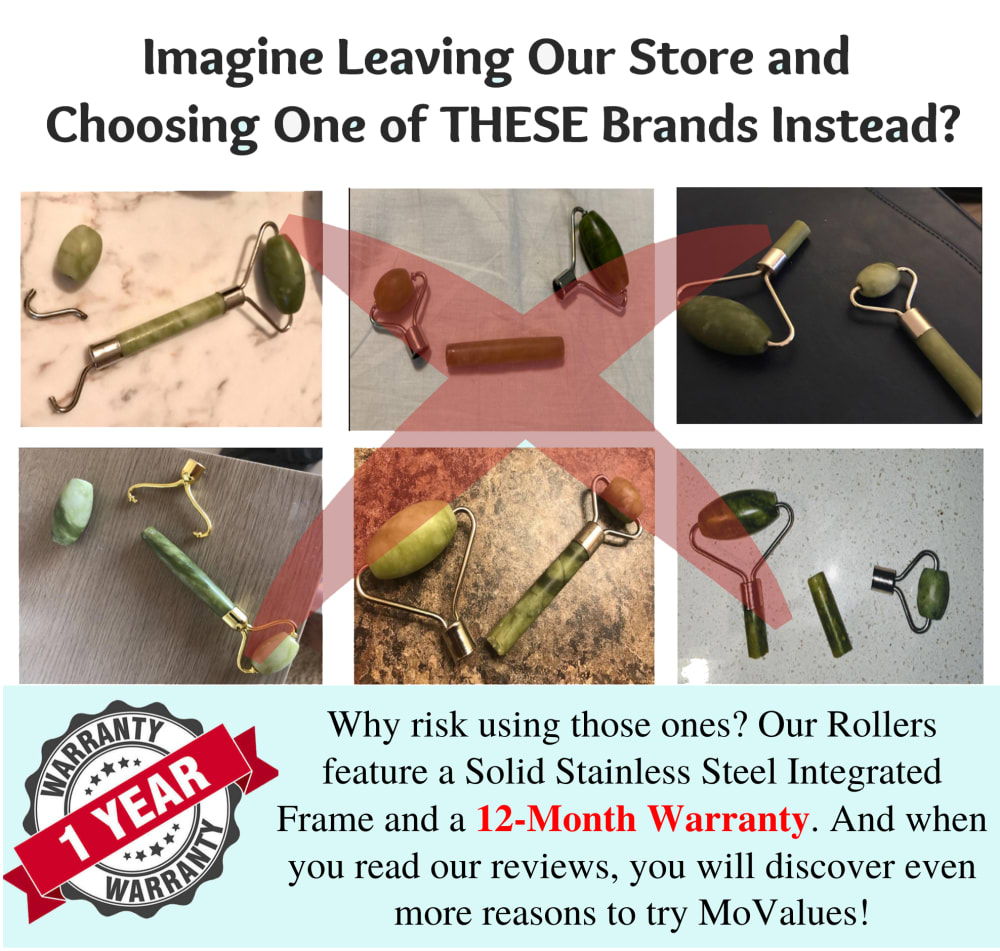
22 Responses to Option B
I feel A is more cluttered and it makes me a little overstimulated by looking at the mess. I will react negatively towards this ad. B is bit more in order.
Option B is a clearer and more precise ad with understandable information and pictures.
this one is a bit more clear as to what it is.
The B add makes more sense as a reason to purchase the product. It speaks of a strong construction of this product and the pictures are arranged nicely, not sloppy.
I made this choice mainly because of the layout and design differences. This one is much more aesthetically pleasing due to everything being neat and orderly looking. It makes it simple for a consumer to know exactly what is going on with the image and to be able to figure out exactly what is being offered. The other picture here is very confusing to look at, very cluttered and almost sloppy looking unfortunately. I could tell I disliked it the moment I saw it.
The second picture is too messy, I would choose this one as I can easily see the products.
The option A is too cluttered and disorganised, which makes it even harder to see with the red ex over the pictures.
The first one looks like a junkyard or something. I feel that B has it more organized and well laid out so people can understand what they are looking at.
Option B is best
i feel more confident in the product i am getting
separated in boxes makes me more interested
It shows the truth of what happens to the peoduct and represents the guarantee of their warrant.
I found Option B's message to be clearer and faster to understand. I can really see why the warranty is needed.
I chose Option B because it is more cohesive and informative. Its clear and has a guarantee that's concise and real sounding. Option A looks haphazard and as though the pictures were just flung into the ad with no care for style.
I think B is kind of confusing. A makes more sense the way it's presented
Its more interesting and grabs people attention rather than saying the other rollers are broken. I would definitely look into the first one
I really am not crazy about either of these ads. I'm more interested in the a photo of the actual product that I am purchasing, not of broken rollers. At least B states that the product is made of solid stainless steel, so that one narrowly wins
I prefer option B over option A. Option B is straight to the point with the replacement warranty and the ad makes me feel like it is offering a quality product. Option A reminds me of the old carpetbagger ad's that promise that a product is SO MUCH BETTER than the competitor's; yet, it's not. Option A is defamatory and annoying, while B is not.
B looks more organized and orderly, but both layouts make the product look cheap. Something found in the back of a free magazine.
The photos are neatly organized.
I chose this because it makes it clear the risk your taking by not buying from their store. Strong advert that would allow me to feel confident in my purchase of their product.
I prefer the wording of B rather than A. I feel its best to be positive instead of saying NO in the opening line. Just talk about the good parts of the product instead.
Explore who answered your poll
Analyze your results with demographic reports.
Demographics
Sorry, AI highlights are currently only available for polls created after February 28th.
We're working hard to bring AI to more polls, please check back soon.

