Poll results
Save to favorites
Add this poll to your saved list for easy reference.
Which product would you rather buy?
Option B won this Ranked poll with a final tally of 26 votes after 7 rounds of votes counting.
In a Ranked poll, respondents rank every option in order of preference. For example, when you test 6 options, each respondent orders their choices from first to sixth place.
PickFu requires a majority to win a Ranked poll. A majority winner differs from a plurality winner. A majority winner earns over 50% of the votes, whereas a plurality winner earns the most votes, regardless of winning percentage.
If an option does not earn a majority of votes, PickFu eliminates the option with the lowest number of votes. The votes from the eliminated option are reassigned based on each respondent’s next choice. This process continues in rounds until a majority winner emerges.
Scores reflect the percentage of total votes an option receives during the vote counting and indicate the relative preference of the respondents. If there is no majority winner, look to the scores to see how the options fared relative to one another.
| Option | Round 1 | Round 2 | Round 3 | Round 4 | Round 5 | Round 6 | Round 7 |
|---|---|---|---|---|---|---|---|
| B | 26% 13 votes | 26% 13 votes | 26% 13 votes | 34% 17 votes +4 | 38% 19 votes +2 | 44% 22 votes +3 | 52% 26 votes +4 |
| H | 18% 9 votes | 18% 9 votes | 24% 12 votes +3 | 24% 12 votes | 28% 14 votes +2 | 32% 16 votes +2 | 48% 24 votes +8 |
| D | 12% 6 votes | 16% 8 votes +2 | 18% 9 votes +1 | 18% 9 votes | 20% 10 votes +1 | 24% 12 votes +2 | Eliminated 12 votes reassigned |
| G | 10% 5 votes | 12% 6 votes +1 | 12% 6 votes | 12% 6 votes | 14% 7 votes +1 | Eliminated 7 votes reassigned | |
| C | 10% 5 votes | 10% 5 votes | 10% 5 votes | 12% 6 votes +1 | Eliminated 6 votes reassigned | ||
| A | 10% 5 votes | 10% 5 votes | 10% 5 votes | Eliminated 5 votes reassigned | |||
| E | 8% 4 votes | 8% 4 votes | Eliminated 4 votes reassigned | ||||
| F | 6% 3 votes | Eliminated 3 votes reassigned |
Age range
Education level
Gender identity
Options
Personal income range
Racial or ethnic identity
Tea drinker
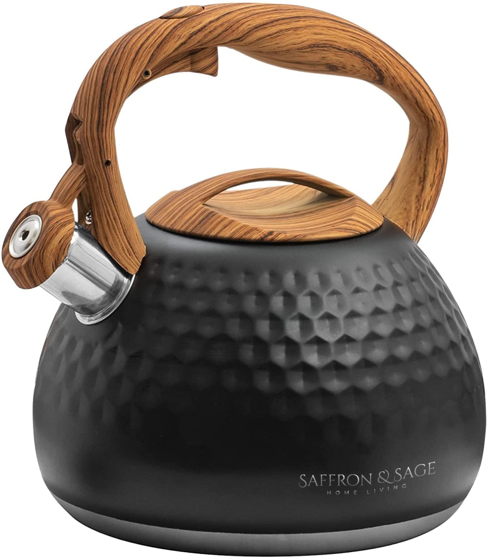
5 Responses to Option A
I strongly prefer neutral colors like blacks/greys/white for kitchen items. Black first, then likely chrome, then grey or white. I don't use many colorful items in my kitchen.
I PREFER THE NEUTRAL COLORS THAT WAY IF I CHANGE MY KITCHEN AT ALL IT WILL ALWAYS MATCH. THAT IS WHY I CHOSE IN THE ORDER THAT I DID.
I really only like A. I might buy B, C or E as a gift. I loathe the other colors.
The black is quite interesting, the design is outstanding and beautiful, I like it allot
I would love any of them. They are gorgeous. I would choose Yellow and White last because they would show every smudge, not that I don't clean a tea pot. If you had a bright and sunny kitchen this might be very popular. Mine is Copper, so I would like the black.
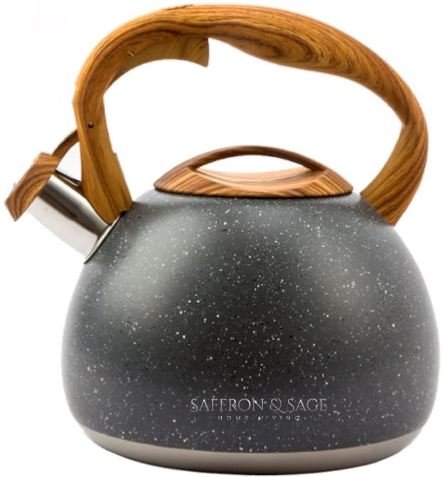
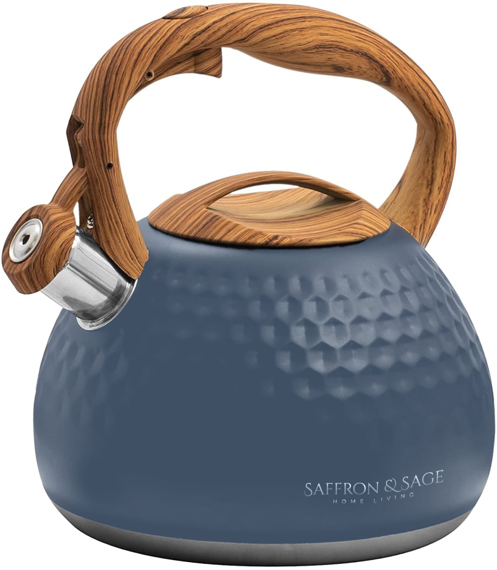
13 Responses to Option B
My favorite is the spotted one, but I also like the soft, muted colors of F, A, & E
The darker colors would hide any and all food stains, splatters and or scratches obtained while using.
I like this design the best, I like the smooth design the kettle has and I like the color scheme on the kettle as well. The other options look like golf balls, and I did not like that.
I prefer neutrals and black, so I voted for those first. Funny enough my kitchen is teal and this color stained wood so I liked those too! I'm not a fan of the blue though.
I like all of them, except the deep blue one. It just depends on which color would fit in with the customer's kitchen. I would like to know what the material is that's wrapped around the handle.
The black color (always my go-to choice) plus the texture of Option B make it the stand-out option for me.
I chose B first because I liked it better with the black color and also because the little white dots in it were very attractive. I did not like any of the others because of the way it was made with the small indented dots. So therefore, B was the best overall and all the others were about the same - all because of the small indented dots.
Option B, the black with marbling, is the best color/texture by far since it reminds me of nice stonewear. I would like a green color more if it were a deeper green, like plant leaves, to match the wooden handle. The green, option G, is much too light for me. Other than that, neutral tones are always good, I'd love a clay kinda color, or terracotta option too possibly.
I love the speckled design on the black it's sublime. The rest of the colors I did neutrals because that's what I like, then yellow and some ugly blue, green and teal colors. It looked the same to me except the color.
I really like the rustic look of B with the white flecks. I think it gives the tea pot more character than the other non specked choices. I also prefer the darker colors because they will show less wear and tear over use compared to the lighter colored ones.
The marble like pattern is really nice
I like the neutral colors because the ones that provide color don't go with my kitchen colors. My favorite thing with the teakettle B is the texture of it.
I prefer the display designs listed in the following order:1. Option B because I like the antique look of the kettle2. Option A because it is of dark coloring which will keep good appearance for a long length of time.3. Option E because it is a dark medium color that would hide demarcations4. Option F because it is a good color but less noticeable 5. Option C because it is a nice cool color and attractive6. Option H because it is a beautiful color and a reminder to go green 7. Option G because it is of the lighter colors whereas I prefer the darker color which would hide demarcations with time.8. Option D because it is pretty but the lighter color would not stay as pretty as the darker colors.
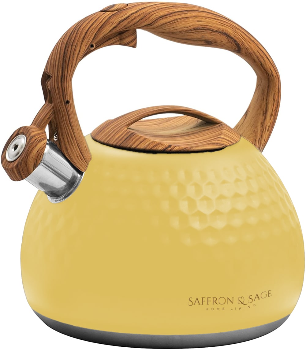
5 Responses to Option C
I like C the best because the yellow would fit with my kitchen decor. The navy blue E or turquoise H are also appealing to me. F and A are about equal, they are nice neutral colors that would stay clean looking. B is only lower than A because I prefer the texture on A. G and D I would personally worry about showing dirt or stains easily.
The yellow color looks so elegant and looks very unique from other options
I choose "C" because yellow is my favorite color. But these are the cutest tea pot.
F felt way too dull. A and E were too dark and depressing. B was at least cute for being speckled. I otherwise liked the options with lighter and brighter colors since these felt more vibrant and refreshing.
The yellow color is perfect for a tea kettle
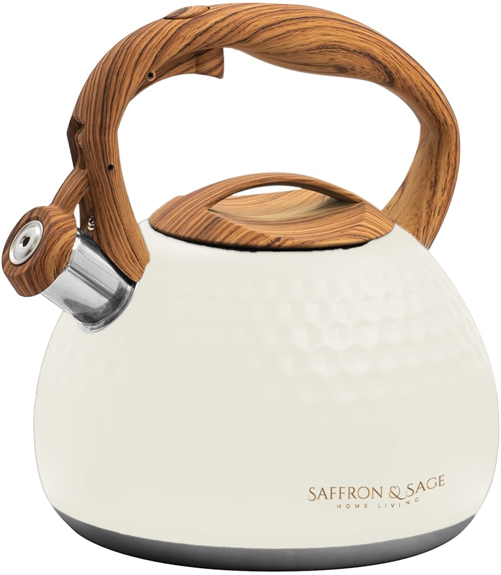
6 Responses to Option D
The pallet colors are more soothing and fun to look act versus the darker colors that have too much contrast to the product.
I would choose option D because I think that it would match best with my kitchen and would still match if I move or redecorate
i ranked color vise i love light color so i pick light color first
I chose in order of the colors I like.
D looks clean for a kitchen and goes with any decor. I kinda like E but it looks like a country kitchen color. H don't like the color . The others don't appeal to me they are not fun colors for a kitchen
I would pick option D because it is white in color, especially I like that it is combination of white and gold, I would always prefer white because it is my favorite color.
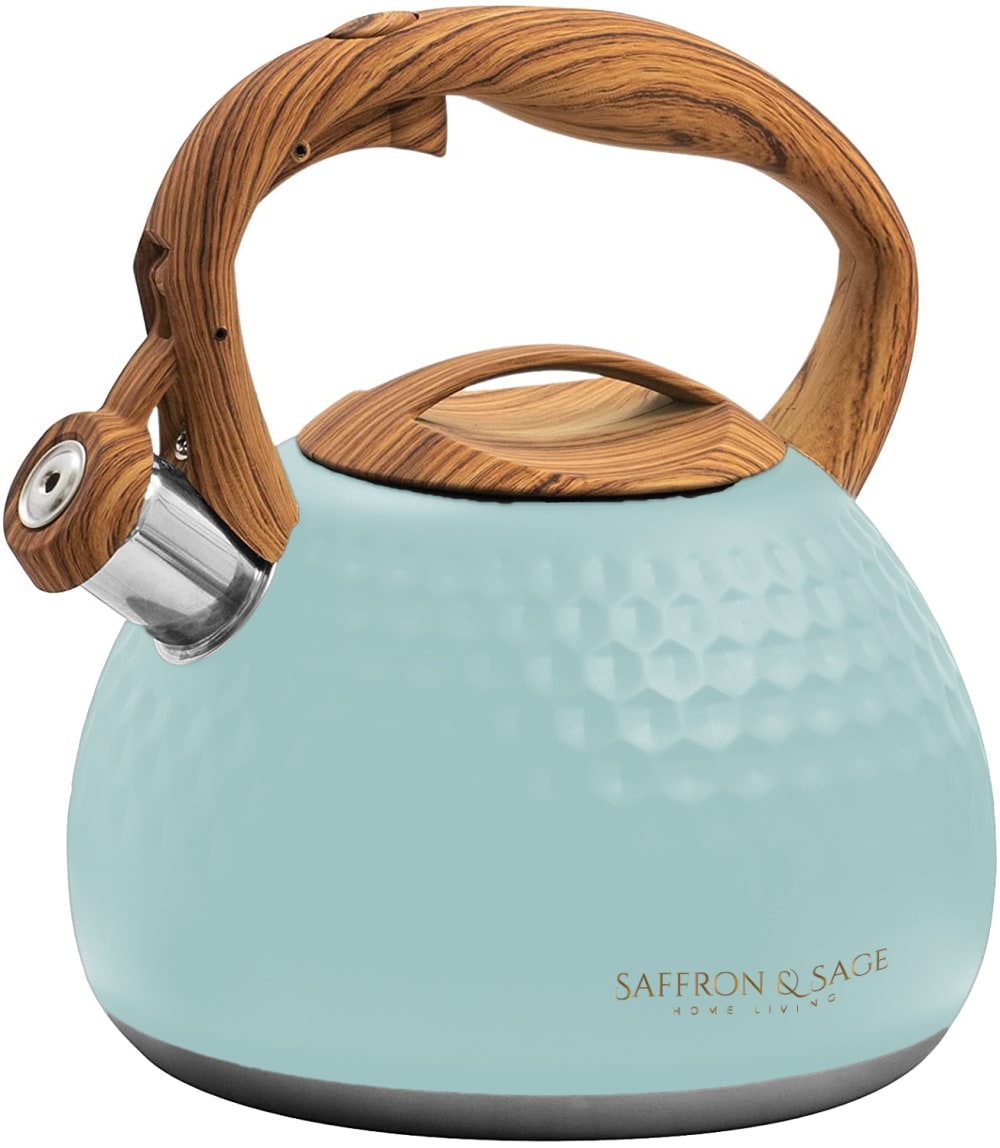
4 Responses to Option E
Given the options, I prefer Option E for the color. I'd be most apt to purchase this one if I was in the market for this type of item.
I went by favorite color mostly. I don't really like the speckly one, but I like it more than some of the color options like yellow.
I like Option E the most because I think this colors gives the best contrast but isn't too bright either. I don't like the very bright colors.
I ranked by how visually pleasing each option was. E was most pleasant to look at where B gave a look like someone didn't completely wash it.
3 Responses to Option F
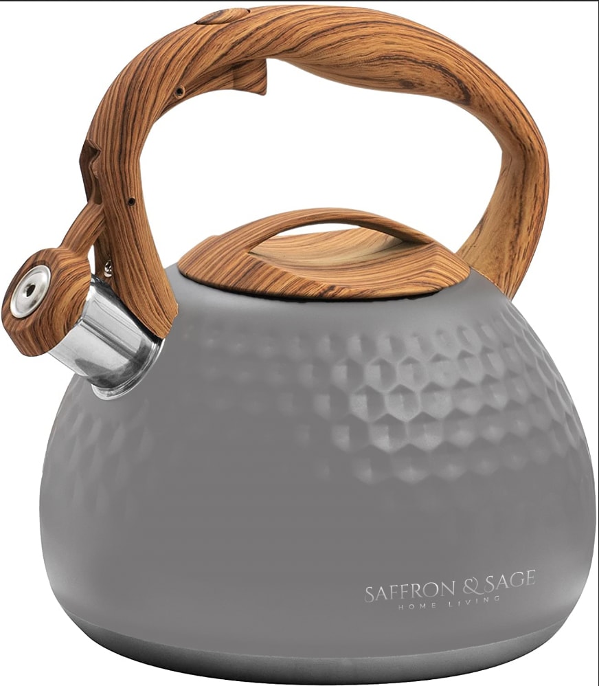
I prefer the more muted colors rather than the bright ones. I love grays and neutrals
i am a very neutral person. i love grey. most of my home and décor is gray. therefore my tea pot choice reflects this as well.
I like standard looks and hate teal.
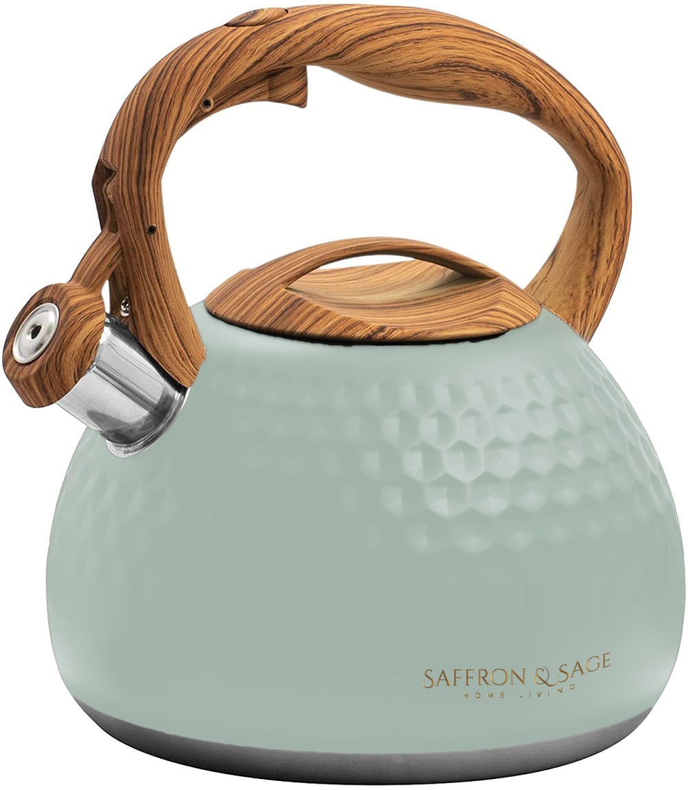
5 Responses to Option G
Option g is green and my kitchen is decorated with this shade of green. It matches perfectly.
I like the Celeron green of Option G. It's very earthy and appealing and seems unique. Options E & F with the blue and the grey are both attractive and stylish. Option B is a dark slate grey and seems sleek and interesting as a color. Option A is also quite nice with the pale aqua color that would bring a pop of color to the kitchen. The remaining options are perfectly fine but not as eye catching and seem a little ordinary.
I like my first two ranked options the most. And these two would be the ones I consider if I were really deciding to buy one. I also like H, so I would be fine settling for that one. I don't really want any of the other colors.
Shades of blue are my favorite colors and I chose them in light of the most soothing shades and my favorite colors as well as colors that would work in the theme of my home
I didn't like the greys and black so much as I did the other colors... not that I think they look bad, but for kitchen decor, I personally keep things lighter. I did however like the look of the speckled grey.... it goes well with the natural look - the shape, curves and color of the wood. I always have a personal preference for green hues when it comes to anything and really was drawn to the overall look of Option D... G and D are my top picks.
9 Responses to Option H
I really liked my first three choices the best. I would have been pleased with any of those selections as they go with my decor.
I chose the colors I found the most appealing. I like blues and I do not like yellow.
i think the color is the cutest
I prefer the green ones the most. I like the colors.
I chose H& E because they were the two that would most closely match my kitchen. I chose B last because I didn't like the speckled look of the tea pot. I like the more honeycomb looking ones.
H has a very strong brand presence and awareness that I find to be on point and have a more consumerist appeal
I liked the lighter color tones of option H, G, C, and D. Option H, I liked the color shade the best followed by option G. Option C, looked nice. Option D, looked a bit more simple with the white cream color. Option E, I liked the blue tones a bit more than the gray for option F. Option A and B, looked fine; a bit more basic with the color tones. Option B, I wasn't a big fan of the speckle look.
i like the colors that are a little darker but also not too dark. i like the ones that stand out a little more but i also do not like the all black or the all white ones very much cause i feel like they are kind of plain and basic.
I love all of these!!!
Explore who answered your poll
Analyze your results with demographic reports.
Demographics
Sorry, AI highlights are currently only available for polls created after February 28th.
We're working hard to bring AI to more polls, please check back soon.

