Poll results
Save to favorites
Add this poll to your saved list for easy reference.
Which product would you rather buy?
Age range
Cosmetics and body care habits
Education level
Gender identity
Options
Personal income range
Racial or ethnic identity
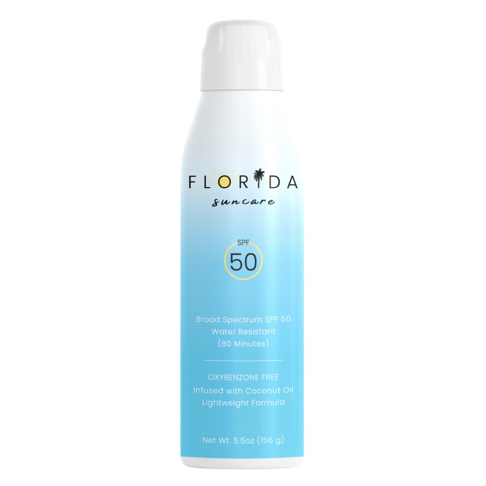
27 Responses to Option A
The Florida name. The ombre blue color is pretty.
I really love the gradient design of the bottle- it sets it apart from the other types of similar products.
i prefer the blue color in option a, its bright and inviting and feels more friendly
Option A looks a lot more composed and attractive. Option B feels a bit cheap.
I chose option A because I love florida and the palm tree on the I is so cute! This is my first choice.
this has more of a simple minimalistic look
I like the ombre blue color more. I think it's a lot prettier.
I chose option A because the bottle reminds me of summer time. My eyes would be drawn to this bottle on a shelf.
The product is more eye catching and looks of higher quality.
I think the ombre white to blue color of the can is not only aesthetically pleasing, but also fun and attention catching, makes it stand out among the other similar products.
I prefer option A because this product packaging design looks more attention grabbing and enticing, I like the name, as well.
I like this one better because it has more color and is eye-catching.
I choose A seems like it would smell better than B
I like how it spells Florida on the top with a yellow sun. I like how the bottle has a lot of blue on it. I like how Florida is printed and not written in cursive writing and Ilike the palmtree a lot too.
A is very refreshing and pleasant compared to B.
One of the reasons I chose option A over B is because I like the name Florida is designed as it catches my eye. I like the colors used on the product bottle and I like that the SPF level of the product is easy to see.
The ombre effect on A is more attractive, the logo is standing out more also (B at first glance looks like shampoo)
It has a much more exciting design and looks better quality.
I liked the design for option A the most.
I love this one as the bottle seems classy and I love the way the colors ombre and fade out on the bottle. It looks young and youthful to me
I feel that people in Florida must have pretty good sunblock.
I like the blue ombré label best and the word FLORIDA! The other label is too boring all in white and leaves too much blank space.
I prefer Option A because I think the logo and name are more catchy than Option B. Option B is bad also because it doesn't seem to indicate clearly that it is sunscreen, and the SPF information is in tiny font.
I really like a better this it’s more classic and it goes along with the product and the description
I prefer the coloring of A. It's a bit harder to read than B, so I'd maybe do the writing a bit bigger
I like the light and cheerful design of A, it feels very cool and refreshing.
The packaging in A is more unique and stands out more compared to B. I would be much more likely to purchase A.
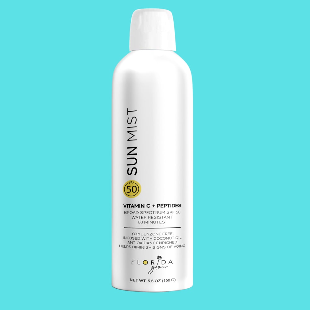
23 Responses to Option B
I prefer Option B because the product looks more scientifically based and like a more effective product, Option A looks like it is for children.
I chose B because I like the look of the clean white can, with pops of yellow that correlate with the logo. I prefer the highlighted ingredients to be featured on the front. Such as: vitamin c + peptides.
I would prefer choice B - with both being 50 SPF, I would prefer the option with Vitamin C and peptides as those are beneficial for my skin.
I have a strong preference for product B. Option A looks like a no-name brand I would buy at a CVS in Florida, whereas option B looks like something you'd buy at a higher end shop/salon.
it additionally lists helps diminish signs of aging, so an extra bonus
I would choose option B. I like that the label on the bottle is easy to read, I don't have to strain my eyes to read the smaller text.
I chose B because it just looked better to me. It looks like a better product.
B looks like a higher quality product, and it's easy to read the can. The white type reversing from the light blue on A is much more difficult to read and when I do, the information is not nearly as compelling.
This one looks more sleek and luxurious. It was a hard decision because the other one looks friendly and happy so i guess it just depends on the purchaser.
It looks more classy and luxurious.
I chose B because it contains vitamin C and peptides.
I'd rather buy B it looks a little bit fancier and I like the vitamin C and peptides!
This looks gentler and better formulated and unique
I prefer B because the packaging is simpler and sleeker.
The black on white text is much easier to read than the white on blue text. B is much more pleasant to look at.
I like that it says it has vitamin c and peptides, so it has some extra benefits.
I like the pure white bottle a lot better than the blue one.
I like the name Sun Mist over the same Florida. It seems more natural.,
it looks more professional and higher quality. i believe it more that its spf 50. i kind of love it and would like to try it .
I prefer option B because I like the fact that it has vitamin C and peptides in it and it's easier to read than the blue bottle, being someone interested in skincare that is a very important factor to me and also that I can clearly see the 50 SPF.
The style of the package is more modern and makes me feel like the product is more advanced.
I can read the label better and I like the name as sun is not just in Florida!
It's about the same really because they both appear to be mineral sunscreens of a SPF 50 which is the kind I look for (50+ and mineral only meaning no oxybenzone). I suppose the color and the background work nicely on choice B but Ialso like the shiny sheen of the surface of the bottle, it looks like it will hold up longer as well as the layout of the text being more high-end and attractive to me.
Explore who answered your poll
Analyze your results with demographic reports.
Demographics
Sorry, AI highlights are currently only available for polls created after February 28th.
We're working hard to bring AI to more polls, please check back soon.

