Poll results
Save to favorites
Add this poll to your saved list for easy reference.
Which product would you rather buy?
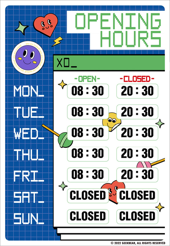
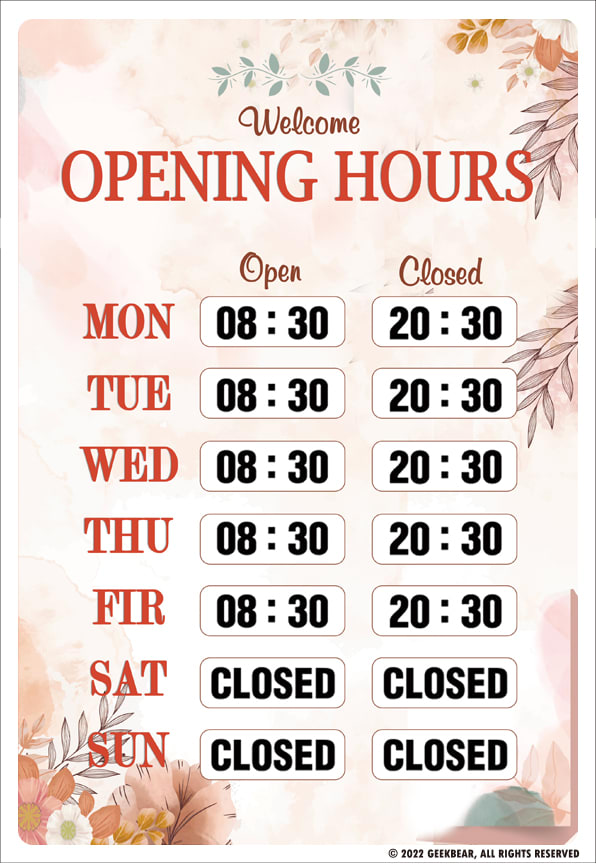
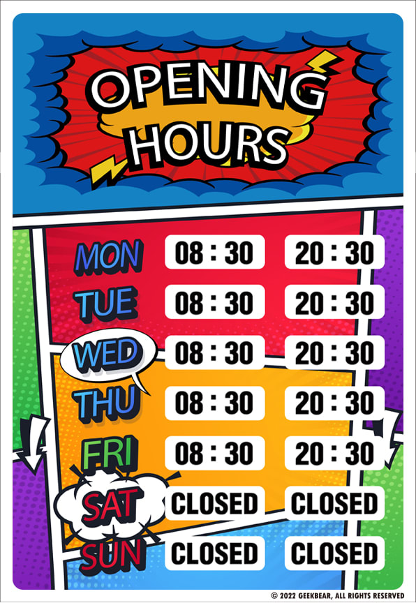
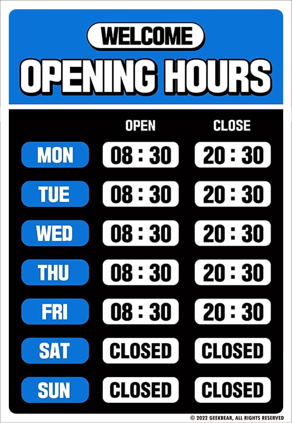
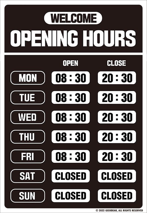

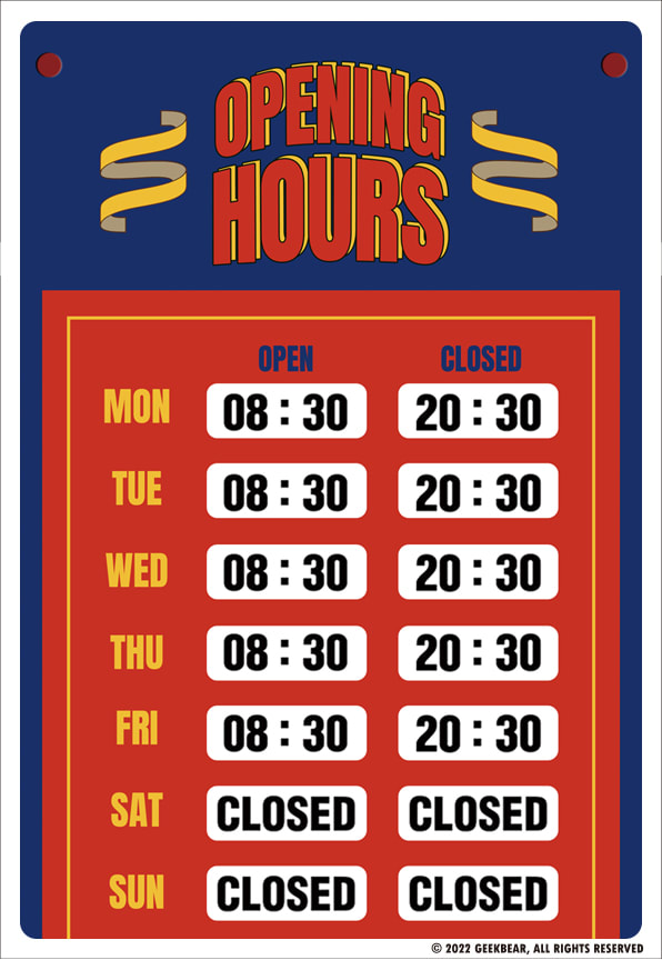
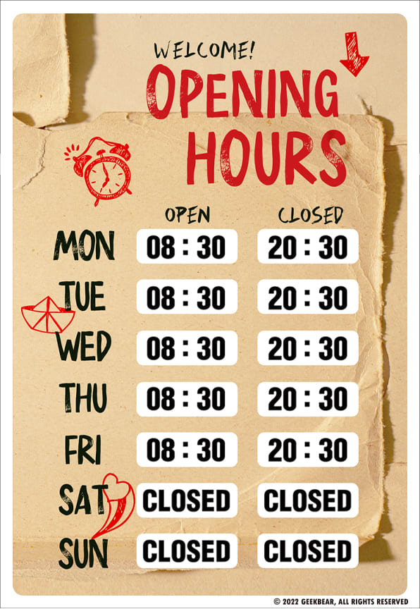
Option D won this Ranked poll with a final tally of 32 votes after 7 rounds of votes counting.
In a Ranked poll, respondents rank every option in order of preference. For example, when you test 6 options, each respondent orders their choices from first to sixth place.
PickFu requires a majority to win a Ranked poll. A majority winner differs from a plurality winner. A majority winner earns over 50% of the votes, whereas a plurality winner earns the most votes, regardless of winning percentage.
If an option does not earn a majority of votes, PickFu eliminates the option with the lowest number of votes. The votes from the eliminated option are reassigned based on each respondent’s next choice. This process continues in rounds until a majority winner emerges.
Scores reflect the percentage of total votes an option receives during the vote counting and indicate the relative preference of the respondents. If there is no majority winner, look to the scores to see how the options fared relative to one another.
| Option | Round 1 | Round 2 | Round 3 | Round 4 | Round 5 | Round 6 | Round 7 |
|---|---|---|---|---|---|---|---|
| D | 26% 13 votes | 26% 13 votes | 26% 13 votes | 30% 15 votes +2 | 40% 20 votes +5 | 48% 24 votes +4 | 64% 32 votes +8 |
| B | 14% 7 votes | 14% 7 votes | 14% 7 votes | 18% 9 votes +2 | 22% 11 votes +2 | 26% 13 votes +2 | 36% 18 votes +5 |
| F | 14% 7 votes | 16% 8 votes +1 | 18% 9 votes +1 | 18% 9 votes | 20% 10 votes +1 | 26% 13 votes +3 | Eliminated 13 votes reassigned |
| C | 14% 7 votes | 14% 7 votes | 18% 9 votes +2 | 18% 9 votes | 18% 9 votes | Eliminated 9 votes reassigned | |
| E | 16% 8 votes | 16% 8 votes | 16% 8 votes | 16% 8 votes | Eliminated 8 votes reassigned | ||
| H | 6% 3 votes | 8% 4 votes +1 | 8% 4 votes | Eliminated 4 votes reassigned | |||
| A | 6% 3 votes | 6% 3 votes | Eliminated 3 votes reassigned | ||||
| G | 4% 2 votes | Eliminated 2 votes reassigned |
Age range
Amazon Prime member
Education level
Gender identity
Options
Personal income range
Racial or ethnic identity
Small business owners
3 Responses to Option A
I choose this option A because this is the better choice and attractive opening
These are all perfectly fine, but why not pick something that makes the customer smile? I think A and C would both do this. G, F, and B are stylish. H is beautiful but maybe for a spa. E and D are great but plain.
Option a has a candy / video game theme feel, I like it
7 Responses to Option B
I like option B the best because I think that the sign is designed in a way that is relaxing to look at and I think it would convey a feeling of warmth and inviting welcomeness to a customer who would look at it.
I like the look of the soft colors and the floral pattern on the one that I ranked first. But I think ultimately, the choice would come down to what type of store I would be using it for because I would want it to match the theme of the store.
B, F and H are attractive simple and make the hues of operation easy to see and read
The plain ones are better for business because they are non offensive.
B is the clear winner to me. It's nice, pretty and simple in design and easy to read. It's a sign that will work in any store and provides a welcoming feeling. F is pretty close but the darker colors make it seem slightly less friendly. H is nice and gives off a more "friendly" vibe but also slightly less professional so that might limit what type of store it would useful for. G is interesting and nice but overall nothing special. D and E are standard and can be used anywhere with nothing to worry about. C and A feel too specific for a store type and would wholly out of place in most traditional stores.
I like option B because the design is nice and simple.. The colors are beautiful on option B. The rest of the colors E-C are not pretty.
My personal preference is for B because it's the prettiest. After that, I chose ones that stand out and draw attention since you would want your customers to have their attention drawn to it.
7 Responses to Option C
I love the graphic/comic design. It's unique, works for both genders, and is very eyecatching.
looks the most unique, which could drive more people into the business
I like and would be more than likely to purchase the more animated imagery. I like the cartoonish look.
I like choice C because I feel that the sign is eye catching to begin with which draws people to the sign in itself.
The brighter and more vivid the colors, the more it'll attract attention and the more that people will notice it. Option C fits that description the best, which is why it's first. Option B is the most muted, which is why it's in last place.
I didn't like the floral design of B and think that it looks too formal unless you own a book store or flower shop. I like how colorful and eye catching C is and how it looks more fun. I also like how easy to read G and D are and how they have color in them as well. The red and yellow look good in G. I don't care for the pictures behind the times in A. I also think F and E are too boring and don't stand out.
The colors on this are vibrant and eye catching. Due to this, this is my top pick
13 Responses to Option D
I think I'd most likely get Option D out of the eight choices. I like the color scheme of the sign compared to the other choices, in addition to that, the sign is very simple and easy to read.
I personally think the black, white, and blue color scheme of D is the best here.
I'd really want something basic and easy to read for something like this. Options D and E's basic coloring does that for me, making it look professional and easy to read at a glance.
i would buy the sign in option D because the numbers are the easiest to read for people
It looks the most formal. I like the dark but bright colors as it’s easier to see.
Although I really like the comic book style of number 7 I think the colors actually make it really hard to read. The ones with the highest contrast are the best. Assuming they're available online also I want to be able to read them if I drive by and I'm curious if they're open or not I won't stop by if I can't read the sign from the road so it needs to be big enough to read and have enough contrast.
I picked D first because I like the black and blue combination and I liked E because of the black too. I chose B last because pink is too feminine.
I like D for this, it is simple and not cluttered looking like some of the others and the added blue helps it pop out to catch your attention.
I want something like this to be fairly simple and plain. Choice D is what I am looking for. It is easy to read and has just a little bit of color. I works and looks professional
Option D stands out the most among the choices. The color scheme does a great job at drawing in attention, but allows it to maintain an easy to read look. It would look natural in most environments.
Options D,H,E and G are options that have color schemes that I enjoyed, I also that option H is creative and different from the bunch.
I like the simplicity of the designs in options D, F and E. I just like the color scheme more in option D, I think it is very eye catching and will get people's attention.
Keep the sign straight and to the point - let me decorate the rest of my building/office, but the sign can remain simple and plain. Options D and F do the best job at that in my eyes, while adding a pop of color to make the sign visible.
8 Responses to Option E
E- has a unique and simple outlook H- seems to be catchy and appealing design patternD- the color goes well with the outlook and design B- has simple and elegant design pattern C- seems to be flawless with different color pattern F- has a great outlook and background is amazing G- seems to be raw and clean A- has a shiny and classy look
The plain signs are just fine. They are only there to provide information to the customer. If there is too much going on, the customer won't be able to see the hours clearly from a distance when they drive past.
I think G A and C look to cartoonish and would not consider. i like e a lot it's easy to read, neutral and goes with any business. B is also a good favorite if it went with that type of store front.
I always prefer the options that are easy to read and eight customer can digest very easily once they glance at it that would be E
I prefer choice E for the more simple print.
For a sign like this, basic is better in my opinion. I would prefer it is easy to read than flashy and noticeable. For that reason, options E, D, and F are my clear preferences, whereas all of the other choices are much less preferable.
I like the simple basic look but depending on the business other choices may fit better.
I like the lighter colored choices that have just the numbers they look quite nice and better quality prints
7 Responses to Option F
I prefer the classier looking signs. They’re less childish and explain more clearly in my opinion.
I love this as it has a very modern feel with a vintage design all in one and is very unique
It looks uncluttered and professional
I prefer the option F time sheet because it is the most clearest one and and has some nice teal and blue colors that I like the most. I chose options D, E and G second, third and fourth because these time sheets are unobstructed by useless illustrations and I like the black background colors more than the red and blue background color in the option G product image. I chose options A, C and B fifth, sixth and seventh because I do not like the illustrations shown on these product images as much. I chose option H last because I do not like the non-solid color of the font used in this product image at all.
I think it would be good to have some color but not be obnoxious.
I like F because it looks to be the most retro and also comes with a highly sophisticated look too.
I like that although it is simple in design, there is a little color added in there to give it some spark. I think hours of operations signs dont need to be too wild and creative. Just simple and to the point.
2 Responses to Option G
G and H have the best color schemes to actually get noticed by your customers and possibly they will remember too. The other options have more dull color schemes that likely won't stand out to your prospects and customers.
I ranked the designs of the opening hours signs that I liked the most. I found the design of option G to be the most appealing followed by option F followed by option D followed by option E then option H then option B. I then liked the design of option C more than option A.
3 Responses to Option H
The times are easier to see and process at first glance. The background makes the numbers stand out better.
I prefer H over other options because the graphic design of H is extremely appealing and visually attractive
I would choose choice H and D first because I find then to have very good colors and also no much bright colors which tend to draw the attention from the dates then choice B and E will follow because they have a quit attractive design and the color choice is not also that bad then choices G and F which are a bit more congested with the design to the point that the dates are not given the required attention by the viewer then the last options will be A and C which I find them to have the least favorite color and also the design is not the best of the options.
Explore who answered your poll
Analyze your results with demographic reports.
Demographics
Sorry, AI highlights are currently only available for polls created after February 28th.
We're working hard to bring AI to more polls, please check back soon.

