Poll results
Save to favorites
Add this poll to your saved list for easy reference.
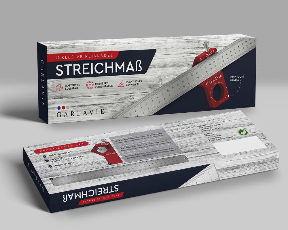
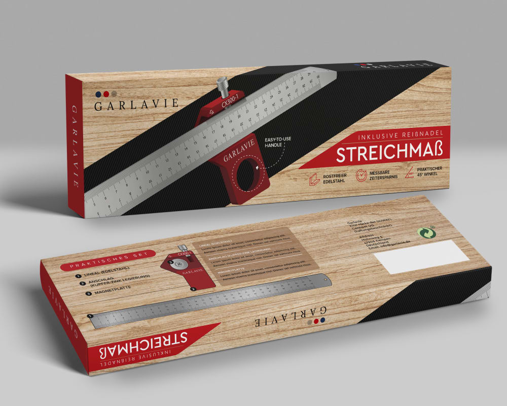
Which Product packaging do you prefer?
Age range
Education level
Gender identity
Interest in gardening
Options
Personal income range
Racial or ethnic identity
27 Responses to Option A
I prefer choice A for the lighter packaging.
I feel like the white/silver and black tones of A are a better all around visual fit for the product in comparison to B.
I liked Option A because I can read the information on the gray box better.
I like A better because I think it looks just a little cleaner. I like that the edge of the ruler cuts off the wood design. In B, the black bar behind the ruler just looks a little out of place. I like the way that A is organized. I also prefer the black and silver combination rather than the brown and red.
I like choice A because it is modern looking.
The silver and white looks better for this tool. Think this is a better choice. I would go with that as the option for the product. Good box in option A.
I think A is the better product packaging. The light colored wood matches well with the silver of the ruler, and the red and black make for nice accents to the overall presentation. Everything looks very clean and professional.
I like the lighter color background.
I prefer this packaging because it looks cool and enticing.
I preferred the grey packaging it was more visually appealing to my simple brain.
I like them both, but the slightly more industrial look of A I think works better with the product.
I think the coloring on option option A seems more professional and I also like the fact that the product name is more prominent than on option B
I picked A because the white and black is bold and stylish.
The white wood in A is very attractive. B is okay but I like A better.
A looks innovative and modern.
A looks cleaner and more modern. It's also easier to read and I think looks more attractive.
The color palette allows you to focus more on the product
I prefer this one it looks more professional and high quality.
I like the gray color, makes the box pop
I like this one more because it seems to be higher end when something is silver and has the classic black and white color over a wood pattern which feels lower quality to me.
This one as opposed to the other one looks more modern, the other one seems dated and drab.
I like the cleaner look of the greyish white. The tan just looks more vintage.
It looks cleaner than the brown one and stands out to the eye better.
A feels more modern.
The black and white one stands out the most. I don't like the brown on the other one. It's not attractive.
The white looks better.
I like the layout and the colors of A better
73 Responses to Option B
I have never seen a wood with the grain of white that is featured in option A. It looks so fake and cheap and painted. It's not white birch, because white birch is not that color inside. It's tan. SO yeah, the regular wood grain wins, in option B. Option A was way too suspect.
Since this ruler is used with wood, I like the wood design of the box. It matches well with the product.
The wood design is cool. It goes good with the tool that you're buying with it
I prefer the lighter wood tone.
the product packing on B looks more enticing beautiful and well designed.
I like B more because it is a bit more colorful and there is a bit more character with the packaging because of the color.
i love the natural wood tone on the packaging
I like the packaging in option B because it feels more vintage and durable to me. Option A feels too average and mediocre to me overall.
B is the one for me as I like the wood finish box better.
Choice b is easier to see the product
Option B packaging looks nice and eye catching then option A
I prefer the product packaging with the wood look more than the other.
I like the package shown in image B because of the natural wood color. It makes me think about the things that I would use the product to measure.
I like option B the best because the wood design background makes the box stand out more.
I like the look of the natural wood color on the packaging.
This option felt warmer based on the light woodsy color it had. The gray option looked dark and depressing.
I prefer the packaging on option "B". The design looks simple and eye catching.
I think that the design of this packaging and box is much more attention grabbing than the other.
The packaging looks better. It is more natural in taint.
B is the best one for me because the packaging is the easiest to read with the colors and fonts. It is more eye catching as well.
I like the wood color on the packaging in (B).
The wooden look adds a nice authentic and classy look to it.
B has a very attractive and nice color
This product looks like it has to do with wood. Choice B has a better look of wood. A is very drab. B has the color to it which is more appealing.
I choose Choice B because of the contrast in color of the packaging. The light brown on the box makes the font and label easy to read and the red banner with the brand name "Streichmab" has a vibrant and eye-catching color. Choice A has too many gray tones and it also blends the packaging and makes the instruction on the back hard to read.
I like the sand color of option B the most, personally.
I like the wood look one. It looks nicer on the eyes.
I like option B the best because I like the brown colored wood background on the packaging.
I thought the wood look was nicer.
I prefer Product packaging " Option B ". I like the color pallet used in option B. I also like the way the Tool is centered on the packaging with black background, allowing me to see it better.
option B is designed to make the picture of the product stand out against the background. Option A has a gray background that blends in with the color of the product image.
The wood is very classy and easier on the eyes than the grey.
I prefer the product packaging in Option B because the tan/black/red/gray combination provides more contrast and depth in the image and makes it much more attractive and appealing. It makes the item you are selling much easier to see and the verbiage on the package much easier to read - I think Option B will much more easily attract the attention of the potential buyer.
i think the natural wood color makes the whole thing look brighter
The box for option b looks so much more professional. What a high quality look.
I like B better because it has the warm toned wood-grain on the package.
B looks higher quality and more elegant.
I like the original wooden background because it is easier to see the product and information against this color. The other color washes it all out and looks faded.
From the looks of it, this seems to be a measuring/angle tool to help people with home projects and construction. I think the wood colored packaging in Option B is the strong choice here since it looks like it belongs in a hardware store and reminds me of wood!
I usually choose the most discreet colors but in this case I will choose option "B" because the design seems excellent to me, I think I can smell the wood.
the grey box on a doesnt make the product stand out as much as b
B because i notice the wood look more and it looks more high quality and appealing to me and makes me engage in this product packaging more and wanting to learn more about it
I like the wood look on the box for choice B, It seems more descriptive of what a person would measure.
B has a better color scheme. The products can be seen clearly against the tan (wood) background. The background in A blends too much in with the product so that the measuring tool doesn't pop out like it does in A. B is the clear winner.
I like the natural wood look of B.
The wood colored package makes it easier to see what the product is for.
The brown/tan wooden background feels warmer and more alive than the grey color palette.
I like the traditional wooden look packaging design better which represent well for wood crafts equipment.
I like the wood color and print . The other one is not bad etiher.
I prefer Option B the most. The packaging looks like real wood and would catch the consumers attention the most.
I like the warmer colors of choice B better than the cool tones. It is more inviting, and make me more apt to grab it.
I like the look of B better because it looks like the device is being used on a normal wood surface and option A just looks like it was used on a fake surface.
I like option B the best. I like the wood grain on the packaging. It is attractive and astatically pleasing
I like seeing the real wood lok.
I like the brown woodgrain look. I think it's more natural and I think the black and white text pops more on B than the gray wood of A.
The wood look is appealing and nice looking .
It's much easier to see the product against this background.
Choice B called my attention due to the wood background.
The wood design looks really sleek.
The wooden one looks more natural of a surface of what the instrument would be used on.
The brown cover of the label looks better since you can see the product a lot better. It makes it stick out.
The more natural wood color on the packaging makes the product look more "artisanal" and natural compared to Option A.
i like the wood tone of the B box better, its a bit more eye catching
I feel that A is too close to the color of the item that it makes it harder to focus on it
I like this one so much because it's so unique! I love that it actually looks like wood/ a board! This is creative and unique and would catch my attention.
I like option B because the dark wood background stands out more on the packaging.
The colors and design is better in option B. I like that the wood is wood color. It makes the box stand out.
The wood is a more natural color.
I prefer B over A because of the fact that it matches it purpose of normally working with wood.
The contrasting colors on the package give me a better view of the product.
B stands out more than A. I like the coloring.
the background of B looks obviously like wood. I don't see that immediately for A.
I personally like the all natural wood look in comparison to the steely cold looking greyscale one. Thank you.
Explore who answered your poll
Analyze your results with demographic reports.
Demographics
Sorry, AI highlights are currently only available for polls created after February 28th.
We're working hard to bring AI to more polls, please check back soon.

