Poll results
Save to favorites
Add this poll to your saved list for easy reference.
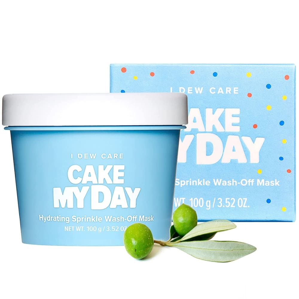
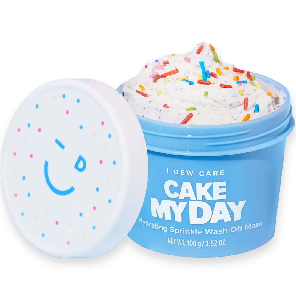
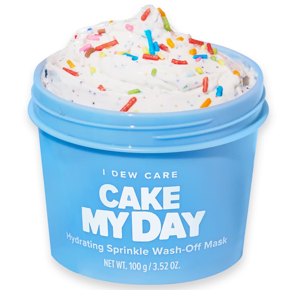
Which product image would you click on Amazon and why?
Option B won this Ranked poll with a final tally of 29 votes after 1 round of vote counting.
In a Ranked poll, respondents rank every option in order of preference. For example, when you test 6 options, each respondent orders their choices from first to sixth place.
PickFu requires a majority to win a Ranked poll. A majority winner differs from a plurality winner. A majority winner earns over 50% of the votes, whereas a plurality winner earns the most votes, regardless of winning percentage.
If an option does not earn a majority of votes, PickFu eliminates the option with the lowest number of votes. The votes from the eliminated option are reassigned based on each respondent’s next choice. This process continues in rounds until a majority winner emerges.
Scores reflect the percentage of total votes an option receives during the vote counting and indicate the relative preference of the respondents. If there is no majority winner, look to the scores to see how the options fared relative to one another.
| Option | Round 1 |
|---|---|
| B | 58% 29 votes |
| C | 36% 18 votes |
| A | 6% 3 votes |
3 Responses to Option A
I would click on option A because it looks the most inviting and friendly. Option B and C don't feel quite as personal and appealing to me.
For A, the olive makes it look very healthy and serious about it's purpose. Option B looks more lively and fun but it is hard for me to take seriously because it looks like frosting..something i would NEVER put on my face. Option A looks all out crazy, just frosting in a jar and I cannot take it seriously
The small, less bold fonts are still quite ideal and suitable for a majority of the products that are on display. The minor variations are still appealing overall.
29 Responses to Option B
I feel like image B makes it look not only delicious but also a fun product and I like that.
Seeing the the food I feel is the most important part of the product. Seeing the top as well is an added bonus and why I chose B over C.
I prefer B and C because the garnish in A strikes me as an attempt to be a little misleading and make the product more visually appealing than it is on its own. B is my favorite because it shows what the top of the lid looks like, which could be helpful.
If I had to purchase something like that online, I personally prefer to actually see the product that I am looking to purchase. I like the angle of the lid better on Option B better than Option C. I would not consider purchasing Option A. Thank you.
I ranked Option A last because it doesn't actually show the inside of the product container, and it has a random plant that seems irrelevant to the product. I preferred Option B over Option C just because it shows the container lid, so it's clear that you can reseal the container.
Option B caught my attention and looks higher quality
I like B and C because you can see the actual product and the sprinkles add a nice touch. B looks best because you can see a cute logo on the lid.
B is the most attractive because it looks more thorough. I like seeing the lid because it has a fun design and it completes the whole presentation.
Option B is the most balanced and eye catching as it mixes a variety of colours together.
Option B and C show what the product looks like once opened, get an idea for the texture of it if it might be safe for the skin.
i like this image the most and would click on it first because it shows the inside of the snack and the slogan
The smiley face lid caught my attention.
I have no idea what’s inside the container in A, so I don’t like it. B and C give me a better idea about what to expect. I prefer it with the lid in B
B allows me to see the product and the cute lid peaks my interest! C allows me to see the product but A I have no idea what it is
I selected the product that most appealed to me visually and that I would personally choose for myself.
The image shows the packaging and the product inside in a clear fashion.
I like to see what the ice cream looks like. I prefer B over C because the cap with the smiley face is cute
I ranked B and C the highest because you can see the product. Choice B is in first place because the cheeky winky smile on the product's lid is too cute.
I think B presents the product in the best way. It shows exactly what the customer will get, and I think showing the lid where it has a smiley face on gives the product more personality and makes it more fun.
B is most unique looking with the sprinkles on the lid, A looks like every product, and C looks fake
I like seeing the cute lid top.
I prefer B because it offers a closeup of the product and also shows you the lid. C is also a good product image but the cute lid isn't in the photo. A is my least favorite because you have no idea what the product actually looks like and you don't see how fun it is.
I liked B most because the lid was cute and added something nice to the image. Next I thought A was a more complete image than C.
Option B has a great presentation to it while option C gives you a great look at the ice cream. Option A is boring looking.
Option B has the most personality to it and is the picture that looks the most inviting, so it would be my first click through. I also really like that it shows the cool design on the lid, which makes the packaging a lot more enjoyable. Option C shows the contents of the container and since the face mask resembles ice cream i think it is important to showcase what it looks like, which is also why i think option A is by far the worst of the 3 pictures (it just shows a closed container).
I like seeing what's inside the tub
b - i like i can see the product and the smiley face on the top just adds to the cuteness factorc - i like i can see the product, but id wonder if this comes with a top, actuallya - tells me nothing about the product. packaging is important, but i also want to see the product
I definitely think seeing a bit of the inside is appealing, and I also like how the lid looks, so that drove my results.
The reveal of the product and the packaging positivity is likeable.
18 Responses to Option C
I like seeing what is inside the best. I love the large one since it's so big.
It's straight to the point.
It's nice to be able to see what is inside the carton. My top 2 choices give you a better view of the product
Option C shows a close up view of the product. The product is also open so I can clearly see it. Option B also show the product but is smaller. Option A has the lid closest and I can't see what is inside. I don't like not seeing the inside.
I like C because it looks like it has more ice cream and it looks good, then B because I like how the ice cream looks more than A which doesn't show the ice cream.
I think they are all very interesting. Just like the peak inside.
I would click on choice C because it is the simplest picture and it shows off the product in the most appealing way. The image in choice C makes me want to buy this product.
100% I want to see what the product looks like - and C and B allow me to do that, so A is last.I don't realy care for the lid - it's kinda silly, so I prefer C slightly over B.
C gave me the clearest view of the mask since it was the only real closeup. C didn't show me the mask at all which did not feel transparent.
I ike being able to see the actual ice cream. I don't see the point of showing the lid as in B
I like seeing what the product (in this case ice cream actually looks like, so either with the open cover is fine.
I went with C first as I like the front view and that it is big enough so you can see everything clearly. I'm less a fan of the lid with the winking smiley face in B, but I still prefer it to A because nothing is in focus that well with that image.
I like that Options C and B show the inside. I think the image looks the most appealing by far in Option C.
I really want to see the product without any distractions like the lid.
C is larger and just looks really good. Then it looks good open in B over A.
Option C is up close and brightly colored. Option B has a cute lid.
I like that I can see the actual mask best in C. I don't like that A just shows me the package and not the contents.
I like the up close and personal shot best, I don't really have a need to see the lid.
Explore who answered your poll
Analyze your results with demographic reports.
Demographics
Sorry, AI highlights are currently only available for polls created after February 28th.
We're working hard to bring AI to more polls, please check back soon.

