Poll results
Save to favorites
Add this poll to your saved list for easy reference.
Which product bottle main image do you prefer the most for an insulated water bottle with bottom compartment and infuser (Which is the most aesthetically pleasing?)
Age range
Education level
Gender identity
Options
Personal income range
Racial or ethnic identity
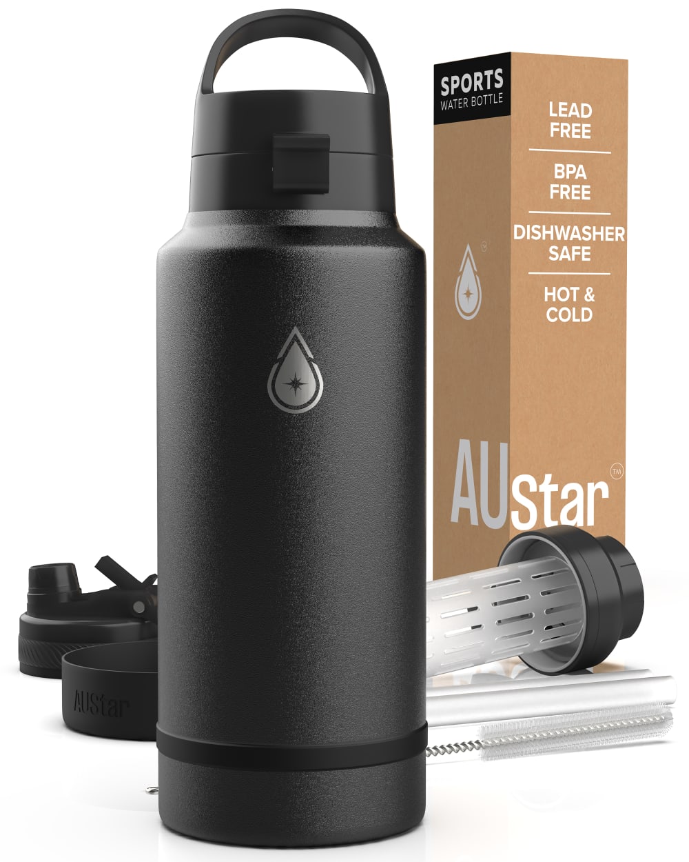
21 Responses to Option A
This looks better.
Option B shows more details on how it looks but I think it looks kind of weird and I can't imagine how the bottle looks exactly with the parts come apart like that.
I think for the main image option A is the most aesthetically pleasing to my eye; I can get an overall picture of the product from the main image, the details can be shown in supplemental images.
A I feel has a better design that would work better I think.
This one looks more professional and put together. I like that the bottle is front and center.
Option A is the most aesthetically pleasing. Option B almost looks broken and confusing.
The design looks cohesive and tied together well
Option A has a wider design that is appealing.
Option A - The image displays the product and its pack in full clarity. The infuser, sipper, bottle brush, and bottom compartment are displayed in the image. This product has an aesthetically pleasing look.
I chose A for this one, however, I would like to add some fruits to show it's an infuser. However, B have the water bottle broken down into sections isn't as easy to look at as the nice clean Option A.
I find this image of the bottle to be visually appealing. It looks complete.
Option A is much more appealing for a product bottle main image. I like the closer-up view of the bottle in the foreground with the accessories and packaging box in the background.
I like the look of the bottle when it is all put together. It is phenomenal I. Design and look. I am so impressed with the overall vibe it puts off. I love it and would buy it myself.
B has too many conflicting colors and unnecessary elements. Show those elements in a different image.
The strawberries take away from the product
no question about it "B" looks weird to me while "A" has a nice sleek look.
The build for this particular model looks solid and without too many extras to clean
I chose this option because my eye was drawn to this image immediately. I think the overall presentation of this water bottle is the most aesthetically pleasing.
I prefer the image provided in Option A. I can see the workmanship of the bottle better in this image. It is also more visually appealing.
I love option A more because the bottle is smoother and more symmetrical, making it more aesthetically pleasing.
Image is well designed and really stands out.
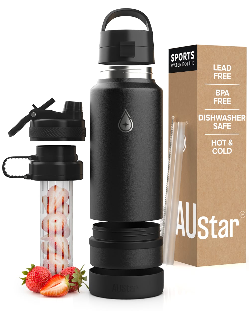
29 Responses to Option B
I like option B because showing the strawberries in the filter grabs my attention more and gives me a better idea what the product is about just based on the image.
I'd buy "B", I can see the infuser in detail from this photo.
Option B does a far better job of showing the bottom compartment and infuser. It highlights the utility of the product, which makes me want to click it.
I chose b because it skinnier and to me easier to hold. My hands are small so the other bottle is u comfortable to grasp
B is more appealing because it shows how the infuser works.
Obviously the red in Option B is the most aesthetically pleasing!
I like image B. It shows the parts of products clearly. The overall look of the shot is better.
Option b shows me all of the features and compartments of the bottle better
This is the best example showing how the fruit can be held in the product.
B is more esthetic since it does show the contents of the bottle and that gives the customer a better view and understanding of the product as compared to choice A.
I like B because you can see the infuser better.
B caught my eye better, it also informs me more easily how the infuser works.
I prefer option B. I like seeing more detail of the item so I know how it works.
I prefer option B because its clear depiction of the product is more appealing to me.
This one generally shows the product better and shows how it comes apart and is used better as well
Option B shows how the infuser looks with fruit in it, it gives me a better idea of how it would look and work.
This display or products is ideal because of the colorful elements in use. I find the version I selected to be suitable for marketing since it looks complete.
I like this display of the all the components of the product.
An in usage photo helps me to make a more informed decision.
I think the infuser is a key selling point here, so I would go with B since it actually shows off this feature prominently.
I chose option B because I like the way it the image looks. It looks nicer.
The visual presentation is Option B is much more visually appealing compared to Option A. It's much more informative and transparent. I also still prefer Option B for the sleek design compared to Option A which looks very bulky.
I thought this was way bigger in A than it actually is in B, so B is important to avoid negative reviews for false advertising.
This one looks nicer and the additional imagery, the fruit and lids, is also attractive as well.
I liked the photo for option B more. I thought it showed off all parts of the bottle a bit better than option A.
I chose option B over option A because I appreciate how the inside steeper for the water bottle is shown with fruit in it, so that the consumer can get a better picture of the product's aspects.
I really like seeing the infuser with fruit in it; it makes it more obvious what I could do with the product.
It is easier to see all parts of the product..
I liked to see the bottle taken apart and this has that image.
Explore who answered your poll
Analyze your results with demographic reports.

