Poll results
Save to favorites
Add this poll to your saved list for easy reference.
Which photo of the product do you prefer more and why?


41 Responses to Option A
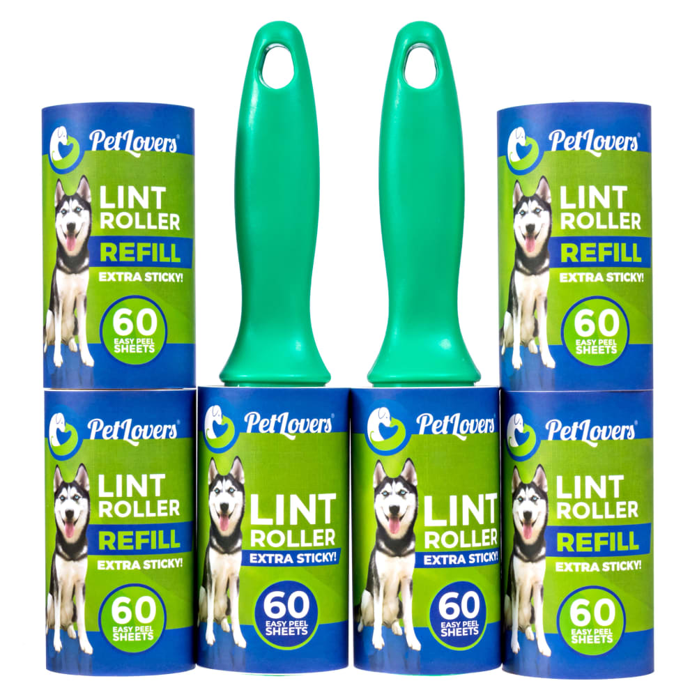
A does a better job at filling the square.
Close up picture enables me to read more about the product.
The picture is only slightly larger than the other one so I figured it's better to take up more of the screen than less
I like the closer view of the product. Also, there is some variety of the product shown which I like.
I like A better basically because it's easier to look at the photo and take it all in at a glance. With the rollers all lined up in B's photo, I have a hard time processing the information quickly enough to make a decision about the product.
I much prefer the closeup view of the product especially since there's a dog on it. Also, the symmetry of how they are lined up is pleasant and appealing. It's also much easier to read the details on the label in the product shot.
I like A better as the rollers are a little larger and easier to see. There is also less wasted space on the page. I did not care for B as there is far too much black space on the page for my tastes.
It gives a closer view, and shows how the sheets can stack when storing them.
It is more inline with how I think I would see it on display or on the shelf, it is more realistic looking
A looks more balanced to me. It looks like someone took the time to display the product with thought. It fills the space better. B has too much white space, is too wide relative to the height, making everything smaller so that it can fit in the same box.
I prefer option A because the photo grabs your attention. The size and positioning for image are more proportional.
As a pet owner, I need a lot of lint rollers so this is something that is relevant to me. I like the first phone because it makes it look like I'm getting more for my money. I know that they have the same amount, but I like the way that it's piled up. It makes it seem that I'm getting more, and I like the general aesthetic of it, like someone put thought into piling it up that way. It also shows me that they are stackable as well.
Choice A is more preferred because the ad actually looks neater than the other one.
I like the symmetry in the photo of Choice A.
i like seeing an up close visual of the product
I think this one is generally more esthetically pleasing also think It displays of the product better and shows you how it works together a little better. Also you can read it better that it's a lint roller
I just think this looks better. The lint rollers look larger. The display just looks nicer.
Choice A is creatively lined up and you can see the adorable dog which is a great selling point
It is easier to see the lint rollers. The picture is less busy and more appealing.
A DRAWS MY ATTENTION IN JUST A LITTLE QUICKER
This is preferred because it's more of a close up image that allows you to read the label more easily.
I really like how the refills surround the rollers. I also love the picture of the Husky on it. There is no doubting what this is for.
I like how the lint rollers are stacked. It looks organsized and you can more easily see the brand.
I like pictures that are more up close. I can see more detail and don't have to strain to read things. I would look at this picture before I looked at the other.
I like seeing the product up close here. Looks great with the dog in the photo so you know what it does. The close-up, higher resolution shot looks better and will be better for consumers. Less whitespace and more focus on the product in this image.
Closer and easier to read the product details
Option A fills in most of the giver space, it gives off a nice clean look.Option B leaves a big chunk of space and, makes the product look further away doing so.
I like how it is more of a square image then a linear image.
It shows the product up close. I can easily read the label and see the product details
I prefer A because it is nice and tidy and offers a proper presentation.
I like this one. It looks more organized and sleek. It is attractive. Thank you.
I like the look of them all together. I lik the boxy look
Because the photo isn't "stretched out" you can better see the packaging.
I like the closer up photo on the lint rollers.
I like the compact and balanced look of A. The other choice looks weird with the product in one line and the 2 handles sticking up. Very awkward.
I thought they both looked a little bit off, and I initially went with Option B, but after further inspection, Option A was my choice. Option A has a fresh set up. It made me look at it longer, and I was more interested in reading about the product because of that.
It is just more aesthetically pleasing to me.
A closeup of the label is very helpful and helps me decide if I want this product or not.
I like A better because it is not as wide as B. I think B is too wide across. I like the stacked up look in A better.
i like how you stack them it gives a better idea of the size
Choice A looks better. I like how it shows how tall the handle is when the rolls are stacked up. I like that it looks like the rolls take up half of the length of the whole product.
9 Responses to Option B
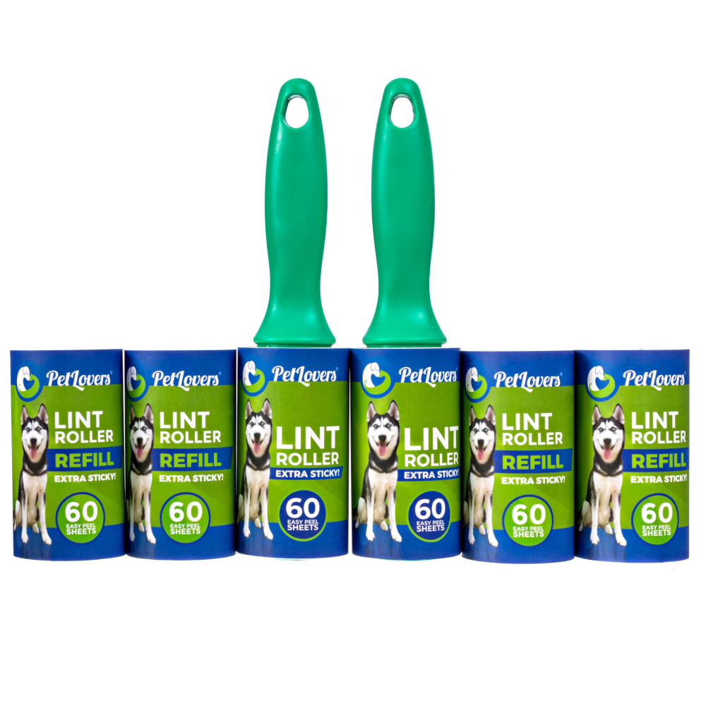
I prefer photo B because you can easily count from left to right how many extra rolls the purchase comes with. You don't have to move your gaze to multiple different points in the image to count them.
I think option B makes more sense. You can clearly tell that there are two lint rollers and 4 refills. Option A just doesn't look like the natural way of laying out the design. I think B is definitely more easy to understand.
I like this option because it is a straight line. I prefer symmetrical images.
The rolls lined up side by side looks like more is included. Stacking them to make the image more compact, gives the appearance of a smaller offering.
I am going with option b. My first thought was that I hate things stacked up over my head like at Sam's and Home Depot. I know this isn't over my head but I do not like the idea of it falling on me. I like option B because it looks like you can finish the one roll and easily pop the roller into a new tube of the sticky paper. I think There are 2 too many rolls. I would just do one refill for each roller because now I have to store 2 rollers and keep up with the extra rolls. Mine fall or get crushed and dented and I hate wasting stuff.
I prefer the way the product is presented here because when it is in a line it looks like there are more. Also it's a more standard arrangement to me that looks more comforting.
I chose B because the layout of the items was easier for me to imagine how many rolls I receive in this purchase. The other image I had to look twice to realize they were not extra long rolls but stacked on top of each other.
I chose Option B because it's more uniform and symmetrical. Option A seems too large, clumsy and awkward. Option B, while very generic looking is more likeable.
I think Option B makes it seem like you are getting more. I know it’s the same amount, but the way it is pictured just seems like more for the money. Option A looks kind of awkward the way it is stacked and the refills on top kind of blend in with the handles.
Explore who answered your poll
Analyze your results with demographic reports.
Demographics
Sorry, AI highlights are currently only available for polls created after February 28th.
We're working hard to bring AI to more polls, please check back soon.

