Poll results
Save to favorites
Add this poll to your saved list for easy reference.
Which packaging design do you prefer? Please explain the reason of your choice.
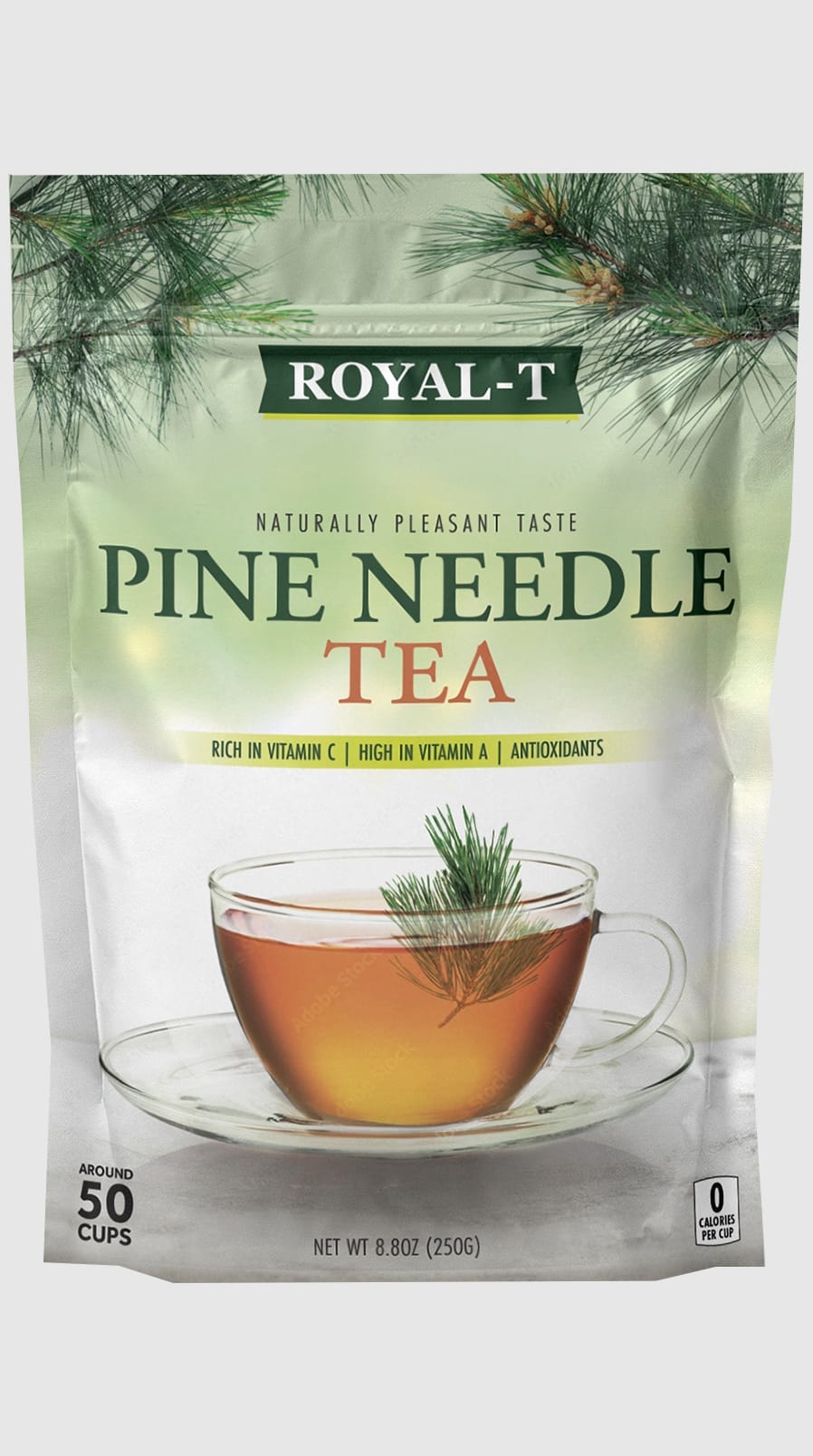
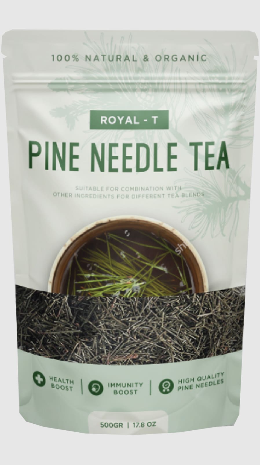
Option B won this Ranked poll with a final tally of 27 votes after 7 rounds of votes counting.
In a Ranked poll, respondents rank every option in order of preference. For example, when you test 6 options, each respondent orders their choices from first to sixth place.
PickFu requires a majority to win a Ranked poll. A majority winner differs from a plurality winner. A majority winner earns over 50% of the votes, whereas a plurality winner earns the most votes, regardless of winning percentage.
If an option does not earn a majority of votes, PickFu eliminates the option with the lowest number of votes. The votes from the eliminated option are reassigned based on each respondent’s next choice. This process continues in rounds until a majority winner emerges.
Scores reflect the percentage of total votes an option receives during the vote counting and indicate the relative preference of the respondents. If there is no majority winner, look to the scores to see how the options fared relative to one another.
| Option | Round 1 | Round 2 | Round 3 | Round 4 | Round 5 | Round 6 | Round 7 |
|---|---|---|---|---|---|---|---|
| B | 30% 15 votes | 30% 15 votes | 34% 17 votes +2 | 36% 18 votes +1 | 42% 21 votes +3 | 44% 22 votes +1 | 54% 27 votes +5 |
| C | 18% 9 votes | 20% 10 votes +1 | 22% 11 votes +1 | 22% 11 votes | 26% 13 votes +2 | 36% 18 votes +5 | 46% 23 votes +5 |
| G | 12% 6 votes | 12% 6 votes | 12% 6 votes | 18% 9 votes +3 | 20% 10 votes +1 | 20% 10 votes | Eliminated 10 votes reassigned |
| D | 12% 6 votes | 12% 6 votes | 12% 6 votes | 12% 6 votes | 12% 6 votes | Eliminated 6 votes reassigned | |
| F | 10% 5 votes | 12% 6 votes +1 | 12% 6 votes | 12% 6 votes | Eliminated 6 votes reassigned | ||
| H | 8% 4 votes | 8% 4 votes | 8% 4 votes | Eliminated 4 votes reassigned | |||
| A | 6% 3 votes | 6% 3 votes | Eliminated 3 votes reassigned | ||||
| E | 4% 2 votes | Eliminated 2 votes reassigned |
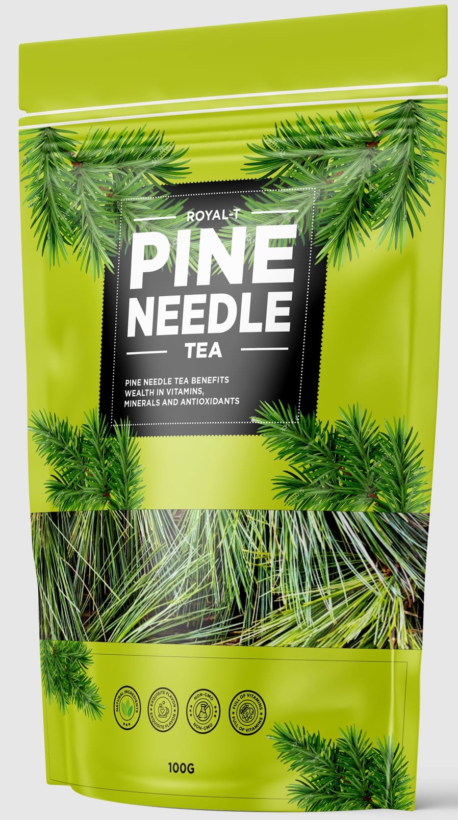
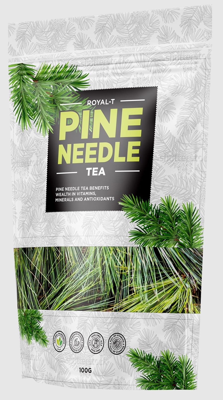
3 Responses to Option A
I particularly like the ones showing the pine needles in a tea cup as it gives me more info of what the product is by just glancing at the picture and it really fits the product more overall than the other packaging designs.
I prefer option A has vibrant colors design. I find it easy on the eyes.
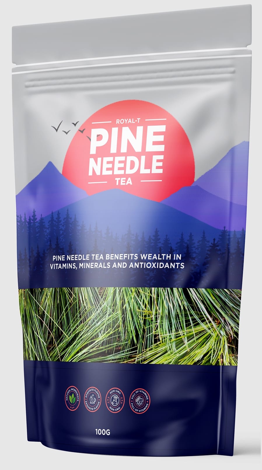
Option A is my first choice because of the yellow color of the package and the picture of the pines. I chose Option B next because I like the picture of the cup of tea. Option E is nice with the pictures of the pines. I chose Option D next because I like the coloring, the mountains, birds, and pine trees. I don't care for Options G, H, C, or F, they look like they contain grass or dirt.
15 Responses to Option B
I think the ones that show the picture of a cup of tea on them are the best and get the idea of the product out the best.
I like option B because it shows a cup of tea on the label. I think that makes it much easier to see what the product is and will look like.
So overall, I don't really like these designs very much, but B is the clear winner and standout for me. I like choice B because it shows tea and it actually looks appetizing. Many of the other designs look more like a package for dirt/fertilizer than tea.
I chose my answers in the order that I liked them. Option B is my favorite because it's got an ice white and green color with images of pine branches at the top.
I like the cup of tea in option B with the soothing color of the tea and the pine branches above. Gives a bold and distinct look. I also like E and D with the colors of the mountains in D and the branches and presentation of option E.
I made it based on which best shows the finished tea product. I also gave priority to the packaging that didn't look busy.
I find the packaging design in options B A and C appealing and eye-catching. The product presented nicely. Simple and consumer friendly.
I like B the most because it shows a cup of tea on the packaging, making it clear what the product is.
I like my first two choices the most because the design is appealing and fits well with other tea products. I think the design on the other packages isn't that nice and doesn't give a good impression of the pine needle tea. Instead, the other choices make me think of dirt and the forest floor.
B is perfectly represented with the visuals and colors. It shows great color of tea and the product in it. The packaging is also not too bright or too dark, it is balanced and look good to the eye.
Personally I've never tried it but all of them except for B made me feel like I would be drinking a huge cup of pine needles and I wasn't interested
Option B has a very eye catching packaging. The color scheme blends together well, creating a modern look. I would notice it while browsing easily, and the information conveyed gives a good enough product explanation.
I like Option A the best. The pack is soothing and comforting looking and looks earthy and organic. Options A & H are both simple but effective and the color of Option A is fresh and attractive. Options G & E are tidy looking and seem stylish but are nothing special. The remaining options are perfectly fine but not as eye catching and seem a little ordinary.
I most prefer option B as this package is the only one that really makes the tea look like it is good tasting. The rest just look like lawn shavings.
With this option my tongue is salivating because I can nearly taste how refreshing and filling this tea would be by the image on the package
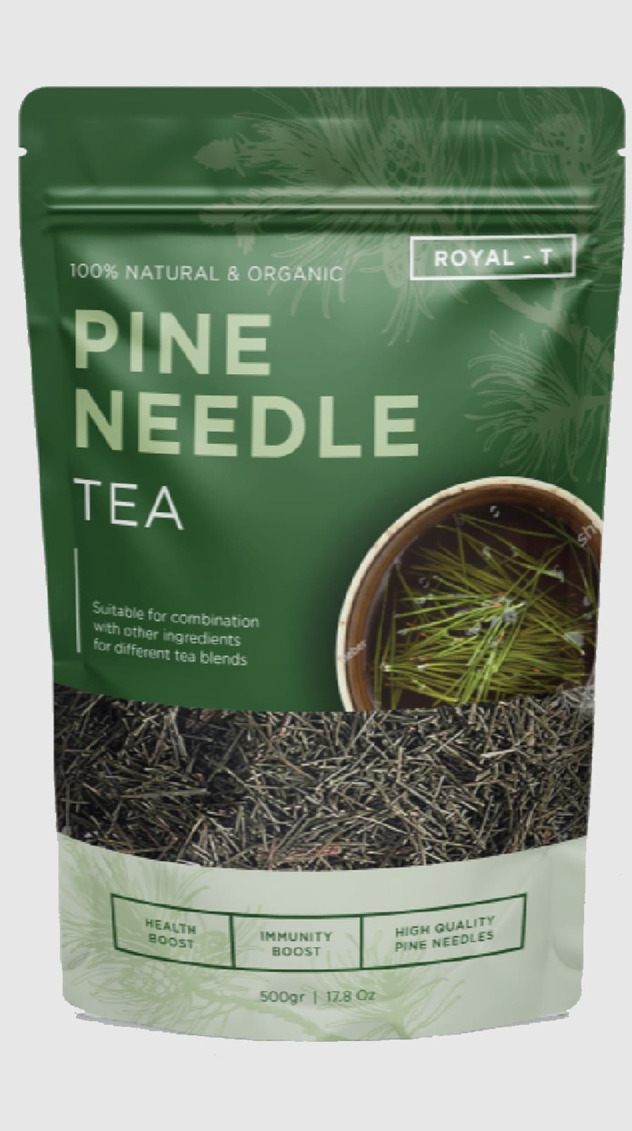
9 Responses to Option C
I like the packaging design of option C the best. The design looks pleasant with the shade of green it uses.
I like option C the best because the color of the bag stands out the most and grabs my attention.
I like the coloring on this one and how the package has a layered look to it with color with font and pine needles.
i want it to look like a clean product, simple and bold, not overly done with colors just to add pop
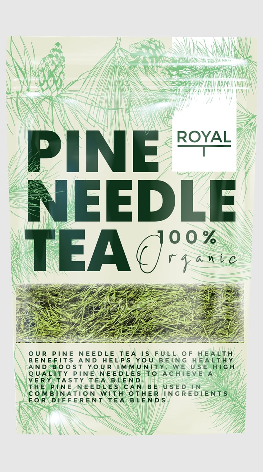
I chose option C first because I like the dark green color scheme on this product packaging the most. I chose options B, G, F, E, H and A second, third, fourth, fifth, sixth and seventh because I like the darker green colors with the pine tree branches shown around the sides of the product packaging and the organic products the most. I chose option D last because I do not like the forested mountain image shown on the front of this product packaging as much as the realistic pine needles shown on the other product images.
Choice C has a soothing green, which catches my eye. I trust this color. I like how choice E shows pine needles, it helps me make the connection. D is visually beautiful.
looks like the most high quality and the most authentic and most trusting one that i would feel most comfortable with
I prefer option C because I think that it has the most premium, eye-catching, and most visually appealing packaging design out of the eight options. I also think that it looks the most "natural" and comforting.
I feel C matches the aesthetic in terms of what I would expect based on the product name. Especially the green color. G and A are close behind.
6 Responses to Option D
D has the most eye catching and attractive packaging design. C looks natural and fits the pine needle theme. B looks the most basic, outdated and low quality.
I definitely like D the best. I really like the shade of blue that makes up a lot of the design. I also like the mountain range in the background. I would like to sit and have a cup of tea while staring at the beautiful nature. I would choose A second because I like the bright green color. It does more to make it stick out and grab your attention than others. I would choose C next because I like that there is more green in it than other options. The ones that are mostly white are just too plain and a little boring
I like the various colors in this one. It stands out more than the others. I love the design.
I don't like option F because the package looks like hamster bedding
I like that all of the options (except B) show inside the package so that I can assess the interior content and examine the product for size, shape, quality and visual appeal. All options (except B) seem high quality, informative.
I love the picture of the mountains, as it seems to make the product feel more refreshing.
2 Responses to Option E
I ranked them according to how attractive the designs are to me and the design in E is the most attractive by a large extent.
I ranked them by which ones seemed the most current or 'now'. The packaging in "E" was the first to grab my eye, while "A" seemed boring and old to me, for some reason.
5 Responses to Option F
I like option F because of the look of the packaging and the look of the product through the window into the package.
I'm a big fan of simplicity, and showing me the actual product, so a big plus for F is that it has the window on the product, and the package clearly and succinctly tells me what's in it. Let the quality of your product sell me on it, not the packaging. Too often I've bought teas that were not shown that ended up being less than stellar, and I have consistently preferred teas that show me what's inside, not hiding the quality from me prior to purchase.
What I prefer is a subjective aesthetic art choice. I have no real reason to prefer one over another.
Option F is the best choice based upon the packaging color and design of the bag.
I picked in order of attractiveness of the package. C is last because it looks like the cover of a product for lawns.
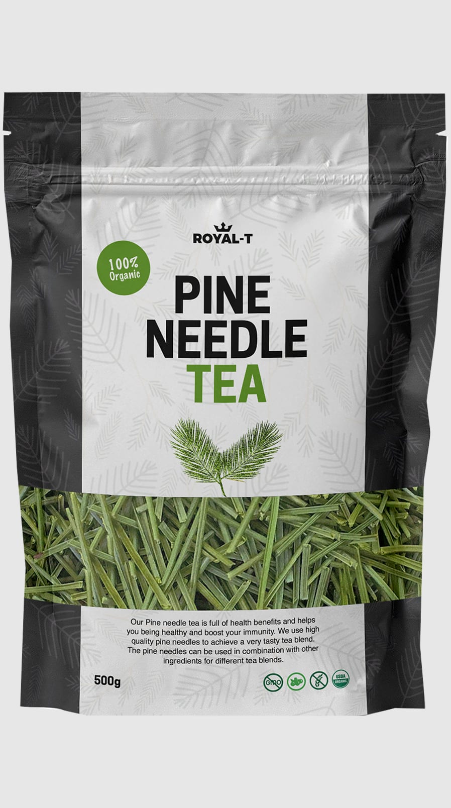
6 Responses to Option G
I like options G/A, I think the green design works better, and I would avoid really using too much of another color. I'm also not a huge fan of the options that show the brownish looking pine needles, I just don't think they look appetizing.
I think all of the packaging is equally appealing because I am completely turned off by the thought of pine needle tea. Being that his sounds disgusting to me, this product would be panned regardless of the packaging design.
I love the fact that you can easily see that the product is organic. I also like that you get a lot of information about the tea with the paragraph that is provided on packaging.
Organic and very healthy plus packaging looks tasty and informative.
I like option G. It grabs my attention and it answers questions that i have about the product. It lets me know why I need this. It keeps me intrigued. The way the 100% organic is written stands out. Option B is visually appealing and gives me some information with the vitamin C but it's not enough I need more. The rest really don't grab my curiosity I kind of glance over them quickly.
those were the pine needle tea packages i liked from best to worst
4 Responses to Option H
I think Option H looks the most like tea and not just a plant supplement
I chose my options on how simple the packaging looks i like the simple look more than pictures on the packaging
I liked H and G the best because it shows the little sprigs of pine on the bag, and it looks like the bag is green and natural. I think it makes it look more organic and fresh and natural.
I prefer the simpler, modern designs with neutral or green colors. I did not like the designs with too much going on or very detailed images on the package. I do appreciate how they all have a windowed design so you can see inside the package.
Explore who answered your poll
Analyze your results with demographic reports.
Demographics
Sorry, AI highlights are currently only available for polls created after February 28th.
We're working hard to bring AI to more polls, please check back soon.

