Poll results
Save to favorites
Add this poll to your saved list for easy reference.
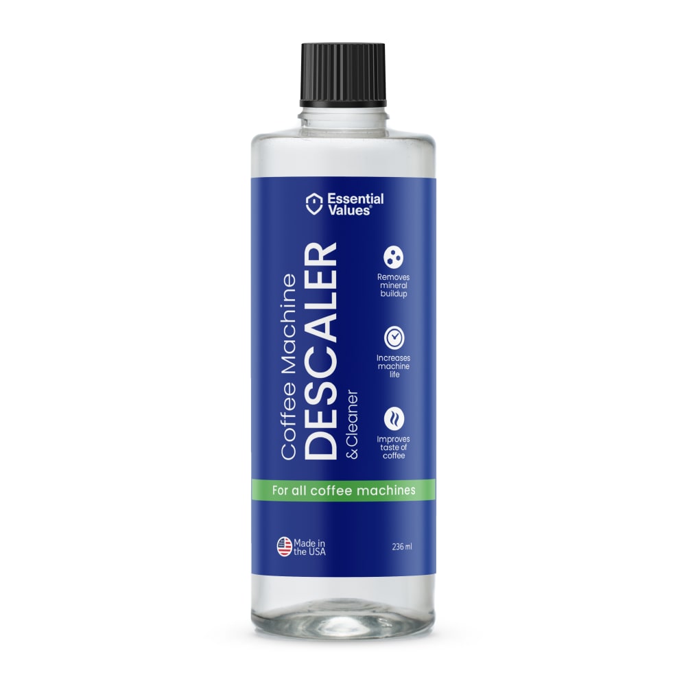
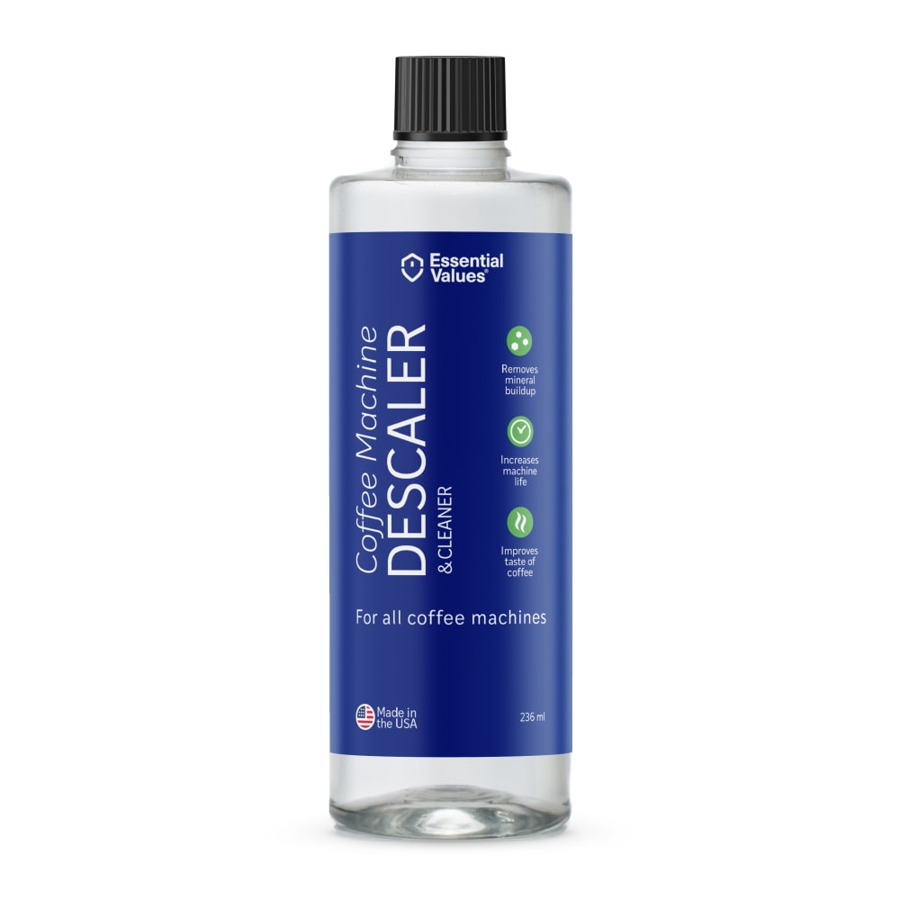
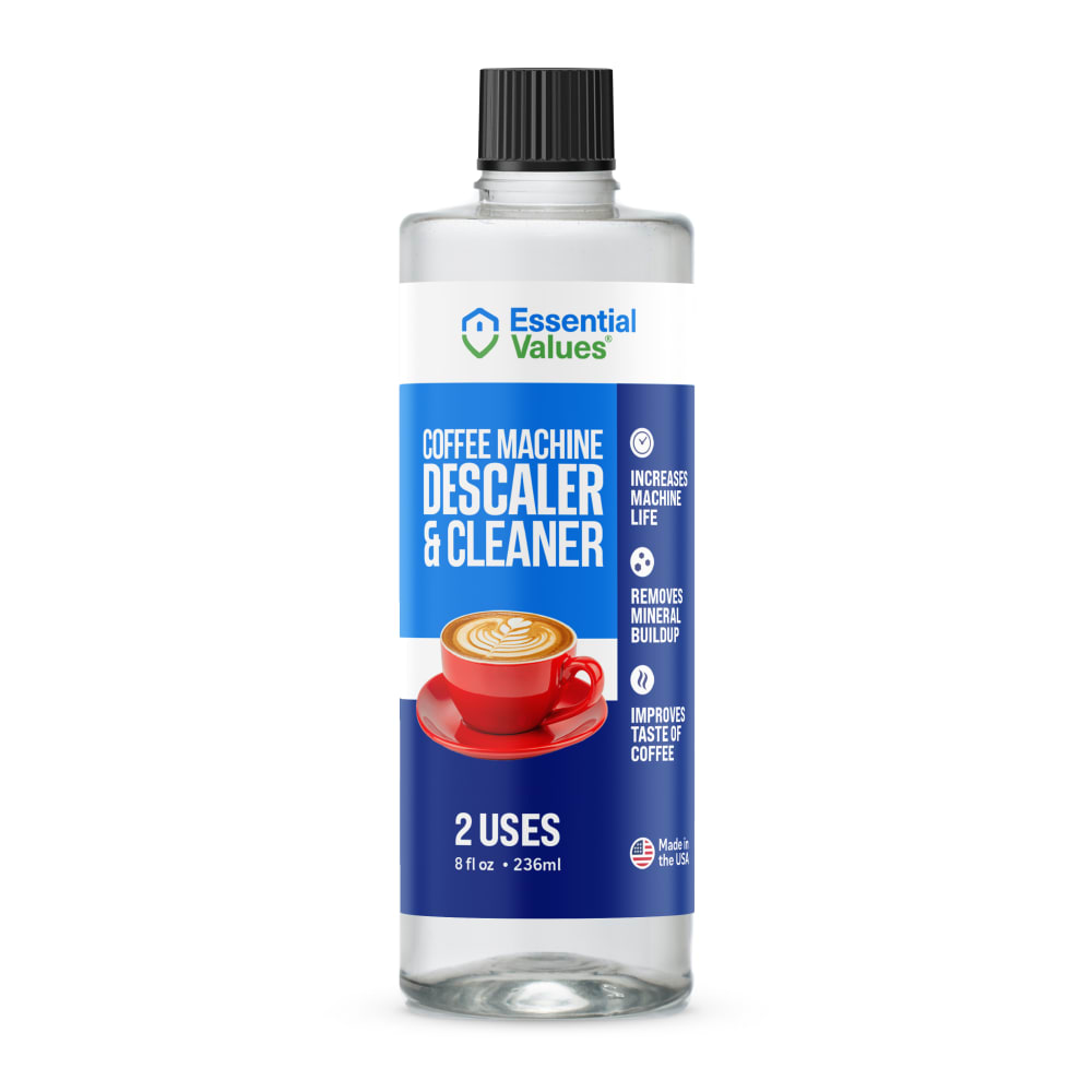
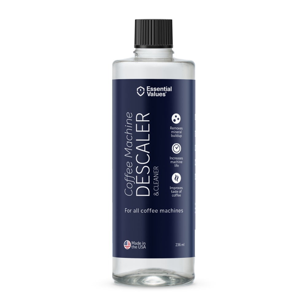
Which packaging design do you prefer for a Keurig Coffee Machine Descaling Solution?
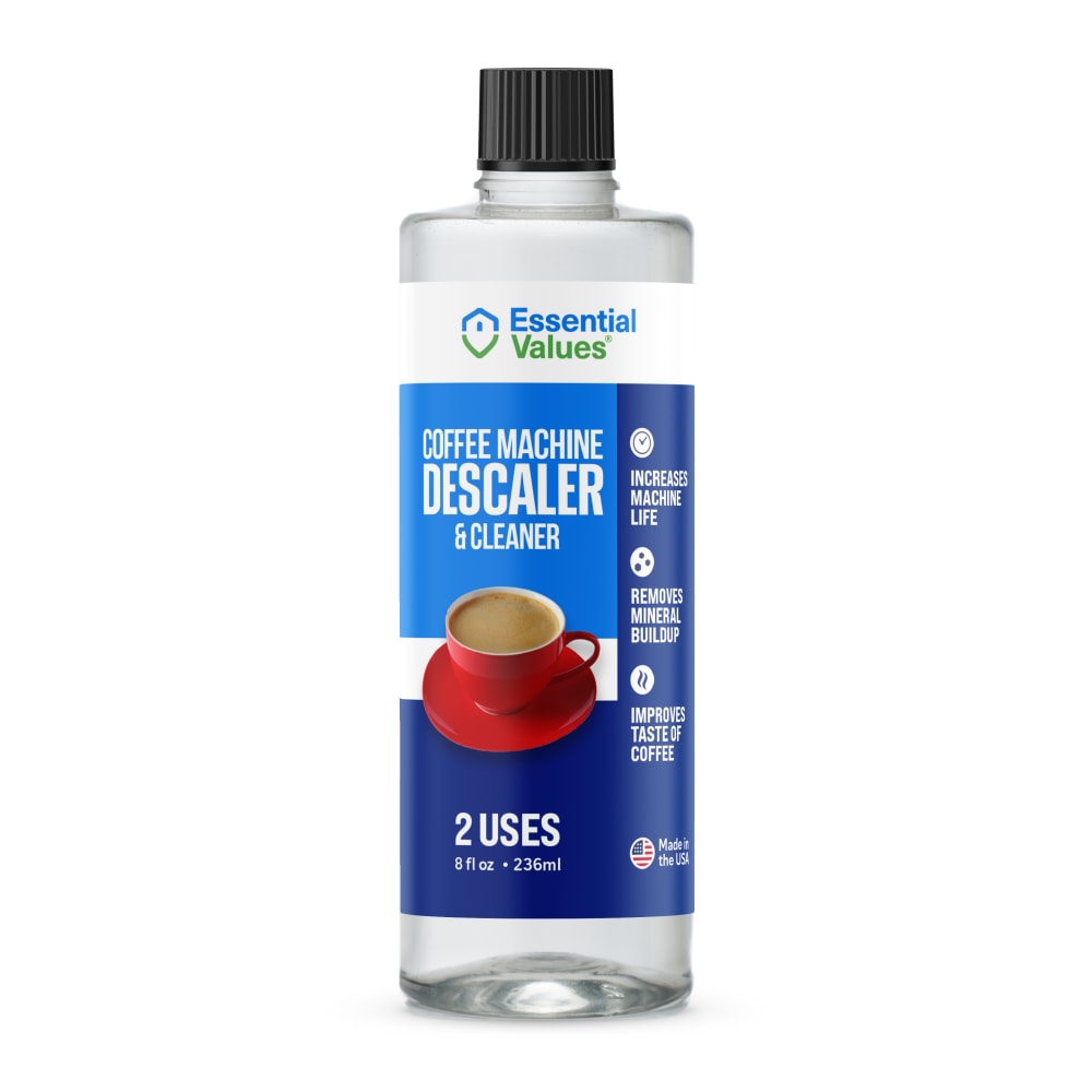

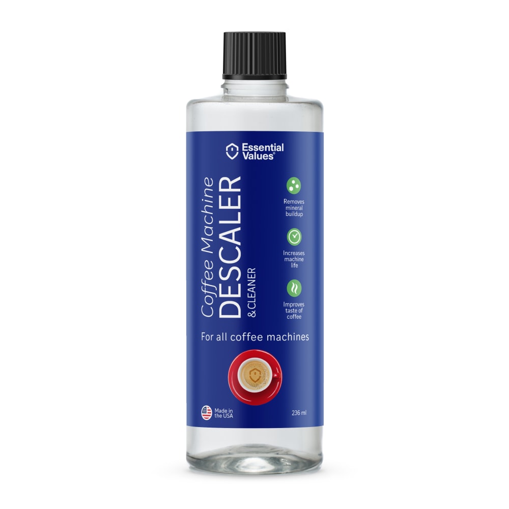
Option D won this Ranked poll with a final tally of 29 votes after 6 rounds of votes counting.
In a Ranked poll, respondents rank every option in order of preference. For example, when you test 6 options, each respondent orders their choices from first to sixth place.
PickFu requires a majority to win a Ranked poll. A majority winner differs from a plurality winner. A majority winner earns over 50% of the votes, whereas a plurality winner earns the most votes, regardless of winning percentage.
If an option does not earn a majority of votes, PickFu eliminates the option with the lowest number of votes. The votes from the eliminated option are reassigned based on each respondent’s next choice. This process continues in rounds until a majority winner emerges.
Scores reflect the percentage of total votes an option receives during the vote counting and indicate the relative preference of the respondents. If there is no majority winner, look to the scores to see how the options fared relative to one another.
| Option | Round 1 | Round 2 | Round 3 | Round 4 | Round 5 | Round 6 |
|---|---|---|---|---|---|---|
| D | 30% 15 votes | 30% 15 votes | 30% 15 votes | 32% 16 votes +1 | 36% 18 votes +2 | 58% 29 votes +11 |
| E | 20% 10 votes | 22% 11 votes +1 | 26% 13 votes +2 | 30% 15 votes +2 | 36% 18 votes +3 | 42% 21 votes +3 |
| C | 18% 9 votes | 18% 9 votes | 18% 9 votes | 24% 12 votes +3 | 28% 14 votes +2 | Eliminated 14 votes reassigned |
| F | 14% 7 votes | 14% 7 votes | 14% 7 votes | 14% 7 votes | Eliminated 7 votes reassigned | |
| G | 8% 4 votes | 8% 4 votes | 12% 6 votes +2 | Eliminated 6 votes reassigned | ||
| A | 8% 4 votes | 8% 4 votes | Eliminated 4 votes reassigned | |||
| B | 2% 1 votes | Eliminated 1 vote reassigned |
Age range
Amazon Prime member
Coffee drinker
Education level
Gender identity
Household income range
Options
Personal income range
Racial or ethnic identity
4 Responses to Option A
I much prefer option A the best. I really enjoy the minimalist design of the labeling and color scheme. Option B is a close 2nd for me.
The combination of colors used in A E and G helped those options stand out from the rest to me. I like the touch of green
I chose by the way the label looked pure.
I like the design and color scheme of my top choice. What I like most about it is the green stripe. I find this makes it look more appealing to me.
1 Responses to Option B
Honestly these all look fine to me. I think the overall design of B looks the best so I would most likely choose it.
9 Responses to Option C
This has the highest quality look to me combined with an easy to read and professional label
I prefer the red in the labeling as in C and D.It looks really nice witht eh blue. E B F and A just looks really plain and there needs to be other colors or a focal point.
I prefer the multi colored bottles that show the side of a red coffee cup. I think those labels stand out the most. The top down view of the mug does not stand out so much. After options C and D, I prefer the font running up and down and the darker colors.
Prefer the ones with the photo of coffee on them - realize it is obvious but just helpful to see the photo.
C D G would catch my eye thats its a descaler for my keurig because it has a picture of a coffee cup on top, some people dont know they have to descale their keurig, I do but some do not.
I prefer the option the first option C image the most. I chose option D second because I like the blue color and the coffee cup in this image. I chose option G third because I like the blue color and the red coffee cup in this image. I chose option G third because I like the blue coffee cup and the other coffee cups in these images. I chose option fifth in this image not as much the other ones. I chose option A, B E and F in this image as well in this image.
the descaler helps to clean the coffee maker and best usage. it shows attractive as we have same at our office
I like options c the best. i think the packaging that has coffee cups on it are the most appealing. Having the coffee cup on it shows that it's for coffee pot use.
The coffee mug on the front of the label helps me to know what it is for. I also like the brighter colors.
15 Responses to Option D
Options C and D both feature the red cup, which makes their labels the most exciting. Of the two, the swirl of milk in the coffee on the label of option D is the most meaningful, attractive and dynamic--it sells not just a product, but a lifestyle.
I like d first since it is a coffe cleaner and it shows me a cup of coffee and then c since it shows a cup of coffee too but is lighter I prefer the dark colork, then I like g it says coffee cleaner and descaler and then e since it is nice although not the best, then e it is good too, although I like the one with the picture then a is ok, the white in it is nice then b and f is too dark for my tastes, I think the winner here is d
I like the bottles with the coffee cups on them so when it's in my pantry or closet it's easy to see what type of product it is. I also feel the coloring of D makes it easy to read the bottle.
I like the clear bottle. I like that it has a cup of coffee on it. I think that'll sell it and you know exactly what it does
I like an image of the filled coffee cup on the packaging because the descaler is making sure I can keep drinking coffee from my machine! And give me the froth over the plain!
I think the coffee cup on the front shows me what the descaling product aims to accomplish
I find option D to be informative, eye-catching and appealing. This image grabs my attention and gets me to notice it. Much prefer option D.
All the seven images of the product are good quality and these product are good trending in online site. These product are reasonable price to buy the product and everyone like it. These product of the color combination are good and used it.
I like the blue label. I like the cup of coffee on the label.
For F I really like the Dark blue being used as a background color but I find the lack of a third color plain. I do like the green accent colors of A and B. The label of E has a good look and it would win if it was not for the inclusion of clip art. For G it is kind of hard to tell that you are looking at a cup of coffee in the clip art. D and C are almost indistinguishable for me so I just randomly chose one.
I find option D to be cheerful and I like the background color as well. I think this would work on all coffee makers though.
I think it's good to have an image of the coffee cup on the label itself. This way you consumer knows that it is for coffee related equipment.
This product has the brightest main graphic and it's where my eyes are drawn to immediately when I see the solution
I selected the packaging designs that I found to be rte most visually appealing for the coffee descaling solution.
I like option D because it contains a coffee cupsimilar to what I use daily. I think that makes it easier to understand what it's all about and makes it more relatable.
10 Responses to Option E
E IS THE MOST ATTRATIVE. THE COLOR SCHEME MAKES THE INFORMATION ON THE PRODUCT VERY EASY TO READ. IT IS SIMPLE TO COMPREHEND AND REALLY HIGHLIGHTS WHAT'S IMPORTANT ABOUT THE PRODUCT
I made it based on the design of the label. the simpler the better.
My top picks look like the most professional designs, and I don't think there should be coffee on the label because that could cause confusion on what the product is. (potentially dangerous)
I think that I like E the best. It is easiest to read and the font really stood out against the rest of them.
I ranked the designs of the descaler solution bottles that I liked the most. I found the design of the bottle of option E to be them most appealing followed by the way option D looked. I then liked the design of the bottle of option C followed by option F then option A then option B and then finally option G.
Option E has a good blend of colors, and lettering. The color scheme is easy on the eyes, and transitions together well. The lettering is bold in the appropriate places, making it easy to read, and understand.
I prefer the designs without the coffee cup - it might make children think it's a drink
overall i think the design of option E is more appealing
E stands out the most to me. I like this label because it's brighter and makes the bottle look more attractive. There is also a lot of helpful information given on the label.
I made my choices based on my personal preferences
7 Responses to Option F
Option F looks so clean and elegant in its design. I find it somewhat classy, and that really stands out from the other options. That clean and organized aesthetic makes me associate this brand with quality and positive results. I'd be most likely to purchase this product to use with my Keurig machine.
I really like the black background because it stands out to me the most. Other than that, I like seeing the coffee on the cover so I can recognize what I'm buying immediately.
I like the option that is the darkest blue option. I think the color looks really nice and I like how it takes up the whole label. I would choose B as my second choice because I like the label being a mostly solid looking blue color instead of having too much design. G would be my third choice because it looks similar to G but I doin't like the red circle at the bottom as much
dark label with the larger font is easier to look at and easier to read
The darker navy label looks the most appealing to me.
I prefer Option F, A and B because they are simple, and explain the info needed. Although this is a Keurig Descaler, the coffee cup is not really needed on the imaging. The simple labeling is what makes me want to visit the page.
I would be most likely to click on and ultimately purchase option F because I think that it has the most eye-catching and visually appealing product label out of the seven options.
4 Responses to Option G
The logo design is informative and necessary. The label conveys a sought after product.
I like the use of royal blue colors, which is bold and confident. Very cool design for sure!
G i like the angle of the shot of the little coffee cup graphic in this quite a bit. C is ok too but i like the angle of the graphic less. D for similar reasons as C but a bit less do to the lack of creamer visible in the coffee. E is ok but i think the white area conflicts with the rest of the label too much. B is kind of basic and there's not really enough contrast in the label, A is ok but i think the little green ribbon banner is too small. F is too dark for my liking.
I Like this one a lot. The color is fantastic and the red matches the bottle great. It is a good contrast.
Explore who answered your poll
Analyze your results with demographic reports.
Demographics
Sorry, AI highlights are currently only available for polls created after February 28th.
We're working hard to bring AI to more polls, please check back soon.

