Poll results
Save to favorites
Add this poll to your saved list for easy reference.
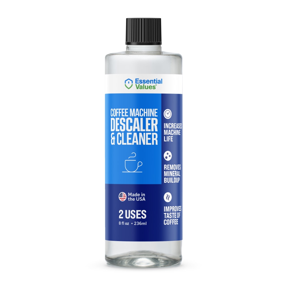
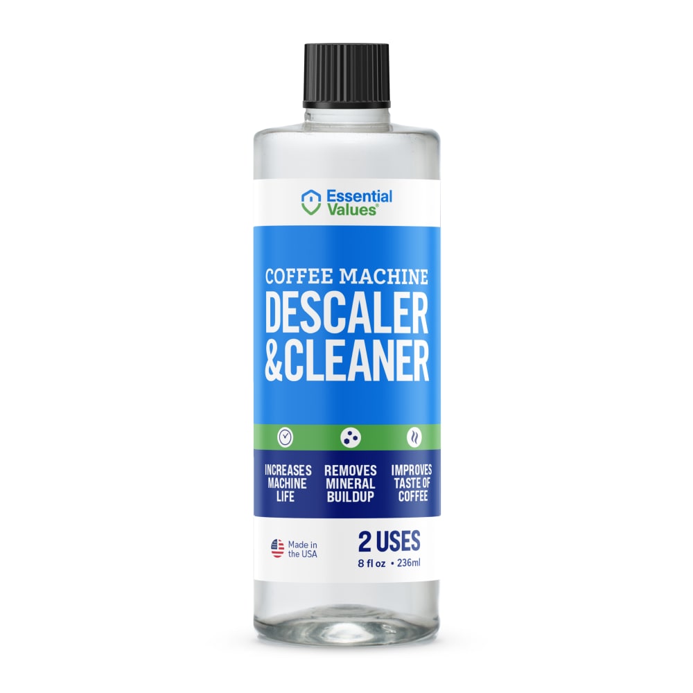
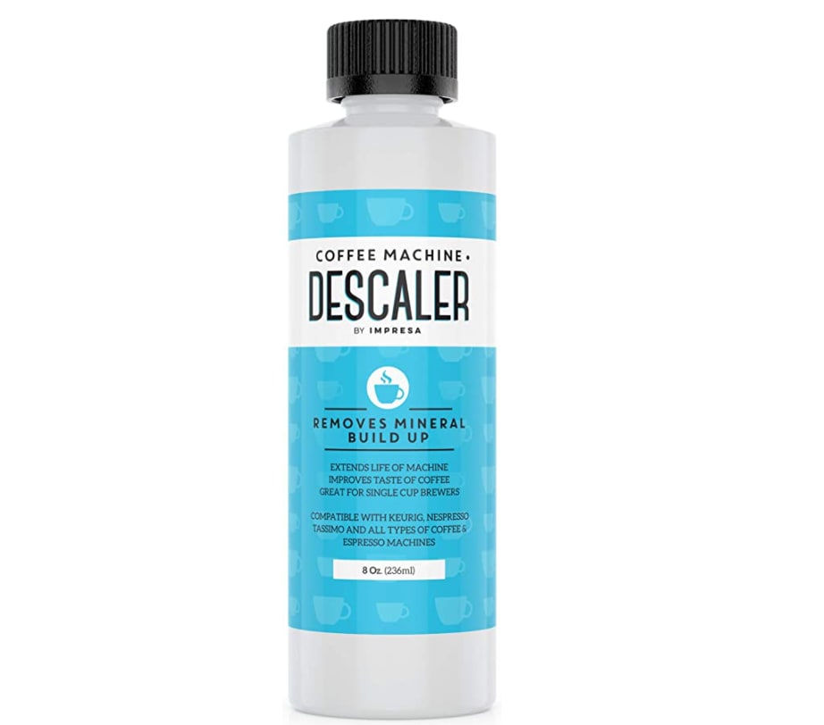
Which packaging design do you prefer for a Keurig Coffee Machine Descaling Solution?
Option B won this Ranked poll with a final tally of 30 votes after 2 rounds of votes counting.
In a Ranked poll, respondents rank every option in order of preference. For example, when you test 6 options, each respondent orders their choices from first to sixth place.
PickFu requires a majority to win a Ranked poll. A majority winner differs from a plurality winner. A majority winner earns over 50% of the votes, whereas a plurality winner earns the most votes, regardless of winning percentage.
If an option does not earn a majority of votes, PickFu eliminates the option with the lowest number of votes. The votes from the eliminated option are reassigned based on each respondent’s next choice. This process continues in rounds until a majority winner emerges.
Scores reflect the percentage of total votes an option receives during the vote counting and indicate the relative preference of the respondents. If there is no majority winner, look to the scores to see how the options fared relative to one another.
| Option | Round 1 | Round 2 |
|---|---|---|
| B | 46% 23 votes | 60% 30 votes +7 |
| A | 30% 15 votes | 40% 20 votes +5 |
| C | 24% 12 votes | Eliminated 12 votes reassigned |
Age range
Amazon Prime member
Coffee drinker
Education level
Gender identity
Household income range
Options
Personal income range
Racial or ethnic identity
15 Responses to Option A
I prefer option A because I think that it has the most professional and visually appealing label design out of the three options.
The extra info on the bottle and the bullet points are the most appealing.
I like the coffee cup on the label. After all, isn't that why I'm purchasing the product?
I like that it has a cup of coffee on the label. Also the clear bottle is a nice touch 'cause you could see what the liquid looks like
I like A the best because it makes it clear what the product is for.
I like the way the colors are blocked. I think having the benefits listed down the side makes them stand out more. The made in the USA seems more prominent.
Option A is the easiest to read, and understand. The packaging changes color scheme in a well done, nice transitional way.
My most preferred design is the one in Option A.
The color on the label makes it more appealing and it caught my eye to look into it further. It's easier to read as well.
stands out as the most appealing and the one offering me the best value for my product
The color and font placement on B makes it look higher quality and easier to read.
A because it has the coffee cup on the label.
I prefer the option with the coffee mug drawing on it, also I like the light/dark blue color scheme.
A was more interesting and the color and design were far more appealing.
The darker blue is a color of more power due to it being a bolder color. Due to this, that signifies quality in my mind
23 Responses to Option B
I like the label on B best, it's use, attributes and origination are made clear, the font is clear and legible and it adds more white, which indicates purity. A DOES give American flag, and I like the addition of coffee cup though. c is like trying to read fine print. I would NOT choose that option.
I like the design and color scheme of my top choice. Plus the green stripe makes it look like this one has natural ingredients in it.
B and A over C because C's details are too small. B over A because A makes you read off to the right for the information, I like how B has it arranged.
This design looks the most professional and well made as it looks like an established brand to me
B has a nice label, this has a more balanced and eye catching look. I trust this product a little more, it looks stronger and more effective.
B-it is very clear and clean looking, easy to readA-the cup on coffee under name is helpful at a glance
I think the medium shade of blue is a clean color and with the green bottom border it makes it even cleaner, the second choice is also for the same shade of blue. The text sizes did not influence me.
I like the blue and green the best. I love the color combo and it stands out the most.
I prefer this one it looks modern and the writing is big and bold so that you can't miss what it is trying to say.
I like the clear bottles.
I choose option B because I find the structure of the text to be more organized and cleaner to read. I like the top down structure and the information is easier on the eyes. I like that it also has the "made in USA" text which provide a sense of premium-ness and confidence. The color combination is utilized well.
My rankings are based on the packaging design I like best and would choose for this product.
I like the ones that indicate they descale AND Clean
I just feel like a bold product name is better. I like that option B stands out. I think of it like shopping at a store. The bold product will really stand out on the shelf.
B looks the best in my opinion with enough contrast to break up the label, A is ok but there's not enough contrasting colors on the label, C i really don't like the look of both for the bottle and the label
I liked option B and C the most because I did not know what the product meant by "descaler" so having the word "Cleaner" there too was helpful. I put option B before option A because the bottle looked larger.
I like the clear packaging the best and the green makes me think it's a cleaning, natural product.
B and A are very similar but the text is hard to read on A. C looks like a more natural product.
The clear and large text and slightly brighter colors look nicer to me
I chose B as first because of the green strip on the label that has the infographic pics. it makes it more direct and to the point with what it is and how effective it is.
B has the best color scheme of the options
I like B the best because it is the easiest to read. C is the hardest to read.
Feels like this product text is much easier to read and from Afar. That boldness also makes me think it's a capable product.
12 Responses to Option C
I don't like the asymmetric design of A. The turquoise label in C looks the most attractive to me.
C reminds me of an organic product and would like to use an organic or all-natural product and non-chemically product in my coffee machine.
I most prefer option C personally. I feel like this option would make it easiest for me to read the information in an organized manner.
packaging design C looks the best for a coffee tool.
I like C the best because of the shade of blue. I like how light and bright it is. Light blue is my favorite color. I would choose B second because I think the little bit of green across the middle is a nice piece of detail that is added to make it stick out
I think C looks best and is the most appealing I really like the light blue color more.
I like C the most. I think that the font on this label really pops and makes the label stand out
Option C is preferable because it explicitly states what coffee makers it can be used on. It is comforting to know for certain you can use it on your brand.Option B just seems more orderly than option A to me.
The design on C seems more modern. It reminds me of the type of design used on a lot of high quality organic products, and that association makes me assume it's high quality. I like how the design on A is mostly blue colors, so I prefer A to B. I think the green and blue design of B is ugly.
My first choice is the most pleasing design.
This options packaging looks the most natural and gentle. I want packaging that doesnt make me feel like im using caustic chemicals
I love option C the most because I love that shade of blue the most.
Explore who answered your poll
Analyze your results with demographic reports.
Demographics
Sorry, AI highlights are currently only available for polls created after February 28th.
We're working hard to bring AI to more polls, please check back soon.

