Poll results
Save to favorites
Add this poll to your saved list for easy reference.
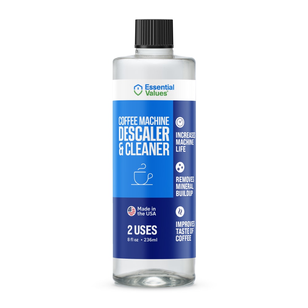
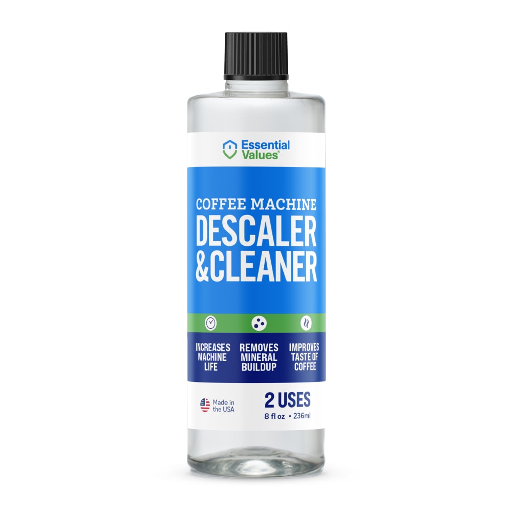
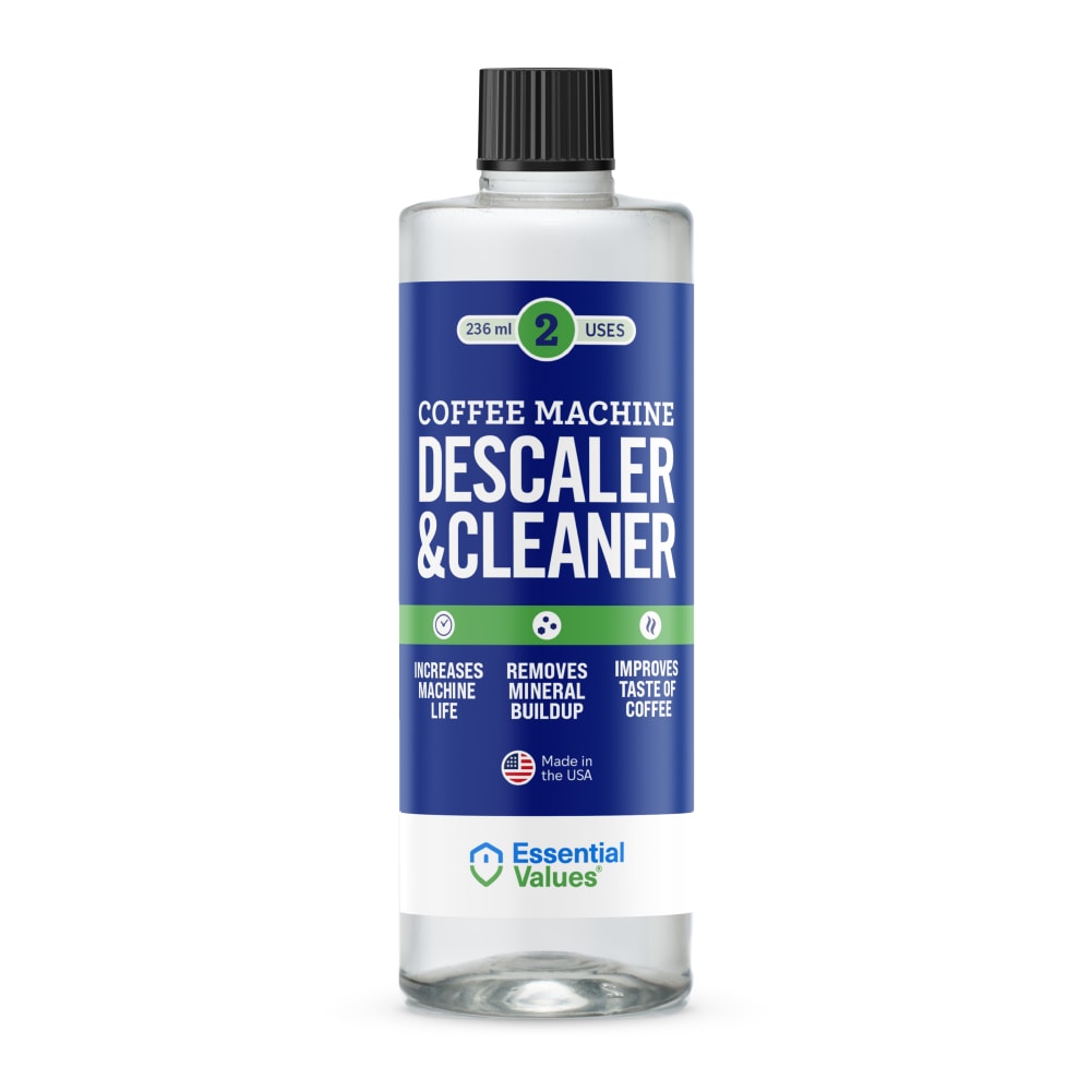
Which packaging design do you prefer for a Keurig Coffee Machine Descaling Solution?
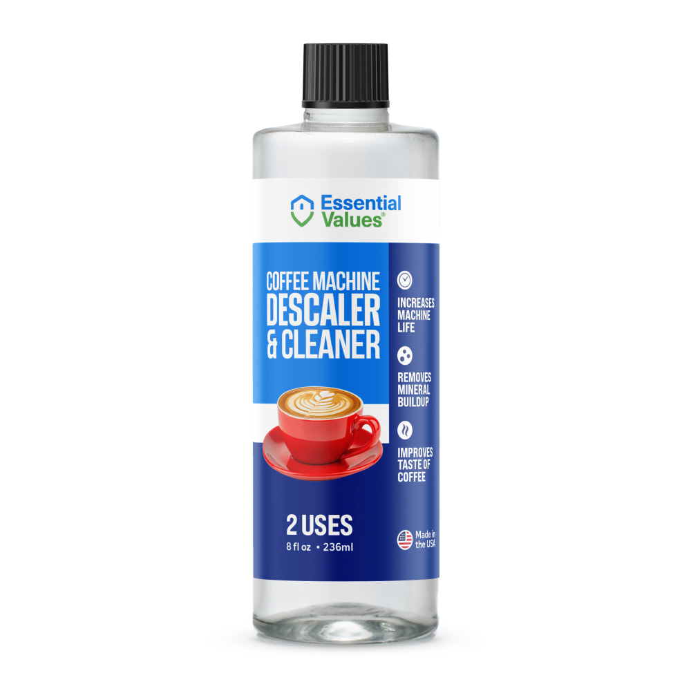
Option C won this Ranked poll with a final tally of 27 votes after 1 round of vote counting.
In a Ranked poll, respondents rank every option in order of preference. For example, when you test 6 options, each respondent orders their choices from first to sixth place.
PickFu requires a majority to win a Ranked poll. A majority winner differs from a plurality winner. A majority winner earns over 50% of the votes, whereas a plurality winner earns the most votes, regardless of winning percentage.
If an option does not earn a majority of votes, PickFu eliminates the option with the lowest number of votes. The votes from the eliminated option are reassigned based on each respondent’s next choice. This process continues in rounds until a majority winner emerges.
Scores reflect the percentage of total votes an option receives during the vote counting and indicate the relative preference of the respondents. If there is no majority winner, look to the scores to see how the options fared relative to one another.
| Option | Round 1 |
|---|---|
| C | 54% 27 votes |
| B | 22% 11 votes |
| D | 16% 8 votes |
| A | 8% 4 votes |
Age range
Amazon Prime member
Coffee drinker
Education level
Gender identity
Household income range
Options
Personal income range
Racial or ethnic identity
4 Responses to Option A
I like option A with the outline of the coffee cup on it, so at first glance you already know what it is for, and the label is clean and tidy making it aesthetically pleasing.
A has a level of understanding that is simply unmatched and unparalleled to the rest. I also like how simple the format is.
A - I like that it's easy to tell it's for the coffee machine. D - it's not very clear it's for the coffee machine without looking, but I like the contrast between the dark blue and the white. B - I don't like the clear bottle. C - looks like it's something that you would add to your coffee.
Option a has the product design that I am most interested in. I like the variations of the blue color on the product label. The clear bottle shows me the product very well and this tells me that the company is honest and transparent about it's products. I would want the design of the option A product
11 Responses to Option B
i like very much
I really don't like the red coffee cup and how it contrasts with the blue backdrop. In addition, I'm not a fan of the asymmetrical design. The two I ranked top I are more symmetrical.
I think the green line across the middle adds a nice touch because it matches well with blue and makes it stick out. I picked B as my favorite because I like light blue better than dark blue and B has more light blue. I like the simplicity of A not having the coffee cup so it is my third choice
Not a fan of the coffee mug. I like the green stripe on the label cause green reminds me of clean and natural. And I like the lighter color blue better cause it also makes me think of cleaner, newer, etc.
Blue is always a clean color to me but when you add the green border it tells me it's environmentally green and clean so B and D got the top two positions. A got third for the blue again.
The light blue label of Option B makes the product seems safe and gentle.
My top pick looks the most professional, and stands out the most. I think that having the coffee on it is bad though and could lead to someone accidentally ingesting it so be careful!
Option B is perfect with text size and straight to the point with bright colors, but not too bright. Makes it noticeable without being obnoxious. Option C and A were my next choices for the image of coffee. Making it obvious what they may be for, but not quite as simple as option B. The red coffee cups sticks out, but not in the greatest way. The cup on option A is very minimalistic and may be hard to notice. Option D is just too dark of a blue.
B's design is the one that stands out to me, which is why I picked it as number one.
I like the clean design and text setup of choices B and A. Easy to identify, professional label.
Option B has the cleanest design overall, and I find it very clearly displays the brand name, the number of uses in the bottle, and the "Made in the USA" tag, all of which are great information to be able to quickly identify. Option D also provides this information well, but I think the dark background makes it less prominent, and I think having the brand name at bottom isn't a good location as the bottom of the bottle will be the last thing most consumers will see as they scan the product from top to bottom. In options A & C I think having the product advantages listed on the side of the bottle rather than the bottom doesn't look as good, and I think the coffee cups look a little out of place on both bottles, but especially in option C the cup looks very distracting and out of place.
27 Responses to Option C
stands out as appealing and offering me the best value for what i am looking for
I prefer the coffee cup on this one. It is a good splash of color
Definitely like the coffee image on the front, helps to drive home the point of the product and lets you know what its for at a distance.
Definately the first 2 with coffee cups on them it so people know what this product is for.
I like the red coffee cup on here. It stands out the most to me. I love the colors.
I like how the and sign (&) is spaced out and looks like its own entity as compared to it being to close to the other words in D and B.
My favorite label here featured the red cup of coffee, which adds a nice color and context to the product display. My least favorite was the labels that had the green icons on them, they just did not catch my attention.
Having the coffee cup on the packaging easily let’s me know how to use the product
I selected the coffee descalers that I found to be the most visually appealing.
I like seeing the coffee cup on C as I know what it is right away, but the font on B looks especially professional.
The red coffee ccup is very interesting to look at. The other options are quite boring. There is too much white in B. The coloring in D is pleasing to look at.
I line the look on c. Just gives all the info and the coffee makes it an eye grabber.
C has the best design and the made in the usa logo stands out.
I chose option C. I think the illustration of the delicious cup of coffee would gain attention as it did mine. My first thought was, "How clean is my coffee maker?"
I like the coffee cup on c it shows steaming cup of coffee and tht it is a descaler and cleaner then a it has a clear line drawing of a coffee cup then b no coffee cup but I like the bright blue then d it is dark and no coffee cup
I chose option C first because I like the dark blue background and the red coffee cup on the product label of this product. I chose option A second because I like the illustration of a coffee cup on this product label. I chose option D third because I like the dark blue background on this product label. I chose option B last because I do not like the light blue background very much on this product label.
Option c with the red cup of coffee makes me take notice of the product. It is eyecatching
I prefer the option with the red cup with a latte on it. I like the way the attributes are list vertically on the right side.
I like the image showing the cup of coffee on the front with the blue coloring. I also like how its clear how many uses there are in the product on the front of the bottle.
i like the green idea present in all of these in one form or another although most obvious in 2 and 3. i personally like 1 becaes i love the piture of the coffee cup but i think that the green could be a bit more empasized.
I like option C the best. I like the picture of the coffee on the label. I think the label is attractive and eyecatching
I like C the most because the picture of the cup of coffee grabs my attention to know what kind of product it is right away. Option A is okay, though the coffee graphic is not as noticeable as C. Option B and D do not grab my attention at all.
The picture of the coffee helps people in understanding what this product is used for. Option D does a good job communicating what it does and how many uses.
I chose Option C first because I like the cup of coffee on the label of the bottle. I chose Option B because I like the brighter blue color of this label. Option A I also like the color scheme. Option D is just average.
I definitely prefer to see a coffee design included on the packaging design. It helps me right away know the products function.
My first choice for a Keurig Coffee Machine Descaling is option C because of the colorful image which helps locate when needed.Second is option D because the dark back ground label bring out the lettering very clearThird is option A because of the line drawn cup of coffee indicate it use.Fourth is option B because it is less demanding for attention compared to the other options.
I think having an image of a delicious drink of coffee is a reminder that the product is working well because your coffee will consistently taste good. If not, your coffee will be nasty. It is subtle branding.
8 Responses to Option D
As much as I like option C, I do think option D is better. It's simple and bold. It's also, more importantly, effective.
I like D because I like the solid blue label with just the strip of green. I think it looks sleek and attractive. I like B and A too but I don't really care for C because the coffee cup on it looks odd.
The bit of green in D and B help them stand out more
D has the most clear and pleasant style to me. The label is very clear to read and looks pleasant to me. It looks like a strong and effective product.
I prefer the choices that are obviously a cleaner. I chose C last because the label is misleading and dangerous as someone could think it’s a creamer and accidentally consume it.
The darker shade of blue in my top choice is bold and confident, which is appealing. Looks like a cool and useful product for sure!
I like the design in option D because it looks the most clean and sleek. Option A and C look quite polished too! Option B is the most unfavorable to me.
The way the information is arranged in D and B makes it less busy and easier to read. Both designs are good, but the sharper contrast on D makes the text pop a bit more.
Explore who answered your poll
Analyze your results with demographic reports.
Demographics
Sorry, AI highlights are currently only available for polls created after February 28th.
We're working hard to bring AI to more polls, please check back soon.

