Poll results
Save to favorites
Add this poll to your saved list for easy reference.
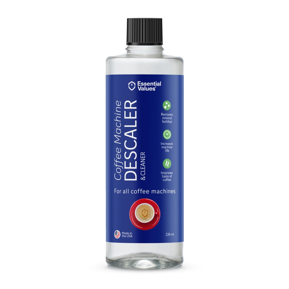
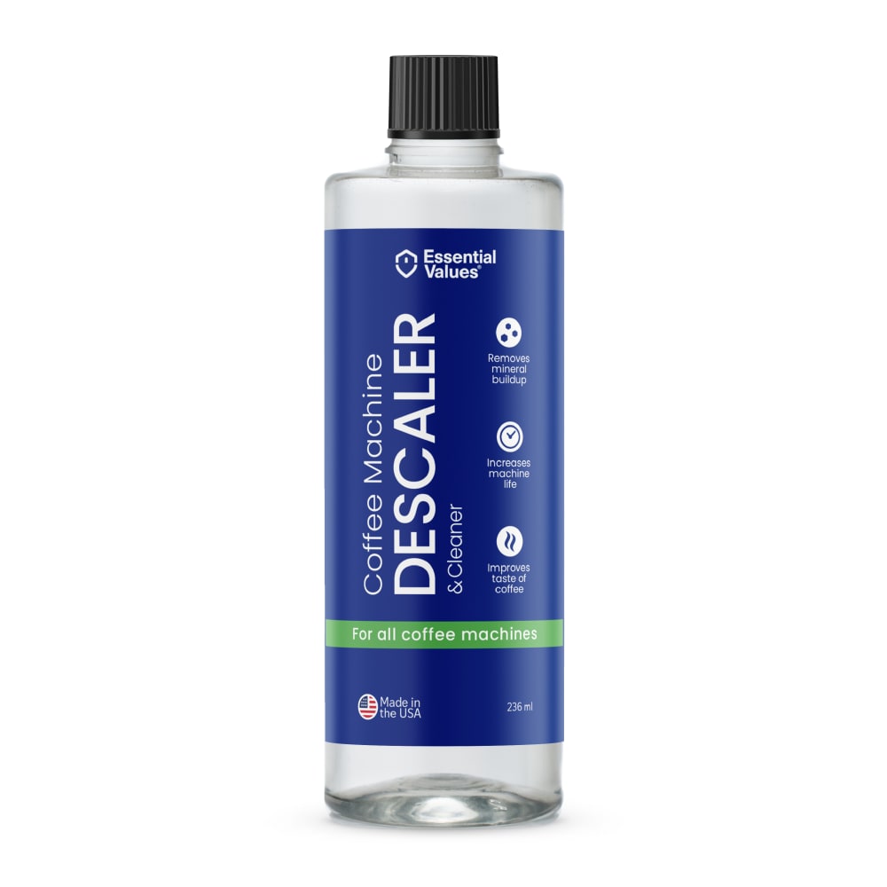
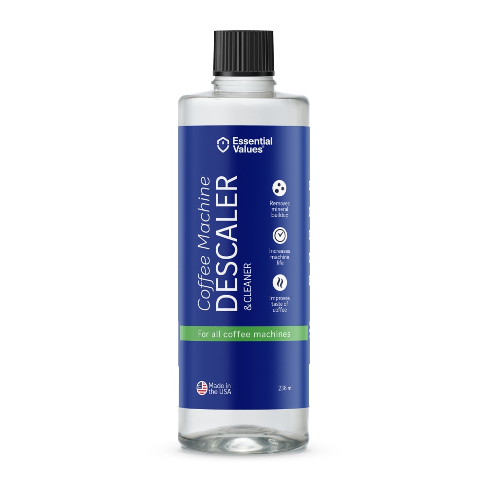
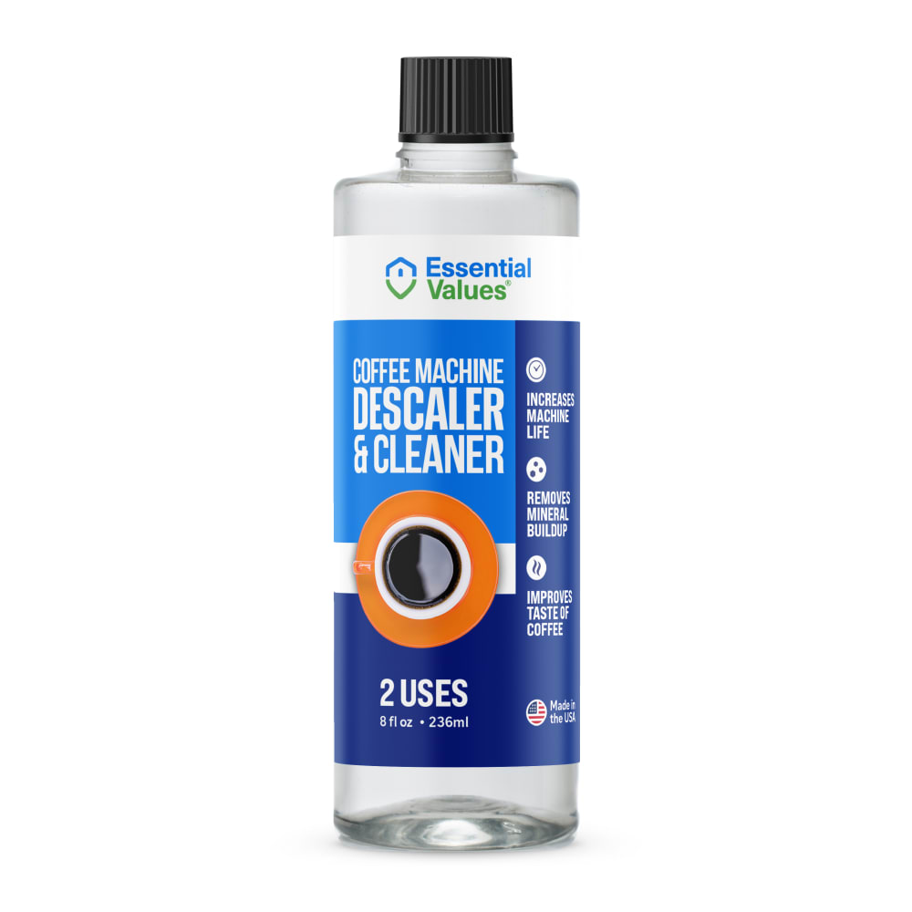
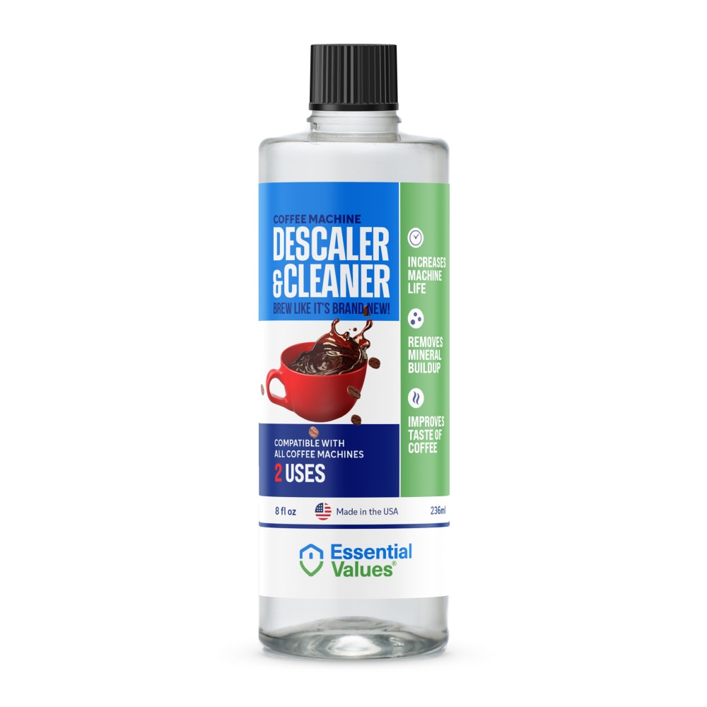
Which packaging design do you prefer for a Keurig Coffee Machine Descaling Solution?
Option E won this Ranked poll with a final tally of 31 votes after 7 rounds of votes counting.
In a Ranked poll, respondents rank every option in order of preference. For example, when you test 6 options, each respondent orders their choices from first to sixth place.
PickFu requires a majority to win a Ranked poll. A majority winner differs from a plurality winner. A majority winner earns over 50% of the votes, whereas a plurality winner earns the most votes, regardless of winning percentage.
If an option does not earn a majority of votes, PickFu eliminates the option with the lowest number of votes. The votes from the eliminated option are reassigned based on each respondent’s next choice. This process continues in rounds until a majority winner emerges.
Scores reflect the percentage of total votes an option receives during the vote counting and indicate the relative preference of the respondents. If there is no majority winner, look to the scores to see how the options fared relative to one another.
| Option | Round 1 | Round 2 | Round 3 | Round 4 | Round 5 | Round 6 | Round 7 |
|---|---|---|---|---|---|---|---|
| E | 30% 15 votes | 30% 15 votes | 32% 16 votes +1 | 32% 16 votes | 32% 16 votes | 36% 18 votes +2 | 62% 31 votes +13 |
| B | 12% 6 votes | 16% 8 votes +2 | 16% 8 votes | 22% 11 votes +3 | 30% 15 votes +4 | 36% 18 votes +3 | 38% 19 votes +1 |
| G | 18% 9 votes | 18% 9 votes | 20% 10 votes +1 | 20% 10 votes | 22% 11 votes +1 | 28% 14 votes +3 | Eliminated 14 votes reassigned |
| D | 10% 5 votes | 10% 5 votes | 12% 6 votes +1 | 14% 7 votes +1 | 16% 8 votes +1 | Eliminated 8 votes reassigned | |
| A | 8% 4 votes | 10% 5 votes +1 | 10% 5 votes | 12% 6 votes +1 | Eliminated 6 votes reassigned | ||
| C | 10% 5 votes | 10% 5 votes | 10% 5 votes | Eliminated 5 votes reassigned | |||
| F | 6% 3 votes | 6% 3 votes | Eliminated 3 votes reassigned | ||||
| H | 6% 3 votes | Eliminated 3 votes reassigned |
Age range
Amazon Prime member
Coffee drinker
Education level
Gender identity
Household income range
Options
Personal income range
Racial or ethnic identity
4 Responses to Option A
i prefer fully darker color with less white, that's why i rated all the options with higher concentrations of white at the end
I like the overall design and the color scheme used I find it more appealing that fits my personality
I'm not a fan of the coffee mug on the label. Seems kinda gaudy. But I like the plain blue label with the red circle best. The red circle makes it attractive and eye catching. Helps provide nice contrast between the green dots as well.
I prefer the options with the text up and down versus across the label (A, H, B, C) and of those I think A has the most attractive design, though I don't like the view of the coffee cup (I think that's what it is?), I think it would look better like the versions in F and G. The up and down text looks most modern, the other ones look a bit like supplements to me.
6 Responses to Option B
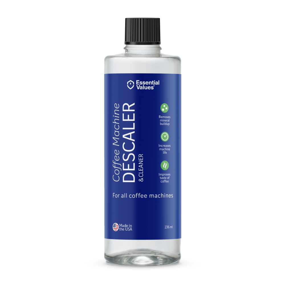
I like B C H & A best as they are simple and you know what the product is for. The others are a little questionable as they as they add food/drink with cleaner.
I like the royal blue color in my top choices, which is bold and confident. Very cool design for sure!
I like that it says what it is - a descaler. I don't care for the ones that show coffee in cups - that doesn't fit to me because it's for the machine.
I'd rather not see a cup of coffee, maybe a coffee maker on the front instead. The ones with no picture are the most appealing to me of the options given
I don't like the picture of the coffee cup on the label - could cause confusion and someone might think this is some sort of additive to the coffee, which would be bad. Accordingly, I like B, H and C in no particular order because they omit this potentially deceiving graphic. The remaining five options all have the picture, so I tried to rank them in less noticeable order.
prefer the block font, pictures of coffee are a bit confusing since it's not for the drink
5 Responses to Option C
C has a very exciting and resonating design that is highly intricate
I really like the labels that do not have a cup of coffee on them. The background color and fonts look a lot better without the coffee on the front. I choose those first. Furthermore, the white background on options G & E look the worst in my opinion. I do really like the amount of uses available on the packaging. It gives the consumers an idea of how much value they’ll get for their purchase.
I just like the crip, clean look of the labels that don't have coffee on them.
I think it works best when you don't show the coffee on it, when I see that it makes me think it's for coffee rather than a de-scaler for a machine.
I like the look of the plain blue label Especially if the bottle is going to be clear. That’s why I chose option C, B and A I like the solid label. I do not think having a cup of coffee on a cleaning products is a good idea and that’s why I rank those the lowest. I’ve never seen a turkey on a can of oven cleaner. I basically divided it into those two groups and went on how eye-catching the label was and text on the Label.
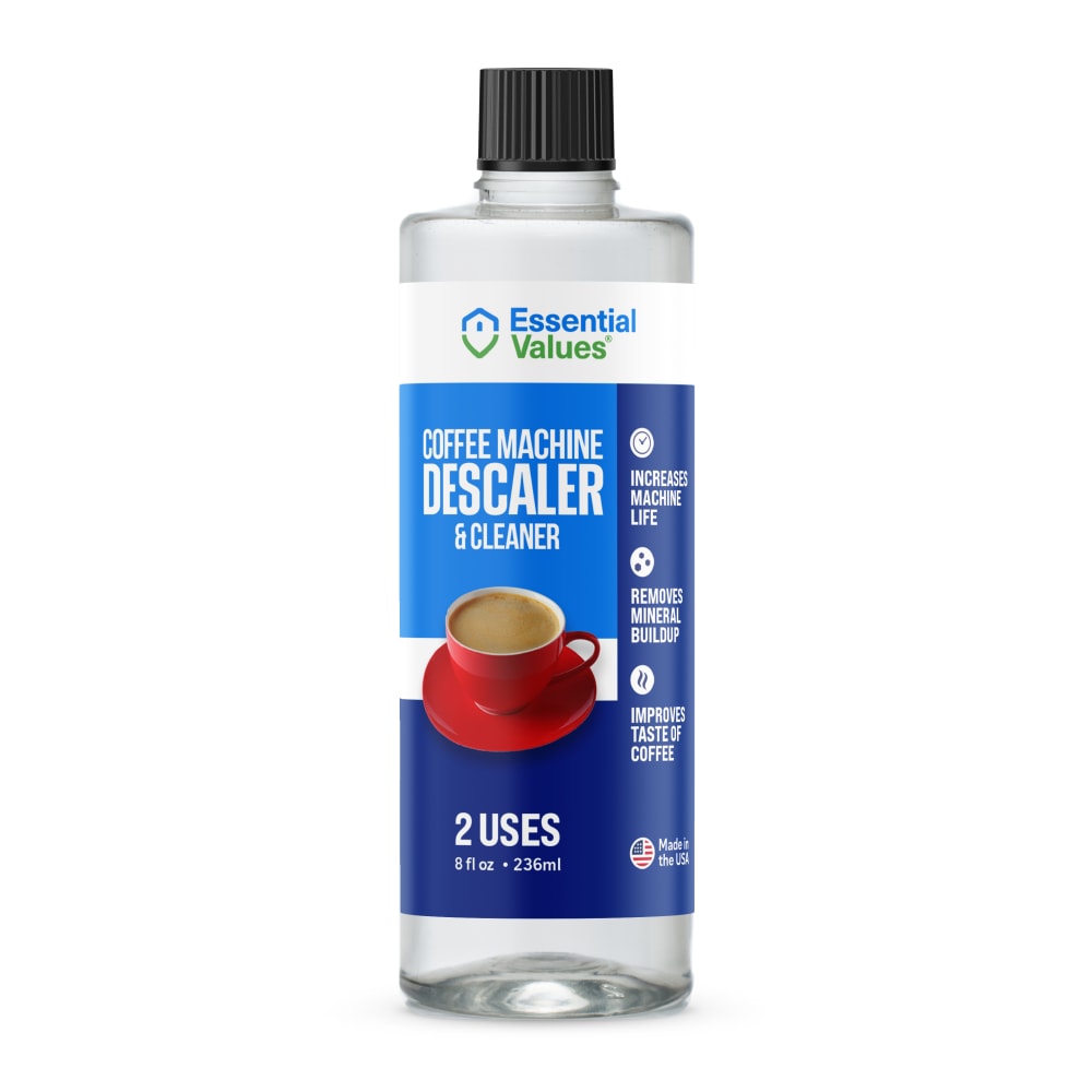
5 Responses to Option D
For me, option D really stands out. It's noticeable and clear. It really separates itself from the pack.
Options D and G are my preferred choices because the label is much easier to read and understand the features and benefits.
Option D is the most eye catching and easiest to read
I like D the most because of the label colors and it tells you flat out how many uses it has. I like that one the most.
I like the design of the label on D the best and the way angle of the shot on the cup of coffee. E is good too but i don't like it the little coffee splash as much. G is ok but i don't like the color of the cup. F for similar reasons as G but it looks even more boring. A while i like the angle of the shot and the overall design of the label i think the color for the cup of coffee could have been chosen better. H is ok but a bit simple and boring. B is ok and i like the little green banner highlighting the text but otherwise its nothing special. C is just boring and simple to look at.
15 Responses to Option E
I like seeing the coffee on the label, let's me know exactly what the product does and the coffee itself I like seeing as black coffee, because that is what I think of when I think of cleaning my coffee maker.
Options E and G have the most appealing labels. They make the product look safe and effective.
I like the options with the coffee on the product, except for D and A where the photo just doesn't look good. I think that the more prevalent the green accent the better, it looks more like a cleaner that way.
After carefully studying and eight images of Keurig Coffee Machine Descaling Solution products, I noted that all eight images displayed the MADE IN THE USA flag logos which is very important to me. I selected Option E as my first preference and the one that I would most likely click on to purchase for my own use because I felt that this image had the most eye catching appeal to me related to its coloring and label design. Option G was my second choice followed by Option D, Option F, Option C, Option B, Option A and finally Option H with all eight rankings based on my own personal opinion of the relative attractiveness of each product image.
I prefer the designs with a coffee cup on them, so that it's easy to identify the product before you read the words on the packaging. I like E best because the coffee is spilling, which implies that the contents of the bottle are a cleaning fluid.
i feel E is the most attractive and presents the product information the clearest
Love the design and style of E as it is outstanding and up-to-date. I'd reach for this bottle first!
I think choice E is the best design of the bottles and the one that looks the best
I prefer the options that have images of coffee on them to help understand what it's for.
The front has a picture of the cup of coffee so if in a hurry and looking for it it will be easier to find and the green part of the left side of the label with the info on it is more descriptive and is easier to see than the rest.
Choices made based on preference of the images displayed on the packaging.
I like the coffee cup on the label because it makes it immediately clear to me that this is a coffee maker specific product and not just a general cleaner
I prefer this option. I like the cup of coffee photo on the label. I also like the phrase/claim 'brew like it's brand new' plus it indicates it can be used in all coffee makers.
I like this design because the see through design and not as much color makes it look cleaner and easier to read.
E is the bottle I prefer because the label is the most eye catching. This bottle looks the most attractive to me. The label information is clear and easy to read.
3 Responses to Option F
Having the cup of coffee on it tells you its for your coffee pots, better advertising.
Go with the one with the cappuccino since I drink those a lot.
I like f first since it has a coffee picture then g since it has a coffe pficture too, and then d since it has cleaner in it, and then h since it has cleaner and descaler in the wording then c it has coffee cleaner then e it is good and then b is good to o and the a is ok as well
9 Responses to Option G
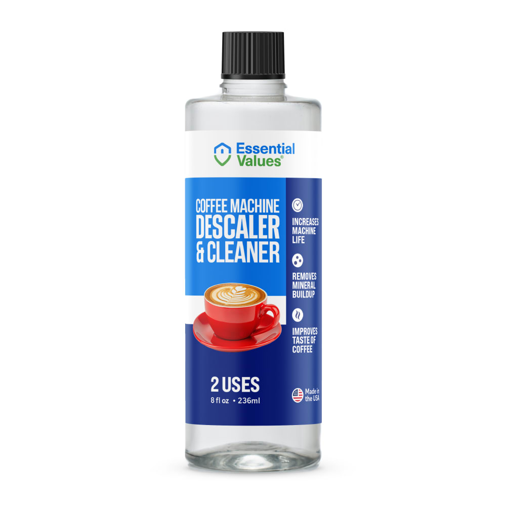
G/F/D make it very clear what the product does and how many uses it has in the container. E is decent as well but the spilling coffee design isn't appealing. A/B/H/C aren't very interesting/clear in design and all look largely the same.
I like the photo of the coffee mug on the label; it gives an idea as to what the product is.
I like option G because the latte is the most creative looking coffee related image on any of the options. I also like that 2 uses is spotlighted on the bottle so clearly.
I prefer the clear bottles with the coffee cups on them, but specifically option G I like the angle and look of the coffee cup on the label the most, it looks very delicious and frothy, makes it obvious what the product is for and is very visually appealing
I chose option G. I think the cup of coffee looks very good and entices the shoppers to read about the product.
I prefer option G. I seeing the cup from this angle. I like seeing the foam on top of the cup, it gives the ad more texture to look at. It also makes me hungry for a latte.
I like being able to see the coffee on the front of the label because it lets me know that this is a solution for a coffee maker.
I ranked my choices here based on the label features, especially the cup of coffee. Since this is a product for maintaining a Kuerig I think it's appropriate and relevant to see cups of coffee on the label. I especially like the coffee shown in G with the eye-catching foam swirl art. I did not prefer the labels without any coffee cup shown.
I chose G because I like the picture of the coffee cup, I like the font, and I like the label that is not sideways. F is second but I don't like the coffee image as much. E is my third choice as I don't like the image as much but I do like the highlights in green. D has a coffee image but not one that looks so good. A and C are both okay but nothing special to the eye. B and H don't look finished without an image.
3 Responses to Option H
Option H is the most appealing label that conveys the information I'd be most interested in if I was in the market for this.
I love option H the most because it seems to be the most effective and it is the most aestheticically pleasing option to me.
I am a fan of the cleaner design, but I also think all 8 labels can work. While I don't think the picture of the coffee mug is needed, it is helpful if you are unfamiliar with the product.
Explore who answered your poll
Analyze your results with demographic reports.
Demographics
Sorry, AI highlights are currently only available for polls created after February 28th.
We're working hard to bring AI to more polls, please check back soon.

