Poll results
Save to favorites
Add this poll to your saved list for easy reference.
Which packaging design do you prefer and why?

Option A won this Ranked poll with a final tally of 52 votes after 4 rounds of votes counting.
In a Ranked poll, respondents rank every option in order of preference. For example, when you test 6 options, each respondent orders their choices from first to sixth place.
PickFu requires a majority to win a Ranked poll. A majority winner differs from a plurality winner. A majority winner earns over 50% of the votes, whereas a plurality winner earns the most votes, regardless of winning percentage.
If an option does not earn a majority of votes, PickFu eliminates the option with the lowest number of votes. The votes from the eliminated option are reassigned based on each respondent’s next choice. This process continues in rounds until a majority winner emerges.
Scores reflect the percentage of total votes an option receives during the vote counting and indicate the relative preference of the respondents. If there is no majority winner, look to the scores to see how the options fared relative to one another.
| Option | Round 1 | Round 2 | Round 3 | Round 4 |
|---|---|---|---|---|
| A | 22% 22 votes | 28% 28 votes +6 | 35% 35 votes +7 | 52% 52 votes +17 |
| C | 27% 27 votes | 29% 29 votes +2 | 35% 35 votes +6 | 48% 48 votes +13 |
| E | 20% 20 votes | 25% 25 votes +5 | 30% 30 votes +5 | Eliminated 30 votes reassigned |
| D | 16% 16 votes | 18% 18 votes +2 | Eliminated 18 votes reassigned | |
| B | 15% 15 votes | Eliminated 15 votes reassigned |
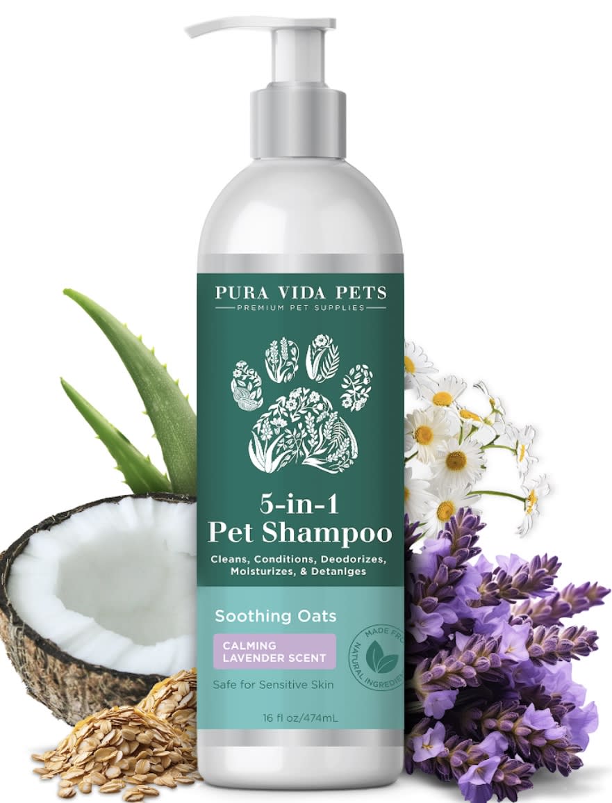
22 Responses to Option A
Option A looks really nice and high class, it's what I would want to use for my pets.
Option A's design is clean and the lavender imagery is calming and attractive. Option D's bold blue design is eye-catching and clearly lists the benefits. Option C's natural ingredients are emphasized, giving it an organic feel. Option B's picture of the dog is cute, but the design is less sophisticated. Option E's design feels a bit cluttered despite the appealing images.
I thought that A would smell the best so I picked it first. I thought the bottle of option B was cute and I like how it is made in the U.S. I feel like D is a high quality option but its bottle did not draw me like A or B. I liked E and C about the same.
I prefer option A. I like that it has oatmeal in it and smells like lavender. I this the paw on the label.
The added flowers etc. look really nice. Hard choice between the paw print and the puppy.
The big paw print made of natural ingredients is a great look. Says a lot visually with a single illustration. The colors on the label are appealing too.
The top design has a clean color scheme, a shape that is not too thick or thin, and a very nice looking paw print design.
A and D have 5 benefits as A is made with natural ingredients and also safe for sensitive skin so I would buy A. As C and B has 4 benefits and also made with organic ingredients and as C lists the benefits I chose it third.
I think the floral paw image is really unique, and I like the colors used on the label.
This seems more natural and safe to me.
I love all of them, but my eyes are drawn to A and D as the blue color is coming off as quite professional and pleasing to me. I like the darker blue a lot for A and the background of that one just feels a lot more natural to me. from there, the white over the green feels more professional
A comes with a blend of different flavors that makes it more attractive. The coconut, aloe vera, lavender and oatmeal flavors give it a nice pleasant scent and also comes with a lot of benefits. The dominant green color of the container label also makes it look organic hence more credibility.
I like the combination of the coconut and lavender I think the coconut would be nourishing for the skin and the lavender would be calming.
I like coconut and the smell of coconut. I also like the coloring of the label and the font choices on the label.
My top choice clearly shows a coconut and lavender, which are both soothing and great smells and I hope these are the ingredients
Option A and E, I liked that it has a pump so its easier to dispense product. Option A, I liked the design slightly more than option E. Option B, I liked that it has a dog on the front. Option D, I liked that it mentions its a 5 in 1. Option C, looked okay.
I like the fruit in the image and how it makes the product stand out. It also gives the feeling of being very natural and like it would smell very good. I really like the colors on the label of the product as well. The pump is a nice touch with this type of product.
I will choose choices A and E first because the coconut and the paw paw products are more effective from my past user experience as compared to the other items which from the image I can not be able to visualize what they are for me
I prefer A because of the label and the dispenser type.
I have to say that the most appealing design for this shampoo bottles is the one shown in option A, because it offers a lot of details and examples of the components or ingredients that this product have, making the pet owners feel more reliable of this product and more attracted due to its design that clearly explains its features and benefits.
the plaier the better. I am not one for excess frippery
I choose A first because I like a pump.
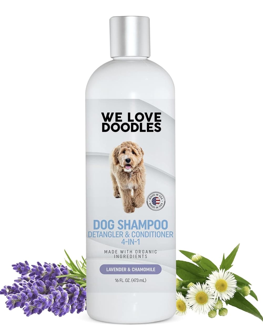
15 Responses to Option B
I like this the best because I like that it has an actual dog on the bottle. I think it makes it look the most cute. It usually always helps to have a real picture of a dog. I also like the brightness of the white and how it has the flowers next to the bottle
My bottom two images are boring and don't stand out. I like my top choice as the photo is cute and the image is clear as to what the product is. I think the pawprint on my second choice is a great fit.
The picture of the dog makes it easy to recognize and easy to find
i chose option b because our dog is a labradoodle and hopefully the product would be designed to deal with their coat
I chose B because it shows a dog photo and specifically for dogs.
I really like the dog on the front of the bottle in option B, so that is the one I would choose.
I like having a real dog on there. I think E looks well made. A is okay. D and C look lower quality.
I like all of these but I chose option B. I think the natural ingredients are fantastic and the presentation of the product also the same.
i like when there are actual pictures of dogs on the packaging
I prefer Option B because of the bright white design. It's fresh and attractive. I also like how I can see how much is in the bottle.
Love the dog photo in B!!! Pops right out at me !
I liked that B looked more refreshing given its more elegant and subtle color scheme (that is lighter in color).
The packaging on option B looks like a high quality product. I like the lavender smell on options A and C. Option E is ok and option D is too plain.
B is my top choice because the dog on the label kind of looks like mine! A is my second pick because I love lavender and the pump top dispenser is handy. C seems like a good blend for sensitive skin. E and D looks like bargain basement brands.
I prefer choice B the most because it has an image of a real dog on the front label.
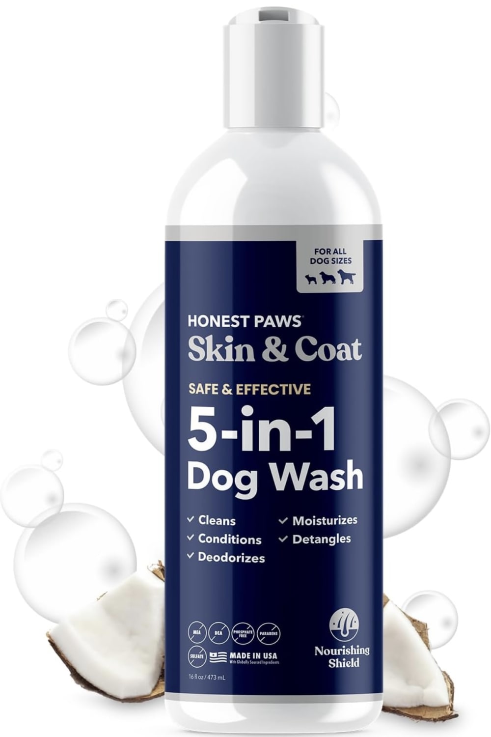
27 Responses to Option C
I like the green and white color scheme of this item.
The prominence of the aloe and oats pictured behind the bottle lets me know that the product will be soothing and gentle on my pet's skin.
I like option C. It looks like it will have natural ingredients and be safe for my dog. I also like the softness of the design. It reinforces the safe quality and makes it seem gentle but also good for the dogs coat.
Simple packaging, the bullet point list makes it seem like it has the most features.
Option c has a much more noticeable bottle is the only option that states the shampoo is orgainc among many other things this product has other choices do not and made in the usa.
I like the shape of the bottle and the ingredients of this one. It fits my style and needs.
I selected option C because it is easy to read and easy to understand. Option C is the most informative and it gives me all the information I need to make a purchase decision. I also like that the product is organic. I also like the shape of the packaging because it looks easy to hold.
I like using oatmeal washes for my dog, as it's good for his skin and coat, so C is my top choice.
It looks the most aesthetic, has the most info and also states it's made in the USA.
C is my first choice because it is the most legible, natural looking, and attractive. The bulleted lists clearly outline the product ingredients and benefits. D is similar, but the background is a bit darker and uglier, and less information is conveyed. E has a nice color but is a basic label. A is quite ugly but at least legible. B's branding annoys me, especially the "doodles" aspect which is something I'm firmly against because it is via breeders.
I prefer the packaging design of product option C as its composition is the best of the lot and I loved its packaging design style too, with its features highlighted and its certifications arranged in a neatly pattern the overall presentation is also very attractive.
I love the simple and beautiful green and white color scheme of C, and how it matches the fruit in the background
I like this design the best I like how the color makes it easy to read
I lvoe the color pop that Option C puts off. I am really into the design elements too. I think this would look great on my shelf. It is an amazing overall look! I am super impressed!
I ranked them based on what level of quality i thought they were and how i effective i thought they would be.
Option 1 has the best product packaging design because the product description and details shown in there. It makes me think it looks good and convenient.
C lists ingredients and benefits. Seems to be a mostly natural product. A seems like a more natural product. Prefer the pump bottle top also. B has organic ingredients, which I look for. D I wouldn't pick. Not sure of the ingredients. E, I don't like things listed as fragrance, so that was an instant turn off.
The first 3 (C, A & E) come off as more natural or balanced products, made with better ingredients. The last 2 (B & D) look much more generic and I would worry that these might have bad chemicals or cheap ingredients that could irritate my dogs skins. They also feel more forthcoming with details on whats in the product itself.
I chose the one that seemed the most safe and soothing for my dog, ones that would alleviate dry skin and itching, and didn't contain harmful ingredients. The last one I chose seemed like it might have had a lot of chemicals in it.
I chose C because I like the colors and the design with a dog and cat.
I like how option C is the most open about what is going into the dog shampoo. It is oatmeal based, which is not something readily apparent on any of the other bottles. From there I think E has a nice mix of simplistic and easy to understand graphics. A is less easy to understand but I think the product's look overrides that. D is the most clearly plain and easy to understand while B is just overly designed and not easy to understand at a glance.
I like c. Great info on label. Easy to read as well.
Option C has the best packaging because it shows me exactly what the product is and how it will benefit my dog. I like the colors used, the brightness of the green is attention getting. The product has a very professional appearance and it's packaging tells me that this is a product of very high quality. I like that the product is made in the USA and that there are many ingredients that will calm and soothe my dogs coat.
I like product packaging that tells me a lot of information I want to know. It comes off being more trustworthy and helps me make my buying decision faster.
c i like the label the most, the colors used makes this look more natural and like it would be gentle on my pups skin
The container design/colors in Option C appeal to me the most. Specifically, I like the green/white color combination with the pawprint background and pawprint bullet points. Additionally, the leaves/oatmeal on each side of the container add a nice aesthetic touch to the overall image. Furthermore, I like the easily visible words, "Made in USA" at the top of the container, as well as the larger volume size.
Packages with green make me think of things that are clean, gentle, and natural. I like packages with images of dogs or pawprints.
16 Responses to Option D
I like the upfront 5-1 on D and A, but the design on E is also really nice
I like the clean and basic look of this dog wash vs the others, feel like it would transition onto my shelf pretty seamlessly
I like options DC and E the best for their packaging designs and main ingredients. I think these look more better and natural and safe for a pet. I think these would sell better as they have better scents and ingredients for pets.
I chose D because it does the most in one shampoo. Currently I am using three different shampoos on my dog everytime I bathe him. One to cleanse, one for shed control, and one for flea and tick prevention. It is a lot of money when I have to restock these so when I saw one that does more than just one thing, it grabbed my attention
I like the color scheme/design the best in D
I prefer Option D because I like the way that the product is dispensed. It results in the least amount of wasted product.
Based on the label and bottle design alone, D I feel has the highest quality look to it.
I don't like pump tops. I like that Option D tells me it has 5 features in one bottle.
Option D is the most descriptive. The dark blue bottle and text is easy to read and understandable at a glance. There is no extras it seems, as in no additional images or other stamps to get in the way. I feel good I am able to see all I need about the product.
I liked D the best because it seems like the most natural one.
I definitely liked D and E because they were simple but strong. I also liked B because it had a cute dog on the label. I did not like C and A as much, not really for any reason specifically but they just didn't draw me in like the others.
I prefer D because the dog wash looks more useful and easier to use.
this one is the best of the ones shown because it has a 5-1 benefit, so it seems like a very thorough product
I like a sleek and shinier package, I choose D because the color and texture caught my eye and it is clearly for pets without being too cutesy. Would look more sleek in my bathroom, that's a bigger consideration in terms of packaging.
I like D because it is simple and straight to the point.
I like the squeeze bottle better. It is easier to use with one hand.
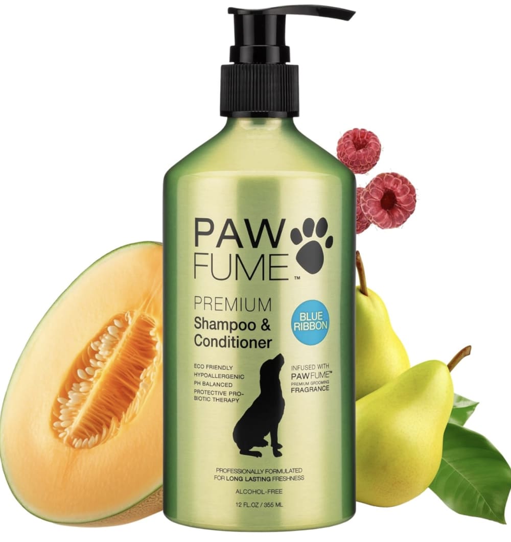
20 Responses to Option E
Option E is my favorite one because of the green product bottle color and the surrounding foods.
the fruit would be the best scent to try for the pet shampoo, it seems fragrant and a great smell for after. so option E is aesthetic.
i prefer the packaging design in option E because it looks natural and healthy for my dog's hair
B is very uninspired, I dislike the minimalist look. I think E has the best overall layout, and solid colors. D has the second best layout. C begins to have too many colors and too much colors.
I think that E looks very refreshing. I would take the bottle from choice B and add it to choice E.
I like how natural the product in e looksC
I prefer option E because the color of the bottle is appealing and it includes a dog and a paw picture.
Option E has the best option because of the green color and the black text. The other options do not look as good.
The package looks bright and colorful. Got my attention.
Option E' is my preferred choice because the packaging has a very attractive design which gives an impression of how quality the product is. Again, I also like how the image displays sample of the products ingredients besides it.
I prefer this option because of the glossy color scheme and overall design of the package and nozzle.
I would want the fruit instead of anything. Looks like it would smell the best.
I like seeing the fruit ingredients in E. This makes me feel like my dog will smell really good. I chose B second as the dog on the packaging is really cute.
D is too dark and the background is too boring. Green is my favorite color so I liked E the best, but it also looked the freshest.
After carefully studying and comparing all five product images displayed above, I selected Option E as my first preference and the one that I would definitely click on first. I felt that this image just jumped right out at me as having the most eye catching appeal based on the bright variety of coloring in the image. Option A was my second choice followed by Option B, Option C and finally Option D with all five rankings based on my own personal opinion of the relative attractiveness of each product image.
I really like E. I love the pump on top, it is easier to use. I also really like the color, it likes high end and of good quality.
I love option E the most because it has the most green coloring on it, this gives the brand the vibe that it cares about being natural.
I choose E because the design looks visually appealing and attractive to me, compared to other options
I ranked in the order that the layouts and photos tell me the most about the product, including what the scent is.
I love the pump on the bottle of option B. I do not like having to pick up a bottle and dump shampoos and conditioners in my hand while washing an animal. It makes the bottle hard to hold and to use. I feel like this bottle has a very upscale look to it. I like the simplicity of the design. It's easy to read and the color of the bottle is very attractive.
Explore who answered your poll
Analyze your results with demographic reports.

