Poll results
Save to favorites
Add this poll to your saved list for easy reference.
Which packaging design do you prefer?
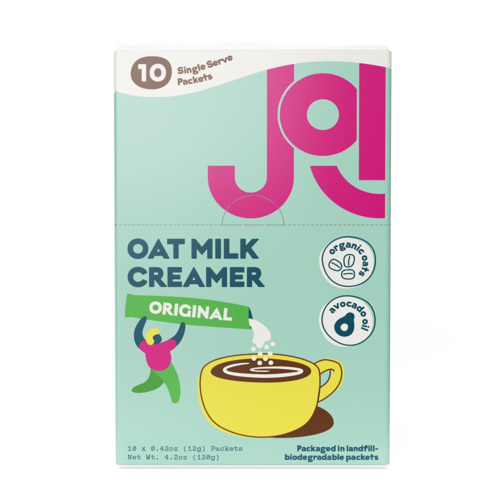
18 Responses to Option A
This one is much more colorful and thus more appealing to me
I chose this option being that i like how the packaging matches what the product is and shows it being used to help with any confusion.
I would prefer option A's design as it looks bright and colorful!
this one is more colorful and it feels vintage. it give the product a feeling of nostalgia and it also feels so fun to see and use.
I liked that this packaging looks more bright and vibrant.
the more colorful one pops and is more exciting
I would like to prefer option A packaging design because it is colorful and design is eye soothing.
I like a. Much more colorful and attention grabbing.
I like the colors, design, layout and font of this fun creamer of choice A is the one I would lean towards.
Option A is my first choice because I like the packaging as it looks funky and also looks colorful.
There is too much white in B
Kindly note that while I did vote for A, I'd really like to see the information contained on B included on A. The points it makes, such as being vegan (or, as it calls it, "100% plant-based"), are important and deserve to be on the end result.
Opt A stands out much more than Opt B, the lighter blue packaging with bright Pink brand name is a great contrast in colors so it's easier to see. Anything that catches the eye is always a big plus for getting the consumers attention. I don't think Opt B does that, although the colors are consistent they blend too much and is easy to walk by this packaging without trying to look.
Definitely Option A because it sticks out and is very appealing to the eye in my personal opinion. Thank you.
I like the pink letters of the brand name cute character is holding original pouring into the coffee cup.
I much prefer the playful and colorful design of Option A. Food should be fun. And as a vegan that relies on milk alternatives, I am telling you, it is especially important for our food to be fun.
It is easier to read.
Although Option A lists important information which I did not see on Option B, such as it being plant based, Option B is more fun and colorful, which is something I need plenty of when reaching for a cup of coffee to put the creamer in, since if I'm drinking coffee I'm probably feeling low-energy and need some pep.
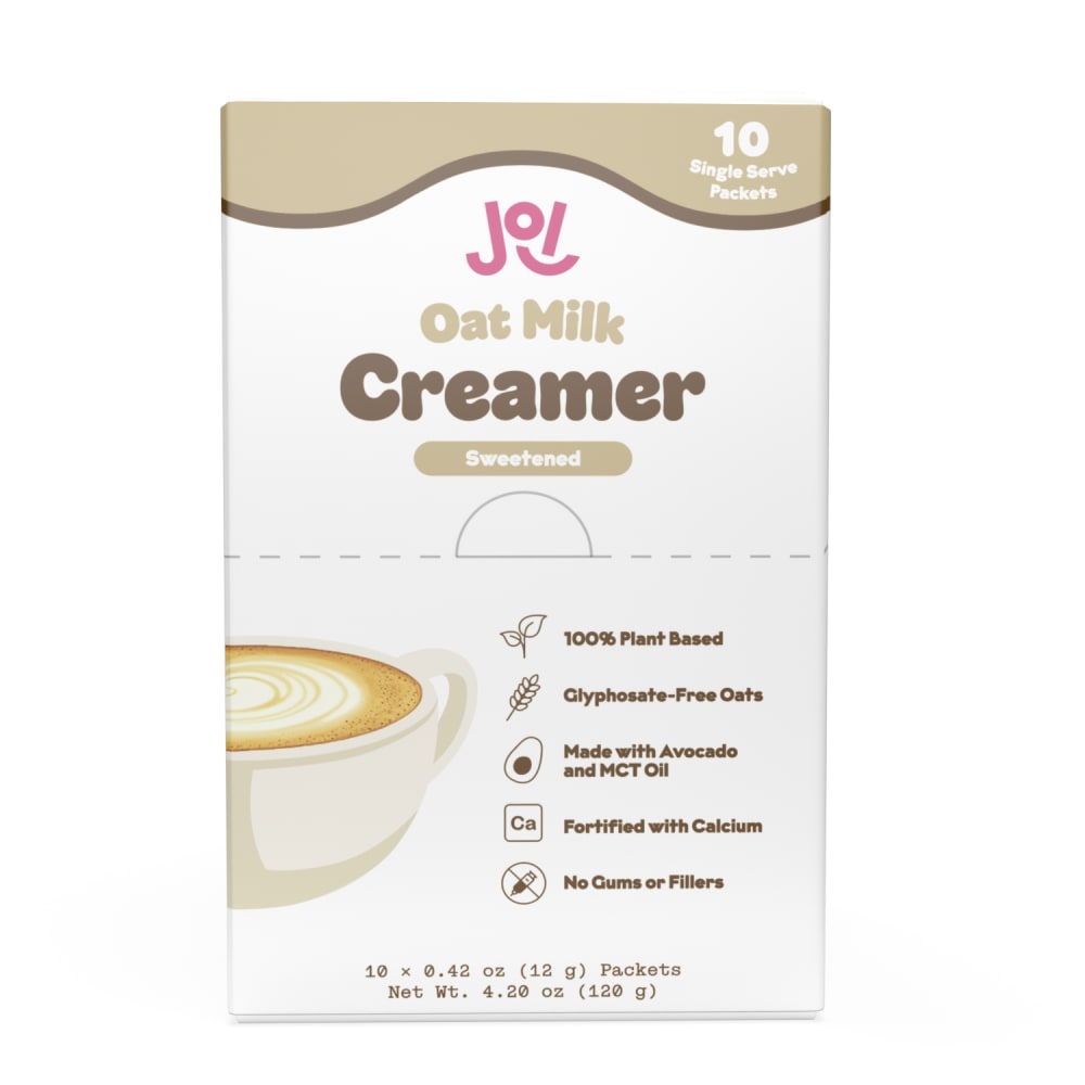
12 Responses to Option B
I like the color scheme and the artwork of option B better.
I prefer option B. I like the appearance of the package. It has great colors and it looks professional. I like how its attributes are listed.
This option's color palette is more mature and fits with the target customer group (mostly office working females)
I prefer the packaging design of choice B because the cup of coffee on the cover gets my attention more.
I prefer this packaging because I like how it shows much details about the product quality.
I prefer B because when I think of oats the colors I want to see are more muted and creamy colors, and the design of A reminds me more of a crystal lite packet than an oat milk packet
I would prefer B's packaging. For one, I like the extra information on the product and how it's made that A lacks, such as that it's a fortified food item. Second reason is brand-type recognition; eco-friendly products are usually more subdued in art design and color, and B fits that well and A doesn't. I wouldn't think A is a green item at a glance, but I knew immediately B was. Third and last, I just don't like the art aesthetic of A.
I voted for B because it has essential information listed on the front of the package. While A is more eye catching, I prefer to readily know what’s inside the package without having to hunt for the information.
B is very simple and natural looking. It looks more trustworthy.
I like the more neutral brown, beige, and white color scheme in option B, A looks too cluttered.
the design is more mature & attractive to my demographic being that I am 28 years old. It also has more descriptors about it being plant based.
The design of option B is classic. I find the art on box A to be ugly.
Explore who answered your poll
Analyze your results with demographic reports.

