Poll results
Save to favorites
Add this poll to your saved list for easy reference.
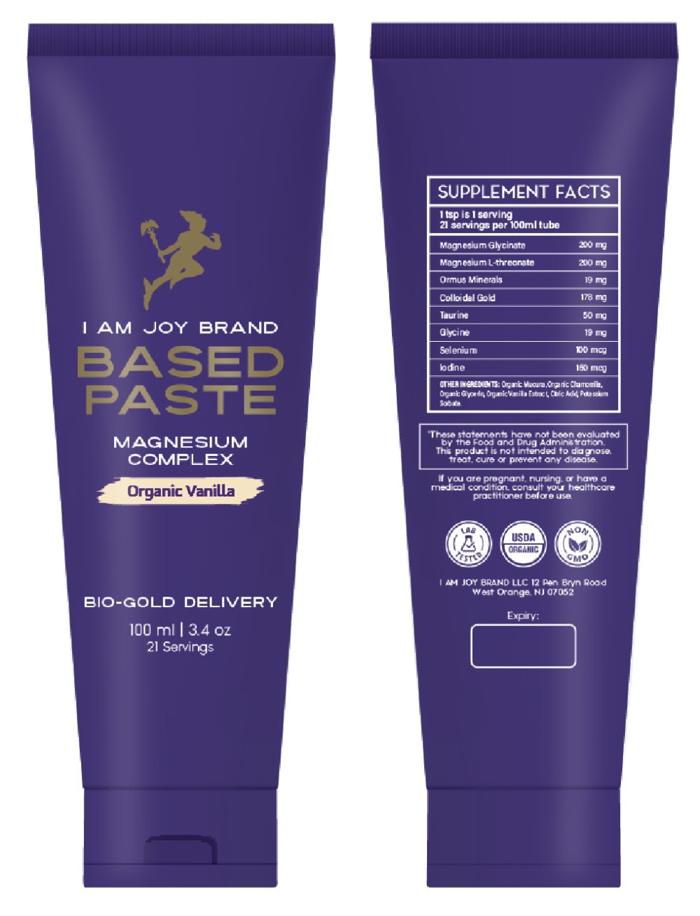
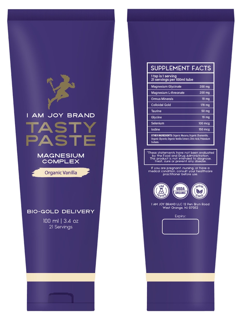
Which packaging design do you prefer?


22 Responses to Option A
It would help if I knew what the product was. Otherwise, I will say that they both look the same, with the only immediately obvious reason being the name. I went with Option A, because it's clever and memorable.
Just because the image is more clear.
I would like to prefer option A product. Because based on the design, full blue background is appeals good.
I like the "based paste" name because it rhymes and because it sounds very powerful and effective.
I prefer the name of this option. The other option makes it sound like a tasty snack that you would enjoy eating. This is too confusing when making my purchasing decision.
I like the name Based Paste of Option A better than Tasty Paste of Option B.
A because it makes me laugh, is fun, and I never will forget it
A just seems more uniform and stands out more to me.
This sounds more unique and makes me want to click it to see what is in it. I find B a little kiddy.
I like Option A because of the fun name and the way the text tapers down. It's a cool design.
The "Tasty Paste" name just doesn't sound very appealing to me.
Easier to read and understand
I like how the name rhymes. This makes it memorable. I don’t like the other option because “tasty paste” sounds weird to me, like eating toothpaste or something.
This is my preference - A - with Based instead of Tasty. Tasty is just not the right word for this product.
A is the design and style I prefer because itis the most alluring and comprehensive.
Tasty paste sounds just awful I wouldn't buy this. The other options is at least a bit better.
I like the name of this product better.
between the two products, there has no big difference between them, but option A has small difference. In option A the flavor of the brand written in Bold format. Of which it is clearly understood.
Option A is more sleek and the gold ring isnt necessary.
I honestly can notdiscern any differences between the two packaging samples presented
The name of A sounds better to me.
I prefer the clean lines of A - I don't think you need a neutral accent line along the bottom. In fact, that might just be annoying because it could get dirty more easily.
28 Responses to Option B
I like tasty paste over based paste.
I think that Tasty Pasted sounds more appealing than Based Paste.
The gold stripe makes it stand out more.
I’d prefer paste that is at least tasty to the alternative.
i would choose the design here because it looks more healthy and natural
I like the container of option B with the lighter color on the bottom.
The stripe helps the bottle stand out better than not having it.
B it stands out a slight bit more in a positive way.
It would make me think that it does not taste gross.
"Tasty Paste" sounds fun and and playful, which is appealing for sure! The purple design looks regal and classy as well.
I like B more because that one says tasty so I know it's not going to taste bad, not sure what based means on the other option.
I like B. The name of it makes it sound more appealing and like it would be helpful.
I prefer option B because this name sounds more enticig.
B seems like a completely product image where as A doesn't. A seems like it is lacking something, but the band on B, around the cap, really makes B feel like it really sets it apart. I do like the font on A's "Organic Vanilla" more. It seems more bold and bigger.
The name sounds catchy when spoken aloud
I think tasty paste is a better name because you eat this. I think telling people it is tasty could be a good selling point. The "based paste" seems like it has missing information. What is it based of?
i think tasty paste is more easily remembered and it sounds like something you are going to like
It was such a small difference between the two choices I didn't recognize it at first. Having that tan line on the bottle of choice B to separate the bottle and cap makes me click on the image
I like option B the best because "Tasty Paste" sounds good and I like the logo above the words.
Seeing as how this is a supplement meant to be ingested, I would pick option B because the word "tasty" helps convey the idea that you are going to eat it.
I like the name of the product. I feel that people are going to buy it if it looks like it will taste good for their pet.
I selected option B because the packaging makes me think the product will be beneficial for me but also have a delicious taste.I didn't select option A because I'm not sure what the name of the product means.
It makes it sound flavorful so I would like it better.
I like the name Tasty Paste better than the other option.
I would choose this one since the Bio Gold description implies it is something of higher quality.
I like how the colors are broken up.
I do appreciate the name of A, but I think B sounds more enjoyable
Tasty makes this more of an edgy product and sounds like so much more fun. This is the one!
Explore who answered your poll
Analyze your results with demographic reports.

