Poll results
Save to favorites
Add this poll to your saved list for easy reference.
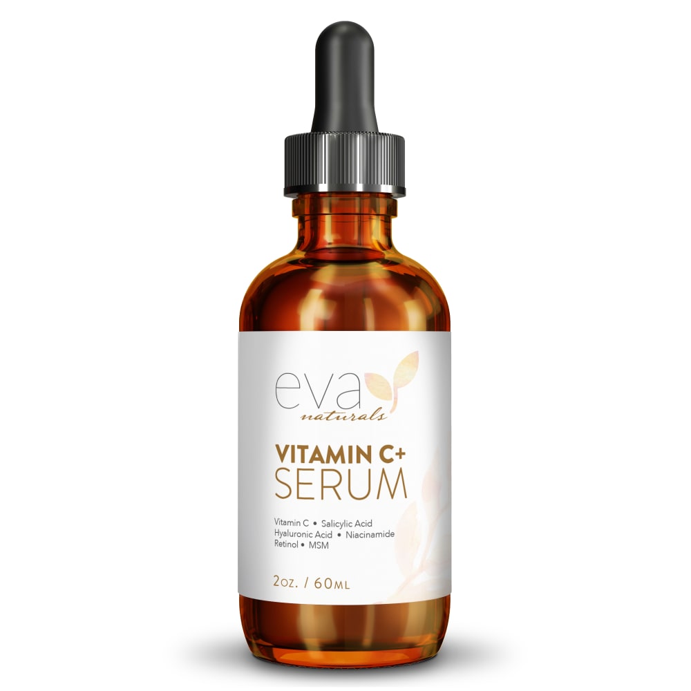
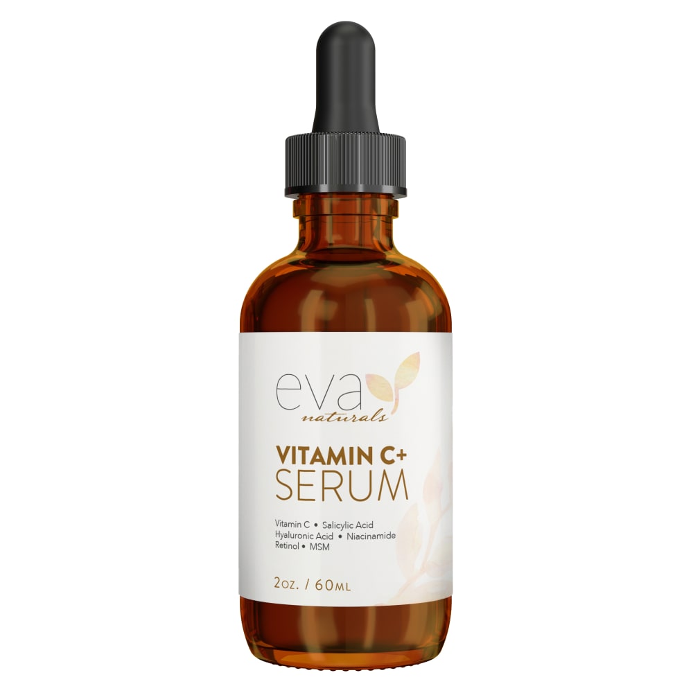
Which lighting style do you like the most for an image of a skin care product on Amazon?
Age range
Education level
Gender identity
Household income range
Options
Personal income range
Racial or ethnic identity
42 Responses to Option A
I liked that the product in this option was a lot brighter and lighter, since it seemed more refreshing.
The shininess of the bottle and the bright white of the label are more eye-catching in A. I think B looks more realistic but if I were scrolling through quickly I would be more likely to stop on A.
I like choice A as it looks lighter and brighter of which that is what this serum would do to my skin if I use it.
It looks brighter so it makes me think of bright and healthy skin.
I thought option A had slightly brighter lighting which I liked.
I prefer A because it highlights the tones and hues of the bottle better.
I prefer option A I think the label looks more high quality than option B.
I love getting a glow from a serum like this, and this serum just looks more glowy to me overall.
B is too dark... especially for a product that's supposed to be "lightening." I would want to bottle to mimic what the product is supposed to do.
B looks dark and dull in comparison
I prefer choice A because the picture is brighter. It makes it easier to see.
The bottle looks brighter, and the label looks whiter.
I prefer the lighting in this option because it make the product look more expensive.
The brightness of A is better and more attractive
I think the illumination here really catches the eyes and casts a soft but noticeable glow
The clean shiny look looks better.
After carefully studying and comparing both images of skin care products displayed above, I selected Option A over Option B as my first preference and the one that I would more likely click on to purchase for my own use. I felt that this image had more eye catching appeal to me personally due to the bright golden glow on the bottle due to the brighter lighting.
I prefer option A because I like the warmer and brighter tones of the bottle.
A looks more beautiful and has more visual impact — the lighting is brighter and provides more contrast and makes it pop off the background.
they almost look the same! maybe A is a little shinier? I like shiny better
A quality looks more appealing then B. A gives off a image of new beauty while B gives off a dull look to an overall image.
I like A over B because the bottle is brighter and shinier in A.
I strongly prefer A. A looks more bright and more 3 dimensional, and B looks somewhat flat in comparison.
The lighting for Option A makes it seem more vibrant.
Looks clearer, cleaner, brighter.
The glossy look is better because people want their skin clear and glossy.
I prefer option A because in this image this skin care product glows due to given lighting which is very fitting for a skin care and smart to use this image.
A. It's just a little more compelling for me visually. Can't really say why. I hardly see a difference.
The closer up picture lets you see the details of the product more easily
I prefer this option because it looks shiny and more eye-catching.
I like how the bottle has more dimension in option a with the light reflecting than the flatter image in optoin b
The label is bright which gives me a sense of welcoming.
A looks brighter and less washed out
It brightens it up more makes it shine better you can see more of the product
I like Option A as the lighting is better and I feel I can read it easier.
I prefer the brighter light. I always think that a product I buy for my skin is going to brighten it, so this would be a good way to get my attention.
the brighter draws my attention more, and it is easier to read
I chose A because the image is bright and easy to read. It really caught my eye compared to B.
I chose option A as the choice that I liked the best because I think that it highlights the product in comparison to the choice in option B.
I think the brighter label looks better.
That gold makes it shine!
I like it better with the brighter lighting. The other seems almost too dark.
8 Responses to Option B
for an image of a skin care product on Amazon option B looks th best for me in my opinion.
The bottle is less shiny. It is more modest. It draws more attention.
B looks as if it has liquid in it A does not.
I like the softer white. Without the comparison I'm not sure it would matter either way though
The one I didn't choose looks heavily edited and weirdly shiny.
A is too shiny. It is distracting. B is clean and professional.
I like option B better because it looks like it has a softer lighting and I think it looks nicer.
I like Option B. I like the darker lighting style for this product. It's more attractive and stands out better.
Explore who answered your poll
Analyze your results with demographic reports.
Demographics
Sorry, AI highlights are currently only available for polls created after February 28th.
We're working hard to bring AI to more polls, please check back soon.

