Poll results
Save to favorites
Add this poll to your saved list for easy reference.
Which image are you more likely to click and buy in Amazon search results?


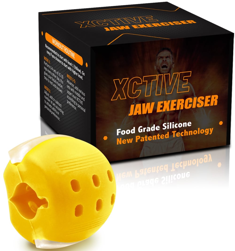
Option B won this Ranked poll with a final tally of 35 votes after 1 round of vote counting.
In a Ranked poll, respondents rank every option in order of preference. For example, when you test 6 options, each respondent orders their choices from first to sixth place.
PickFu requires a majority to win a Ranked poll. A majority winner differs from a plurality winner. A majority winner earns over 50% of the votes, whereas a plurality winner earns the most votes, regardless of winning percentage.
If an option does not earn a majority of votes, PickFu eliminates the option with the lowest number of votes. The votes from the eliminated option are reassigned based on each respondent’s next choice. This process continues in rounds until a majority winner emerges.
Scores reflect the percentage of total votes an option receives during the vote counting and indicate the relative preference of the respondents. If there is no majority winner, look to the scores to see how the options fared relative to one another.
| Option | Round 1 |
|---|---|
| B | 70% 35 votes |
| C | 14% 7 votes |
| D | 10% 5 votes |
| A | 6% 3 votes |
3 Responses to Option A
A had a better overall layout and was more fun to look at.
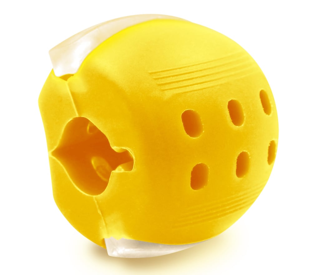
I like option A the best because it shows a close up image of the exerciser.
A gives me the best close up of the product, I dont really care about the box
35 Responses to Option B
I like at the product is big and picture you can clearly see it and imagine using it
I like Option B the best because it is the most close up picture and I can clearly see the Jaw Exerciser and the package.
I would click and buy option "B" on Amazon. The angle of the product looks appealing. The overall product looks creative.
I thought the packaging was needed to explain this ambiguous looking product so A was ranked last. B showed the product and the packaging together in the most prominent way with the most detail and made the text on the packaging look the clearest.
Option b shows both the product up close as well as the box with helpful information
Choice b is easier to read the box and see what the product is used for
The first one is just a tiny bit too close up but I like that the product name hits me, I chose the second two based on the fact that the box was present and well aligned.
I like how big the box is in this picture. It would catch my attention the fastest and makes it easy to read all of the details for information. I like the boxes in the picture instead of just having the product and I like them staggered in option C second
B is the most appealing image because it shows the product pretty well but also gives a good look at the box so I can learn more about the product more easily.
Option B is the best balance between showing the product and the box in the closest angle.
I like the closer view with the box. Seeing the box always helps me decide on a product.
I like the way that the package and item are displayed at an angle in option b. It is a high quality Look that will draw the consumer in.
B is the biggest and provides the most detail on the box. I can read all of the text and understand what this is. This is necessary because it is not self evident
Option B is the most appealing as the product and the package has the most zoom to it. You can see each layer of the product, as well as easily understand the features from the package.
B, the photo is large and I can see details in the product and packaging easily, it makes it easy for me to read about it and imagine using in front of me.C, I find the product and packaging make it easy for me to imagine using and the packaging makes me think about opening it and placing the product in front of me.D, I find the image looks a little small, and I don't like the placement of the product next to the box.A, I find the image of just the product makes me lose out on seeing the packaging and reading details or imagining taking out of the box.
Option B shows the picture of the product box really well as well as the product itself I would click that to learn more
The image used in option B provides the clearest view of both the product and the packaging.
I like option B because the product and box are up closer so you can see them better.
The angle and size in B and C is more preferable
I liked choice B the best since the image is up close and easy to see. Choice A is just the product which isn't appealing and doesn't grab my interest.
I like option B the best because it stands out the most to me and the box is up close in the image.
Since I don't know what this is. I would choose B because the box is bigger and I can read it better. I would not choose the one without a box.
I like the close up of the box. It shows me this item is a way for people to work on their muscles and being more built.
The ones with the boxes next to the product are the best because I always like to see the box.
Want to clearly read box
Just the yellow item in option A looks super plain. It is boring. I like the colors on the box. I think the box and the item in B are perfectly sized for the space.
I think the size of the package here in my first choice relative to the product really gets your attention the best because it tells you exactly what the product is and because of the size of the box it exudes strength and toughness, so it's the best pairing in my opinion.
I chose by images that best show the detail of the product. I also like to see a box.
I prefer the option to see the packaging along side of the product. Without the packaging, I did not know what the product was designed to do.
I like that choice B has a more zoomed in feel. It gives me the opportunity to examine the product more carefully and diligently .
Any of the listings or product displays with the box should be fine, but avoid the listing without. It makes the exerciser look like a giant block of cartoon cheese.
I like that option B is a closeup of both the box and the product and I like when the box is included in the picture as it provides a fuller shopping experience.
Although the first three I selected are relatively similar, I chose the order based off of the size of the display. I felt as though my first choice gave the best option in terms of size and relativity. The last option however just is not appealing because you do not have the box to know exactly what you are looking at.
My first choice is best because it shows off the product well and has a good look of the packaging. My second option is good too but isn’t the best because it isn’t as zoomed in. My third option also is not very zoomed in and a bit difficult to see the wording. My last option I didn’t like because it doesn’t explain what the product is because there is no package shown.
B- I can clearly see the box to know what it is. D/C- box is harder to read. A- doesn't give any info
7 Responses to Option C
I would be most likely to either click on C or D, simply because the two look most professional to me. The style is also pleasant to look at and gives off an auora of being trustworthy.
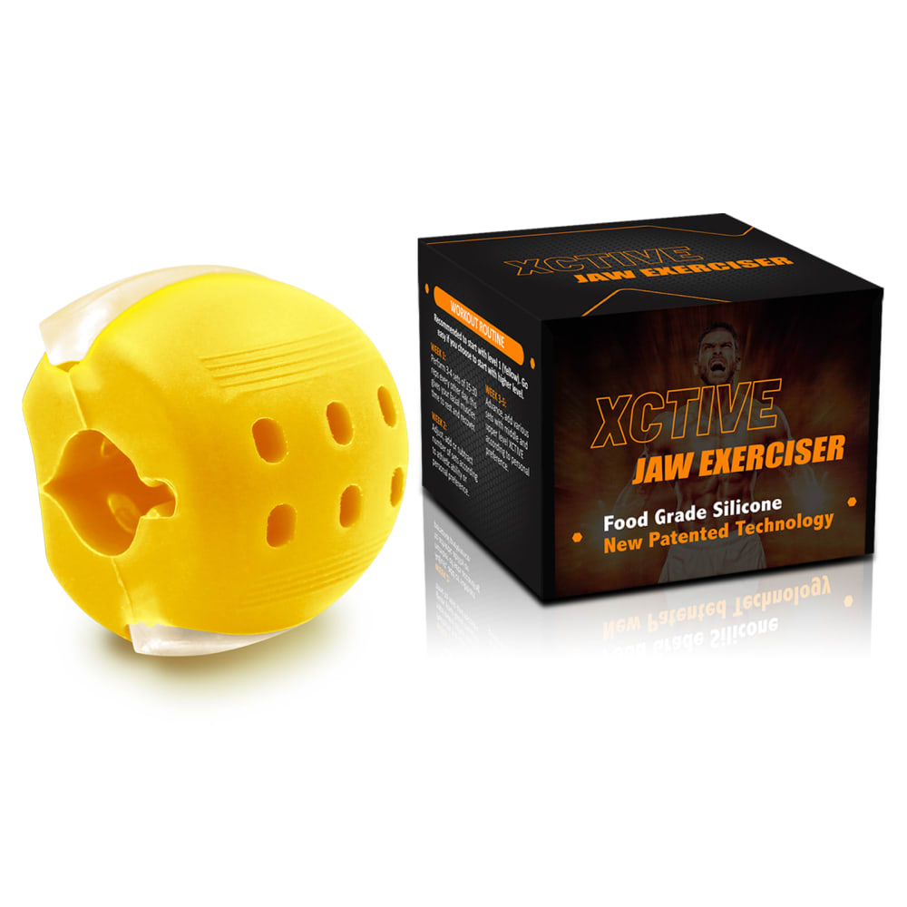
It think this image definitely needs the box so you can see what the product is. I like C the most because the package is to scale with the product.
I'm more likely to click on one of the ones with the box because otherwise I wouldn't know what it is.
Option C, followed by Option D, are the best choices for this product because the display allows you to read the information on the package and also get a close up view of the product.
This option has both an up-close image of the item that I'm getting, plus the packaging. These two reasons combined, are why I'd pick this option
C is the perfect mix of having the product up front and large in addition to the box. I would click that one.
C seems to give a little more scale to the object, so might want to click on it. I'd have no idea what D was, so wouldn't click on it at all.
5 Responses to Option D
I like the zoomed out photo showing the real size of the jaw exerciser.
I prefer the images that show the product seperat from the box or sand box altogether. I don't like the images where the product and box overlap each other.
i chose the ones I feel showcased the products best
I like how the product and the box are shown off side by side. This gives me the best idea of scale as well as being able to read the information on the box the most clearly. The image feels balanced as well.
Option D provides the best view of the product and the packaging. Options B and C are okay, but they aren't as visually impressive as option D. Option A suffers from not showing the packaging -- the product on its own is not as enticing.
Explore who answered your poll
Analyze your results with demographic reports.
Demographics
Sorry, AI highlights are currently only available for polls created after February 28th.
We're working hard to bring AI to more polls, please check back soon.

