Poll results
Save to favorites
Add this poll to your saved list for easy reference.
Which design you like better?


15 Responses to Option A
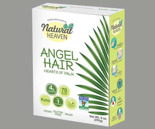
I love seeing that natural plant on the side, it gives me an instant feeling of natural calm
I do not like veggie pasta,.
I honestly just thought that A was a more modern relevant packaging design. B looked like something my parents would have bought in the 80s.
I found it more visually appealing.
This option is more modern and creative while the other choice appears very dated.
I think A is clearer in what the product actually is, as I don't see any details about what the pasta is made out of in design B. I also like the circular images on the side of A a lot. I think they are fun but also look cohesive and organized.
The white background makes the pictures and text stand out and look better.
I think the box is more appealing
Option A looks modern, bright, and attractive. The palm leaves are also way more obvious which is nice. I don't really like how the clump of sauce looks on Option B.
After carefully studying both designs, I chose my preference as Option A because of the coloring and design of the box. The box in Option A is much more eye appealing in my personal opinion.
B looks gross b/c of the blue
A is best for me because I can clearly see all the information easily. I love hearts of palm noodles and I can see this with this layout right away. I would buy this one.
Choice has a clean, appealing design while B just seems to be very cluttered and distracts from the product.
I like A because B looks like baby food or something. I immediately wanted to look away.
Option A is more appealing in the sense that the design looks more health friendly because of the images of plant leaves on the front of the box.
35 Responses to Option B
I really like the colors better.
Shows the product in an appealing way, letting me know what is inside at one glance.
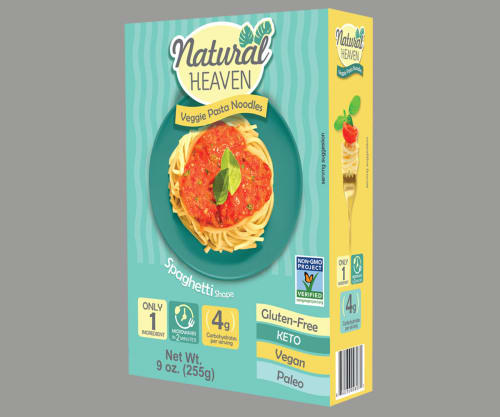
In an online marketplace like Amazon I would certainly pic B because it has all the info I need "veggie pasta noodles" while also being easy to identify as noodles by the picture in the middle.
B -the color alone will help it stand out on shelves
It is pasta right? I actually prefer to see the pasta picture with the sauce on it.
The colors on the packaging in B are more appealing. Additionally, it is more clear what the product is (a pasta-type product) with B than it is with A (I was unsure initially that 'hearts of palm' was the same as the veggie pasta shown in B).
This one looks appetizing. The other box doesn't really indicate food to me at all. I like the colors on this box, the photo of the food, and the way all the information is clearly presented. It looks like more fun to eat.
This box looks much better than A. Both do not typically look like a box that contains food, but B much more so than A.
It is much more colorful and will stand out more on the shelf.
I prefer seeing a picture of a completed dish. It looks delicious and would make me want to give the product a try. I also like the pattern of the design, it is eye-catching and would look enticing on a shelf in a grocery store.
Looks much better with a pic of actual noodles on the box.
The package is colorful and it has a good photo of the product. I really like it.
The colorful box is so eye-catching. The spaghetti with sauce accurately describes what you would make with the product. The "Gluten-Free" label is easier to notice. The dropshadow on the Natural Heaven logo is quite lovely as well.
I like the colors and lettering makes it stand out.
The color scheme of option B is appealing. Also, the subtle heart shaped sauce on the pasta is a nice touch.
I like the picture on the box
Option B clearly shows what the product is. Both have prominent and important information on the box but option A confuses me in what the product is.
I think it is more eye catching and easier to read the information about this product being veggie pasta. I like seeing how it looks cooked up with sauce, it gives a better idea how the product will look.
The color in B is more attractive. It stands out more
this one is more appealing and shows the product
I like b better, I like the colors and being able to see and understand the product
This design has much more pop to its color and overall image. Nutrition facts are placed nicely and look nicely on the bottom.
I like B Better in this option, as I appreciate the colors on the box rather than just plain white, and enjoy that the darker green tones look a bit like spaghettis.
I like the colors on the box for B. I also like that it showed the pasta product in a serving suggestion on the package.
B is batter I like seeing the pasta dish on the cover it makes me want to eat some pasta. I also like the colors better there is more color variety and it stands out.
i chose option b because i like the colorful package as opposed to the white and green box as the other option. also, i love pasta so this box with the picture of a pasta dish is great for me.
The packing has a retro look to it. Very enjoyable to look at. Gives me a good feeling.
I picked option B because I feel like the design makes the product "pop" out more. The color and design makes the product stand out more than option A. I feel like the colors go really well together and I really like how the image of the product is placed on the design. It makes it look like it would taste very good and makes me want to buy it more than option A.
I like seeing the image of the noodles on the box so I know there are actual noodles inside...even if they are made of hearts of palm.
I like being able to see the product. a isn't immediately obvious as a pasta.
I like the blue background and details on the one I chose.
i like that this one shows the actual pasta in a plate
the color of the box catches your eye better. Also it is easier to read all of the information they way that they have it printed. I also like that they have an actual picture of the product on the box.
I like the package that shows the dish of pasta because it gives a good indication of what the product looks like. I like that it looks like regular pasta, and I think that other people would like seeing this. I also find the infographics about the nutrition to be more eyecatching and easy to understand.
It is bright and colorful looks very nice and detailed
Explore who answered your poll
Analyze your results with demographic reports.
Demographics
Sorry, AI highlights are currently only available for polls created after February 28th.
We're working hard to bring AI to more polls, please check back soon.

