Poll results
Save to favorites
Add this poll to your saved list for easy reference.
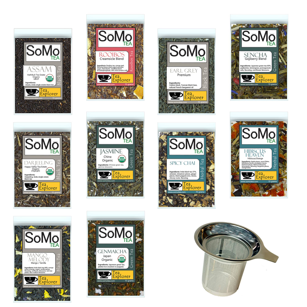
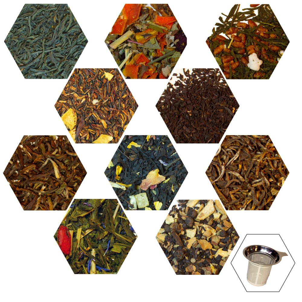
Which design would be a better main image for Amazon?


37 Responses to Option A
this one a is better although I like b I do not know it is for tea so the other lets me know it is tea
I like being able to read about what I am looking at and know what type of tea it is. Having the labels makes me more interested.
This is the best for me because I want to see the the name of the tea clearly and I can get a idea of how big the bag is before I buy.
I like that I get to see the packaging and if I look close enough I can read details about it, and I can still see the contents through the bag, so I am getting to see mor of the product and getting a better idea of it.
I like choice A the best. The other option kind of looks like grass clippings.
I like to see what I will actually get in the mail. I like the whole package picture more.
While I enjoy tea and drinking tea, I think the images in Option B could be confusing. When smaller, they could look more like spices or herbs or something other than tea. I like the different bags because not only is it more clear, but I can read the different options. I would not know the options from picture B. I also think the tea strainer looks better in A. I would be much more likely to click on image A.
I'm mainly making my choice based on the idea that I would randomly come across this image on Amazon, or see it in my suggestions rather than it being the result of me deliberately searching for tea. But Choice A is better at communicating what the product actually is, and is especially helpful as it has flavor names; Choice B looks like it could be a kind of potpourri, and even if I knew it was tea, I might not know what the flavor is!
A looks familiar, so I immediately know the product is tea. The other picture looks like gardening products or marijuana. I don't recognize it as being something to brew and consume.
I think the brand is good
I preferred seeing the items in their packaging. Even though I couldn't see the tea leaves as well, I liked seeing them in the package where the various types were clearly labeled. I can zoom in on Amazon to get a closer view of the tea inside the clear packaging, so that image works really well for me. The teas definitely look delicious!
While B does give a better look at the tea itself, I think most people would rather see what the items look like packaged, which is why I choose A.
While I do find the ability to see what the tea looks like, I find it more useful to know the name of the teas. Also there is no way to guarantee that the tea I receive would be the same quality as the pictures in option B.
Seeing both the product and packaging is always better.
I think that Option A is more descriptive than Option B.
I like seeing the tea in clean packaging.
I like choice A much better. It is a clear view of each tea and is obvious what the consumer is looking at. Choice B is confusing - it could be weeds, tobacco, spices, etc. I personally would not understand that the images were of tea.
It shows the packages and the name and products information.
The overall appearance is better in my opinion. Looks better, the thought is it taste better.
This show the packaging ad you can read it
Nicely packaged and ready to go!
I can't just identify random leaves. A has the names of the actual tea on the label, which I can read.
I find the image A to be more interpretable as to the specific nature of the product.
Definitely A because it's good to see what the package looks like. Also, the name of each tea is really helpful when deciding to purchase tea like this. I don't like B because it's difficult to tell exactly what it is and what the flavors and aromas are of each one.
I like being able to see the packaging. Especially since it's good packaging.
I much prefer to see the packaging myself, to know the specific types of tea and what they're named.
I like a better because you can see the name of the tea that you're looking at versus the other one that's really nice that you can see what the tea looks like but I don't know what is what with it so therefore I am choosing a
I like the visual of option B, but I would prefer to see the varieties of tea in the package, like in option A. If there were a way to do the hexagon thing with the tea names on it somehow, that would be my first choice.
I like this design because I lie seeing the packages it comes in and not just whats inside
Showing the product like this gives a better look at it so that is preferable to me.
In option A there is the best display for the tea due to the fact that the tea is shown on the box and the box itself is shown. Showing nothing in option B but the tea itself does not do the product any good. It does not show the product name and the pictures are not complimentary. Showing the product name and box is the best advertisement and it gives people a better idea of what they will be receiving when they order the item
A looks like a tea for sale... B looks like it could be anything.
I prefer to see the packaging with the description of the tea which is shown in Option A.
Definitely this one. Not sure what the other one is.
I like knowing what i'm getting
I want to see the bags - nothing else
I like how it shows what the tea packages look like. It is more visually appealing than B.
13 Responses to Option B
i like it shows the leaves a lot better
This looks great to me. I think there's a bit too much white/empty spots but I prefer seeing the whole herbs.
The close-up of the tea is beautiful and appealing. Any serious tea drinker would recognize it at a glance and be intrigued and want to know more. The A image is too cluttered and busy and doesn't show the product well; I'd scroll on by.
I like this because it is thinking out the box and beautiful
stands out a lot more
I like how Option B shows the actual product inside the bag as it gives you a sense of what you are buying. Option A looks cluttered and is visually ugly. It requires some effort to tell what you are looking at. The only negative thing I have to say about Option B is that it doesn't have some sort of small label for each picture. I feel like adding a small label would make the picture perfect for a product display.
option b is visually appealing, well thought out, has a cohesive theme, makes you feel like you are getting exported teas from around the globe. The honey comb design also gives me the sense that I am receiving organic, eco friendly, top shelf quality leafs. though I would recommend adding the names of the tea under each individual honeycomb. I like option A because it has the bags labeled but hands down option B in my opinion is esthetically visually appealing in my opinion.
looks more like pictures of the tea itself
It give a real world view of product.
I like being able to get a better look at the tea leaves, because the appearance of the leaves gives me some information about how it will taste
Love the closeups of the various tea leaves / components. It would definitely make me at least try them once, if not more than that :)
B is unique and extremely interesting. I think the image should have the brand name somewhere though
I think people would love to see the visual and texture of the different teas close up like this
Explore who answered your poll
Analyze your results with demographic reports.
Demographics
Sorry, AI highlights are currently only available for polls created after February 28th.
We're working hard to bring AI to more polls, please check back soon.

